Society of Visual Storytelling

    SVSLearn Forums

    • Register
    • Login
    • Search
    • Recent
    • Tags
    • Popular
    • Users
    • Groups
    • Search

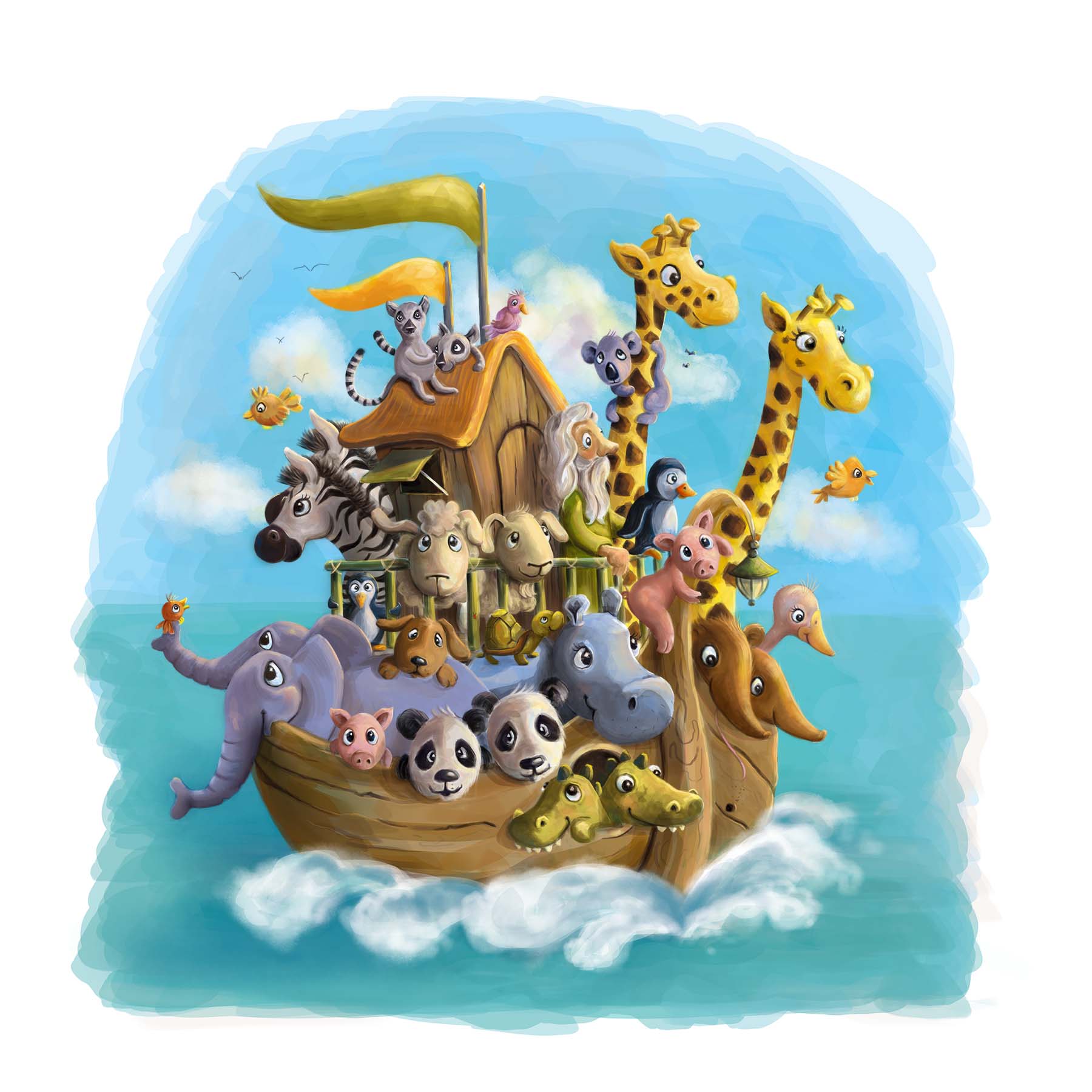
    Noah's ark picture book cover design update!

    Sketchbook
    20
    39
    13815
    Loading More Posts
    • Oldest to Newest
    • Newest to Oldest
    • Most Votes
    Reply
    • Reply as topic
    Log in to reply
    This topic has been deleted. Only users with topic management privileges can see it.
    • Lee Holland
      Lee Holland last edited by

      Really nice @leontine

      https://www.facebook.com/pages/Lee-Holland-illustration/285517801577676?
      https://www.instagram.com/lee_holland_illustration/
      http://lholla56.wix.com/lee-holland

      1 Reply Last reply Reply Quote 0
      • Beatriz "Bett"
        Beatriz "Bett" @Chip Valecek last edited by

        @Chip-Valecek Thanks. I also wondered how to reply to some!

        1 Reply Last reply Reply Quote 0
        • Leontine
          Leontine last edited by

          This post is deleted!
          1 Reply Last reply Reply Quote 0
          • S
            Shannon Perkins last edited by

            I'm agreeing with what others have already said, the animals are going to be a good draw for the age group. Lee White's comment it spot on. And as others have mentioned, the creative composition class is priceless, I learned a lot from it... Considering watching it a second time tbh.

            Centered imaged tend to feel stiff, flat, and very staged. Asymetrical compositions are more appealing to the eye, have dynamic, and feel more natural (not much in nature is symetrical). Having varying sizes, length, shapes, etc. is visually stimulating to look at, and it moves the eye around an image. When everything is the same it turns more into a pattern, and a pattern isn't meant to have any focus, which isn't what you want to tell a story.

            Sent this from my phone so I apologize if it's not the most coherent.

            http://shannonreneeperkins.tumblr.com/

            1 Reply Last reply Reply Quote 0
            • MOO
              MOO SVS OG last edited by

              I like the first as the cover one because it is easier to read as the well-known story of Noah's Ark. The other one would be better within the story pages, imo.. Really cute.

              Marsha Ottum Owen

              1 Reply Last reply Reply Quote 0
              • Leontine
                Leontine last edited by

                cover ark leontine.jpg First colored version. no text added yet...

                Rich Green 1 Reply Last reply Reply Quote 8
                • lmrush
                  lmrush Pro SVS OG last edited by

                  Nice job so sweet and your colors are so balanced

                  Lisa Rush
                  www.lisarushgallery.com
                  www.facebook.com/ArtbyLisaRush/
                  www.instagram.com/lisarush11/

                  1 Reply Last reply Reply Quote 1
                  • Carrie
                    Carrie last edited by

                    Darling! Looks great.

                    1 Reply Last reply Reply Quote 1
                    • Rich Green
                      Rich Green SVS OG @Leontine last edited by

                      @Leontine This is a very charming illustration. Love the painterly style you have been doing in all of your recent pieces!

                      www.richgreenart.com instagram.com/richgreenart/

                      1 Reply Last reply Reply Quote 1
                      • NoWayMe
                        NoWayMe last edited by NoWayMe

                        There are so many good things going on in this illustration! I love it!

                        The only thing is that some of the animals seems "cut" by the side of the boat and the railing... I have circled them in red. I think it is especially true for the elephant, the panda on the left and the sheep on the left.
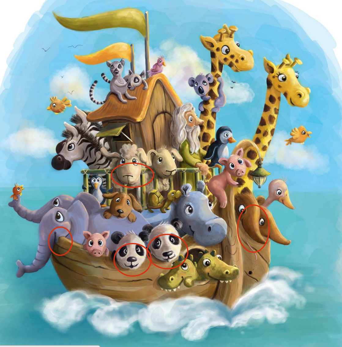
                        Capture d’écran 2016-02-04 à 12.55.59.jpg

                        Also, I think the zebra that's farther from us is cut in a weird way by the other zebra. Maybe his head could be really facing the horizon? So we wouldn't see a part of the nose and it would read a little better.

                        I hope this helps, they are minor things in a otherwise spectacular image, but I think it would improve it a little!

                        🙂

                        noemiegionetlandry.squarespace.com
                        noemie_illustration on Instagram

                        Leontine 1 Reply Last reply Reply Quote 2
                        • Leontine
                          Leontine @NoWayMe last edited by

                          @NoWayMe thanks, thats reason for improvemenr!, Ill work on that tomorrow, its already evening here 😉

                          1 Reply Last reply Reply Quote 0
                          • First post
                            Last post