Society of Visual Storytelling

    SVSLearn Forums

    • Register
    • Login
    • Search
    • Recent
    • Tags
    • Popular
    • Users
    • Groups
    • Search

    Moonlit moai WIP

    Projects
    moon water
    8
    16
    4343
    Loading More Posts
    • Oldest to Newest
    • Newest to Oldest
    • Most Votes
    Reply
    • Reply as topic
    Log in to reply
    This topic has been deleted. Only users with topic management privileges can see it.
    • Jordan Peterson
      Jordan Peterson last edited by

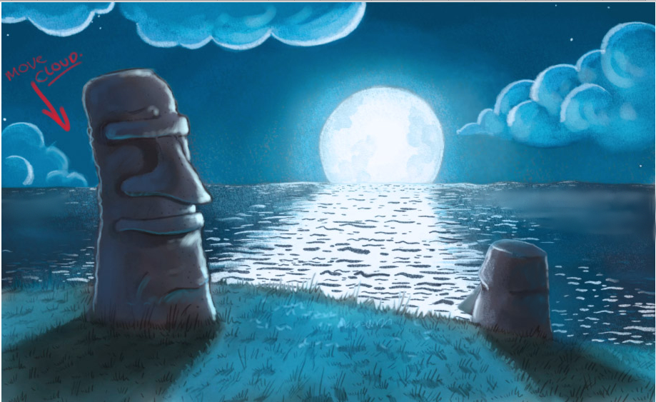
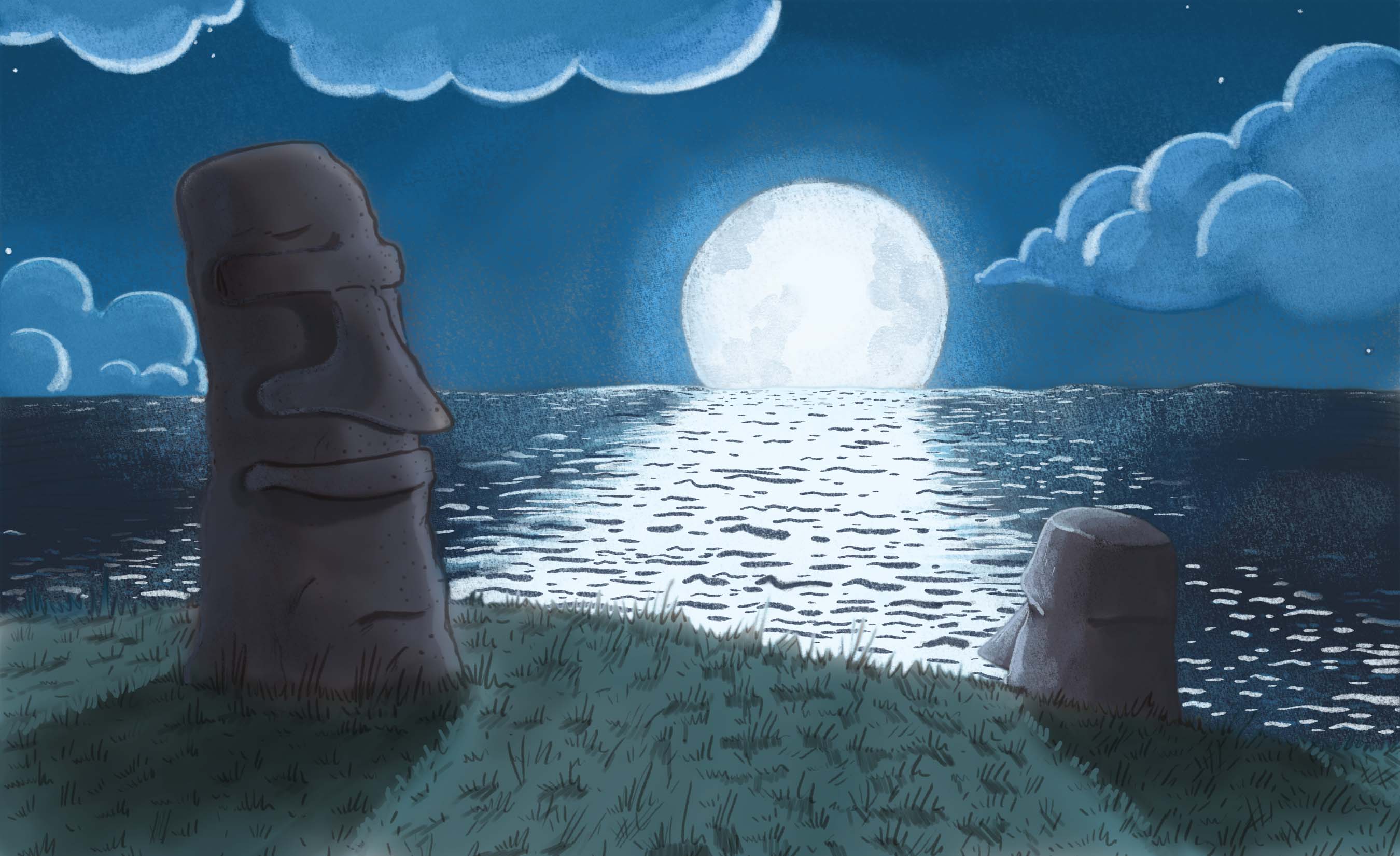
      Jasytiki.jpg

      Ok, so I've gotten as far as painting the back/middle ground, but I'm getting stuck on painting the actual stone dudes. I painted the little one, but now you can't really tell where the water ends and his face starts because the highlights are the same color as the moon's reflection. Should I just use a slighter darker shade of that blue to highlight his face? And any help on how to paint the bigger one without losing my sketch would be awesome. I want to maintain all the contours, but it's kind of breaking my brain.

      1 Reply Last reply Reply Quote 5
      • Thrace
        Thrace last edited by

        You have done a really good job so far and have created a nice mood. The only way I know to keep your sketch would be to put a multiply layer over it. Good luck! Someone with more experience will probably come along and tell you more than I can.

        1 Reply Last reply Reply Quote 0
        • mattramsey
          mattramsey last edited by

          I would just say that the highlights on the stone will not be as "hot" has the highlights on the water because the material is not nearly as reflective. if you were concerned that the little stone against the water wasn't reading well you could darken the highlight on the stone a bit.

          https://www.inprnt.com/gallery/mattramsey/
          https://mattramsey.artstation.com/
          https://twitter.com/mramseyART

          1 Reply Last reply Reply Quote 0
          • Jordan Peterson
            Jordan Peterson last edited by

            Thank you! That's exactly what I wasn't sure of.

            1 Reply Last reply Reply Quote 0
            • Lee White
              Lee White SVS Team SVS Instructor Pro SVS OG last edited by

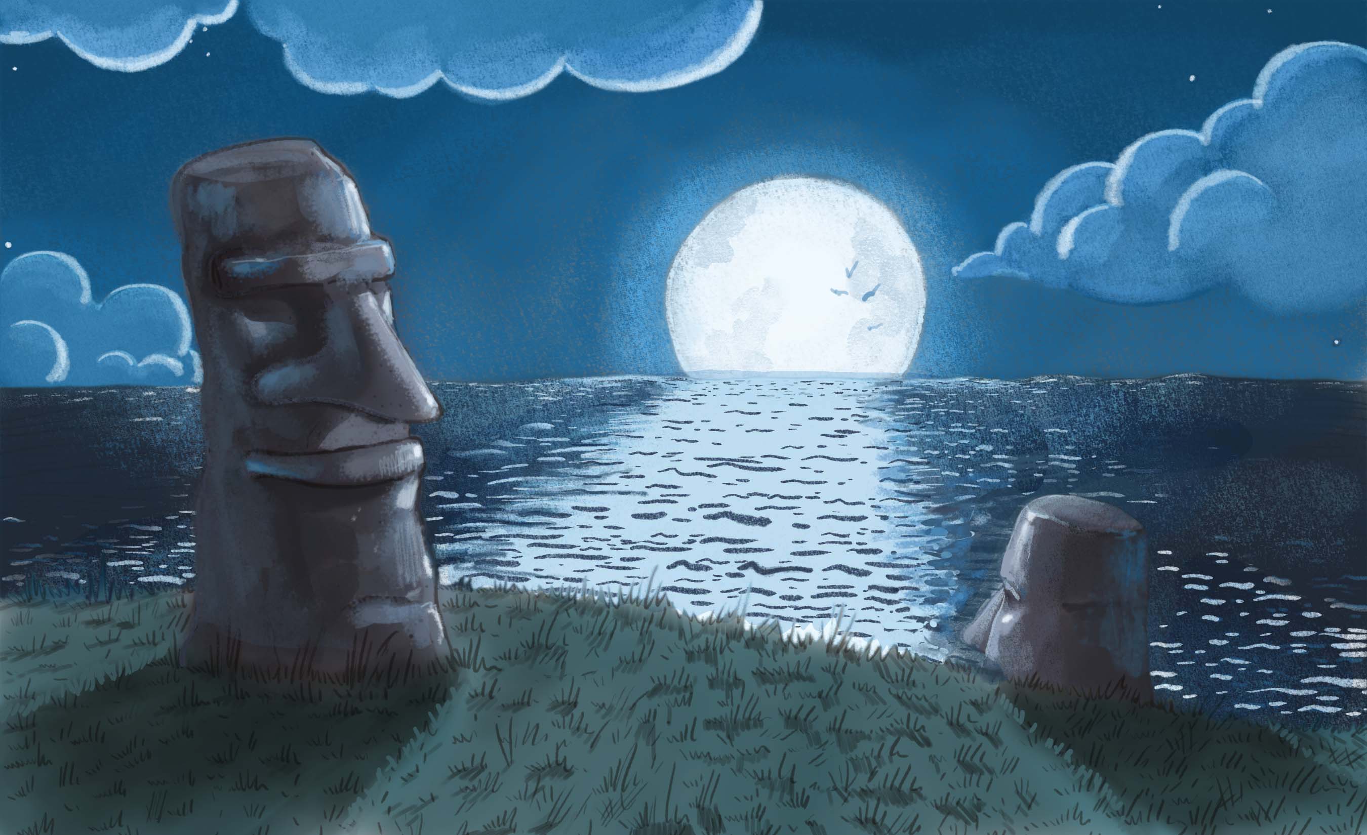
              There are a couple of things I can recommend here. The first is using blue reflected light to help define the form on the shaded side of the statues. All that light in the sky would actually luminate the top planes and backside planes pretty well. Then maybe shrink that moon reflection and knock it back a bit. It's drawing too much attention right now when you want the focus to be on the statues. I'm not sure the moon being in that spot is working great for this image. I love the layout, I'd just add a third statue and get rid of the dominance of that moon a bit.

              Here's a quick draw over for reference.

              Cool image!
              1454641631974-jasytiki.jpg

              SVS Faculty Instructor
              www.leewhiteillustration.com

              Jordan Peterson 1 Reply Last reply Reply Quote 0
              • Lee Holland
                Lee Holland last edited by Lee Holland

                Hi Mbore710

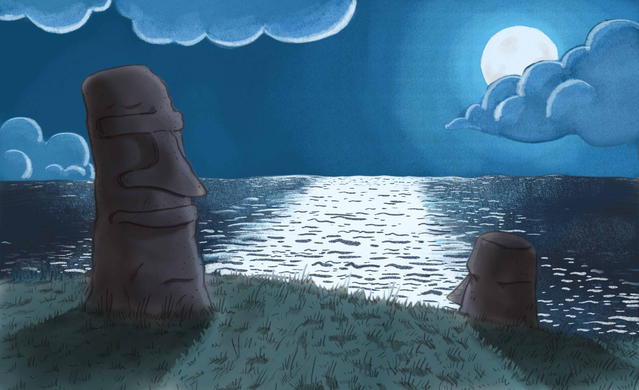
                I went and did a quick work over on this, I think the same time lee was but I thought i'd post mine also for you to look at. lee explained it really well.! I don't know if the cloud was behind the statue but the cloud line was right next to the stone.Screen Shot 2016-02-05 at 18.08.00.png

                https://www.facebook.com/pages/Lee-Holland-illustration/285517801577676?
                https://www.instagram.com/lee_holland_illustration/
                http://lholla56.wix.com/lee-holland

                Jordan Peterson 1 Reply Last reply Reply Quote 0
                • Jordan Peterson
                  Jordan Peterson @Lee White last edited by

                  @Lee-White Thanks Lee! This is my first genuine go at something that isn't colored line art, so I've got a lot to learn! It seems like I could kill 2 birds with one stone by putting a third statue right in the middle, thereby putting more emphasis on the foreground and muting out the moon, but I feel like it may just muddy it up. Thoughts?

                  1 Reply Last reply Reply Quote 0
                  • Jordan Peterson
                    Jordan Peterson @Lee Holland last edited by

                    @Lee-Holland Awesome thank you so much! The clouds look way better in the work over you did. Not just the one you adjusted, but the way you lighted the rest of them. Did you just throw more blue down around the moon as well? The glow looks a lot smoother in your work-over

                    1 Reply Last reply Reply Quote 0
                    • Lee Holland
                      Lee Holland last edited by Lee Holland

                      Hi @mbore710

                      I Rolled my colour nearer to the light source. If your moon is a light greenish blue then make your cloud colour go more greenish blue and your coloures will have that glow feel.Screen Shot 2016-02-05 at 19.06.48.png

                      https://www.facebook.com/pages/Lee-Holland-illustration/285517801577676?
                      https://www.instagram.com/lee_holland_illustration/
                      http://lholla56.wix.com/lee-holland

                      1 Reply Last reply Reply Quote 0
                      • natiwata
                        natiwata SVS OG last edited by

                        Great piece overall, made me smile when I first saw it. Has a very nice sense of atmosphere and lighting.

                        Nat Iwata
                        www.iwataillustration.com

                        Jordan Peterson 1 Reply Last reply Reply Quote 0
                        • Jordan Peterson
                          Jordan Peterson @natiwata last edited by

                          @natiwata Thanks! Hopefully I'll finish it this week with suggestions for improvement

                          sergio 1 Reply Last reply Reply Quote 0
                          • sergio
                            sergio @Jordan Peterson last edited by sergio

                            @mbore710

                            Hi M. The moon is backlighting so, for me, the more distant moai looks more natural in terms of lighting behavior. It looks more 3D. The main one looks flat. I think the flat style is more coherent with the rest of the image.

                            Moais are made of very porous volcanic rocks so they are nor too reflective and you will not see such rim lights. Then, it's an artist license. For me, that license gives a touch of romanticism.

                            1 Reply Last reply Reply Quote 0
                            • Jordan Peterson
                              Jordan Peterson last edited by

                              Jasytiki2.jpg

                              I decided to rearrange the moon, because I do want the emphasis to be on the statues and not on the moon, and as @Lee-White pointed out, in my first version it was a little too loud. I'll go in and re-paint the clouds and water, but wanted to post an update in the mean time.

                              sergio 1 Reply Last reply Reply Quote 0
                              • sergio
                                sergio @Jordan Peterson last edited by sergio

                                @Jordan-Peterson

                                What about moving the main moai a bit?

                                moai.jpg

                                1 Reply Last reply Reply Quote 0
                                • Jordan Peterson
                                  Jordan Peterson last edited by

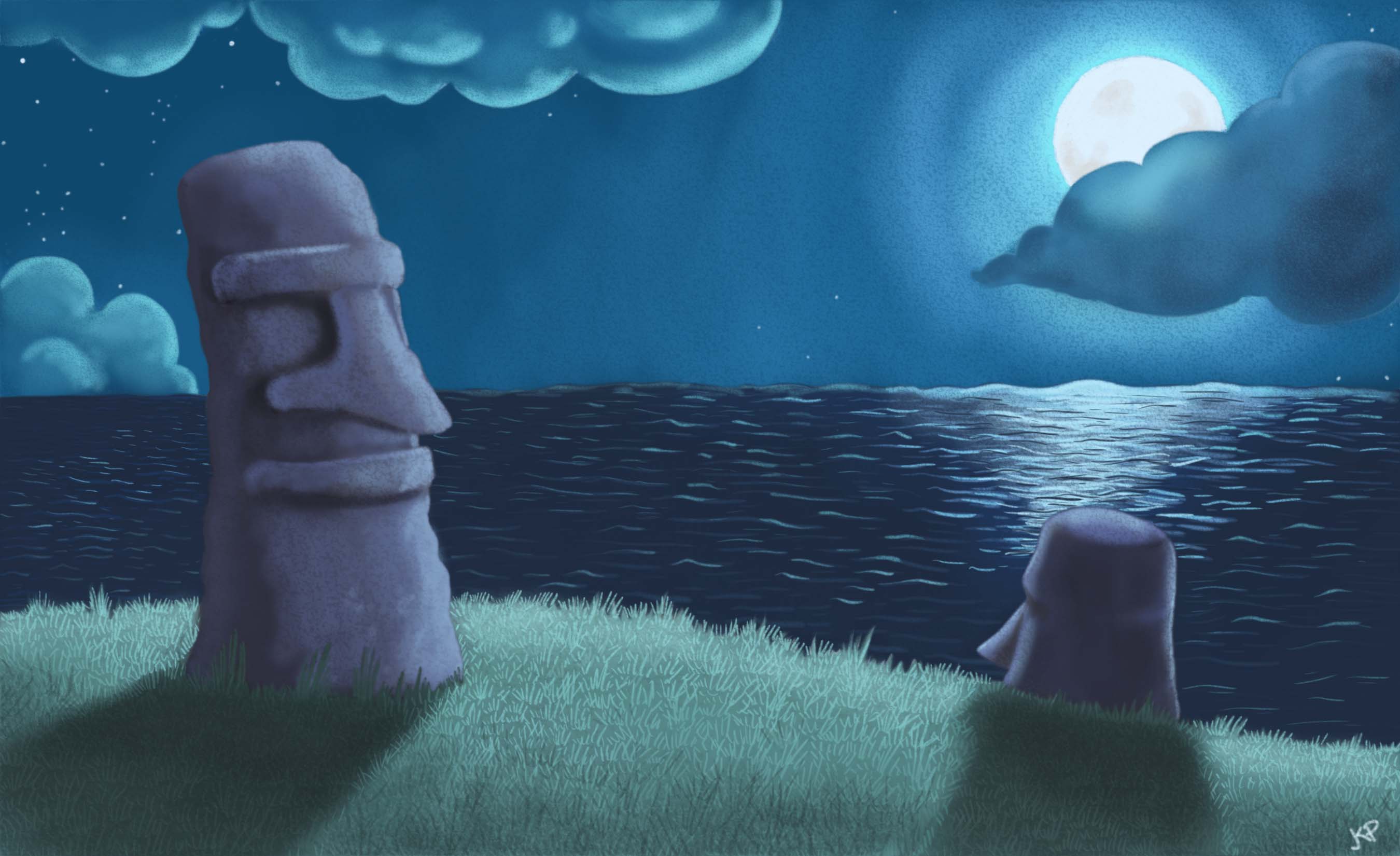
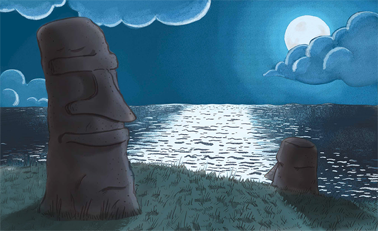
                                  Jasytiki2.jpg

                                  Ok...I wasn't able to work on this for a few days, but here's the revised (and hopefully finished) version. Thanks again for all the suggestions/advice!

                                  1 Reply Last reply Reply Quote 1
                                  • stacilyn
                                    stacilyn last edited by

                                    I really like the coolness of this piece. One quick suggestion...I feel like the grass directly behind the lower moai would not have a highlight, but would also be in the shadow.
                                    1 Reply Last reply Reply Quote 0
                                    • First post
                                      Last post