WIP - Reinventing your watercolor palette - sea landscape
-
Hi, I finally started working on the watercolor palette course by Vesper Stamper. I had bought the colors two weeks ago and was afraid to open them
") Actually I lack many other skills in watercolor painting and illustration in general but this seemed like a nice place to start doing something, I really liked her presentation and pleasant personality. I wanted to make my own composition so I have no idea what I am really doing here but hope it will be colorful enough Any advice will be appreciated! I know I should tape the papers edges but for this first try I was too lazy and also afraid if I spend too much time in preparations I'll never get started on the actual work.
Actually I lack many other skills in watercolor painting and illustration in general but this seemed like a nice place to start doing something, I really liked her presentation and pleasant personality. I wanted to make my own composition so I have no idea what I am really doing here but hope it will be colorful enough Any advice will be appreciated! I know I should tape the papers edges but for this first try I was too lazy and also afraid if I spend too much time in preparations I'll never get started on the actual work.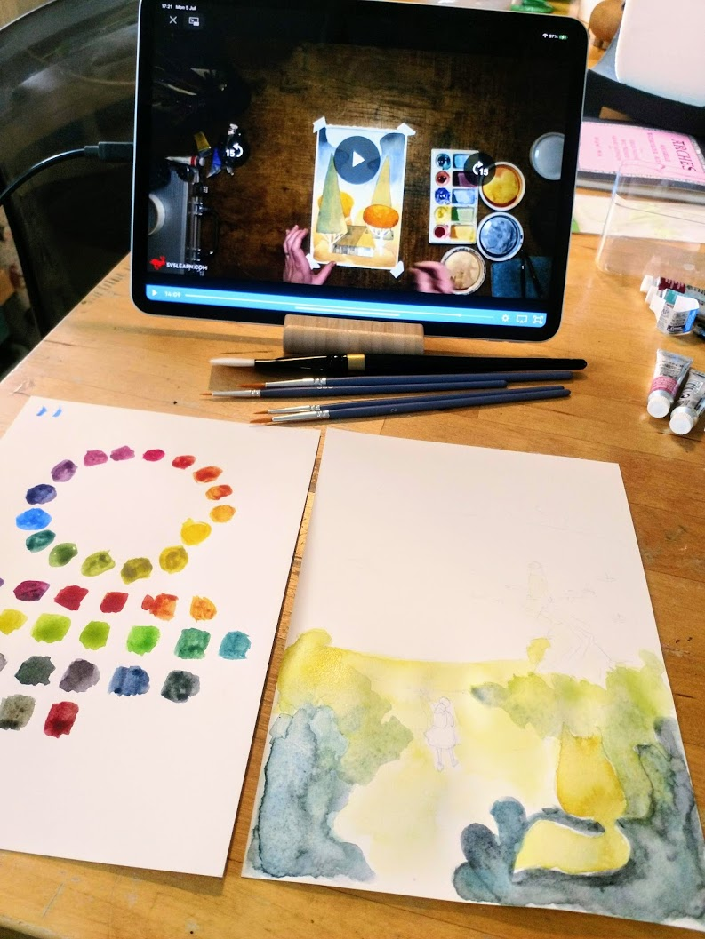
-
I started by messing up the title of this post, I wonder what a "sea landscape" really is?


-
@Oana You don't need to worry about the title. : ) What is your goal with this watercolor work?
-
@Becky For now I think I can't have much of a goal except getting myself more familiar with the watercolors. There is a story lingering in my mind for some time that I thought I would try to start to illustrate, it has the sea as a setting, and I like the look of graphic novels in watercolor, but today I think I'm just "woopeee the nice colors!!" - kindergartner style
-
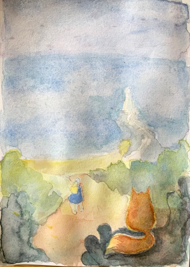
I liked how the first simple colors looked, now I'm adding more layers and messing it up a bit, at least the cuorse point was true, even when I blend the colors randomly and messy, they don't seem to become "mud". Also the paper is holding well. Unfortunately I already lost most of the white, should have left a bit I think, but I had no real plan... I'll let it dry and get some details in.
-
@Oana looks like you're off to a great start! Have fun with it!
Advice or tips? Start out using high-quality materials instead of "student grade" -- I learned this the hard way. It looks like you have the Winsor and Newton professional line of watercolors, so you're way ahead of me when I started out! If you continue in watercolor, I recommend trying out a few different brands of paint to find the paints that match your preferences and your style.
I also learned that the paper and brushes you use make a BIG difference! 100% cotton watercolor paper behaves SO much differently than wood pulp or cellulose paper -- if you're an artist who likes to work in layers (and it appears you do) 100% cotton paper works with you instead of fighting the cellulose paper, which tends to not absorb the paint so the layer(s) below lift when you're trying to put down a new layer.
If you like YouTube and want to learn more about watercolor supplies and techniques, I highly recommend In Liquid Color and The Mind of Watercolor -- both are highly informative channels.
illustrator - author - smiley person
mbaileyart.com
instagram.com/mbaileyart/ -
@Oana I did Vesper Stamper's course about a year ago and used only the five colors she recommended for about a year. Limiting my palette to her recommendations really helped me to learn color mixing and although I have finally expanded my palette, her five remain central to my painting. Have fun playing!
Laurie DeMott
instagram.com/demotlj -
@Melissa-Bailey-0 Thank you for the channel suggestions, they look good! I do have tons of cheap watercolors (joint posessions with my kid
 ) and I had timid and varied results over time. After watching the course I was convinced to buy the exactly recomended stuff so I would know if the results I'm getting are bad just because of my technique or because of the materials too
I'll also look for some better paper. -
@demotlj I agree, the limited pallete works nice and as always limited choice makes things easier for a begginer!
-
@Oana You're welcome! Paper makes the biggest difference for me, hope it does for you too.

-
Watercolor paper preferences can be pretty subjective, but here's a rundown on my favorites. I use both hot and cold press, depending on the painting. As Melissa Bailey said above, don't waste your effort with anything other than 100% cotton. You learn and adapt to your paper just like you do with your other tools.
If you want to skip taping down your paper, you can go with 300 lb paper. But say you have a sheet of Arches 300 lb hotpress and a sheet of Arches 140 lb hotpress: the texture and absorption will be different even though you have the same brand and the same surface.
Arches is the workhorse, affordable and consistent quality. Personally, this is the kind I buy most frequently, in full sheets of 10, both hot and cold press. It may be all in my head/nose, but the sizing (animal derived gelatin) smells a bit stronger than in some of the other watercolor papers I use.
I love Waterford cold press...soooo lovely, feels handmade.
I've used a few sheets of Fabriano hot press and been really happy with it.
My friend always used cold press Lanquarelle. Around 15 years ago, she swore the company changed the quality. She bought sheets a few times but each time said the surface didn't feel right. I'd inherited 30 sheets that were a few years old and had no love for them, but she refused when I tried to give them to her. In her mind, they were irreplaceable, in my mind they were taking up space. I started giving her sheets for her birthday. When those finally ran out, she switched to Arches, but she's still nostalgic about her old paper.
-
@RachelArmington Great information Rachel, thank you!
-
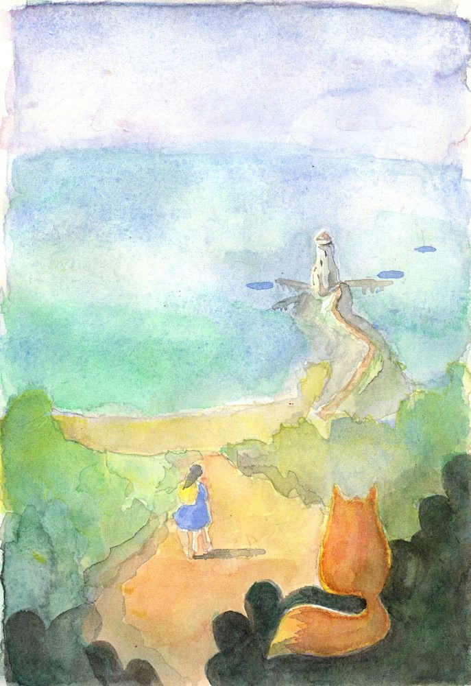
I consider this exercise complete. I tested some dark grays too and the palette is indeed really nice to use and fun! Next I should plan a project with a clearer color scheme and composition, level values...
-
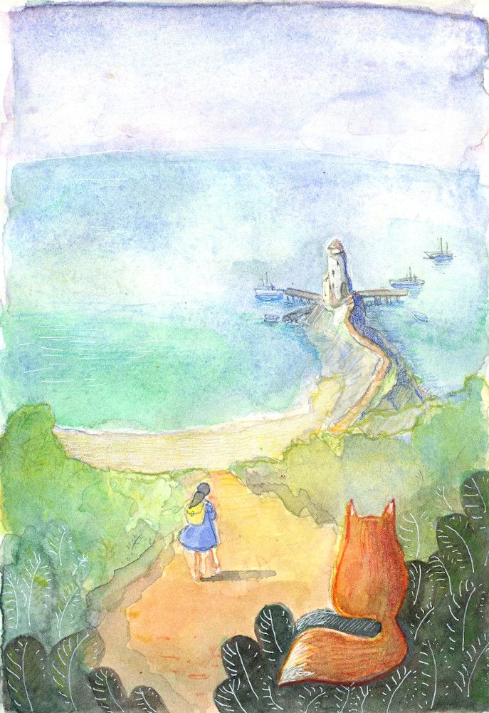
After finishing and scanning the watercolor painting I decided to try some details in pencils and some white gel pen, not sure it makes it better or worse, but had to try it! Just the watercolor - it lacked definition too much, with the pencil work I think I went too far.
What do you think would have worked better? (besides painting the thing again in a more planned and careful way?)