Watercolor sketchbook fun while learning to create in public and plein air
-
All of these recent posts of folks sharing there water color sketchbook pieces - made me want to share some of mine.
Last year I started taking a little time now and then to go out into the world and attempt to do a sketch and then watercolor it on site.
I had received a little travel pan of watercolor paints and a water brush as a gift and wanted to give it a try. I had also been to an illustration intensive featuring Matt Faulkner in which he went over some of the basics of illustration and he talked about things like always having a little blue in your brown and a little brown in your blue to add a cohesive feeling to paintings - or at least that was how he approached his watercolors.
So the first day I was meeting the author of the book series I illustrate at a Panera so I arrived early and gave it a go. I was a bit nervous about doing any drawing/painting out in public like that - and I certainly did not want people to feel like I was constantly staring at them as I was going about this but I learned that you have to quickly get down the basics as people come and go and the scene changes in the blink of an eye.
The resulting image looked like this:
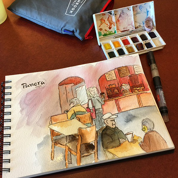
All kinds of things are wrong with the perspective and how I handled the paints but it was a fun learning experience and I decided to post it at the time on my social media sites and got a pretty positive response.
So that gave me the encouragement to try it again and again.
Then next stop was at my local library:
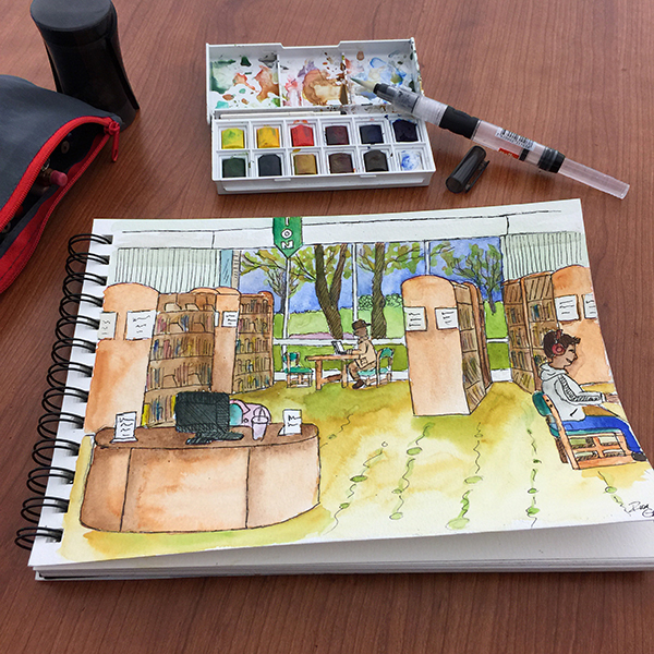
I sat at an empty table and picked a spot that included things in my view that I could use in the sketch - desk, bookshelves, window with view outdoors etc. I had to edit a bunch out of my line of site to keep it simple and then I just started trying to have fun with adding in color for shadows and shading and again had fun with it. People would pass by and I could tell they were looking at what I was doing but I was so focused on the image that it did not bother me as much. Posted this one on social media and again folks responded positively.
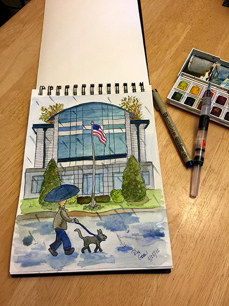
Next I wanted to try and capture this modern glass type building near my house. It was a rainy day so I pulled into a parking lot across the street and sketched from inside my car. I also got some of the base colors down while sitting in my car - but then drove home and finished at my table because it just was not that easy for a bigger guy like me to try and paint on my steering wheel.
This was also a great time to try and start using that blue/brown mix I had learned about because of the gloomy day, the colors of the building etc.
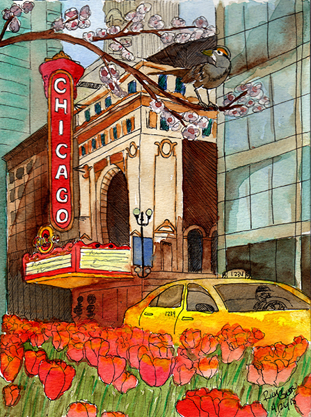
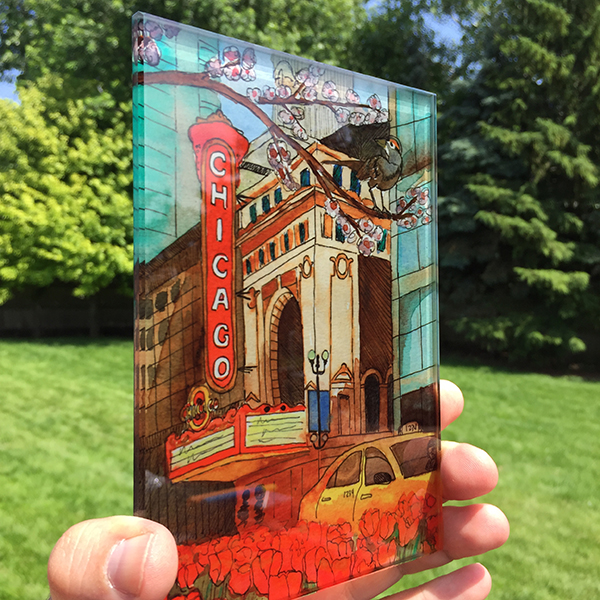
For some reason people really responded to this one - and so that further pushed me to take these to the next level. Which to me was to try a sketch of a far more well known landmark. I had been taking an Adobe Illustrator course at the School of the Art Institute in downtown Chicago so I decided to drive into the city early and walk a few block over to the famous State St and do a sketch of the well known Chicago Theater.
I found this great spot across the street that allowed me to get the now blooming tulips into the scene and just for fun I added in the tree limb with the bird to put something else into it that brought nature into this otherwise urban jungle.
It was a nice sunny day and the light was doing all kinds of fun things to the buildings and the colors and I really took my time on this one and I think for me it was a bit of a breakthrough on how to better handle some of the colors/shading etc. Here again I really used that blue/brown quite a bit on the buildings and then let the reds/yellows really pop out against them.
Well when I posted this one - people really went crazy about it. And that is what is so fun about social media - if its working in your favor it really fuels you to keep doing more and pushing yourself. Sure these may not be the most technically proper watercolor sketches ever - but those who follow me responded well and I was learning quite a bit about their likes and my skills all at the same time.
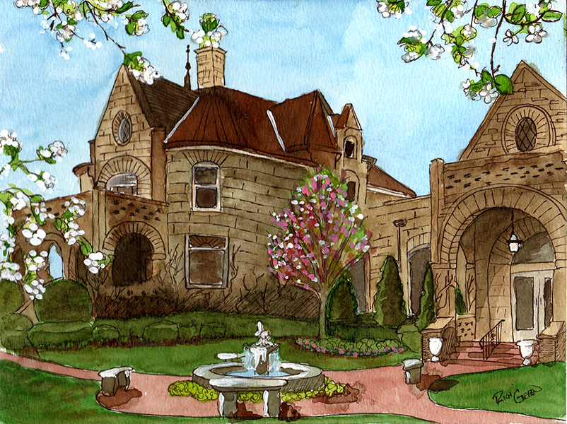
Next up I did some research on historical buildings in my own town and came across this really cool mansion (which is now used as a banquet facility so it is kept up so nicely). I did this one standing out front and using the wrought iron fence to balance my my sketchbook and do the drawing and painting. Again it was a fantastically sunny spring day and while I know I clearly overworked the browns of the building and it got too dark and away from me - I still had fun with the details. I did have to go back and add some white gouache when I got home to make the little flowers and the water fountain pop. Not sure if that is frowned upon in the watercolor world but hey - this was my little sketchbook, right?
When I shared this one online - I found that one of my friends grandmother was best friends with the original owner of the mansion and she remembers playing there as a kid. Later on she actually got married there - so she was in love with this one. I printed out a copy and sent it to her and she framed it and has it hanging in her house - that was kind of cool!
The last one I worked on, was by special request from one of the social media followers - they asked for me to do the Buckingham Fountain in downtown Chicago. So I was up for the challenge and really loved working with the tones in the water on this one.
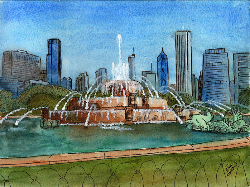
My sky got a bit too gritty - don't think I was patient enough or either that or the sun was drying things up a bit quicker - I can not recall. This time I brought some of that white gouache with me and did that on site once it had dried a bit. But it really was fun using those blues and greens and browns in the reflecting water.
Because I was getting such nice response - I actually thought about how I might be able to turn these into products to sell online and toyed with the idea of using a service that can print images on glass. I ordered a sample of the Chicago Theater piece and I loved it in the raw sunlight. I have still been playing around with turning into a back light shadow box of sorts - but found I am not crazy about all of the wood working it involves and I sort of stalled out on what to do about that. I could probably just offer these as glass sun catchers or something - but the price for that process is a bit high and I was not sure if folks would pay for that. I probably need to revisit that however - buy a few put them online and see what happens.
-
@Rich-Green Wow the Chicago piece is really beautiful. Lovely colors, composition and blending...you can really see you are getting more and more comfortable with the medium. I love the flowers in the foreground and how you handle the color on the cab! Love that you are doing plein air studies...that is my goal too now that I have portable pans. Which one are you using? Mine is the Koi Watercolor Pocket Field Sketch Box with 24 pans.
Happy Creating
www.charlieeveryan.com -
Wow thanks for sharing your artistic journey with watercolours with us Rich! These are really super pieces - like your followers I also really like the blue one with the modern glass - I like the way the rain and the blues echo the glass of the building...and also the Chicago one, beautiful bold colours.. and the bright reds and contrast work nicely with the inked outlines, it's got a nice feel to it. But they are all great and I also really enjoy the textures of the brown in the fountain reflection.
Love the print onto glass too! Perhaps you could make a set of glass coasters?
-
@Charlie-Eve-Ryan First of all thank you so much! Yes I would highly recommend getting outside and really taking in how the light and colors really look. And then try to capture them or your creative variation of them in your own colors - its really so amazing how different it is than sitting inside looking at a reference photo. Plus life happens in the process (clouds change the sunlight, or people come and go and so on) and it really makes you work in a whole new way. I found it very fun.
The little travel kit I have is just a 12 pan Winsor & Newton kit. I really like working with it and keeping myself limited on the color palette - as I tend to go overboard with colors anyway and when I have access to all of them in Photoshop I have been known to use a few too many of them
")
-
@Dulcie Thank you very much! I really enjoyed reading what it was you responded positively to in the various pieces. Nice to get the opinion of what stands out to other artists and why!
Yes I really do need to pursue the art glass options again - I do feel like it would make for a unique offering at an art/craft fair - as I have not seen anything similar being offered. Hmmm
-
I agree: the Chicago piece is gorgeous. Every centimeter is interesting. Wonderful color scheme, very appealing abstraction... Sold!
-
@sergio Wow! Thank you so much Sergio! Seriously - this feedback is so kind and just incredible. I am humbled right now - thank you again.
-
@Rich-Green Really cool work! I too like the Chicago piece. So vibrant!
-
@Rob-Smith Thanks Rob - that is a high compliment coming from you - as you have such a wonderful way with watercolors! Really appreciate it!
-
This is great! Loved seeing the progression. I hope you continue!
-
Very nice! I've been trying to do more outdoor sketching/watercolor lately and it is so much fun. The blue and brown mixing sounds interesting... will have to try! I also really like the painting with the tulips, it just flows well.
-
@Steff and @shinjifujioka thank you both so much!
-
Love your Chicago piece- thank you for sharing!
-
@lmrush Thank you so much for the nice compliment! I really appreciate it!
-
@Rich-Green great stuff Rich, proud of you, you are so dermined to improve, I love it!