New portfolio illustration. How would you improve it?
-
@Melissa-Bailey-0 @Nyrryl-Cadiz @Jeremy-Ross @R-Fey-Realme @KathrynAdebayo @LouD @RachelArmington @lidia-ull @Casual-T
So many awesome comments helped me make some changes to this illustration to nudge it even closer being a picture book illustration.
The first important point was so add text space. To do this the unicorn and princess are a bit smaller which I really like because it takes less emphasis off them. The text is 16 point.
All the bunnies are now different colours instead having white fur, the main character who is still white and he has some dark fur patches which still give him the highest lightest value. Two of the bunnies are now closer to the door and they have those funny party things that you blow and they make a noise so they look more like they are ready to party.
The background was easy to change to a pale blue which contrasts with the princess dress and brings her and the unicorn forward, think they have a better silhouette now. I extended the unicorn's bottom past the dress so the tail looks like it is in the right place and not coming out of the dress.
Also lightened the value of the trees as they were quite dark and competing for attention.
The fairy wings are whiter so you can see them more easily.
I kept checking the values too, always a great tip!
Thank you everyone. I am really pleased with it now. I do have one question which is about text. Do you think the text has to be black?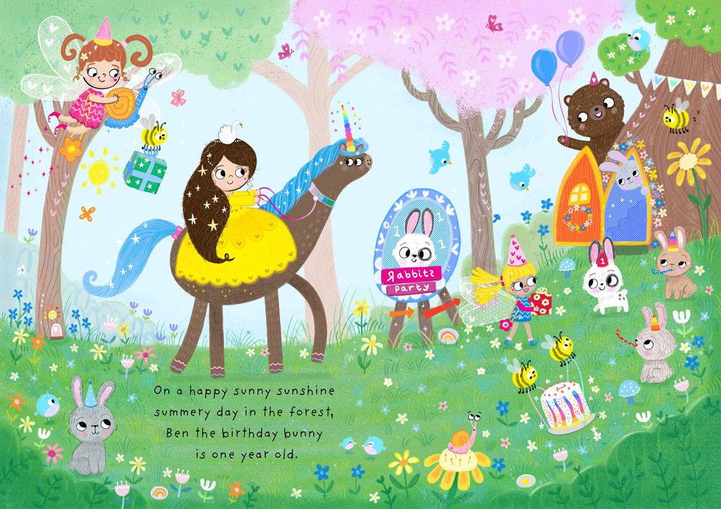
Website http://www.judyelizabethwilson.com/
Instagram https://www.instagram.com/judyelizabethart/
Sharing positivity through art.
-
What a change! You really improved it!
Regarding your question about text: no, it does not have to be black. (The last 3 picture books I formatted, the text was dark green, dark blue, and brown. Sometimes it adds a little something extra if the text is not black.) However, there does need to be sufficient contrast between the text and whatever it is placed over -- this is for readability. While you chose a readable font (good job!), I would recommend lightening the grass behind the text so that it is lighter in value rather than mid-tone.
A note about text placement: where you put the text leads the eye. In this composition, because the princess and unicorn contain some of the brightest colors and the darkest values in an otherwise mid-tone piece, and because they are placed directly above the text, my eye goes to them first. Visually for me, they are given the greatest importance. While you have definitely improved the values, in terms of hue and value, I don't think this illustration is communicating what you want it to communicate.
Probably not what you were hoping to hear, but wanted to share what I see, and this is just one person's opinion. Take this feedback how you will.

illustrator - author - smiley person
mbaileyart.com
instagram.com/mbaileyart/ -
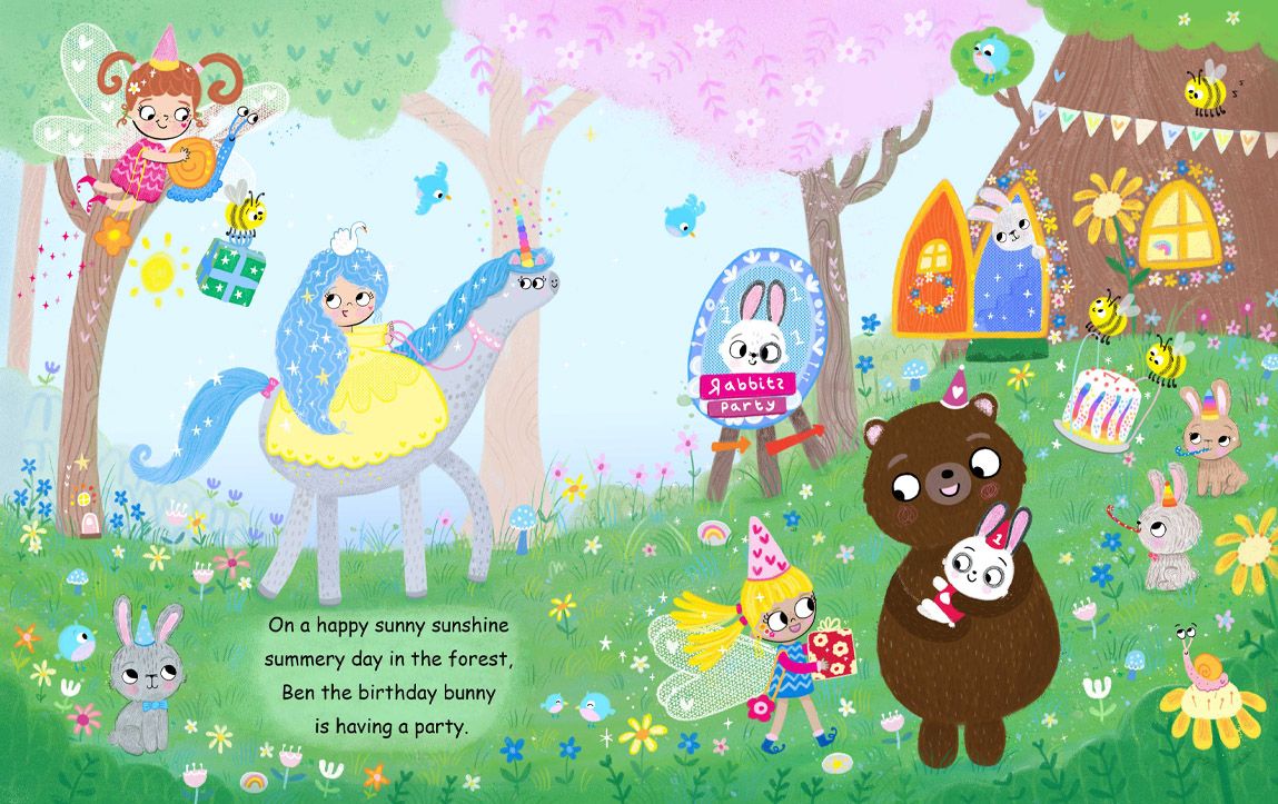
@Melissa-Bailey-0 Thanks Melissa. I would like to do the text in a dark blue, it is a bit softer isn't it, still very readable.
Good point about the grass, it would look better with the grass area lightened in value.
You know, I think what I can about the princess is make her dress blue or a cooler colour, then she will not be center of attention. Let me see if that brings birthday bunny more to the center. I could also give a t shirt to bunny to bring some attention to him. Love your feed back. Much appreciated. Thank you!Website http://www.judyelizabethwilson.com/
Instagram https://www.instagram.com/judyelizabethart/
Sharing positivity through art.
-
@Judy-Elizabeth-Wilson I love the revisions you've made. My favorite part now is the orange door that wasn't as noticeable before...it looks like a carrot!
As far as black type, if your book is going to be printed in four color process (as the vast majority of picture books are these days), you would need to make sure the text is large enough so that there is less chance that it shifts out of register. When a book has black type, all the type is on a single plate (the black plate, which prints last). In 4/c process, color type is made up of a mix of two, three or all four of the inks. For example, if you wanted your type to be a sort of navy blue, it would probably be printed with cyan, magenta and black. Which means the type is on those three plates and the risk of one of them shifting during printing is increased.
If you are considering using print-on-demand, those presses only use four color process at this time (...to my knowledge...if anyone else knows of any POD printers that go beyond 4/C, sing out!).
If your book is going to be printed with spot (aka special) inks, the size of colored type wouldn't be an issue. But it would be more expensive.
-
@Judy-Elizabeth-Wilson you're so welcome!
You know, the more I look at it, the issue isn't just that the princess' dress is vibrant yellow (it's part of the problem, you're right). It's that she and the unicorn are one of the largest shapes in the composition and they are the area of highest contrast (along with the bear). They need to be brought way into the midtones so that they blend in more with the scene instead of standing out.
How might you do this? Make the unicorn very light gray or blue or pink -- not white but lighter than the background. Give the princess blonde or purple or pink hair. Make her yellow dress more pastel instead of vibrant (or you could try blue but keep in mind that you have her against a blue sky and blue mane -- it might be hard to find a good balance).
The other thing that might help is to find a way to make the bunny really stand out. It will require some rejigging of your composition, but what if you brought the bear forward to have him hold the bunny, perhaps giving him a ride on his shoulders or hugging him or something? That would place your two highest contrasting values directly against each other, and that will really make the white of your bunny MC stand out. If the lightest and darkest values are in the upper 1/3 left of your illustration, surrounded by midtones, that will really draw the eye.
Just a possible solution that sprang to mind that I thought I'd share with you...


-
@Judy-Elizabeth-Wilson Hi Again...I should have asked this before: I'm assuming this is for a single page of a landscape oriented book? Or is it a double page spread for a vertically oriented book (if so,the unicorn's nose will be in the gutter). Or is it just a very fun project unlimited by trim size?
-
Thanks everyone who helped with suggestions with how to make this illustration better. @Melissa-Bailey-0 @RachelArmington
To make birthday bunny the center of attention he is now at the front of the scene and lifted up by the big bear, as Melissa suggested, the lightest value on the darkest value. He looks more like a one year old now, he looks cuter.
The other change is the unicorn and princess, the dress is a lighter and paler yellow and the unicorn is now light grey so they are still part of the scene and yet not taking up so much attention.
The grass area is lighter for the text. Thanks for all the help. Is there anything I have missed? Would like to know if you spot anything.
Website http://www.judyelizabethwilson.com/
Instagram https://www.instagram.com/judyelizabethart/
Sharing positivity through art.
-
@Judy-Elizabeth-Wilson Wow!! Such an improvement in showing the story! And it is beautiful and such a wonderful style for children.
-
@KathrynAdebayo Thank you Kathryn! I agree, everyone's ideas really came together and the story really shines now. I am very happy with this illustration compared to the first version.
-
@RachelArmington Really glad you noticed the carrot door!
")
Website http://www.judyelizabethwilson.com/
Instagram https://www.instagram.com/judyelizabethart/
Sharing positivity through art.
-
@Judy-Elizabeth-Wilson
And now I want blue hair like the princess! So lovely! -
@Judy-Elizabeth-Wilson you fixed the value issues! The main character is easily identifiable now. Well done! This is such a CUTE illustration! Love all those details.
So, this is really nitpicky, and it's applicable only if you're planning to put this in your portfolio with text: you may want to choose a different font. While it's very legible, it's Comic Sans, and most book designers HATE Comic Sans. Art directors, who might be looking at your portfolio, are often also book designers. Avoid inducing an icky gut reaction -- use a different font.
Font recommendations? Gaegu, the font you originally had, is good. ABeeZee is also a font that would work well and is free for commercial use from Google Fonts. The goal in book design, when choosing a text font, is for it to be easy to read and to be "invisible" -- you don't want the reader to notice the font as that will take them out of the story.
Alrighty! I got wordy again! Sorry for rambling on. Long story short: your illustration is ADORABLE. Definitely portfolio-ready. The only thing I'd personally do is choose a different font (but that just might be perfectionist me!). The illustration is great!
illustrator - author - smiley person
mbaileyart.com
instagram.com/mbaileyart/ -
@Melissa-Bailey-0 Thanks Melissa. Especially for your guidance and tips. Bringing rabbit and bear forward made all the difference!
Haha, I will swap the font back to the other one, internet was down for and some reason because I have PS where you can download fonts online when internet is down, any of the downloaded fonts are not available, only the preloaded fonts. I will check out the other fonts you mentioned too! -
Last one, I promise. Here the finished illustration with a better font. Thanks everyone!
Website http://www.judyelizabethwilson.com/
Instagram https://www.instagram.com/judyelizabethart/
Sharing positivity through art.
-
@Judy-Elizabeth-Wilson awesome! Your first image looks like a nice cute drawing but this illustration is definitely a picture book spread
Nicola Schofield
Twitter: twitter.com/NSchofieldArt
Instagram: instagram.com/NicolaSchofieldArt/ -
@NicolaSchofield Thanks Nicola. Could only have done this with everyone's suggestions and ideas! I am really happy with the bear and rabbit.