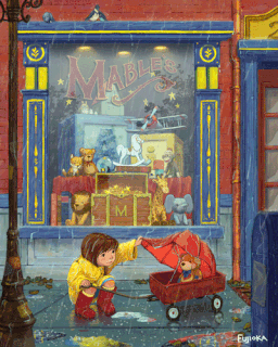
February 3rd Thursday. Love is a teddy bear.
-
@shinjifujioka All I can say is WOW! I am so in awe of your work, you are amazing!!
-
@shinjifujioka I LOVE this piece, so charming and heartfelt and I love the characters, the rain and the reflection in the puddles! So awesome!
If you are going to revisit it I would maybe just tone down the colors on the animals in the window and the frame and let the bear and boy POP. And/or maybe try to make the glass just a bit hazy since you probably could not see all the toys so clearly in the window from the angle.
If not, this is an amazing piece so do as you see fit!!

-
@shinjifujioka Absolutely beautiful. Even the more subtle details like the weathering/aging on the down spout are fantastic - just such a wonderful piece. You are extremely talented!
-
@shinjifujioka Also I love the Helmet and Hound are tucked in this scene now too! Very clever.
-
@bharris
@Naroth-Kean
@Leontine
@JajaJulie
@Thrace
@Charlie-Eve-Ryan
@Rich-GreenThanks everyone!
Also, good eye, Rich!
-
@shinjifujioka just a quick paint over with the no hood idea. Plus I added some reflection to the window (which I think there would be--but maybe not as strong as I have it). The reflection also might serve to "calm down" the background a bit and bring more focus on the main characters (as @Charlie-Eve-Ryan mentioned).
The only thing on that is: I really love the vibrant background so I'm not really sure about that change.
@bharris the reason to take out the raincoat/remove the hood is to more strongly push the love concept (love is sacrifice). It isn't that it (i.e. the raincoat and hood) somehow is detracts from the image at all. But the idea that the girl is willing to get rained on to protect her bear is pretty powerful IMO.
-
@mattramsey I'm not able to view the paintover...I wonder if that's just an issue with my computer?
-
@shinjifujioka weird.
I wonder if anyone else can see it.
Here is the photobucket link if that helps: http://s96.photobucket.com/user/lemonween/media/shinjiFeb3rd-thur-crit-small.gif.html?sort=3&o=0
I may have done something wrong but it is showing up for me. It's a .gif saved for web viewing. That might be the issue. Not sure.
Let me know if that link doesn't work. I'll try submitting a .jpg
-
BEAUTIFUL!!! Love it all...every detail, the concept, composition...amazing!
-
@mattramsey Okay, now the link worked, but I'm not able to view the larger version. Only the thumbnail. Perhaps a jpg? Sorry for making you go through this.
@Carrie Thank you!
-
-
This post is deleted! -
@mattramsey I can view it now. You helped me solve a problem I had by putting in that reflection. I tried a few times to paint water droplets on the glass, and I was having the hardest time. I think the frosted over glare will provide enough lightness to depict water drops. Thanks!
Also, thanks for the paint over. I really appreciate you taking the time to do so (and for providing the suggestion at the beginning). I'll probably go with the hood based because I like how the yellow contrasts with the blue of the window sill. But I hope you continue to provide input in the future. Having different opinions gives me opportunity to mull over which direction to take an image, and a lot of times that will result in finding solution I wasn't aware of in the beginning. For example, you suggested no raincoat (or at least hoodless) and the reason being that it would showcase sacrifice more. So then I started thinking about how can I push that idea without losing the raincoat? Then I thought that perhaps I could make the raincoat feel a little tattered. And the umbrella broken. And the wagon rusted. And all of a sudden (for me) the story started to come alive about this not-well-to-do little girl who used her savings to.....aaaaand this is getting a little long, haha. Basically, thanks for the input!
-
@Renduin said:
If anything I think pushing it just for the sake of pushing it would kill the charm and move it into the realm of mere sentimentality.
I'm not really sure I understand that statement but I definitely agree with you that Shinji has done another amazing piece as it is now--without any alterations needed whatsoever!
*Although I'm sure pros like Will/Jake/Lee can add helpful tweaks etc.
-
I think it look great shine well done. love the fact that you are painting the unseen in the reflection of the shop window . great.
-
This post is deleted! -
@Renduin there is definitely a lot of power in subtlety.
-
This post is deleted! -
This is awesome. Also, love the Totoro in the window.
-
I know you already had a lot of input on this piece, but I wanted to say how incredibly wonderful it is! There is just so many good things about this, I wouldn't know where to start!
I do however like @mattramsey added reflections in the window. It also serves to diminish the contrast of the background so that your focal point read more clearly.
I have another suggestion, but keep in mind that your skills are years more advanced than mine, so I might be wrong. I just think that you have a lot of very saturated colors (especially the yellow) on the window/door in the background. Applying @mattramsey suggestion will help with this, but maybe you could try desaturating the rest of the background a little bit to increase the focus on your main characters in the foreground.
As for the raincoat "debate", I am PRO raincoat lol! However, I think this is a grey zone where it's mostly a matter of opinion, and there is not a good or bad answer!
Once again, very inspiring work!
