Society of Visual Storytelling

    SVSLearn Forums

    • Register
    • Login
    • Search
    • Recent
    • Tags
    • Popular
    • Users
    • Groups
    • Search

    Illustration Critique Third Thrusday

    General Discussion
    7
    8
    1942
    Loading More Posts
    • Oldest to Newest
    • Newest to Oldest
    • Most Votes
    Reply
    • Reply as topic
    Log in to reply
    This topic has been deleted. Only users with topic management privileges can see it.
    • sam marrero
      sam marrero last edited by

      1453876198805162-1.jpg For third Thursday

      1 Reply Last reply Reply Quote 7
      • lmrush
        lmrush Pro SVS OG last edited by

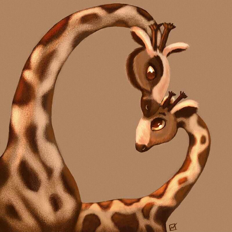
        Such a sweet image, I especially love how you have rendered their coats

        Lisa Rush
        www.lisarushgallery.com
        www.facebook.com/ArtbyLisaRush/
        www.instagram.com/lisarush11/

        1 Reply Last reply Reply Quote 0
        • Beatriz "Bett"
          Beatriz "Bett" last edited by

          I like the texture of the giraffes' skin. Nice subtle differences in the features that differentiate the boy from the girl.

          1 Reply Last reply Reply Quote 0
          • Camomilla
            Camomilla last edited by

            Love the heart in the negative space - so clever 🙂 Adorable giraffes 🙂

            1 Reply Last reply Reply Quote 0
            • bernadetta
              bernadetta last edited by

              It's great!!! I love it very much 🙂

              https://www.behance.net/bernadettacal

              1 Reply Last reply Reply Quote 0
              • Chip Valecek
                Chip Valecek SVS Team SVS OG last edited by

                Great idea, my only crit would be to push the value on the little some more. Right now it sorta flows into the large one.


                https://www.instagram.com/chipvalecek/
                https://www.facebook.com/cvalecek
                http://www.cshellmedia.com/

                1 Reply Last reply Reply Quote 0
                • Sarah LuAnn
                  Sarah LuAnn SVS OG last edited by

                  This is darling! I agree, the values are all pretty mid-range. It would be a bit more readable if the silhouette were clearer. Other than that, I think this looks awesome!

                  sarahluann.com

                  1 Reply Last reply Reply Quote 0
                  • sam marrero
                    sam marrero last edited by

                    Thanks everyone. I will work on the background to get the values to contrast a bit. been so busy I might no make the deadline.

                    1 Reply Last reply Reply Quote 0
                    • First post
                      Last post