3 Hansel and Gretel illustrations for CBPro
-
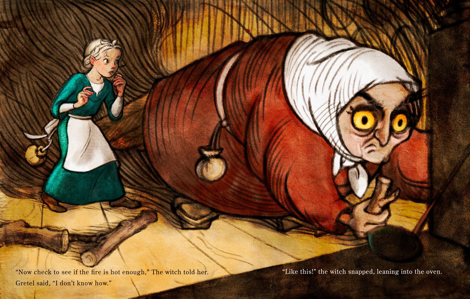
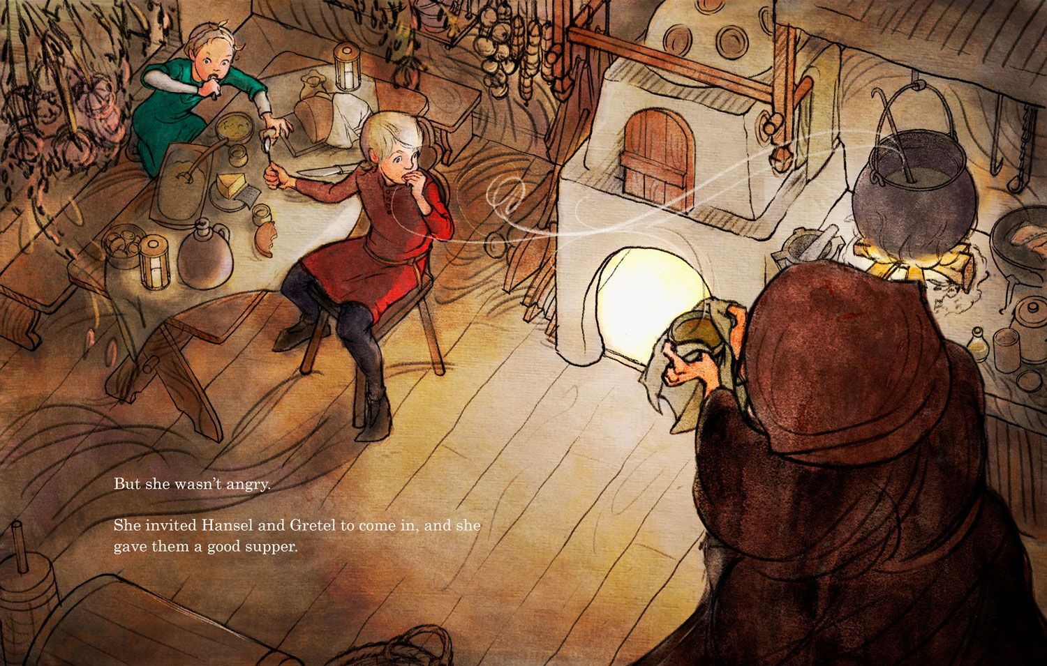
I love your work, spot on with colors and story telling. I wouldn't worry about putting suggestions of human features on the trees, your long finger like branches give the illusion of scary human like forms with out the need of specific details. I think the style, proportions and line work in the first and second (woods and eatting) work well together but as much as I LOVE the witch in the oven one, she doesn't seem to fitas well to me because the children are very realistic in proportion to the table etc. but the witch has huge hands compared to the ones holding the bowl in the eatting shot and she looks too large to live in that space you've created. I love the bulging yellow eyes but I'm just wondering if she'd be a better fit if she was just scaled down. Beautiful work, love the challenging angles you took on.
-
@larue Ok, obviously I need to take another look at this witch in more than one aspect. Thank you!
-
@lauraa I love the size of the witch in the the first one and yes those eyes! It’s very spirited away to me in the way that size relation to other characters doesn’t matter, but her size comparison from the first to the second image just need to be closer. Awesome again!
-
I really love the illustrations, and the design (and colours) of the witch. However concerning your second question I feel the action isn’t that clear. I know this is the point Grietje will push the witch in the oven, but your illustration doesn’t really foreshadow that (for me). At the same time due to the perspective the witch looks very big compared to Grietje, so just how will she push her into the oven?
They do work as a set. Since you write that the second one is ‘t finished yet I’d like to add that I miss the bold/intricate lines/linework you used in the first illustration. They give a sense of unease (just like they do in The Scream by Munch) and the second illustration looks very ‘clean’ compared with the first.
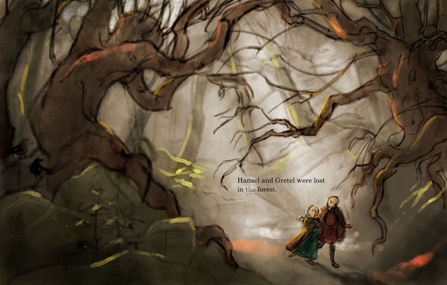
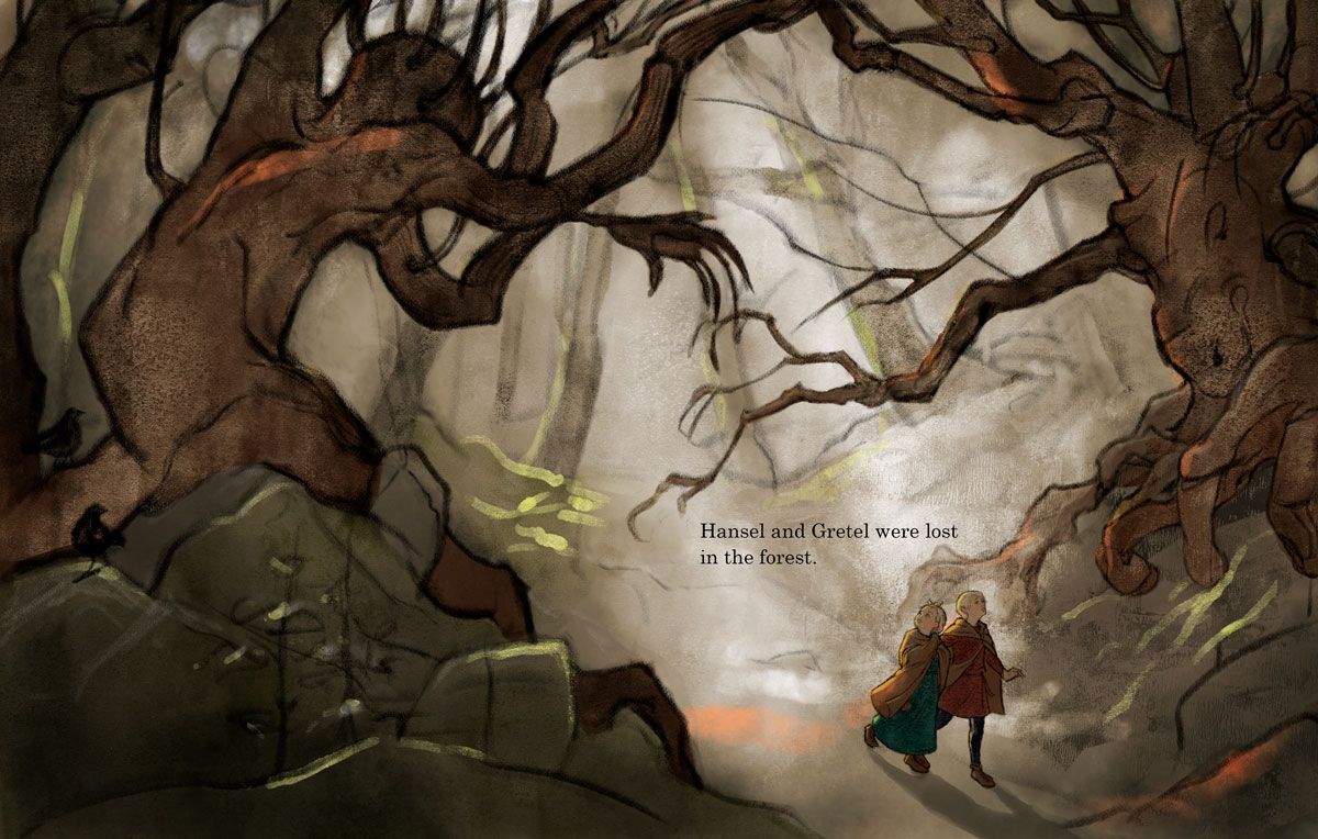
Don’t fret about the landscape in the third illustration, the trees really work. I’d suggest a bit more heavy shadow in the borders to accentuate the light behind Hans and Grietje. Though if you want to rework something, maybe change the face on the right tree. It looks a bit like a beaked head, which is maybe a bit too on the nose?
-
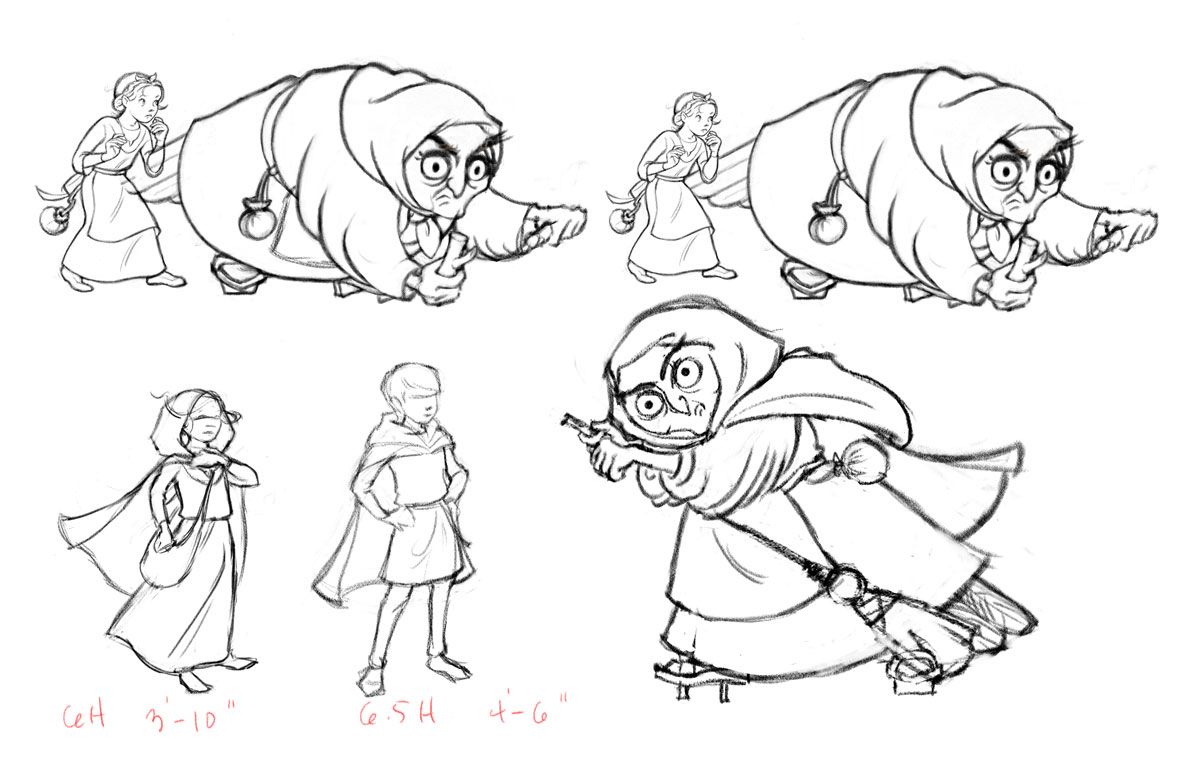
So I went back and did new sketches based on my originals. Pardon the lack of finish here, because I only allotted myself a certain amount of time to work on it (I need to finish all three illustrations by next week). I decided that the first piece would work better if I made Gretel bigger instead of making the witch smaller (top drawing on left). That way the witch still feels plenty bulky in the frame.
As for the kerchief color, there's a page which I have not yet drawn out in which the witch throws of her disguise before throwing Hansel into the cage. And as my original witch sketch had a cloak, I'm going to say she was wearing the cloak inside the first night to better disguise her owl features. That's why she has a dark hood on in the kitchen dinner scene and not in the stove lighting one. It's a retrofit, but hopefully a believable one?
I think the take-home here is, finish all your dummy sketches before finishing illustrations! But I didn't have time to this summer and so I tried to take some short cuts. DIdn't work!
-
Are these more consistent in size now? Never mind color and line for the moment.
-
@lauraa it’s definitely a closer match. I think it’s just a little hard to differentiate because of the perspective, that probably wasn’t very helpful. It’s probably just me though, but as the witch is such an interesting character I want to see more of her. But I realize that you most likely have other images with her in them, you’re just covering different angles. Again probably not very helpful, sorry!
-
These look great! Love the over all look of these. The first thing that stood out to me here is that the first and second illustration don’t totally seem to fit together. I think this is because the first image is a bit messier with thicker lines and the second is cleaner with thinner lines. I think I like the messier, thinker lines better personally but you could solve this by making either one more like the other. Hope that helps!
-
Update on the lost in the forest piece:
The first is my color sketch, which I thought had a lot going for it but it needed more finish. The second is my attempt of far to finish it out without losing what I liked about the sketch. Questions:
Do I need to add back in some of the branches from the sketch?
Is there enough finish now? Too much in some parts?
Are children consistent with previous illustrations, and are their poses effective?
Is there anything amiss here compositionally, etc. that needs to be fixed?@Griffin I agree about the lines not being consistent yet. I'm going to go back and try to reconcile the style more, but want to have all three to a certain level and then go back and work that out, because there's no use getting them just right if something more fundamental is off.
As you can tell, I'm in a little bit of a spontaneity/finesse conundrum at the moment.
-
@lauraa I actually like your sketch better. It’s quite lovely. And I like the business off the branches. My question is what is your focal point? I am thinking the humanoid tree. If so you are spot on. If it’s the kids I think they need to be scaled up and lined heavier. I really really really love the style of this. It is a style I would love to emulate. It reminds me of old school childrensillustration. So good!!!
-
@chrisaakins Thanks, Chris! I am a little sensitive about my nostalgic style sometimes, because it isn't exactly in vogue right now and I'm not trying to be derivative, but it's what comes out when I draw!
I would say the left tree is the focus. I don't want it to be the kids, because I want them to look "lost." The focus is on the scary surroundings.
I think I'll redo the kids' pose, because I feel like the first one was more dynamic.
-
@lauraa well I love your style and I thinks it classic. I think because it’s not popular right now it’s a very nice refreshing look. And I think you add a fresh look to it. I would suggest lightening the kids value.