Creating with shadow vs. creating light with light
-
Short: is it better to create lighting by painting in shadows or by painting in light
Long: This feels a bit hard to explain but I often get up hung up on this. The two ways I create light is by A: painting a multiply layer over flats or B: painting a screen (or similar layer type) layer over flats to add light. Once I have my flats in I never know which option is better for my lighting situation. I often just end up having to render out the whole thing before realizing I should have done it the other way.
So my question is: is there a way to know which approach is better? Does amount of light vs shadow in the illustration influence which approach is more viable or is it all just merely preference?
-
@griffin
From what I’ve learned here at SVS and other places (Lee White has a good fundamentals class here on it), the basic approach is to start (or do flats) somewhere in the middle of the tone range of the entire illustration. Then, do BOTH shadows, and light, one after the other, and then possibly go back to re-touch/add as needed.To help guide that process, it helps to do a value study on a thumbnail version of the illustration to make sure you’re starting in the right place prior to shadows/light.
-
@griffin Please watch my Light and Shadow course if you haven't see it. I go over this principle specifically.
But short answer is Shadow over local color is the easiest and typically the best way to add lighting. But you will need to add actual lighting if there is direct light streaming in, etc. No rules though, but many people who don't understand painting end up "over lighting" a scene and ruining a good value range because of it.
SVS Faculty Instructor
www.leewhiteillustration.com -
@lee-white thanks Lee! I actually have watched that course but it’s been a while so I’ll go back and check it out! I found Will’s 10 steps to digital painting course where he does shadows first rather than flats which kind of confuses me but it’s always helpful to see different approaches. Maybe you and Will can duke it out in the next 3PP episode over which method is best.
-
@griffin Ha, there are a million ways to do it for sure. The main thing I wanted to push is that local value really does matter A LOT. and it's something many artists leave off.
Will, on the other hand uses sort of a cinematic approach to lighting scenes and uses broad areas of value to direct your eye around a scene. Such as having all dark items in the foreground and then a bunch of lit items in the mid ground which is where his focal point will be. That method works great too. I'd say it's more advanced though. He is controlling a LOT of things and he makes it look easy!
SVS Faculty Instructor
www.leewhiteillustration.com -
@lee-white Local value revolutionized my thinking. I go back through old work and cry when I see no local value. People say "oh that looks good" and I shake my head and say "no no no no".
")
-
@lee-white do you have any examples of overlighting? This is something I suspect I've done. I found your light and shadow class very helpful, BTW. I always think about local tone now.
-
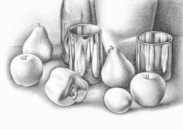
@matthew-oberdier Here are some examples I found online that show what happens when local value isn't added. It basically looks like the items are all white and just have shading applied. It's weird because they teach so much about shading, but so little about local value. I mean that last still life drawing is beautiful! Except all the fruits are white! lol! BTW, I use the term "over lighting" because so much is being held together by the light and shadow vs the actual breakdown of values using local tone. If good local tone is used, then very little lighting has to be added (typically). Now there are situations that require extreme lighting, such as light streaming in a window, etc. or actual light sources such as candles or fireplace, etc. So I'm just speaking generally. There are always exceptions to the rule.


SVS Faculty Instructor
www.leewhiteillustration.com -
@lee-white you have my honorary teacher of the year award, appreciate the effort. Thanks for the explanation.
-
@matthew-oberdier ha! my pleasure. Hope it helps clarify things. : )