Frustration in the Digital Switch
-
Wow guys! Thanks so much for the turnout to my post! All of your guidance has really helped me to take a deep breath and understand that I just need to be patient and move forward with a little confidence. Really appreciate all of the encouragement, so thank you!
I think that copying her (Joy Ang's) work directly has helped me to slow down and understand how to develop the piece. She seems to work with a hard brush on lower opacity and layers the paint till the right color is achieved. Here's my little study I did to copy Joy...

I am taking a Ctrl+paint lesson once a day now. The tips there are quick and easy to grasp. Thanks for that! I'll also look into schoolism @Kevin-Longueil
@audrey-dowling I do mostly the same things you are doing! Will Terry's way is simple and he has a lot of great advice! After my coloring test for Joy's work, I now laying down color lassoed in basic shapes with the paint bucket. the from there i work to the darks with a 30% opacity hard brush. I use the airbrush or soft brush to blend but trying to use it sparingly. I like the results more than Terry's airbrushed look, so I'm going to create more work with this method to see how it goes.
I'll keep making more and try to practice as often as i can. Thanks again for all of your advice and encouragement! I'll post my developments on the facebook page so like it if you want to see where I go from here!
Follow me on Instagram and twitter! @christinabdraws
Facebook: https://www.facebook.com/cbrownillustration/ -
@Christina-Taylor-Brown Hi Christina, I looked at some of your work and my suggestion if you haven't already tried this - is to pretend that you are using the same traditional mediums you are used to. For instance when I want a pencil look in PS or on the iPad I draw with a small brush the same way I would in pencil. It doesn't save me much time but I get the same look. I do save time on not having to prep a surface or sharpen pencils, no clean up or corrections, and no scanning time.
If I want an acrylic or oil look I do the same - I avoid large short cuts using an air brush, masks, or shape tools...
There are a lot of options online so keep going!
")
SVS Instructor
http://willterry.com/ -
@Christina-Taylor-Brown Amazing! The only difference I see between yours and Joy Ang's is that she uses a darker color for the outline of the sweater, the sweater shadows and under the chin. Just push your shadows a little more and you'll be there. Also, you added a shadow under the girl's bangs and Joy Ang didn't. Also, keep an eye on your negative spaces (between her legs and between her hair and leg. Her legs are in a bit of a different stance than Joy Ang's). She has a bit of a flatter style than you do, so you'll probably see that come out in your work - don't let that frustrate you, it's just your natural style coming out.
The old masters did master copies and that's a great way to learn technique. I'm self taught and pretty much everything I've learned has been from either doing master copies or segment copies. Your work is already so good that you have nothing to worry about; we all get frustrated, but your rendering skills are great.
Facebook Page: http://www.facebook.com/amberwingart
Instagram: @savinafranciscoart
YouTube: http://www.youtube.com/amberwingart
Website: http://www.amberwingart.com
SVS Sketchbook: http://forum.svslearn.com/topic/915/savina-s-sketchbook-updated-2-13-16 -
@Will-Terry Thanks for your advice! Your 10 step process is great, but I'm not achieving your amazing results yet. I still need practice! I will definitely try to pretend I'm working traditionally. What frustrates me the most with that are the brushes. I mainly paint traditionally in acrylic and water down my brush/paint to blend color. Here I don't know how to do that! Any suggestions other then lowering the opacity?
I won't give up! Thank you for taking the time to give me your thoughts. Really appreciate it!
Follow me on Instagram and twitter! @christinabdraws
Facebook: https://www.facebook.com/cbrownillustration/ -
@amberwingart Thanks! When I'm re-working art I try not to go for a "copy paste" look, but more of an imitation. I was focused mostly on how Joy Ang puts down color and shadow. I did notice these same things you have pointed out, and I think they're good for me to see! That way I can choose to keep or discard my differences at to what's working and what isn't. Thanks for your critique! Do you have any suggestions on working from the masters?
Follow me on Instagram and twitter! @christinabdraws
Facebook: https://www.facebook.com/cbrownillustration/ -
@Christina-Taylor-Brown maybe trying playing with the "Flow" slider (next to the Opacity in Photoshop). I've heard people say that Corel Painter has brush/paint options that are closer to traditional and is therefore better than Photoshop---but I have no first hand experience in Painter.
Also if you have a new enough version of PS you can try the "mixer brushes." I don't have a lot of experience with them but I think you can tweak all kinds of options to where they "run out" of paint like a traditional brush, and they "smudge/blend" the paint on the canvas like a traditional brush.
BTW: you really nailed your Ang studies!
-
Hey Christina,
I agree with Matt in trying the mixer brushes. If you go the brush arrow, the last option is the "mixer." I've primarily worked traditionally in oils and pastels in the past, and blending has been vital to my painting. That's something I've found to be really difficult to achieve digitally. I think the blend tool in Photoshop is super ineffective and the smudge tool is erratic; I don't feel I have enough control over the results. However, I've used the brush mixer and that has helped some. You really have to play with and tweak the settings, which are like the "flow" and "opacity" settings for the regular brush tool. I also think your work is really great! When I'm feeling frustrated with digital, I look at the very first digital painting I did and it makes me laugh so hard that I feel better about whatever I'm currently working on. Know that you are making tremendous progress! -
@Christina-Taylor-Brown Hi Christina - If you want to skype sometime I can share my settings a little more clearly? I'll also be able to ask a few key questions about your settings and there might be something missing... email me at will@willterry.com and we can set up a time...
-
@Christina-Taylor-Brown Do I have any suggestions? Sure! My suggestion is: stop being hard on yourself (seriously) - your work is completely amazing...keep doing that.
-
@shinjifujioka said:
- I use brushes with hard or semi-hard edges (but mostly leaning toward the hard edge side). When I first tried to learn to pain digitally, I thought a brush with a really soft edge would help me achieve the sort of gradation I wanted. It didn't.
You know, this makes a lot of sense! I was flipping through some of my recent digital paintings and the ones I didn't used soft edges looks definitely better. And now I finally know why, lol.
Anyway, I just wanted to upvote on the people who mentioned ctrl-paint.com. That's definitely a nice place to learn. And I think you're doing great @Christina-Taylor-Brown. Just keep it up.
-
Hello again everyone! I've been practicing, and am going to try to paint this guy for a portfolio piece. It's for a book that I'm writing and illustrating called "Dog, Dog, Goose!". Trying to be a biit more simple with shapes and lines after seeing how well it works for Joy Ang. Anyhow, I just wanted to thank you all for your advice and encouragement! You've really pushed me to keep at it and I'm starting to enjoy this all again!
I'll probably make a new post later on about my improvements, but just wanted to share!
Thanks again!
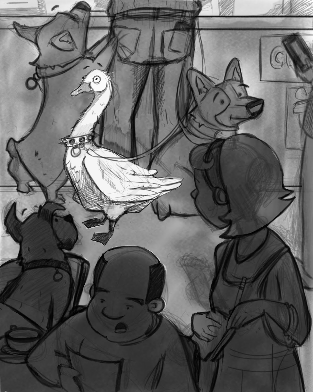
Follow me on Instagram and twitter! @christinabdraws
Facebook: https://www.facebook.com/cbrownillustration/ -
I think this is fantastic! I love the studded collar on the goose. Really nice composition. I especially like how the images are cut off on the edges or "cropped" out of the scene. Very well done.
-
@Christina-Taylor-Brown This image reminds me of stuff that I see from Dan Santat. I think his stuff might be good reference for you. I look at his stuff for inspiration as well
-
@Carrie Thanks so much!
@shinjifujioka said:
I am actually referencing him for color! He's so inspiring. I love his imagination! Thanks! -
Aaaaah, THAT DUCK! This is gonna be awesome!
-
Love this!!!!! The shapes are great, the composition is very solid (in my non expert opinion anyway) and the goose... well he is awesome. What if the dog looking behind him would actually look at the duck with a suspicious/confused expression (not in a surprised way like the dog in the foreground but like in a confused way) ?
Can't wait to see more!