Hansel and Gretel exterior feedback
-
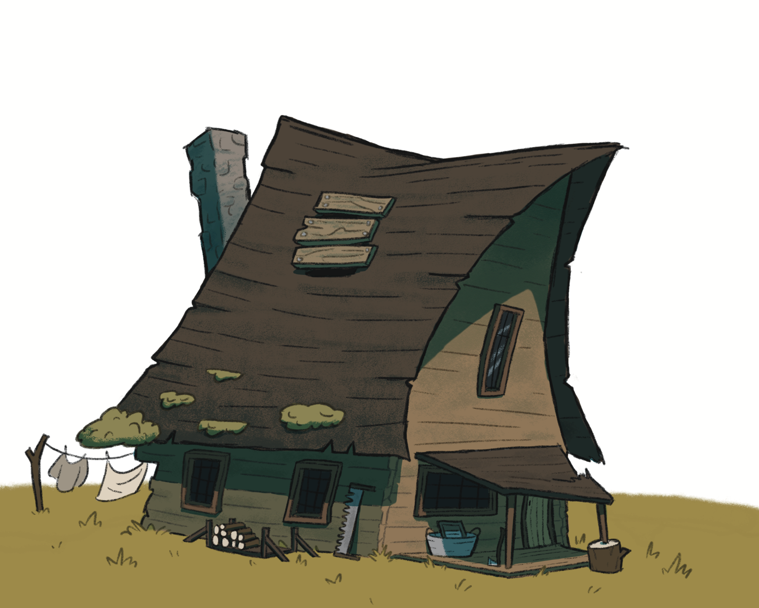
So this assignment is just to design an exterior from the story I’m working on, Hansel and Gretel in this case. Here are my questions
- Does the house feel finished? I feel like it’s lacking just a little something I can’t put my finger on.
- Though the assignment is just to design an exterior should I include an entire background? I’d like this to be a portfolio piece so does that mean it should have a full background as well or is it fine for it to be just the house?
-
This look great. With Hansel and Gretel, I would think more trees, maybe a walk path or stepping stones leading to the front porch and the wood pile. Some dead grass where there’s a lot of activity.
Hope that helped.
-
I think this looks great!
To your first question - note that your porch roof has a definite thickness, but your main roof does not. This could be a little thing that makes a big difference?If you want it to be in a portfolio, then I’d say this piece - especially for the story at hand - demands a creepy forest, but that’s just me.
-
@griffin It looks great! I love all the ways it's falling apart. The house definitely looks worse for wear without being a messy drawing.
Some smoke coming out the chimney might make it feel more lived-in, but that might depend on your backstory for the house. I like the moss and wouldn't mind seeing more of it--but that's probably a personal preference.
I don't think you need to have a full background to use it as a portfolio piece.
-
@tonydupreart good catch on the roof! I think I’ll add some thickness to it, it looks too paper like at the moment . The reason I’m shying away from filling in a background is that I know every piece in my portfolio shouldn’t be a full page illustration, there should be a variety. I think a full page would certainly look better because a full page always does but I know I should have some spot illustrations and other varieties. Just can’t decide yet.
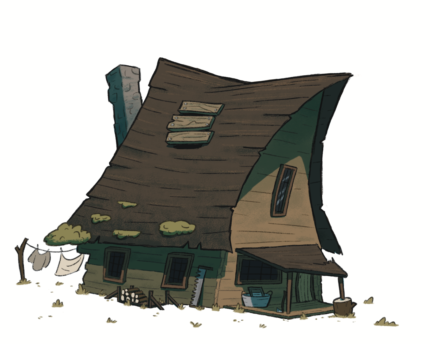
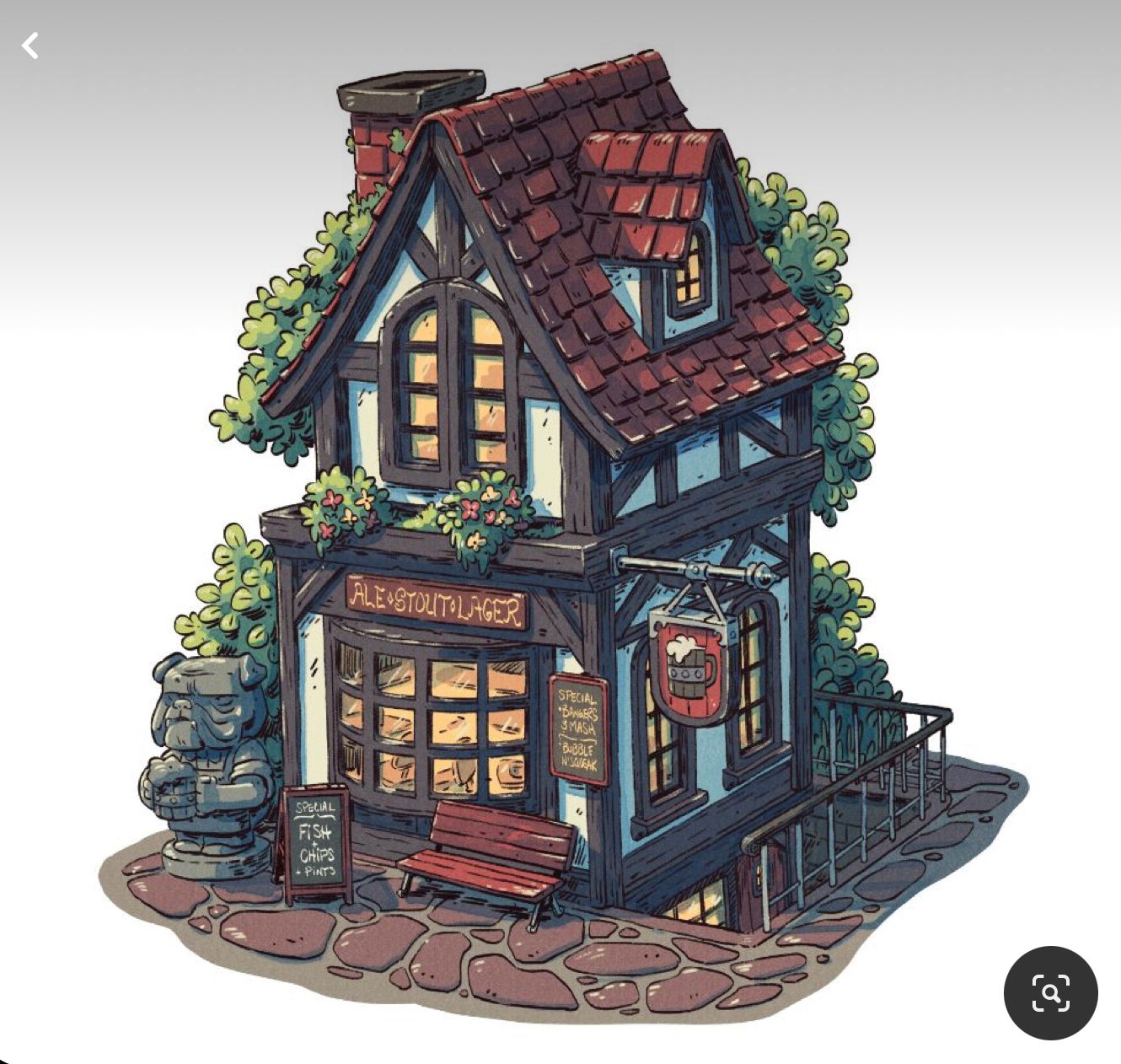
I’ve been looking at this illustration by Derek Laufman for what I have in mind and here’s where mine is at now. .
-
@griffin I see what you mean. The two differences I see are that his exterior looks isometric (I could be wrong) and has a base with a clean edge cut around its entirety (does that make sense), like it stands alone (reminds me a bit like a sticker you could just peel off).
So maybe if you wanted to put your exterior on a larger piece of paper or shrink your current one (so to include the laundry out the back
 ) and draw in a ground (round or squarish) maybe that would solve your dilemma. Just a thought.