Finding Your Palette (Colours) -Traditional Mediums
-
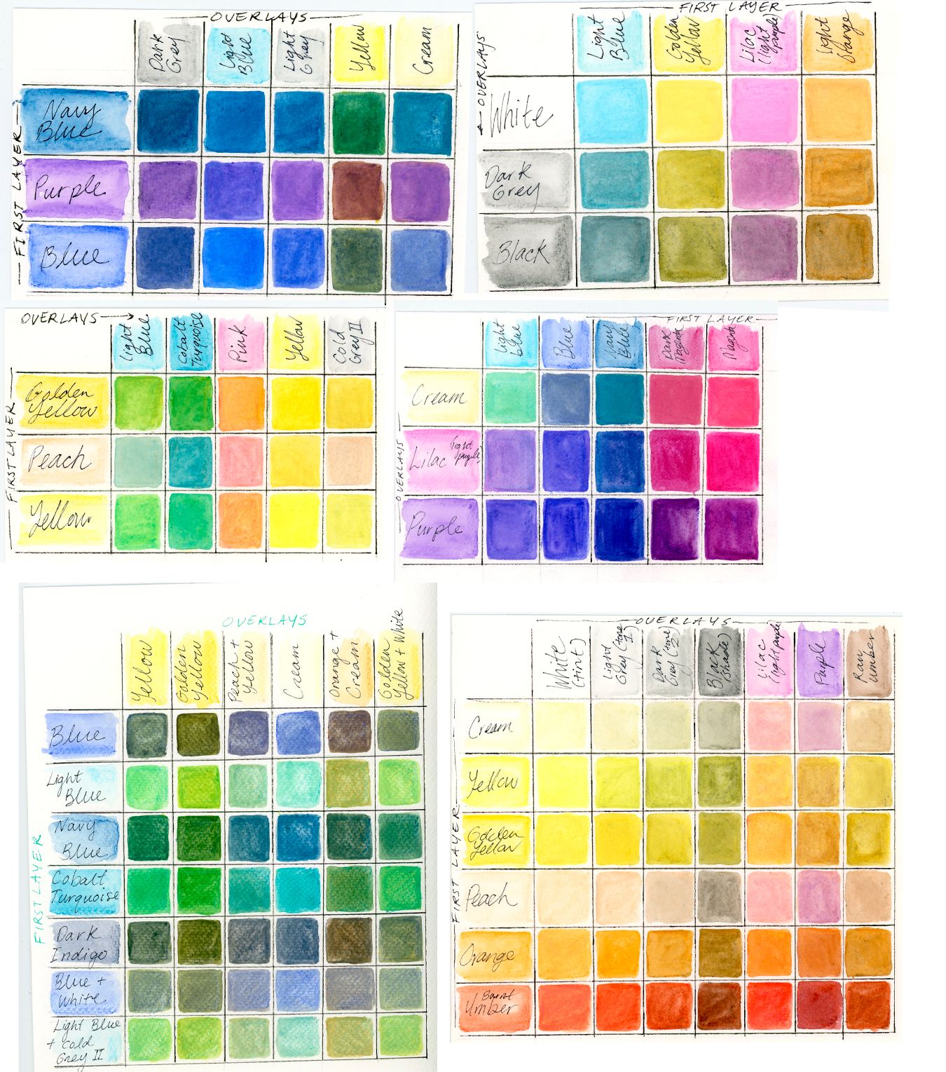
@Heather-Boyd in keeping with what @PenAndrew has mentioned, I've found making color charts extremely useful in finding a color palette in traditional medium.
I do it with watercolor pencils, but maybe this is helpful for you to see:
-
@Heather-Boyd sorry, one other thing - I think this is also a very empowering exercise because it makes you realize that you really can make a huge variety of color swatches with only a set of 24 or even just 12.
So you're not daunted by the task of buying many different expensive uniquely colored pencils... Hope that makes sense!
-
I only use 6 colors total in my watercolor palette. I'll be doing a whole lecture and demo on that process soon (for my Patreon). The base colors you pick make a MASSIVE difference in your overall ability to hit color. Two colors that look the same when squeezed from the tube will mix is a very different way.
There are a few keys to getting really consistent colors with a good range while also staying as simple as you can. The color charts here are essential too for fully understanding the range of possibilities. The important thing is to have a base understanding of what you are looking for in a palette (sounds confusing, but it's really not), then you can pick the right base colors for it.
SVS Faculty Instructor
www.leewhiteillustration.com -
@Lee-White will it just be available for your patreons or will it be a course on svs too?
Website: www.von-Nimmermehr.com
Instagram: https://www.instagram.com/von_nimmermehr_illustration/ -
@von_Nimmermehr Vesper Stamper has a course on SVS in which she describes her 5 color watercolor palette. I've used it for quite a while now and it really helped simplify color mixing for me.
-
@von_Nimmermehr This is going to be one of many many things I'm going to have on my Patreon. I'm using that space as a place to put things that don't necessarily have enough info to be a full class, but can make a dramatic impact on your art. I'm doing tons of full demos with voice over too. Getting into materials and how they affect your art, etc. Even a place to do critiques for students. It's more of a personal teaching space for me and a window into the things I'm making and how I'm making them Specific business topics relating to selling art, taxes, etc too. : )
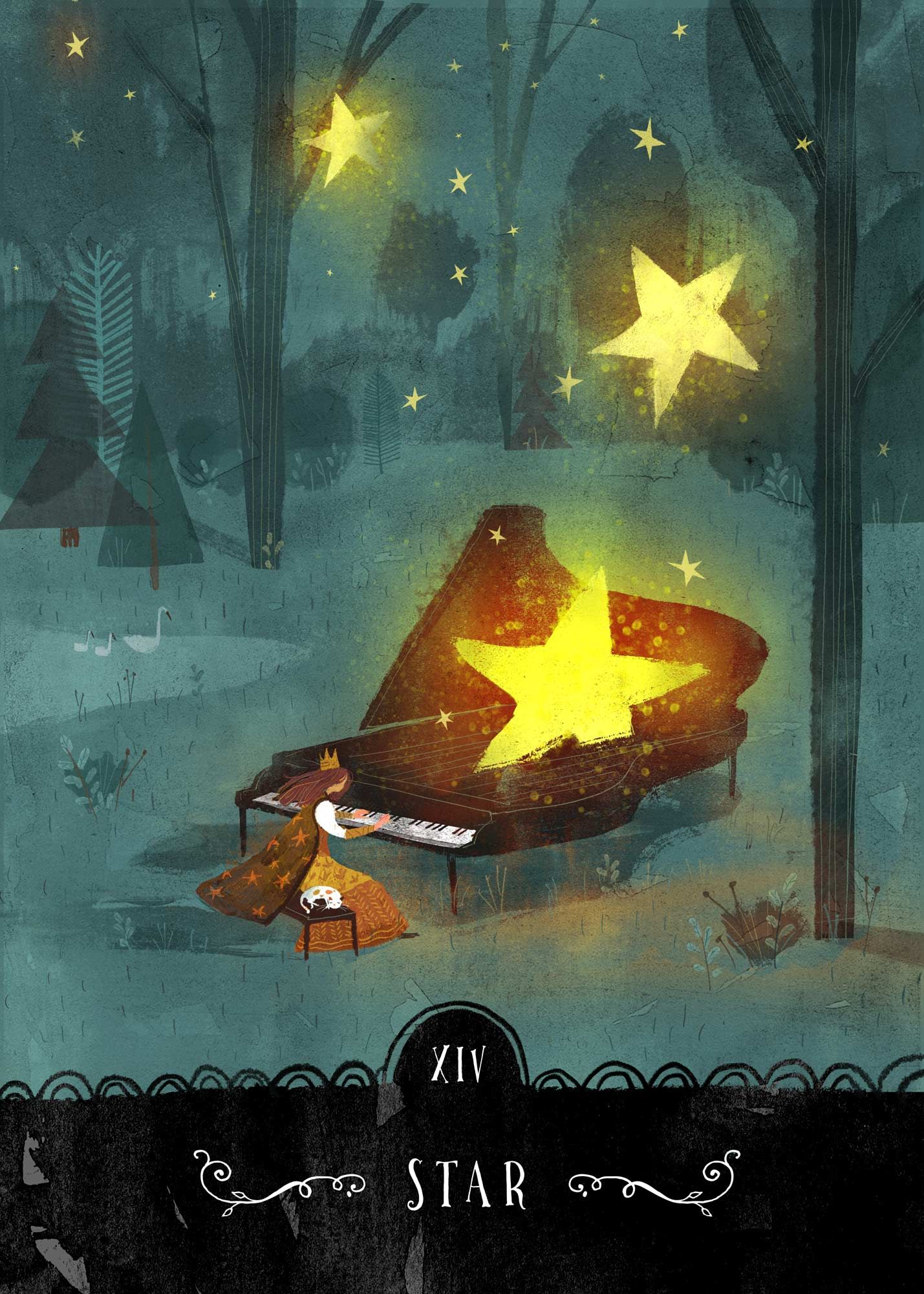
I just did the voice over for how I painted this image. The total painting took about 3 hours, but the tutorial video is about an hour. The Patreon isn't live yet, but will be by Monday or so.
SVS Faculty Instructor
www.leewhiteillustration.com -
@PenAndrew woah that’s a great idea
-
@Lee-White you are just reeealy good at selling yourself and i spend a good amount of my money on supporting you all (just backed your Tarot deck) but i just canceled all my patreon support and stuff. The last two years have been hard and i have to make a step back...out of just beeing selfemployed and go back to normal work... the amount of money you have to pay back to the goverment AND Taxes on top...all because of Covid, its crazy.
I know i don't need to explain myself, i will take a look at it when things are getting better and i'm looking forward to it.
I made so much progress in the past year, and mostly because of you guys
")
A good day to say thank you. -
@Heather-Boyd hello! You've gotten some great responses so far, and I especially agree with @AngelinaKizz 's advice. Looking at your website, your work is gorgeous, and you seem to have a really nice eye for color. Your limited palette is working in your style. Are you looking to expand your color palette? Or are you looking to try something new?
Not knowing what brand of colored pencils (pencil crayons) you have or prefer, it's difficult to make recommendations. Budget also plays a role in recommendations.
Yes, you can buy sets of colored pencils -- all brands offer sets. But the downside of that is you only get the pencils that come prepackaged in the set. Earth tones and pastels usually don't come in the 12 to 48 color sets.
Many brands offer open stock (buying the pencils individually) and I've found that has what has worked best for me, especially when trying to find my preferred brand on a budget. That way, you only buy the colors you want, need, or think you'll use. You can purchase online through sites like Blick and Jerry's Artarama (both US based but sell internationally), Jackson's (UK based but sells internationally), and DeSerres (based in Canada but offers a more limited selection of open stock pencils).
If you have a store like Michael's in your area, they often sell Prismacolors open stock and provide a pad to test out the colors. Prismacolor is a very good budget pencil brand, really creamy and soft and highly pigmented. The downside is that quite a few colors are not lightfast (which is a concern only if you're planning to sell the original art) and the core tends to separate from the casing, which leads to breakage. Your local art supply store might also sell open stock colored pencils and allow you to test the colors out before buying.
Hope this helps!
illustrator - author - smiley person
mbaileyart.com
instagram.com/mbaileyart/ -
@Melissa_Bailey Delta Art in Edmonton has a fabulous open stock selection of all the major cp brands, and the prices are really good.
-
@PenAndrew Thank you. I had not considered drawing a chart. Do you first put all the colours down and then go and mix them gradualy?
Instagram: www.instagram.com/heatherboyd.illustration/
Website: https://heatherboydillustration.ca
Shop: https://www.inprnt.com/search/products?q=HeatherBoydIllustration
Ko-Fi: https://ko-fi.com/heatherboydillustrationBe blessed,
-
@LouD Thank you.

I have certainly considered it but trying to find the exact colour that I located in a image with the teardrop vs. finding it in my colour pencil crayons have rather intimidated me, as well as possible disappointment if I cannot find the colour in my pencil crayons.
However, I will look into it further. There are possibilities in what you've said could help.
Instagram: www.instagram.com/heatherboyd.illustration/
Website: https://heatherboydillustration.ca
Shop: https://www.inprnt.com/search/products?q=HeatherBoydIllustration
Ko-Fi: https://ko-fi.com/heatherboydillustrationBe blessed,
-
@AngelinaKizz Wow thanks, I am so not practised in pencil crayons lols. How do I avoid burnishing too early? I tend to do that.
-
@Kristen-Lango Thank you. It's also helpful that you've noted the first layer and overlayer.
-
@Lee-White I would love to simplify to 6 colours! If you haven't already answered this, I haven't read everything under this post yet, how many out of your 6 are base colours? And do you tend to use only one additional colour overtop of the base layer or more than one? I apologies if these are the things in your Patreon.
-
@Lee-White Critique for students from teachers is what I miss from school and in many ways what I wished SVS had but understandable. I know you mainly work in digital/watercolour, would you still give critique help in other mediums?
Instagram: www.instagram.com/heatherboyd.illustration/
Website: https://heatherboydillustration.ca
Shop: https://www.inprnt.com/search/products?q=HeatherBoydIllustration
Ko-Fi: https://ko-fi.com/heatherboydillustrationBe blessed,
-
@Heather-Boyd said in Finding Your Palette (Colours) -Traditional Mediums:
but trying to find the exact colour that I located in a image with the teardrop vs. finding it in my colour pencil crayons have rather intimidated me, as well as possible disappointment if I cannot find the colour in my pencil crayons.
^This would be where mixing colors comes into play, and having a color wheel handy is really helpful. You can make the entire color gamut by having primaries,
black and white (i like to additionally use magenta, and cyan in the mix for brighter tones). Layering the colors will help you create new colors. Using a light touch in tight ovals is how I work. I would suggest setting up a whole page of thumbnails, and on one side have your first color, the other side your second color, and work at blending them to the middle for the smoothest gradation you can achieve. You'll see the new color you can create and you'll have a great reference guide to work from.If you're into pastels, I would get the pastels you love and then add the 8 additional colors. The same with earth tones. Get what you're drawn to in open stock plus the 8 and you'll have the entire rainbow at your fingertips.
When it comes to burnishing, I burnish when I can no longer see the tooth of the paper.
-
@Heather-Boyd First I colour the line of squares up the vertical and at the top horizontal- my example here i kind of did the wrong way around so the space was on the wrong side so it looks visually better if you start with the first line of mixing as the left vertical,
2. You then can apply your red(for example down the whole vertical as your first base colour.
3. Then add the additional colours one by one.
4. After you have mixed the first colour with all the colours for the second vertical row- you realise there's no need to repeat the same mix so gradually you get the triangular form of the chart. So for example if you were mixing 8 colours your first vertical would have 8 mixes, then 7, then 6, 5, then 4...
I hope this makes sense! -
@Melissa_Bailey Hi and thanks! I wouldn't say I have a colour palette. I have a lot of colours I like (3/4 of what I have I like) which feels like not enough and when considering Lee White uses 6 colours, quite too many lols.
I think I prefer Faber-Castell anyways. I have there 24 set of student grade and only a few (from my father's old set of 24) of their Polychromos. Honestly though I generally go with colour over brand/grade. But yes I'd like to sell origionals so I have to upgrade which is why I am considering how to choose colours I want.
-
@Heather-Boyd Yep, I've worked in every medium and tested them exhaustively! The new patreon is here, check it out if you like: https://www.patreon.com/leewhite