Society of Visual Storytelling

    SVSLearn Forums

    • Register
    • Login
    • Search
    • Recent
    • Tags
    • Popular
    • Users
    • Groups
    • Search

    Composition Feedback

    Projects
    6
    6
    436
    Loading More Posts
    • Oldest to Newest
    • Newest to Oldest
    • Most Votes
    Reply
    • Reply as topic
    Log in to reply
    This topic has been deleted. Only users with topic management privileges can see it.
    • C
      chloekrog last edited by

      Hi there,

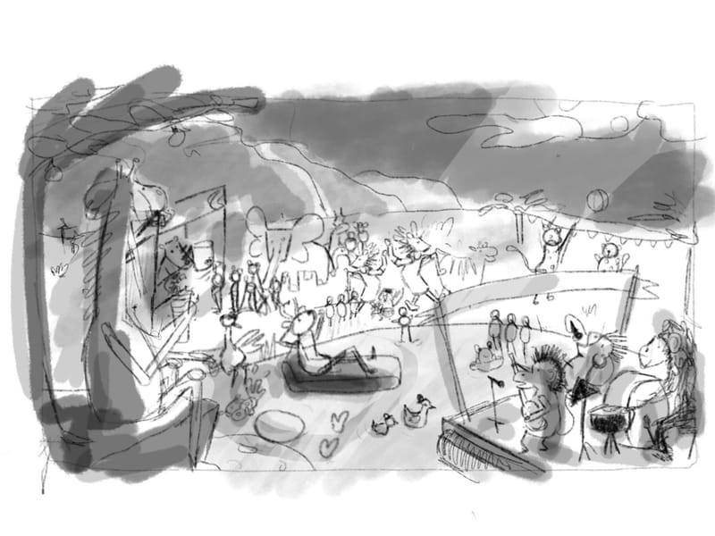
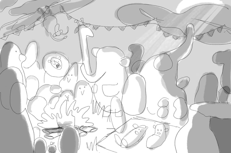
      I’d love some feedback on two possible compositions for the opening page of a book. The copy reads:

      “Every month when the moon is round,
      the animals meet in open ground.
      It’s time to put disputes away,
      To sing and let the music play.”

      One composition is more of a birds eye view of the party, and the other is on the ground with the animals.

      C8056883-1C1C-492A-85D6-B2C4067B1809.jpeg 2C7CA478-414E-45C2-A4A4-CB5DB0222540.jpeg

      JessicaLinnEvans Melissa_Bailey ? 3 Replies Last reply Reply Quote 4
      • JessicaLinnEvans
        JessicaLinnEvans @chloekrog last edited by

        @chloekrog These tonal studies are fantastic. Great comps and nice tight rhyme!

        jessicalinnevans.com/
        instagram.com/jessicalinnevans.illustration/
        twitter.com/JessEvans915

        1 Reply Last reply Reply Quote 1
        • Melissa_Bailey
          Melissa_Bailey @chloekrog last edited by

          @chloekrog what POV is the story told from? Is it told in 1st person or 3rd person?

          If the story is told from a human's perspective, the first comp might more effectively help tell that story.

          If the story is told from an animal's perspective, or if the reader is meant to feel in among the animals, then the 2nd comp would be the better choice.

          Good question! Since this is the opening illustration, it does set the stage for the rest of the book. My personal opinion: I'm more drawn to the first comp -- there's so much going on and it's so interesting, my eye is drawn to that one. To me, the second comp feels more static, which is why I might not feel as engaged with it.

          Hope this helps. Please share your progress with this illustration! We'd love to see more.

          illustrator - author - smiley person
          mbaileyart.com
          instagram.com/mbaileyart/

          1 Reply Last reply Reply Quote 3
          • Griffin McPherson
            Griffin McPherson last edited by

            I think the first image fits the text a better. It feels much more festive and lively and seems to really show what the the text is telling us.

            1 Reply Last reply Reply Quote 2
            • ?
              A Former User @chloekrog last edited by

              This post is deleted!
              1 Reply Last reply Reply Quote 2
              • patricialamas
                patricialamas last edited by

                I agree with all of the above. The two compositions look great for two different purposes! To me, the first option looks more like it’s setting the scene, as the text is, and the second one looks like you’ve now entered into the action and are learning more about some individual characters.

                www.instagram.com/patricialamasdesign/

                1 Reply Last reply Reply Quote 0
                • First post
                  Last post