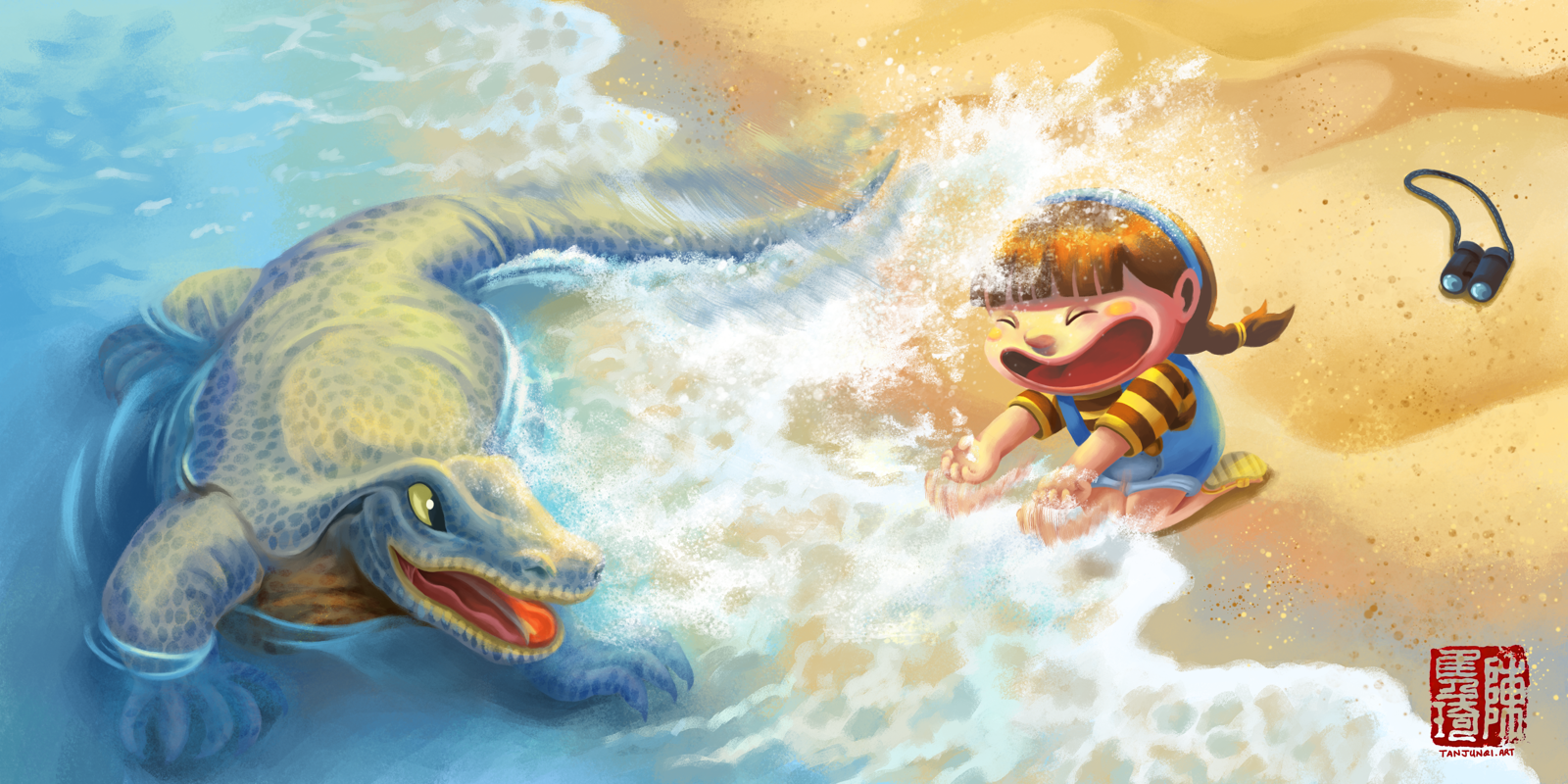
Shan Shan's World - Children's Book Project (珊珊的世界)
-
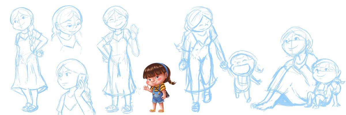
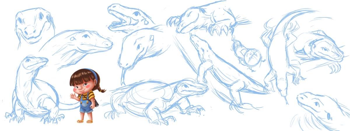
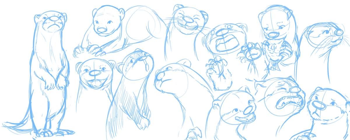
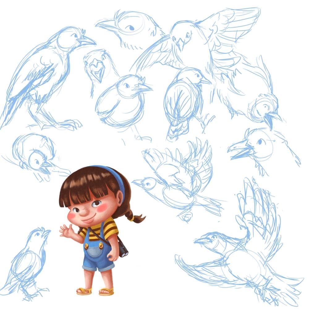
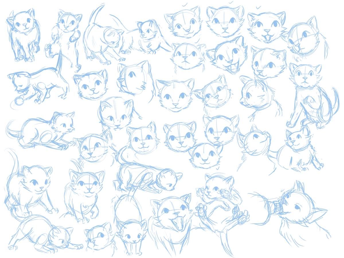
And just sharing some of the sketches I made as I was developing the characters
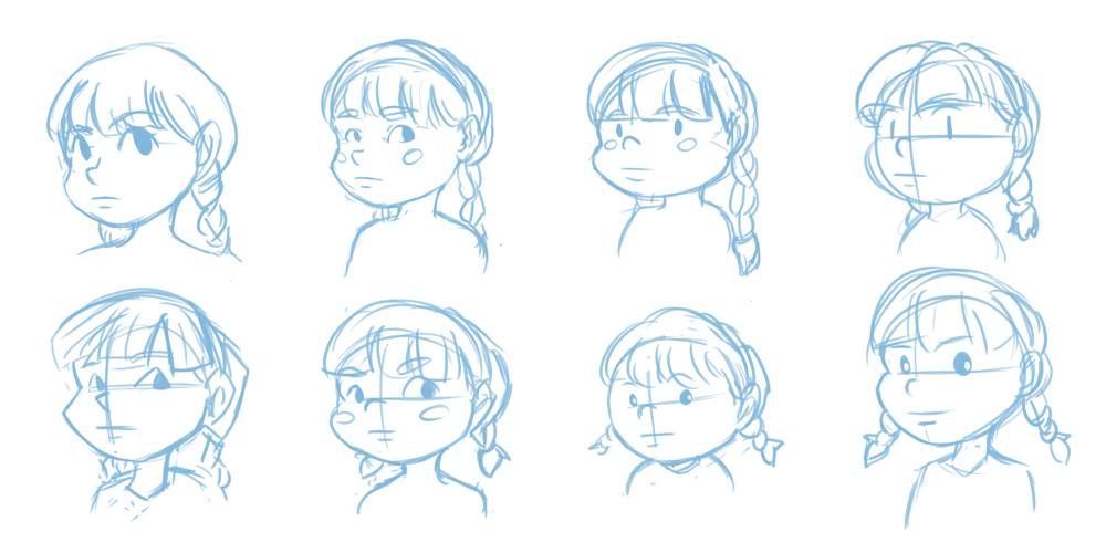
Initial iteration - I chose second from left in the bottom row to further refine her look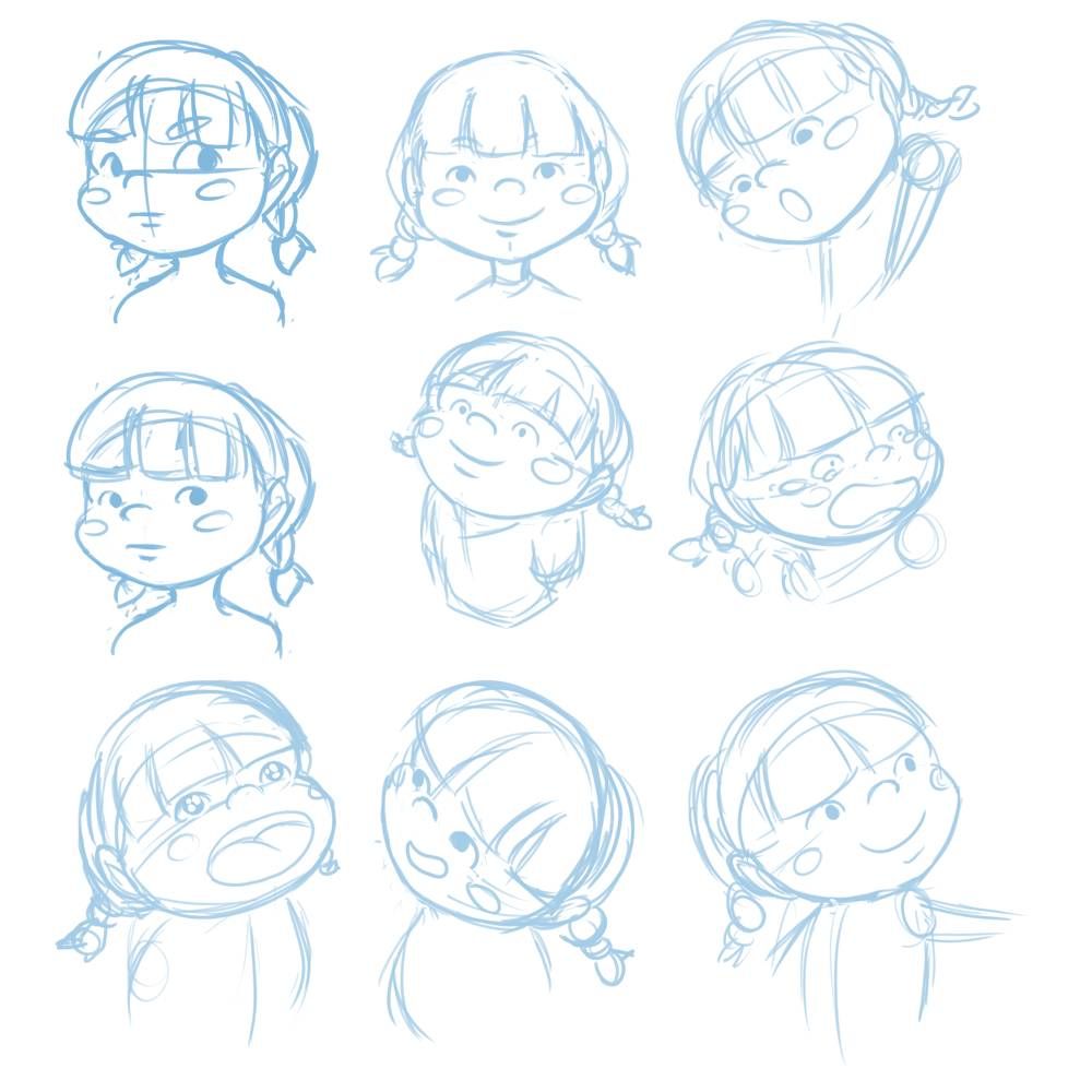

Got the hang of her
-
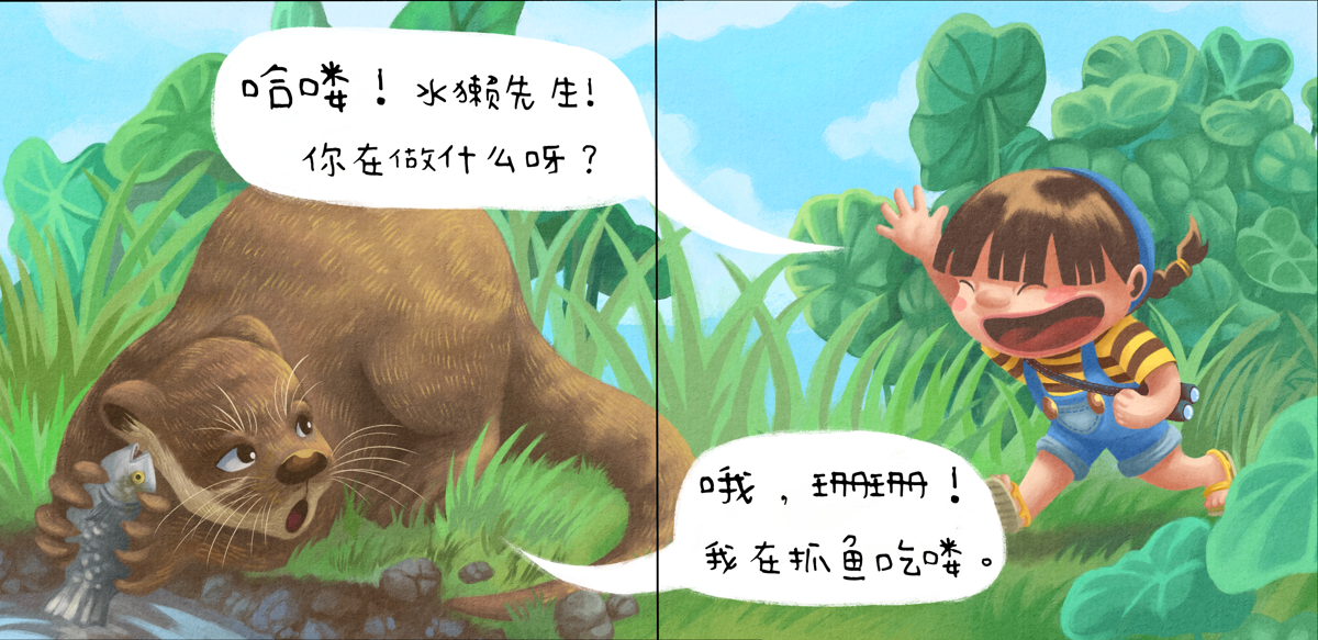
Here are some sketches and a finished spread from one of the books, titled "Shan Shan and Mr. Otter". Thanks to previous feedback from the good folks here, I've made some amendments compositionally to some of the sketches and also improved the values and contrast in the finished piece.
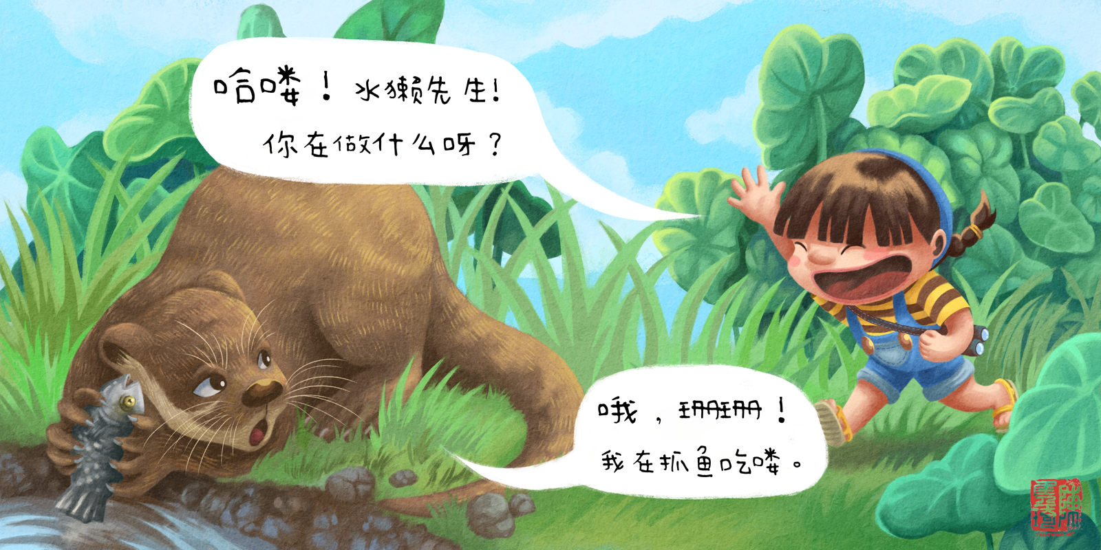
Shan Shan: "Hello Mr. Otter! What are you up to?"
Mr. Otter: "Oh, Shan Shan! I was just catching fish to eat."Improved values and contrast. Old piece for comparison:
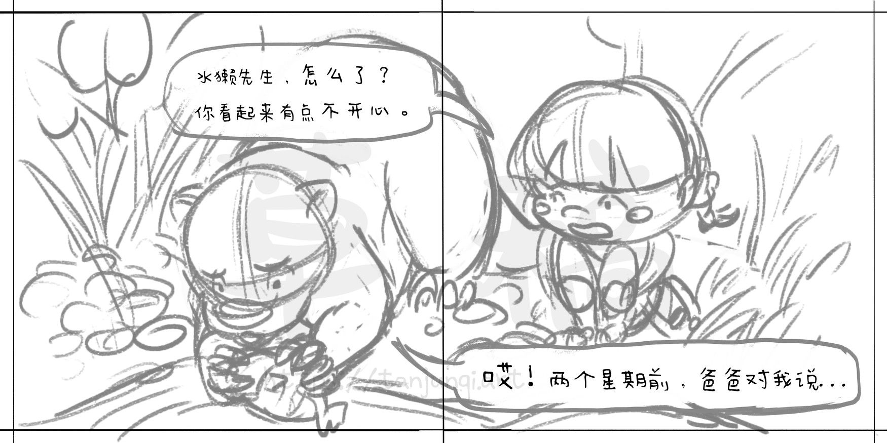
Shan Shan: "What's the matter Mr. Otter? You look a little unhappy...."
Mr. Otter: "Well...two weeks ago my father said to me...."
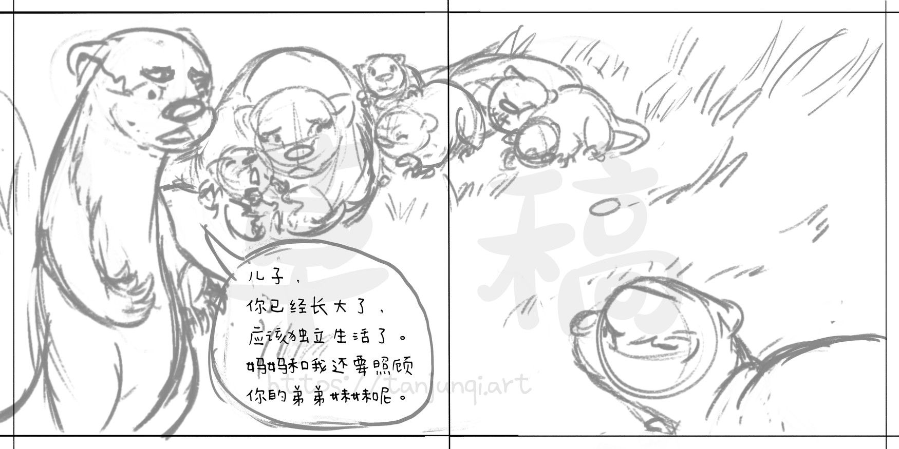
Papa Otter: "Son, you're grown up now and it's about time you started living independently. Your mom and I still have to take care of your younger sibilings."Moved text and characters' faces away from gutter
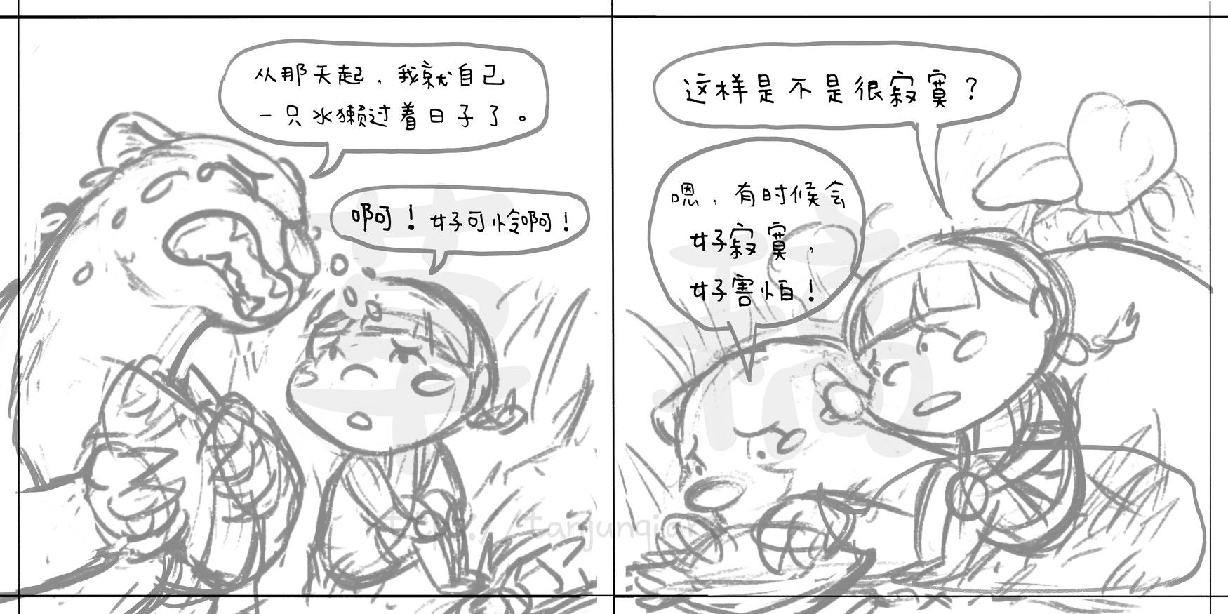
Mr. Otter: "From that day onwards, I've been living as one poor otter all by myself!"
Shan Shan: "Oh! You poor thing!“Completely changed the angles of the scenes for variation
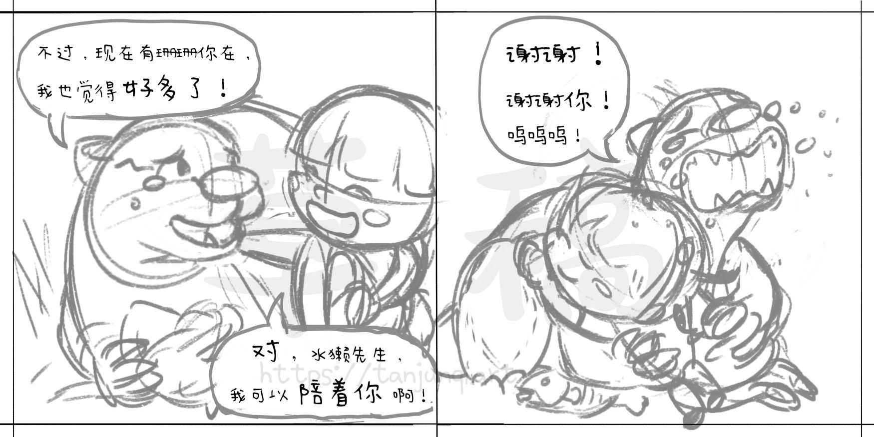
Mr. Otter: "But now that you're around, Shan Shan, I feel much better!"
Shan Shan: "That's right Mr. Otter, I can keep you company!"
Mr. Otter: "Oh thank you, thank you! Sobs " -
@JQ Looks amazing! Your style is really great for children's book.
You said it before too, but there are some sketches that looks weird to me because of the perspective of the features aren't placed properly and they look flat to me.
I would also point out the gestures of some the characters aren't believable; what I meant with that is that some poses aren't natural for people to do, at least to me! Take this with a grain of salt.
After going out of work I will try to send some paint overs with an example beside your drawings to explain myself better. -
Wow, you are incredibly talented at drawing animals - the detail on that water monitor is phenomenal!!!
-
@Eliana-Bastidas Thanks very much for the honest feedback and taking the time to give it!
-
@Meekipink Thank you! I do enjoy drawing animals - in fact there was a period where I did a lot of animal portraits in acrylic, though those were mostly furry animals
 . I really love painting the details and texture of fur and feather and scales, although I'm definitely not trying to achieve full-blown realism here.
 -
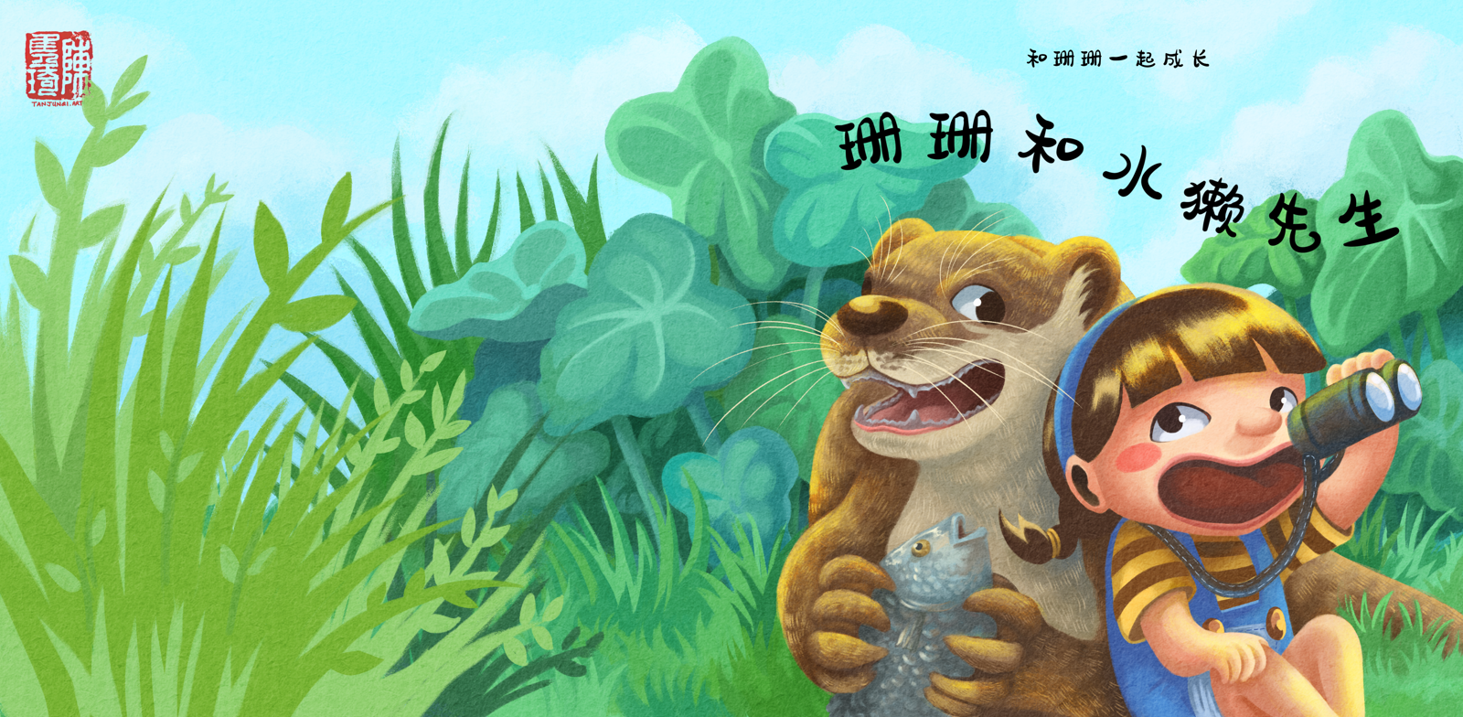
Here's the finished cover of "Shan Shan and Mr. Otter". It's going to be part of a 5-book series called "Growing Up with Shan Shan". Each book will follow a story between Shan Shan and one of her animal friends.
I also took time to improve the colors and contrast in this piece since I posted it last time; I was definitely rushing back then.
-
Sorry I forgot yesterday.
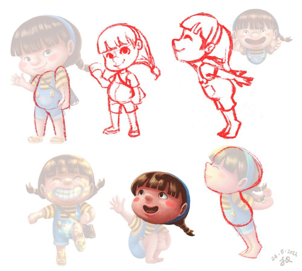
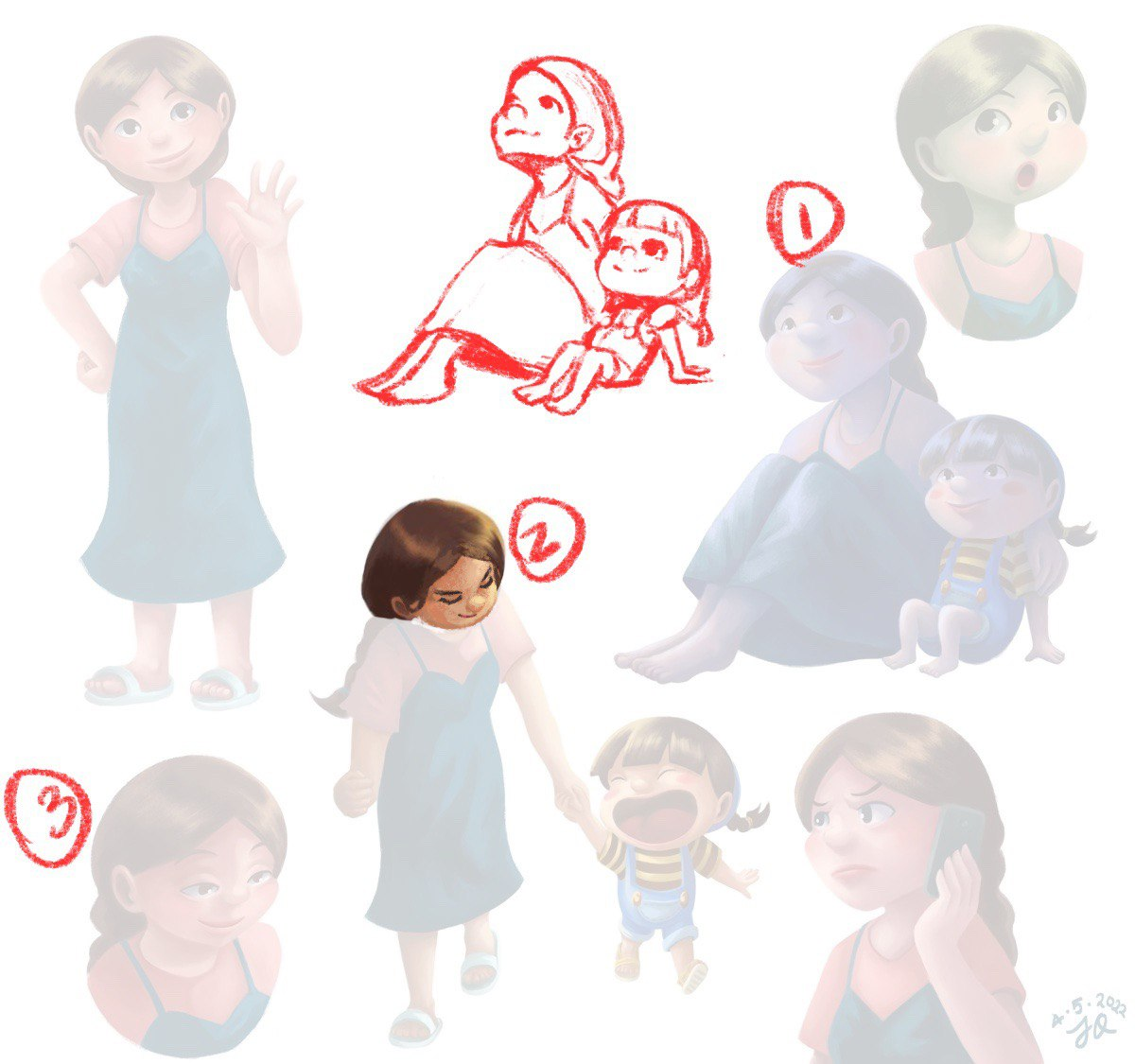
The first figure, to me, a normal pose while saying hello wouldn't have the shoulders up.The face that is in the middle, I just tweaked the eye a bit.
The last pose, I think mainly the arms were weird, because the arms are curved up, and you can't curve your arms that way because of the elbow, the more they go back, the more straight they are. When I do that pose, my hands are open the way I drew them, I just messed up with the thumb, it looks weird in my drawing.
-
-
The faces looking up without showing the neck made me feel that it flattened the image.
-
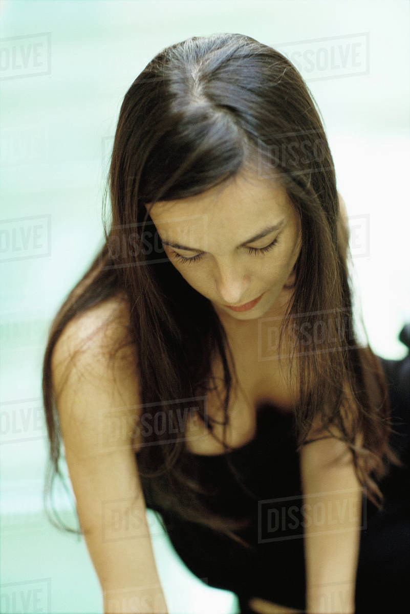
tweaked the head a bit, when you are looking down, you should put the nose way down, touching the lips and the way you see the eyes also change.
Here is an example, I used this as my reference:
-
same feedback as image number 2.
-
-
@JQ Yes! It's like cartoony realism - it's what makes your pieces so instantly recognisable. I LOVE your rendering style. I'm still paralysed by colour and rendering, which is why I'm so impressed by your skill and level of output ^_^
-
@Eliana-Bastidas This is really helpful feedback!
@JQ I recently watched a class by Wouter Tulp on Schoolism which absolutely BLEW my mind ("Expressive Characters" if you're interested).
Although SVS Learn covers this in character design (Anna Daviscourt's class is excellent), I wanted to go a bit deeper since I was having a lot of trouble with posing and keeping my characters consistent and recognisable (especially in a turnaround or when they displayed really diverse emotions).
My main takeaway was that it's all about SHAPE. Even the facial expressions. Pretend the eye/eyebrow is a superhero mask and draw that shape on your character's head to make different expressions and turn it in space. The corners of the mouth affect the shape of the nose and eyes when they're pushed up or turned down (lightbulb moment - the tip of the nose stretches or gets pinched depending on the facial shape! This makes for much more dynamic and convincing expressions).
The body is made up of bean shapes, cylinders and a sphere for the head. Haha, I know this is obvious information and we all "know" this as illustrators, but it was AMAZINGLY helpful to see Wouter explain how he keeps his designs consistent and easy to manipulate in various poses. Also, how he uses gesture, clothing, weight, acting - everything to convey expressive, interesting and dynamic characters, he truly is a master at his craft!!
I absolutely adore your characters, but I agree with Eliana that some of your images appear flat or warped because you may not have used a reference to help you gauge where the body parts are meant to be lined up. I think if you really tightened up on your poses and expressions, plus paid attention to the gutter on double spreads you'd be an absolute FORCE to be reckoned with!! Your colouring, rendering, background design and all of that good stuff is impeccable. Like, absolutely top-notch, I'm in awe, haha ^_^
-
@Eliana-Bastidas Thanks a lot for doing the drawovers and the critique! I do get where you are coming at, though for the little girl (Shan Shan) the lack of a neck and and more "noodly" limbs is part of the stylization. I understand it may seem odd or not convincing to some though (kinda like chibi anime-style characters). I will definitely keep the issues you pointed out in posing/perspective, in mind, thank you!

(sorry for acknowledging your response super late, I've kinda dropped out of the forum for over a week, had lots of stuff occupying me of late ><)
-
@Meekipink Wow thanks so much! You are too kind!
 And thank you for sharing about Wouter Tulp and all those tips, I've taken the Anna Daviscourt class but I hadn't heard of Tulp before. I will definitely want to check his classes out (but still have to work on my SVS courses first XD)
 -
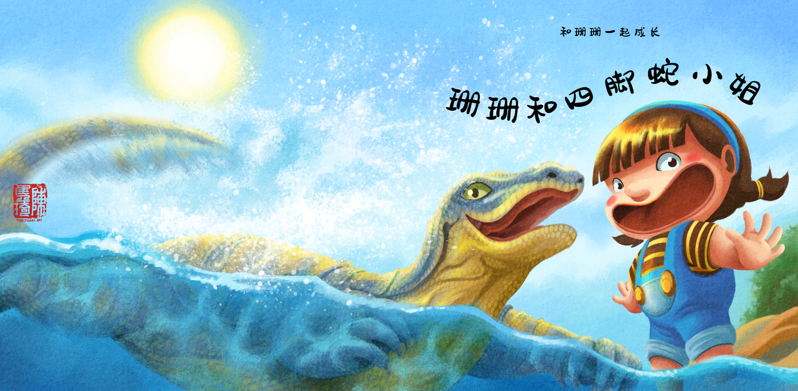
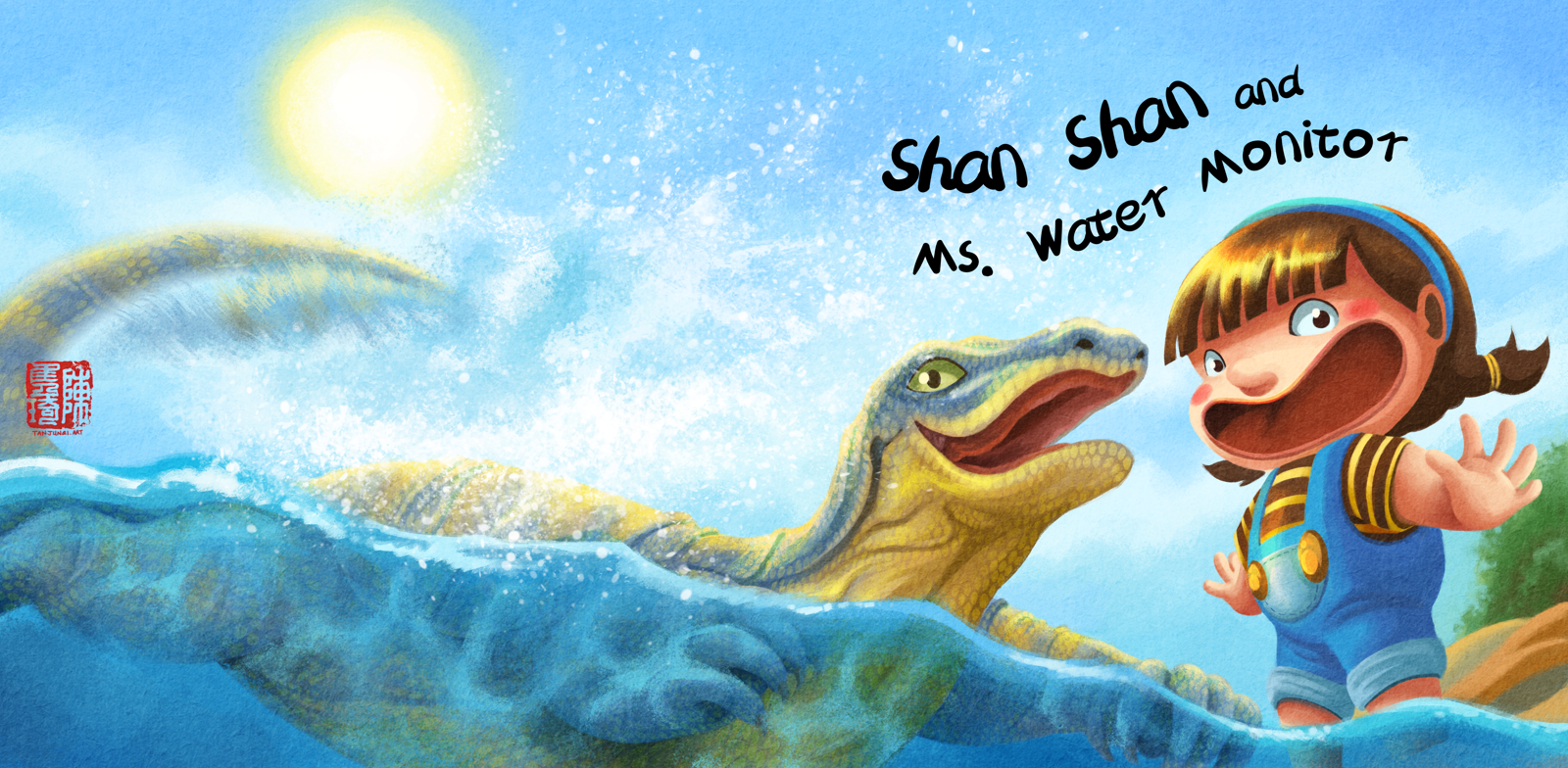
Book cover design of what I plan as the first book of the "Growing Up with Shan Shan series", in Chinese and English.
-
@JQ this is beautiful!!! i love the color and how dynamic it is.
-
@Nyrryl-Cadiz thank you
 I'm glad the motion comes through.
 -
Completed 2-page spread from "Shan Shan and Ms. Water Monitor" I did as part of my dummy sample.
