Portfolio Upgrade -- Feedback Appreciated!
-
So I took the plunge and signed up for a one-on-one portfolio review with an agent at a SCBWI conference that's happening in my area September 4th. I have been sitting on this "refresh my portfolio" project for well over a year and figured I needed a hard deadline to light a fire under me and actually get it done.
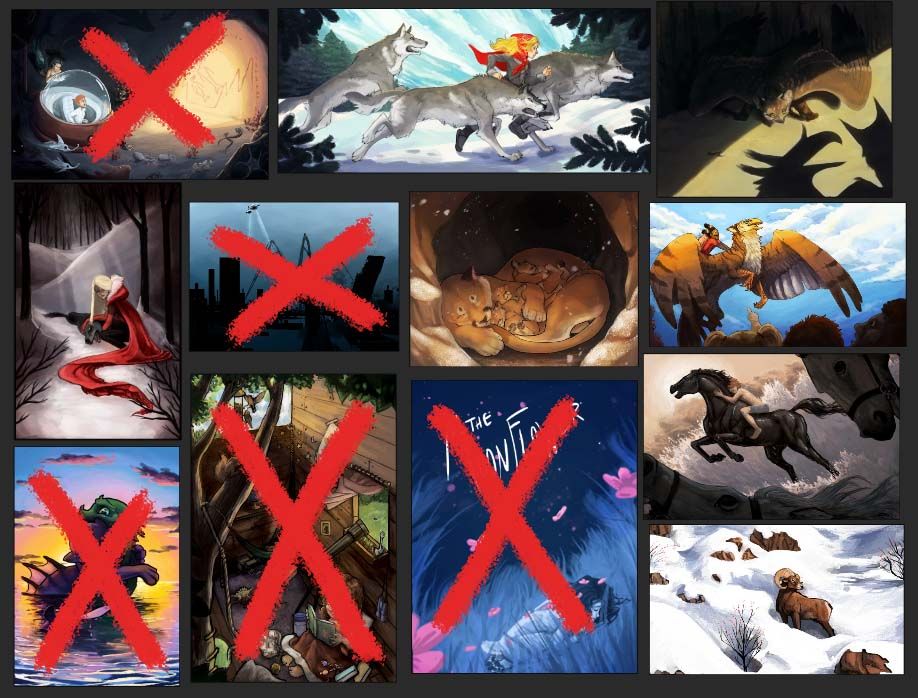
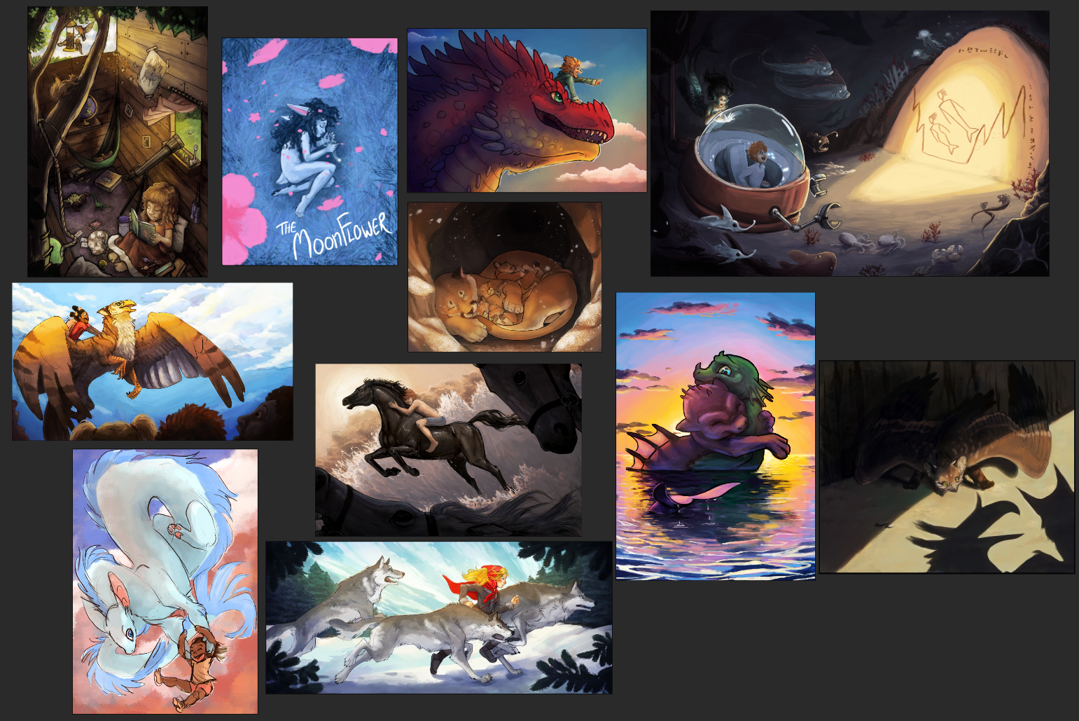
Here is my current body of work with a few new additions I've done since signing up for the review:
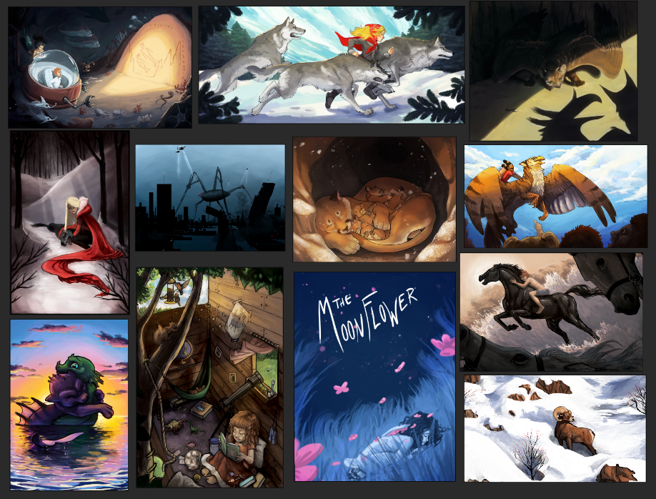
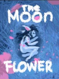
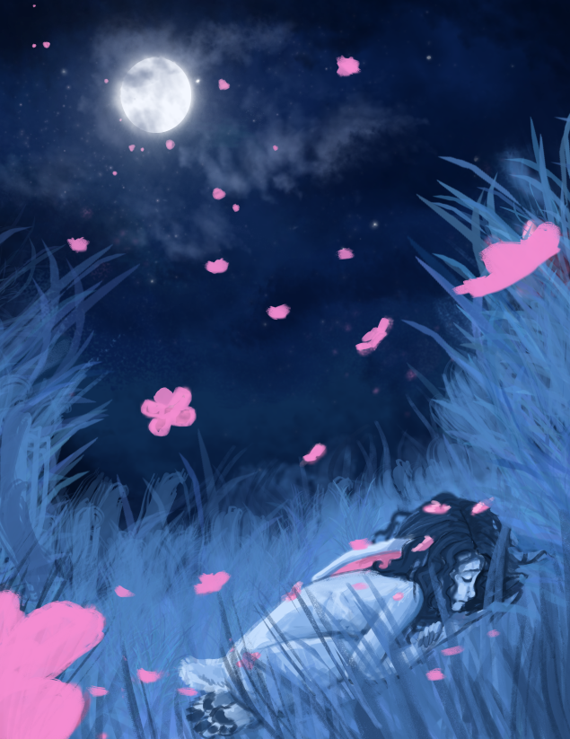
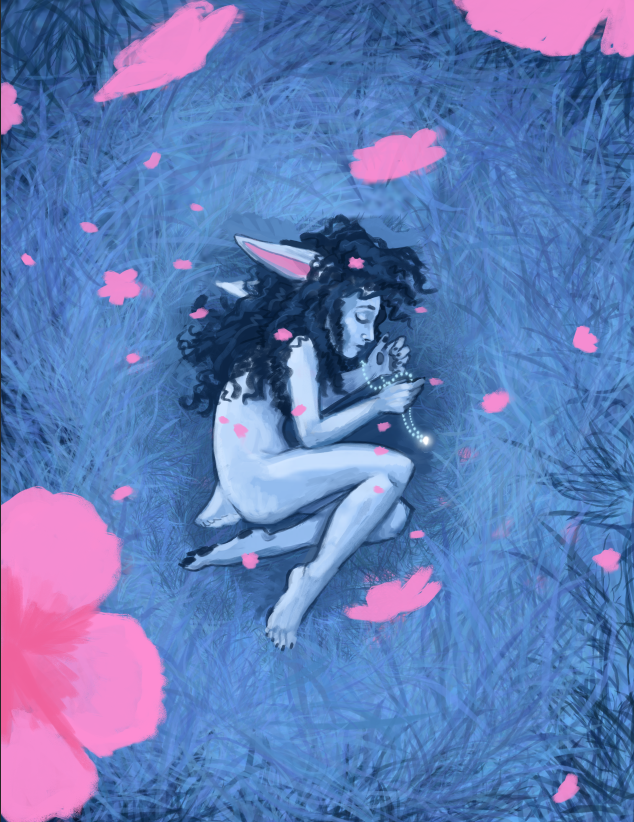
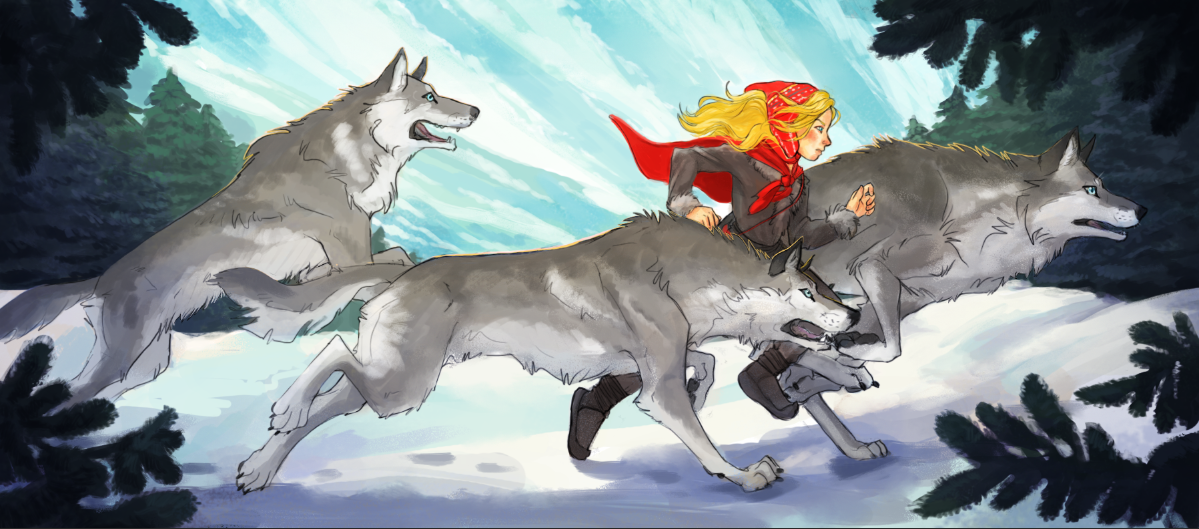
The two new pieces are the one in the upper corner with the wolves running and the other is "The Moonflower" cover piece. I'm still working that one up and trying to find a way to make it interesting without the text to take up the dark area. An alternative thumbnail for that one that my crit group liked was this one:
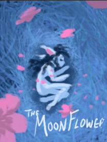
I thought the composition was kinda boring and centered, but maybe it would work better for this review since I probably shouldn't be including text? Would love thoughts.
I'm planning on touching up a few of the current pieces, specifically the top left one since my painting style has changed a bit and I don't think it really matches the other pieces very well. I also want to go back in and lighten up some of the darker ones since my work tends to look too moody for most kidlit agents, I think.
I will say that the agent I signed up for specifically specializes in older kids (middle grade) and graphic novels, which I feel like is a better fit for my current style. I am also working on a webcomic and am struggling with whether or not I should include a page from that comic in the portfolio or not. It feels like if I'm going to do that, I should include at least two so the agent can see consistency. Thoughts? My webcomic is done in a very painty style and isn't specifically aimed at kids, so I dunno if it would read well during the review.
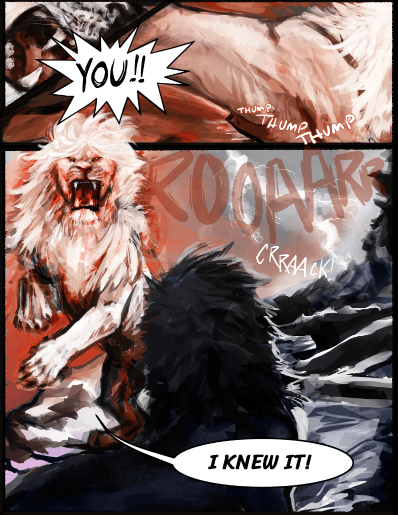
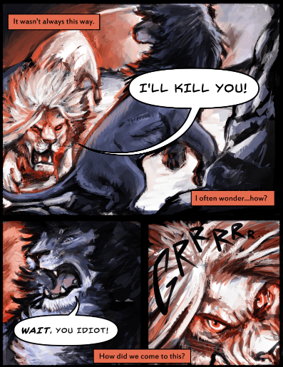
(Here are a few example pages of the webcomic)
-
@Kasey-Snow beautiful work!
Yes, the one in the upper left corner does stand out as different from the rest. Making it more cohesive with your current style is a good call. Lightening up some of the darker pieces will also help with the readability.
Regarding the web comic: you might want to keep that out of your portfolio. It looks a little more mature for MG/graphic novel and the style is slightly different.
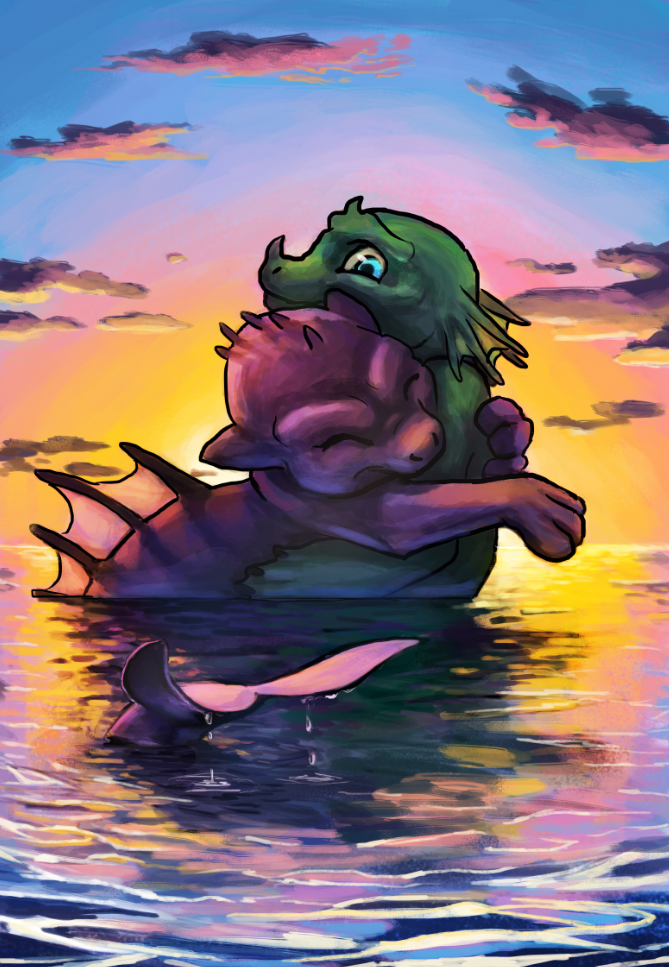
The illustration on the bottom left corner is difficult for me to read. Is it a dragon and —something else— hugging? Or are they fighting? Why are they in the sea? It might just be my eyes, but that one confused me.
The Moonflower does need a little more work; I agree that there’s something about it that isn’t quite hitting how you’d like it to, I think. Could you crop it a little more so that the character is larger? Move them up slightly, as it looks like their bottom is resting on the bottom of the page?
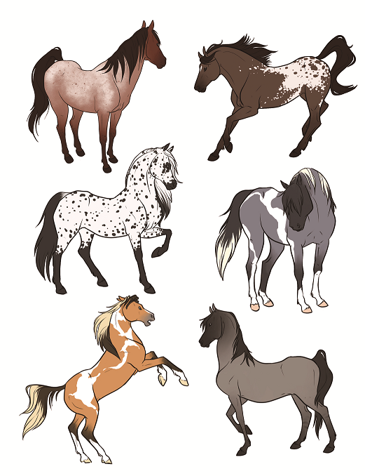
I love the illustration of the cougar(?) in the cave and the one of the horses on the far right. Even though it would be improved with updating, I do love the storytelling of the one in the upper left corner. Again, gorgeous work!
Please keep us posted how everything goes.
-
@Kasey-Snow you got some interesting things in your portfolio.
What I would say you should focus is on shape design. Your work looks messy, there is no purpose for most of your shapes, and you should accommodate the shapes with the proper values too, because the value looks like an added layer with a black airbrush. The exercises that IMO helps the most with this is to make value studies with a hard brush, using 2 or 3 values at most, then you try to apply that to your original pieces.
I think that If you really focus on what I told you, you could take your portfolio to the next level.
-
@Kasey-Snow Hi Kasey! First off, great portfolio! I think your style is a great match for middle grade. Secondly, all my advice here are definitely just my opinions. Take them with a grain of salt.
ok, so to start, I think you need to trim your portfolio. Get rid of the weaker pieces and those that don't show a cohesive style with the rest. I've marked the pieces that I think you should take down below.
Since you mentioned your meeting is still in September, I think it is a great time to make new pieces for your portfolio. I'd suggest going for at least 3 pieces. You need to show more kids and more narrative. If you can show the same characters over different pieces, the better.
I think this cover has great potential. Maybe do the text like this? I'm no graphic designer tho. So feel free to disregard.
-
Thanks for the feedback all! I do plan on lightening those older images, I know they don't read well at that small size, but I will reupload updated images as I get to them for feedback.
")
Because I work a part time job I only have about three days a week to work on new stuff, so I don't have time to make 12 whole new paintings, unfortunately, before the deadline. Goal is to make 3-4 new pieces to include and make do with what I can from existing work--but I do hope to lighten up and unify some of the older pieces to the style of the new ones as much as possible!
Here are the worked up versions of "Moonflower." I am super confused as to whether or not it is adviseable to include text in a portfolio piece or not. Any thoughts? These are sans text and very rough, but hopefully give a better idea of story/composition. Still not sure which one to refine or if I should just drop it entirely:
Closeup of the wolf runner girl which I envision as a book cover or possible book jacket:
@Melissa_Bailey Bottom corner one is dragons hugging, it was from a project I did with a self publishing author. Plan is to brighten/lighten that dark space between them and refine the shapes, but I could discard if it's not strong enough to be included:
I super appreciate anyone taking time to help me take a look at this stuff, thanks a bunch!
-
Current status of the portfolio (more or less):
A friend told me to include spot illustrations too, despite lack of background.
I have a few sticker sets I've made, thinking of putting some of them together on one page (thematically, of course). I have some dinosaur ones that I think are really fun, but they aren't cutesy--more graphic: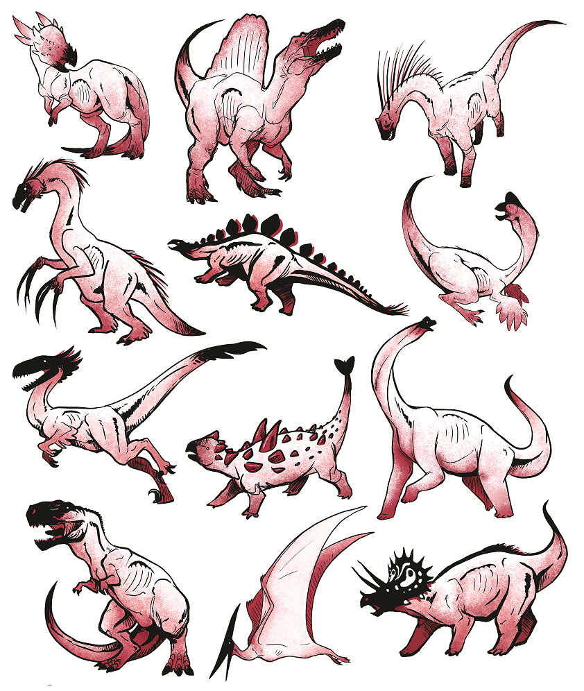
I wouldn't arrange them this way, just posting to show what I'm talking about.
Also have some cutesy critters though that are cuter (ignore duplicates):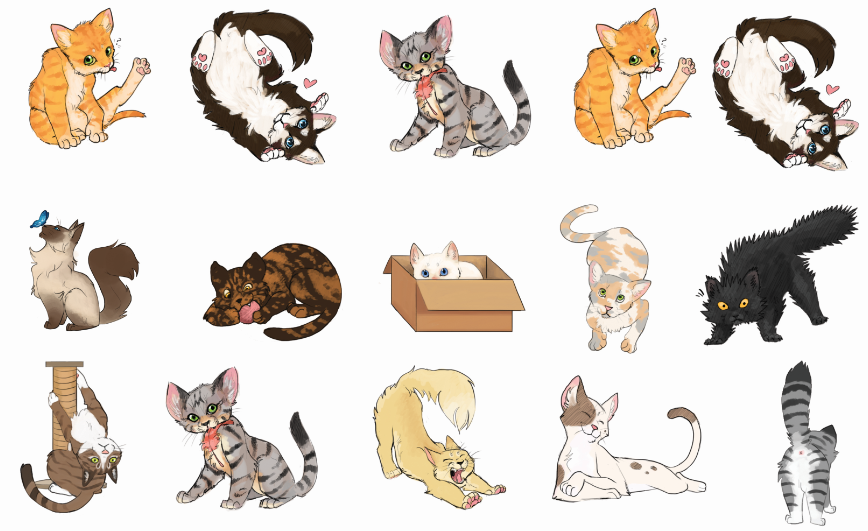
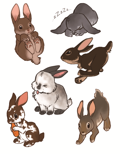
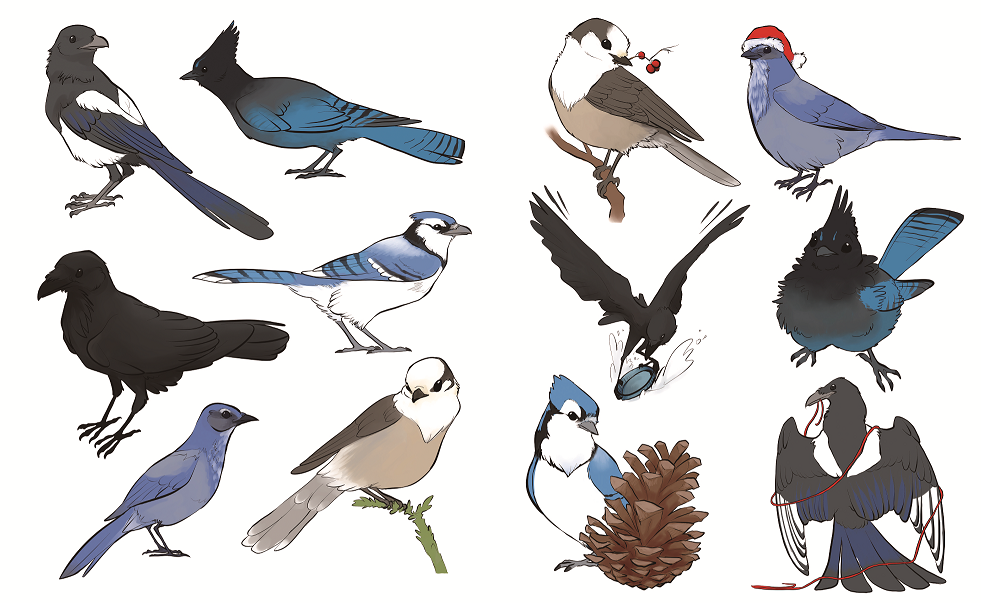
Thoughts on which sets, if any, I should include?
Also, I found out that the agent I am getting a review from also does YA along with graphic novels, so I am hoping they have targeted feedback since I'm likely aiming for an older audience than most folks are on SVS. Still, I tried to get a few kid-friendly pieces in there in spite of the darkness.
-
@Kasey-Snow it looks great for the most part, but I would consider removing the two dragons in the water it’s your weakest piece. As for the stickers I wouldn’t use whole sets just grab a couple from one or two sets, that are cohesive with the rest of your images. Good luck!
-
@Asyas_illos I would love to. Problem is I need to have a minimum of 12 images and without it I don't have enough. The only other options are pieces that seem geared more toward YA audiences or are equally weak (see below) :
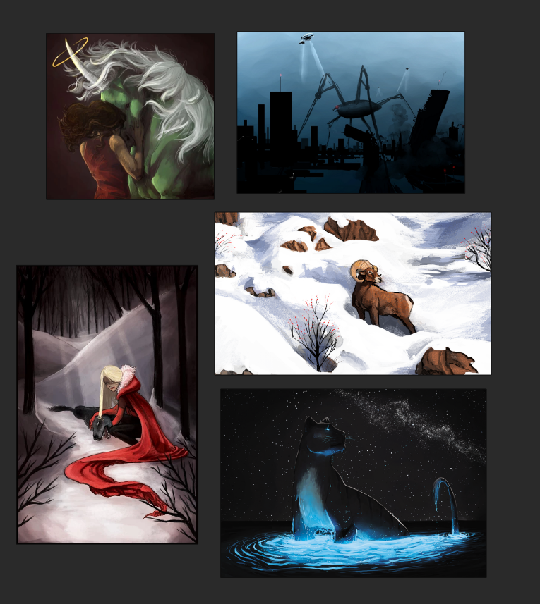
If I manage to finish more pieces by the deadline on the 4th then I will swap it out, but my time is very limited due to having a day job.
-
@Kasey-Snow I don’t think these are weak I would use that red cloak one it’s stunning!
-
@Kasey-Snow The line art is kinda heavy and flattening the dragons. You may want to thin it out or replace with rim lighting from the sunset.
-
@Asyas_illos Yeah, I like that one too, but it's the second red riding hood piece I'd have along with the one of her as a little girl running with wolves. And it's got blood and a dead wolf in it, haha. Not too gruesome for a Middle Grade focus?
@kayleenartlover That's a good idea, I'll toss some rim lighting on there, thanks! Rim lighting is becoming a theme in this portfolio, haha.