Critique Time! Constructive Suggestion
-
Hey Friends! I have been having so much fun with these action drawings but I would love to improve. I eventually want to have this guy falling from a glass window of a sky scraper. I just wanted to check in with my anatomy and line drawing. Eventually I am going to be adding tone, to provide contrast. Thank you guys and gals!
-
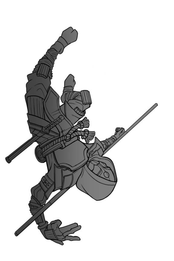
@Kori-Jensen this pose is TOUGH with all of the foreshortening. What stands out to me the most is the characters left hand looks too big and the forearm seems too small. The right arm also seems like it could be a bit wider and longer, so just a hare less foreshortened. Props for tackling this though. This is the kind of pose where I’m not even sure you can get a good reference for it so it can be very tricky.
-
@Kori-Jensen Awesome pose, and as @Griffin-McPherson said, very tricky with all the perspective, twisting and foreshortening... The thing that immediately stands out to me as not quite correct is the left hand. I think it's too big for what it should be, but more importantly, I am fairly sure that the placement of the hand is anatomically impossible. The bend in the wrist is too severe, but also, you couldn't bend your pinky like that while your ring and long fingers stay straight with your wrist in that angle. It also makes the fall less convincing, i think, because a hand pose like that requires a lot of control (even without the bend in the wrist), and if you're falling from a window your focus would be elsewhere.
On the same note, I feel like the placement of the stick behind his neck is not consistent with what's happening in the story. If he's just fallen backwards out of a window I would have expected his body to have twisted, which would have moved his shoulders out of alignment. Thus, I would expect the stick to be less attached to his body, and more at an angle to the line between his shoulders, and maybe even pointing down on the right side, falling away from him.
But in all, what an engaging pose! Very impressed with your work thus far!
-
I agree with the others regarding the foreshortened arm and hand but what also stands out to me is his torso\waist seems a bit short, and I think his head could be larger as it’s closer to us.
-
@Asyas_illos @Griffin-McPherson @mia-clarke Thank You so much for your awesome instruction.
It'll make everyone happy to know that I have decided to change the hands as per your instruction and change them all together for something slightly more complex and natural.
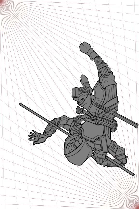
He is a highly skilled ninja with insane skills, he can afford to jump out of a skyscraper window waving goodbye to his enemies. All this while not even looking at where he is falling. I wish I had enough skill to put some twist in his waist, but alas I am not...yet.I have also adjusted the elongated leg slightly by shortening and straightening it. However, I kept the slight curl of the leg to show some motion in his actions. I also added some two points of perspective to help show where this piece is going. I'm so excited.
@Asyas_illos As for the head being slightly bigger, I get what your saying, I tried it, but I don't think I have enough knowledge on how to do that correctly. I have attempted as such but nothing looked accurate or good to me.
-
@Kori-Jensen Hahahaha, awesome! I love it! This update looks way more dynamic, and I like the added cheekiness of the wave. Great work!
-
@mia-clarke Thank you so much you guys rock I'll show you the finish line art as the progress comes
-
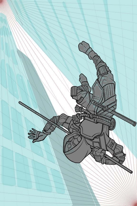
@Asyas_illos @Griffin-McPherson @mia-clarke I have done up a flat backdrop that will be the landscape for this scene. What do you guys think?
-
@Kori-Jensen I really like the negative space behind your character but I’m wondering if you could push the height even more? I’d personally like to see the buildings get much smaller towards the top to get a good sense of how dramatic the fall is. But it is coming together nicely!
-
@Asyas_illos You mean making it look like he is up higher?
-
@Kori-Jensen actually I looked at this totally wrong! I thought the edges of the buildings were tops lol. That being said I’m not sure I’m sold on building on the left. The angle seems off to me. I don’t have time to draw over right now, but I’ll check back in, in awhile.
-
So what's behind him is supposed to be the street? Sorry just trying to clarify before offering advice
-
@Asyas_illos Im curious to know
-
@AngelinaKizz yes, wow I didn't think my background was so obscure. lol thank you for your patience
")
-
@Kori-Jensen so based on your previous image with the perspective grid, you're viewer would be looking at the vanishing point (the red convergence of perspective lines). So that would mean the viewer is looking up. What you have, looking down at the street, would create a different vanishing point, and a entirely different perspective on your character. It's both possible to look at him from above (birds eye) or below (worms eye) but if you wanted the street to be visible below him, you'd need to put your vanishing point lower than your character and the street would be quite far off in the distance. I think you'd be best to change the perspective on your buildings to have height towards your current vanishing point.
-
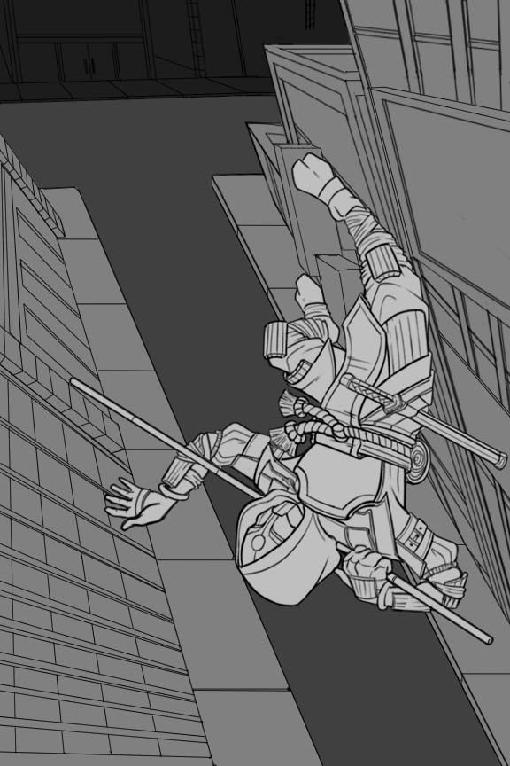
Here’s a super rough draw over, in the current perspective grid you have laid out, the buildings would be tall without a road seen. I hope that makes sense.
-
It's awesome that you're challenging yourself with a complex composition. A few things stand out.
- I think what's confusing is on the initial take the body motion looks like he's falling headfirst. But with the background, it looks like he's tumbling into a position of being parallel with the ground, but the position of the lower half doesn't match the movement of the upper.
- The arm and hand positions look off. I can only recommend to have a photograph taken of someone performing the pose.
- The feet look a tad long. Could use some foreshortening.
- The area between the hood and chestplate bothers me. Seems odd to have the cloth tucked under the corner of the plate.
- The rope belt looks tied like a thin string opposed to a thick rope. Plenty of references online.
- Your point perspective gird isn’t setup properly. The boxes should be wider towards the camera, smaller at a distance. I saw two points perspective in an earlier image. Are you utilizing three point perspective?
-
@AngelinaKizz Very interesting so you are suggesting that I utilize the vanishing point to extend to the edge of the page instead of a T-intersection at the end?
-
@willicreate I am trying to utilize that two point perspective as much as I can, but I think I might have gotten a bit confused. I think this next time around I am going to put 2 color points. As for the body, I get what you mean about the position of the top and bottom of the body. I wish a possessed the skill to do that, but at this point I haven't tried it just yet. I love the way he looks at the moment. I don't mind the size of his rope, but next time I'll add another wrap around to add some body to it. I agree with the feet, but in a way, to me it adds a bit more length to the legs and does not look too, human... if that makes sence.
-
@AngelinaKizz this is what my mind was seeing also