Halloween book cover redesign challenge
-
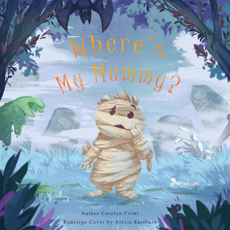
@Johanna-Kim thank you for the feedback! I'll try and explore other options for the main character's pose.
-
@Griffin-McPherson thank you for your advice! I like the idea of the cover text on the tree instead. I'll give that a try too.
-
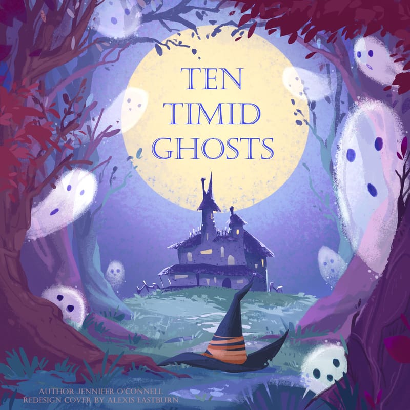
Here is an update on how my book cover redesigns are going! I originally planned to do four, but I don't think I'll have time to squeeze it in this month with my other work.
I had a lot of fun with this concept and had so much nostalgia from re-reading these books. Let me know down below if you have any feedback or if you also read these as a kid.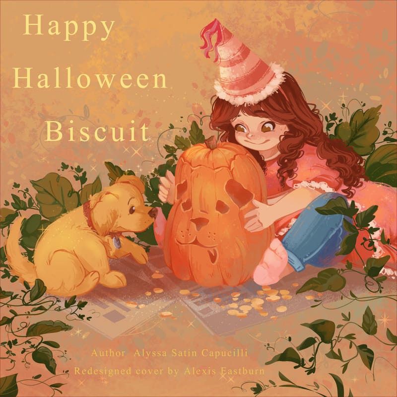
-
@alexisartxox These are lovely! I’m super impressed!
-
What a great idea, these are wonderful!
-
@Mia-Clarke thank you very much!
-
@Asyas_illos Thank you! Also, I saw your submission to the "Glow" challenge this month that you posted. I absolutely love it! So adorable and wonderful work on the little details like the rug and having the jump ropes holding up the tent. Best of luck with the challenge!
")
-
@alexisartxox
 ️ thank you!
 -
@alexisartxox wow! These all look so good!!!!
-
@alexisartxox These are beautiful!
-
Wow these are all incredible. What a great idea too, something I am going to add to my To-Do list for my portfolio. Thank you for posting, I love your work... your redesigns are in my opinion better than the originals.
-
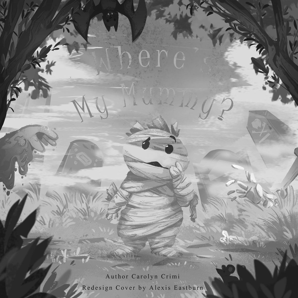
@alexisartxox These book covers are so cute. I do have a little bit of a hard time reading the title on "Where's My Mummy?". I think the light orange/yellow areas are too close in value to the sky in the background and gets a little lost (posting a black and white version to show what I mean). If you made those areas the same value as the darker orange on the title, it would be more visible, or made the background a little lighter. Great job. I love the illustrations!