Society of Visual Storytelling

    SVSLearn Forums

    • Register
    • Login
    • Search
    • Recent
    • Tags
    • Popular
    • Users
    • Groups
    • Search

    Kamari Concepts-Which one?

    Projects
    10
    34
    2284
    Loading More Posts
    • Oldest to Newest
    • Newest to Oldest
    • Most Votes
    Reply
    • Reply as topic
    Log in to reply
    This topic has been deleted. Only users with topic management privileges can see it.
    • ArtistErin
      ArtistErin @kirsten-mcg last edited by

      @kirsten-mcg I love the Phoenix concept! πŸ™‚ It's easiest to understand and you are doing great so far with color πŸ™‚

      Erin Richardson
      instagram.com/erinrichardsondesigns21
      www.erinrichardsondesigns.com

      kirsten-mcg 1 Reply Last reply Reply Quote 1
      • kirsten-mcg
        kirsten-mcg @Asyas_illos last edited by

        @Asyas_illos THat's true! I've been trying to keep too much blue out of my artwork, because in the past I've had a tendency to use it too much. But you're right that this time there's a good reason for it!

        Instagram: https://www.instagram.com/kirsten.mcgonigal.art/
        Portfolio Site: www.kirstenmcgonigalart.com

        1 Reply Last reply Reply Quote 0
        • kirsten-mcg
          kirsten-mcg @ArtistErin last edited by

          @ArtistErin I'm so glad to hear that my concept comes across! I've been a little worried about that part. πŸ˜…

          Instagram: https://www.instagram.com/kirsten.mcgonigal.art/
          Portfolio Site: www.kirstenmcgonigalart.com

          1 Reply Last reply Reply Quote 0
          • MarcRobinson
            MarcRobinson @kirsten-mcg last edited by

            @kirsten-mcg liking the way this is going! Idea... Maybe try and keep the background elements cool in colour temperature. This'll help the warm phoenix glow better. On the two colour comps you've got the whole image quite warm, and it'd be a shame for such a great creature design to not pop off the page.

            kirsten-mcg Sarah VanDam 2 Replies Last reply Reply Quote 2
            • kirsten-mcg
              kirsten-mcg @MarcRobinson last edited by

              @MarcRobinson Good point! I'm working on a blue version right now to see how I like it. That would definitely cool things down. 😁

              Instagram: https://www.instagram.com/kirsten.mcgonigal.art/
              Portfolio Site: www.kirstenmcgonigalart.com

              1 Reply Last reply Reply Quote 0
              • Sarah VanDam
                Sarah VanDam @MarcRobinson last edited by

                @MarcRobinson I agree. Maybe more of a sapphire blue or blue-green base

                https://sarahvandam.art/
                Instagram: @sarahvandam.art and @artistsandbox.etsy

                1 Reply Last reply Reply Quote 1
                • kirsten-mcg
                  kirsten-mcg last edited by

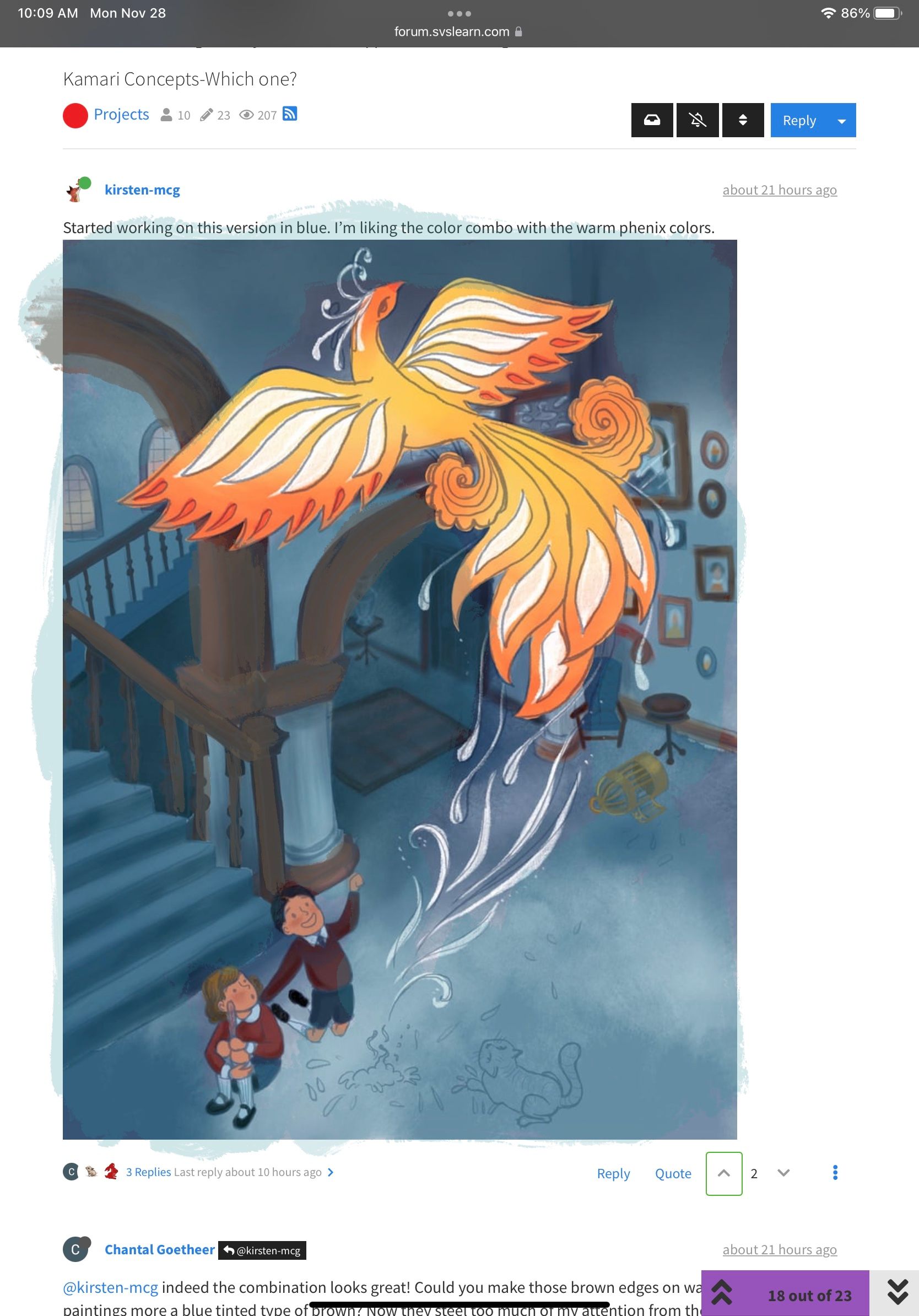
                  Started working on this version in blue. I’m liking the color combo with the warm phenix colors.57344CD3-9F78-49A2-BB61-16030C4FAF77.jpeg

                  Instagram: https://www.instagram.com/kirsten.mcgonigal.art/
                  Portfolio Site: www.kirstenmcgonigalart.com

                  Chantal Goetheer mzameckaart Miriam 3 Replies Last reply Reply Quote 2
                  • Chantal Goetheer
                    Chantal Goetheer @kirsten-mcg last edited by

                    @kirsten-mcg indeed the combination looks great! Could you make those brown edges on walls, stairs and paintings more a blue tinted type of brown? Now they steel too much of my attention from the Phoenix.

                    kirsten-mcg 1 Reply Last reply Reply Quote 2
                    • kirsten-mcg
                      kirsten-mcg @Chantal Goetheer last edited by

                      @Chantal-Goetheer I've been playing with the color of those quite a bit. Still haven't hit on something I'm completely happy with. I'll try a more blue shade and see how it looks. Thanks!

                      Instagram: https://www.instagram.com/kirsten.mcgonigal.art/
                      Portfolio Site: www.kirstenmcgonigalart.com

                      1 Reply Last reply Reply Quote 0
                      • mzameckaart
                        mzameckaart @kirsten-mcg last edited by

                        @kirsten-mcg I think a phoenix is a very clever idea for this prompt! πŸ‘
                        For some reason I really liked the green background, but the blue one will also work well.
                        Maybe the cage should be bigger? Or was the previous incarnation smaller than this one?

                        https://www.instagram.com/mzameckaart/

                        kirsten-mcg 1 Reply Last reply Reply Quote 1
                        • Miriam
                          Miriam @kirsten-mcg last edited by

                          @kirsten-mcg This is looking great! I really like the blue & agree with @kirsten-mcg that it would be good to tone down the browns.

                          I'm not very good with colors, but maybe you could try lowering the saturation on the brown? (more like the edges of the rug)

                          1 Reply Last reply Reply Quote 0
                          • kirsten-mcg
                            kirsten-mcg @mzameckaart last edited by

                            @mzameckaart When I asked my family about half of them like the green! I think it's just personal color preference. 😊 I'll check the size of the cage. Thanks for noticing that!

                            Instagram: https://www.instagram.com/kirsten.mcgonigal.art/
                            Portfolio Site: www.kirstenmcgonigalart.com

                            1 Reply Last reply Reply Quote 1
                            • Asyas_illos
                              Asyas_illos last edited by Asyas_illos

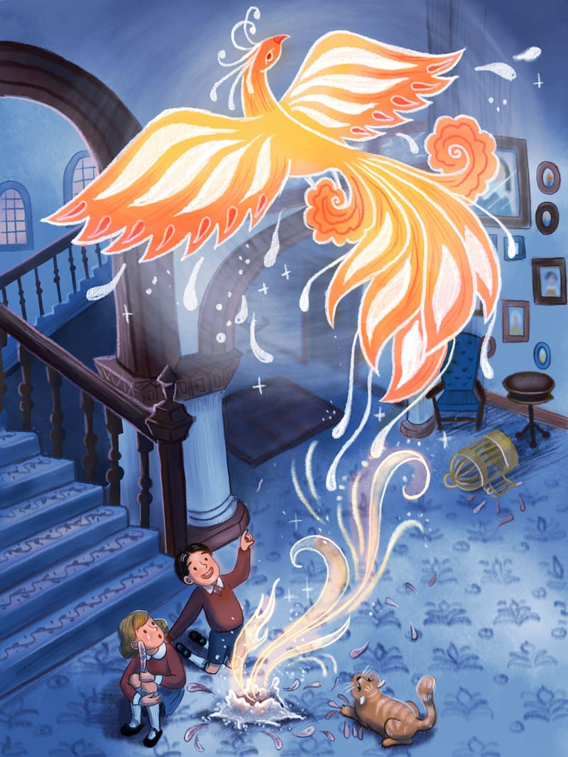
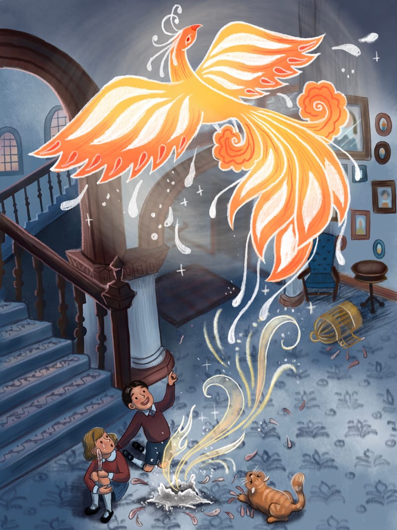
                              I tried going over everything but the Phoenix and kids with a low opacity aqua color to see how it looked. I think a more orange based brown for the woodworking could help too, it’d be less contrast-y if it were a tad lighter
                              36F7553C-B45E-43CC-A492-0382CC59F453.jpeg

                              Asyasewardillos@gmail.com
                              www.Instagram.com/asyas_illos/
                              https://asyasewardillos.wixsite.com/mysite

                              1 Reply Last reply Reply Quote 2
                              • kirsten-mcg
                                kirsten-mcg last edited by kirsten-mcg

                                Just about finished. I still need to add my watercolor texture, but I like to save that for vert last as I have to flatten all my layers first. I might try another version in more of an aqua color like @Asyas_illos suggested. Finding the right color for the wood is just killing me! What do you think @Miriam @mzameckaart @Chantal-Goetheer @MarcRobinson @Stephanie-H and @LittleRaven ?B5547AA3-7055-4699-AD40-135D3628895A.jpeg

                                Instagram: https://www.instagram.com/kirsten.mcgonigal.art/
                                Portfolio Site: www.kirstenmcgonigalart.com

                                Chantal Goetheer MarcRobinson Miriam LittleRaven 4 Replies Last reply Reply Quote 3
                                • Chantal Goetheer
                                  Chantal Goetheer @kirsten-mcg last edited by

                                  @kirsten-mcg the background is taking much less attention now and the Phoenix is popping out much more, so good job!

                                  kirsten-mcg 1 Reply Last reply Reply Quote 1
                                  • MarcRobinson
                                    MarcRobinson @kirsten-mcg last edited by

                                    @kirsten-mcg I like it a lot. I particularly like the pattern textures on the floor and steps which add a lot of visual interest.

                                    kirsten-mcg 1 Reply Last reply Reply Quote 1
                                    • kirsten-mcg
                                      kirsten-mcg @MarcRobinson last edited by

                                      @MarcRobinson Thank you!

                                      Instagram: https://www.instagram.com/kirsten.mcgonigal.art/
                                      Portfolio Site: www.kirstenmcgonigalart.com

                                      1 Reply Last reply Reply Quote 0
                                      • kirsten-mcg
                                        kirsten-mcg @Chantal Goetheer last edited by

                                        @Chantal-Goetheer Thank you! That's good to hear.

                                        Instagram: https://www.instagram.com/kirsten.mcgonigal.art/
                                        Portfolio Site: www.kirstenmcgonigalart.com

                                        1 Reply Last reply Reply Quote 0
                                        • Miriam
                                          Miriam @kirsten-mcg last edited by

                                          @kirsten-mcg This is great! It looks very magical & the focus is on the bird & the action.

                                          1 Reply Last reply Reply Quote 1
                                          • LittleRaven
                                            LittleRaven @kirsten-mcg last edited by

                                            @kirsten-mcg Sorry, bit late to the party but better late then never I guess. I really love how this turned out! It looks really nice, great job! πŸ‘

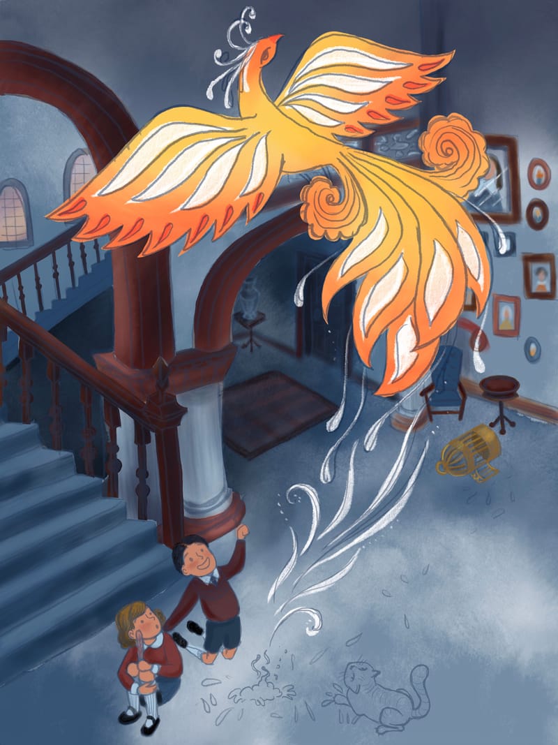
                                            But since you had a hard time with finding the right color I want to give you some feedback. First of all great job on finding a good color scheme with the complementary colors with the orange and blues! But I do feel its a bit lost in the final image. To just push this a bit more I would set a layer in photoshop to overlay and paint over the whole background with a desaturated blue tone, and really make the bird pop out. And this also creates a nice atmospheric effect like it would be a scene at night.

                                            I feel the vocal points should be the bird and also the kids, so everything in the background should stay in the blue color family as much as possible. Right now for instance, the wood of the stairs in the background is in the red family and the stairs is in the blue, this creates color contrast (aka complementary colors) and this really attracts the eye. If you put a blue overlay on it, the reds are pulled more towards the blues. I also would add a layer in linear dodge mode with a dark red just on the kids faces to pull those more to the red family. To show all this I feel like a picture speaks more than words, so I created a paint over for you.

                                            Hope this helps! πŸ˜„

                                            1669681997697-b5547aa3-7055-4699-ad40-135d3628895a-resized.png

                                            kirsten-mcg 1 Reply Last reply Reply Quote 1
                                            • First post
                                              Last post