A Dangerous Rescue - help me pick thumbnail
-
@ArtistErin great idea. I'll let it bounce around for a bit before I settle on something haha
-
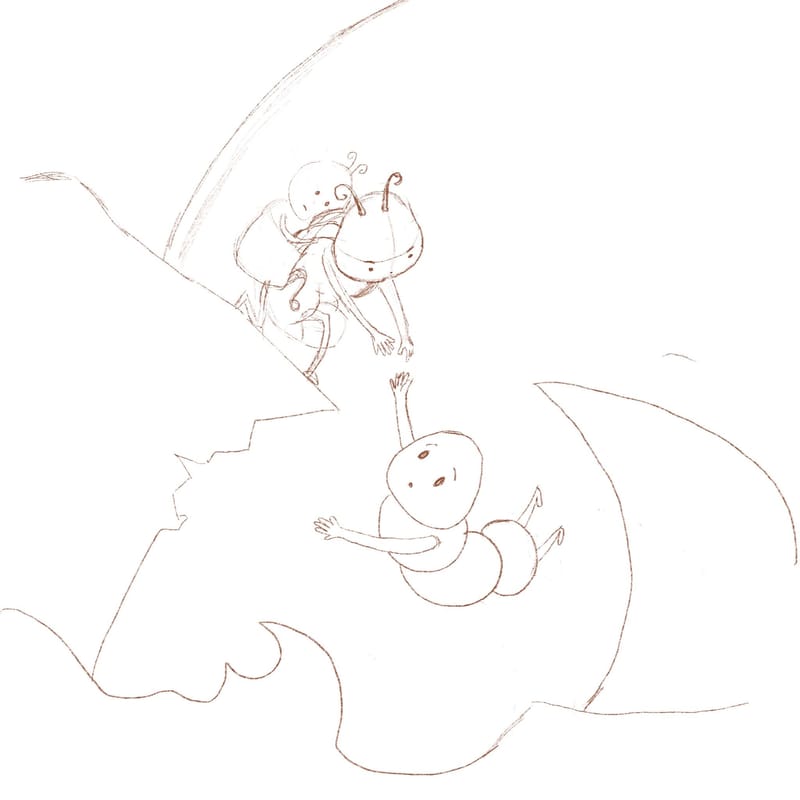
@ArtMelC I think the only reason the size difference doesn't work in thumbnail 1 is because of where the characters are in space. Since the caterpillar needing rescuing is closer to us in space, the size difference doesn't really read. If you were to change the format so that we were looking at them both on the same plane, like you have in #2, then I think you could easily incorporate your idea for size. If you go that rout, just make sure you really exaggerate it. Mouse trying to rescue dog scale, or something like that.
-
@kirsten-mcg @ArtistErin @danielerossi @Chantal-Goetheer @Mia-Clarke

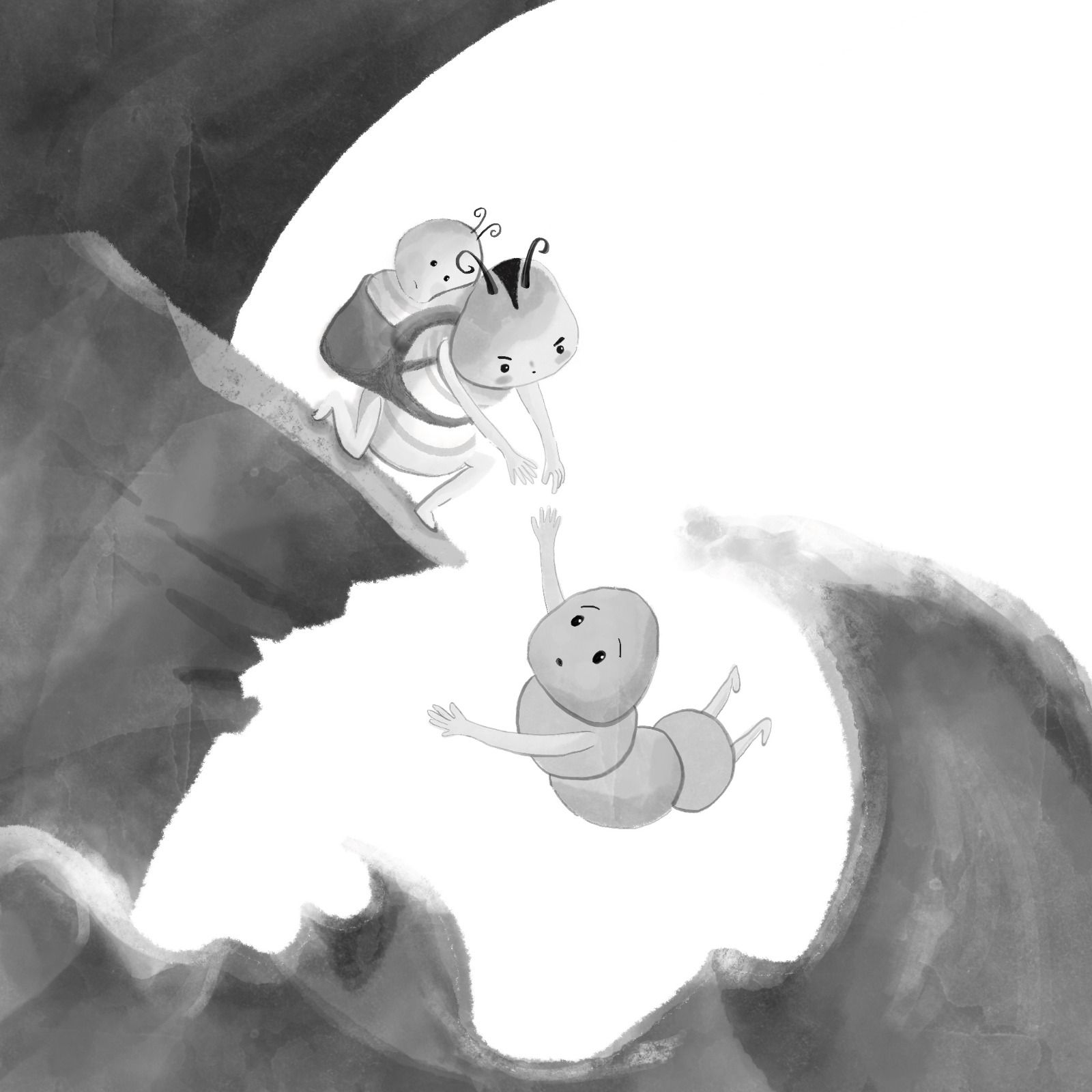
So...instead of a size difference I incorporate a version of #4 , so hopefully the idea that rescuer caterpillar is already carrying a baby on their back will give a little bit of worry / doubt on the viewer on whether the rescue operation will be a success, while maintaining the initial silhouette.
Also tried to fix the gaze of the characters so it all makes sense
Anything else jumps out at you?
-
@ArtMelC Nice!
-
@ArtMelC the baby on his back definitely has me worried!
-
@ArtMelC yes, the baby combined also with the slope of the cliff makes me envision a whole drowning scenario.
-
Oh for sure this is clear.. the shifting angles definitely lends to uncertainty and makes me concerned for the baby ! Great job

-
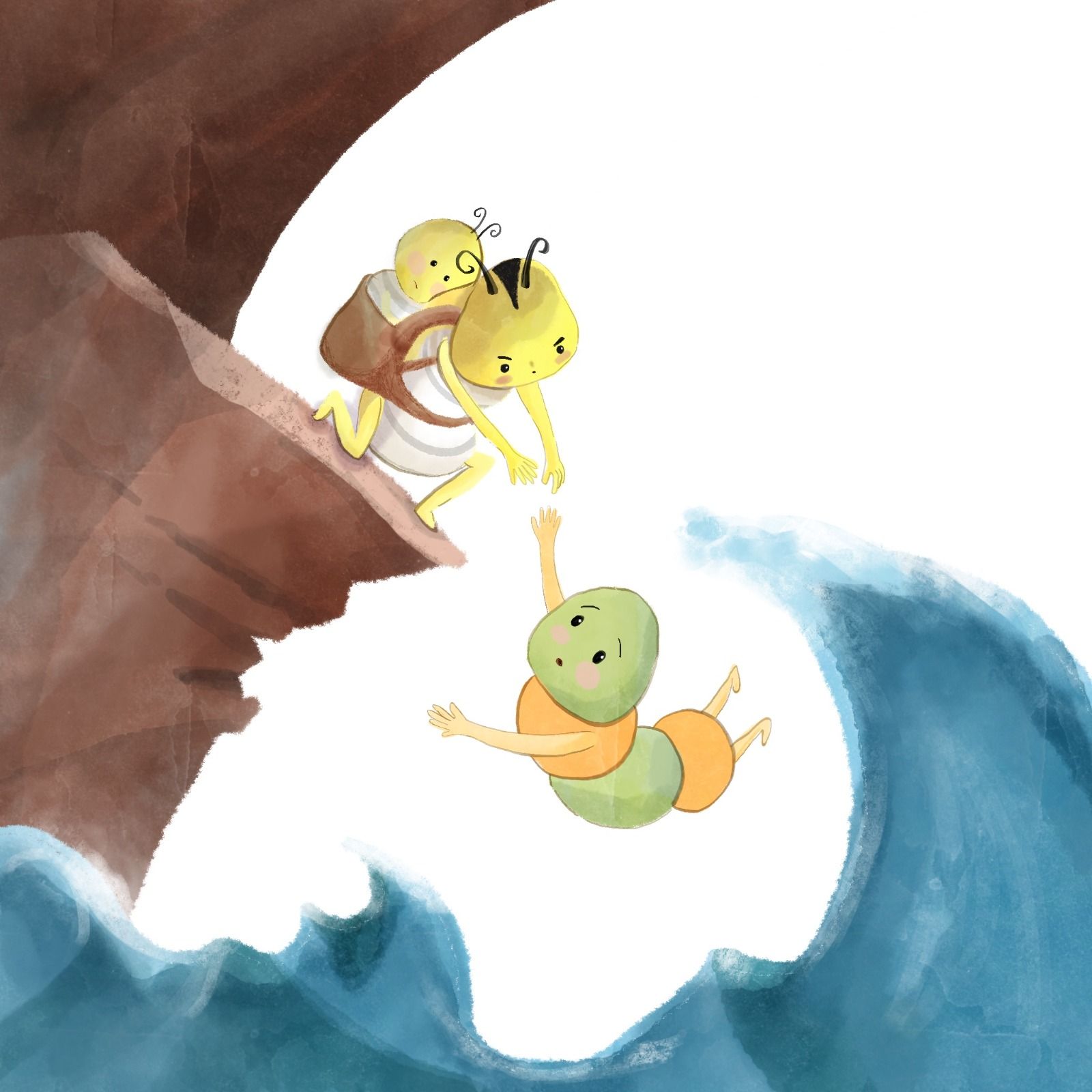
Colouring frustration

I thought the values look ok

But the full colour isn't working. My eyes fail to focus on the caterpillars despite the framing. I think the yellow is too close to white BG but the design of the yellow caterpillar is fixed (he is the main mascot). Any tricks?

-
@ArtMelC Hmmmm.... I see what you mean. The story is happening with the caterpillar and the baby and the one being rescued, and your values seem to be competing with this as a focal point. So maybe you could reverse the saturation and deepen the caterpillars in detail/saturation and kick back the rest?
-
@ArtMelC I think that yellow and white might not be the best colors to use for the rescuing caterpillar and baby. It’s too close in value to the white background. You could try a different color for the, like green. It’s easier to make green a darker value than yellow! Another idea would be to darken the sky behind them. That would make the light yellow stand our beautifully.
-
@ArtMelC yes it's the white background that makes it harder to see the yellow of the characters. So i would try to change that when you can't change the caterpillar's colour. Maybe something in the way of a desaturated purple family would make the caterpillar stand out with yellow as a complementary colour scheme. No clue how that would look like. And maybe get the cliffs to also move more into that same direction of the desaturated colour scheme. Now the cliff seems to grab most attention.
-
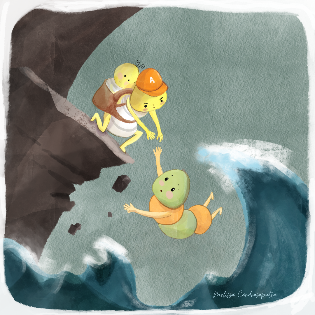
Alright peeps, I think I am quite done with this piece. Thank you so much for your valuable input! Also a reminder, please do take care of your own health, safety, and needs before rescuing others - I think many artists need this simple message
 Love you all!
-
This post is deleted!