Looking for critique--stork illustration
-
congratulation! Sarah. I think it's a lovely idea, and the baby looks very excited.
-
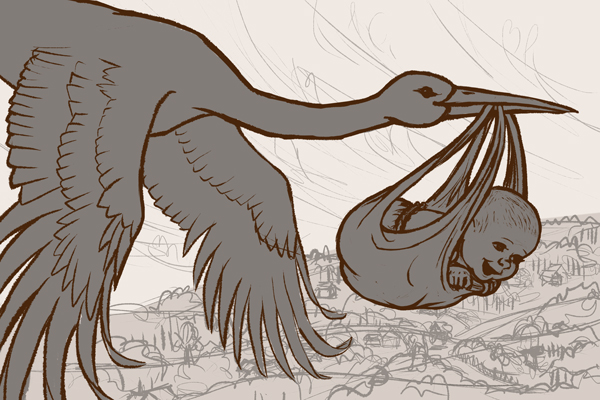
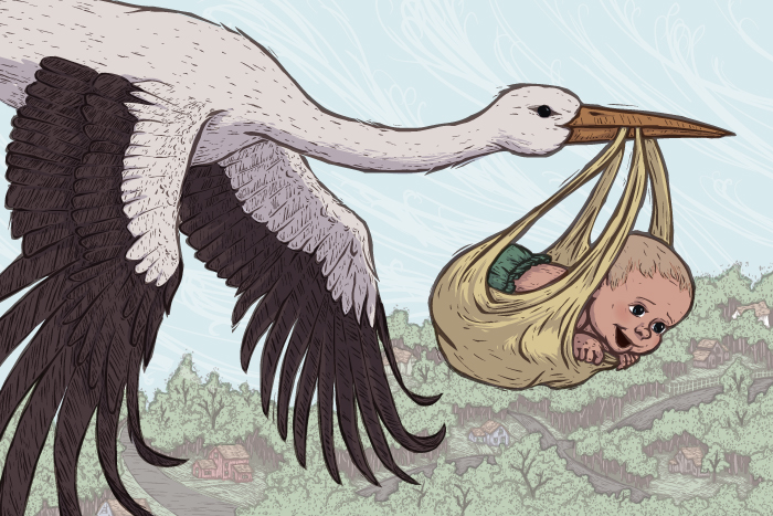
Ok, here is sketch that is a bit more refined, though the background is really just scribbled in for now. I had a big debate over how old exactly I wanted the baby to be, and decided I didn't really want a brand new newborn. A newborn wouldn't be able to hold its head up and have the same expression as I wanted in the picture. So I cleaned up the face, without really going for the newborn look.
-
@Sarah-LuAnn That looks so much better to me!! isn't it amazing how a few lines added or removed can change an age? She still looks excited, and much younger now!! I love the flow on your stork

-
@Sarah-LuAnn I think you found the perfect balance with the face of the baby now. Looks great!
-
@Sarah-LuAnn What a sweet idea and Congrats on your upcoming addition!!
-
Such a sweet piece, congratulations to you both
-
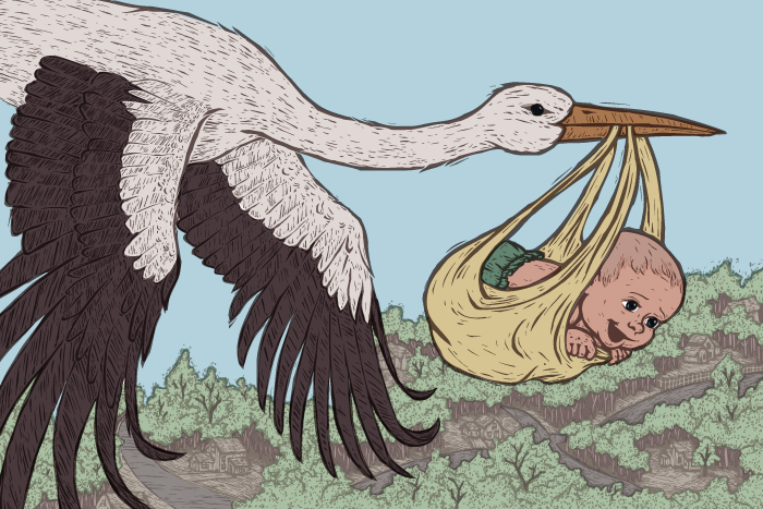
I got a bit more done on this piece and got most of the colors laid in (still some details in the background I haven't got, like the clouds and houses), but I feel like something is off and I'm not sure what it is. I don't feel motivated to move forward with this piece until I figure out what it is. Thoughts?
-
Lovely colors! I think it may be over textured. try removing it from the white on the stork, definitely all of it on the baby, and blur the trees a bit. Your baby looks so happy!!
-
@Sarah-LuAnn I think it may just be a contrast issue - i did a quick paint over - i darkened parts of the ground - lightened the top of the stork and darkened the bottom of the stork - also thinned out lines that are facing the sky - lightened parts of the skin tone of the baby and shrunk the features a bit too - took the sky to a less gray blue too to try to make the stork's head pop - i think i strayed very from your cool block print style but i was just working on the contrast to see if that might be what is bothering you
") .... oops i just noticed i forgot the edge of his little ear - i think too that i should have lightened or darkened the feathers that dip down below the trees just a tiny bit - right now they are a bit close to being the same value
.... oops i just noticed i forgot the edge of his little ear - i think too that i should have lightened or darkened the feathers that dip down below the trees just a tiny bit - right now they are a bit close to being the same value 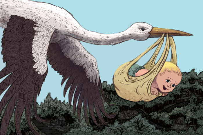
-
@Sarah-LuAnn Lovely work! Agh it's so frustrating when you don't know what's bugging you with a piece. Well I'm going to offer another opinion/idea for you, to make it more difficult
")
To me it looks like the background is sort of fighting with the stork's flow through the air, I don't know why but perhaps because it slopes upwards from left to right, feels like an uphill struggle almost..I know that's really abstract but just my reaction.
So, what I'd try is flipping the flow of the background so it slopes down in a swooshy way that echoes the shape of the stork & baby.. with more of your woodcut style adding detail flowing in that direction...like they are flying really fast! ...but you could still add enough detail to make it interesting. Here's a visual idea of what I mean (excuse the quick job, you'd obviously make it look better!):
-
I think it's a great composition. I understand that you haven't really done details yet. The baby's face does look a little old but I think I especially would like to see some light beaming from those little eyes
Congratulations. Being excited AND terrified means you're ready You want to do a good job as a parent and you will! So exciting to see that little one for the first time :-). -
@Sarah-LuAnn Coming along great! I really like the wood-block style you have going on, very cool!
-
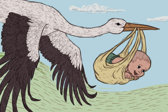
The weird thing about critiques is, sometimes they hit the nail on the head, and sometimes they... don't.
I thought long and hard about each comment you guys were nice enough to leave, and ultimately decided that none of them hit on what was bothering me about this piece. I don't want to make it sound like I just dismissed everything you guys said, because that isn't what happened. Its actually hard to not take people's suggestions sometimes!
It did help my decision in a weird way that everyone's comments were quite different from each other, rather than just one piece of feedback with everyone chiming in to say "I agree!" etc. Since everyone was seeing something different, I decided that I just had to figure this out myself.
I'm still not done, and there are several things I still want to perfect, but after giving myself a break from looking at the piece I moved forward with what I felt needed improvement. Sometimes the real problem is that we've been looking at something too long, I think. I feel like it's starting to come closer to what I envisioned. Thanks again everyone for your comments!
-
I haven't read this whole thread, but I like the highlights you added and how you pulled back a bit on the texture on the babies face which helped soften the features and warmed up the skin tones. Really nice progression!! Great job.
-
Looks like the baby is saying "here I come ready or not!". Very cool!
-
Haha, you can see on my website that the text I added was, "Here I come!", so that was pretty much the emotion I was going for. I'm glad that came across!