Frustrated...please help
-
Hi,
I'm going to preface this by saying that my strengths lie in drawing and rendering one object. I am not good with making a unified piece with a whole composition, which is probably my problem.
But, I have started and restarted this same piece so many times and it never looks good. At this point I don't know what is wrong. Is it the sketch, the composition, the values, the colors? Or am I just stopping at the ugly stage and I need to keep working past it. Any comment would be helpful. Should I just work on something else?
Does anyone else just have a piece that wrecks your confidence and makes you want to quit?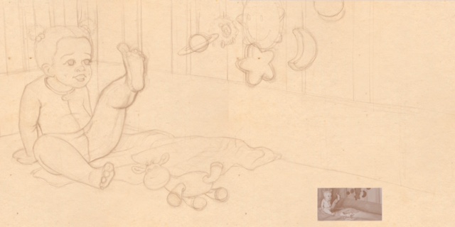

-
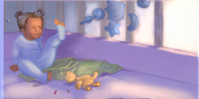
A couple things that might help. I think the girl needs to be moved more towards the center of the page so she is more of a focal point. Not dead center but over just a bit and down. Your colors may just be too similar in temp to stand out from one another. Try making the the girl with a warm colors and then the background in all colors that are a bit cooler to help her pop out more. Kind of how the blue mobile pops out really nice against the warmer background and the giraffe pops out against the blue blanket, but you should do that with the character instead.The drawing is really nice. I love the toy giraffe.
-
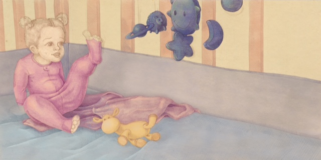
cute piece! I did a quick paint over and moving stuff around and I hope you don't mind. I'll will come back with explanation because I got to go haha, running out of time. I hope this help a bit.
-
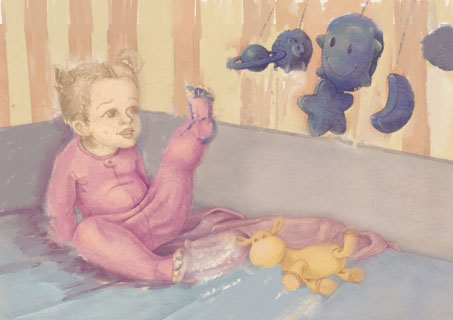
I also did a very quick paint over to illustrate my points.
-
@evilrobot @naroth kean, thank you so much for the input. I really think I need to take your suggestions, especially pushing my colors to emphasize my focal points. I can also move the girl over except this is a book spread and I'm afraid of getting her too close to the gutter. It's a book spread for a personal project.
-
I did a quick paint over to bring the light in from the right so that it catches the foot and her face abit. i'm not great at this stuff either but hope this helps. Also naroth and evilrobot have soom great points which with make this peice look great.
-
@stacilyn no problem, I guess the paint over is pretty self explanatory. Yes the composition was a bit problem due to the big blank space on the right, and I think cropping it out will help a lot. I like how @evilrobot brought the Mobile in a bit closer which helps with the storytelling. I tilted the Mobile a bit for subtle movement.
-
I think this piece has a lot of potential and I like what others have suggested.
As from me, I have the same problem when I illustrate things; it's natural for me to instantly draw characters doing nothing (like staring into empty space, behaving like statues, etc). I think your character may have the same problem, so always draw your characters doing something, even drinking water or walking somewhere. This will add a sense of liveliness to any illustration. Illustrating is essentially storytelling, anyways as you wouldn't want to read about characters doing nothing.
") If she was fiddling around with the toys in her crib, reaching for something that's out of picture, etc, this would help, I think.
If she was fiddling around with the toys in her crib, reaching for something that's out of picture, etc, this would help, I think.Hmmm, I wonder if this is why it's important for us to grab our sketchbooks and pen, go out in the community, and draw people. I think this would allow us to shake off this bad habit.
Anyways, good luck!
-
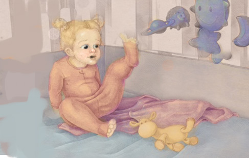
@LeeHolland, looking at your work you are very good at this type of thing. Need nice! Thank you so much for you lighting suggestions. I tried variations with it lit from the right and I couldn't figure out how to do it without it being backlit. Your lighting will exactly highlight my focal point.
@kelvinburnett3, thank you for your encouraging words. I'll keep pushing thru