Society of Visual Storytelling

    SVSLearn Forums

    • Register
    • Login
    • Search
    • Recent
    • Tags
    • Popular
    • Users
    • Groups
    • Search

    *Question* March 3rd Thurs Toxic Waste

    General Discussion
    20
    48
    22659
    Loading More Posts
    • Oldest to Newest
    • Newest to Oldest
    • Most Votes
    Reply
    • Reply as topic
    Log in to reply
    This topic has been deleted. Only users with topic management privileges can see it.
    • bharris
      bharris last edited by

      march 3rd 2.jpg

      I decided to add some more kiddos! Let me know what you think or if you spot anything. Tone work soon.

      www.brittanyharrisillustration.com/
      www.instagram.com/britillustration/

      1 Reply Last reply Reply Quote 2
      • lmrush
        lmrush Pro SVS OG last edited by

        That is so great I love your line work!

        Lisa Rush
        www.lisarushgallery.com
        www.facebook.com/ArtbyLisaRush/
        www.instagram.com/lisarush11/

        1 Reply Last reply Reply Quote 1
        • bharris
          bharris last edited by

          @lmrush Thank you!

          www.brittanyharrisillustration.com/
          www.instagram.com/britillustration/

          1 Reply Last reply Reply Quote 0
          • bharris
            bharris last edited by

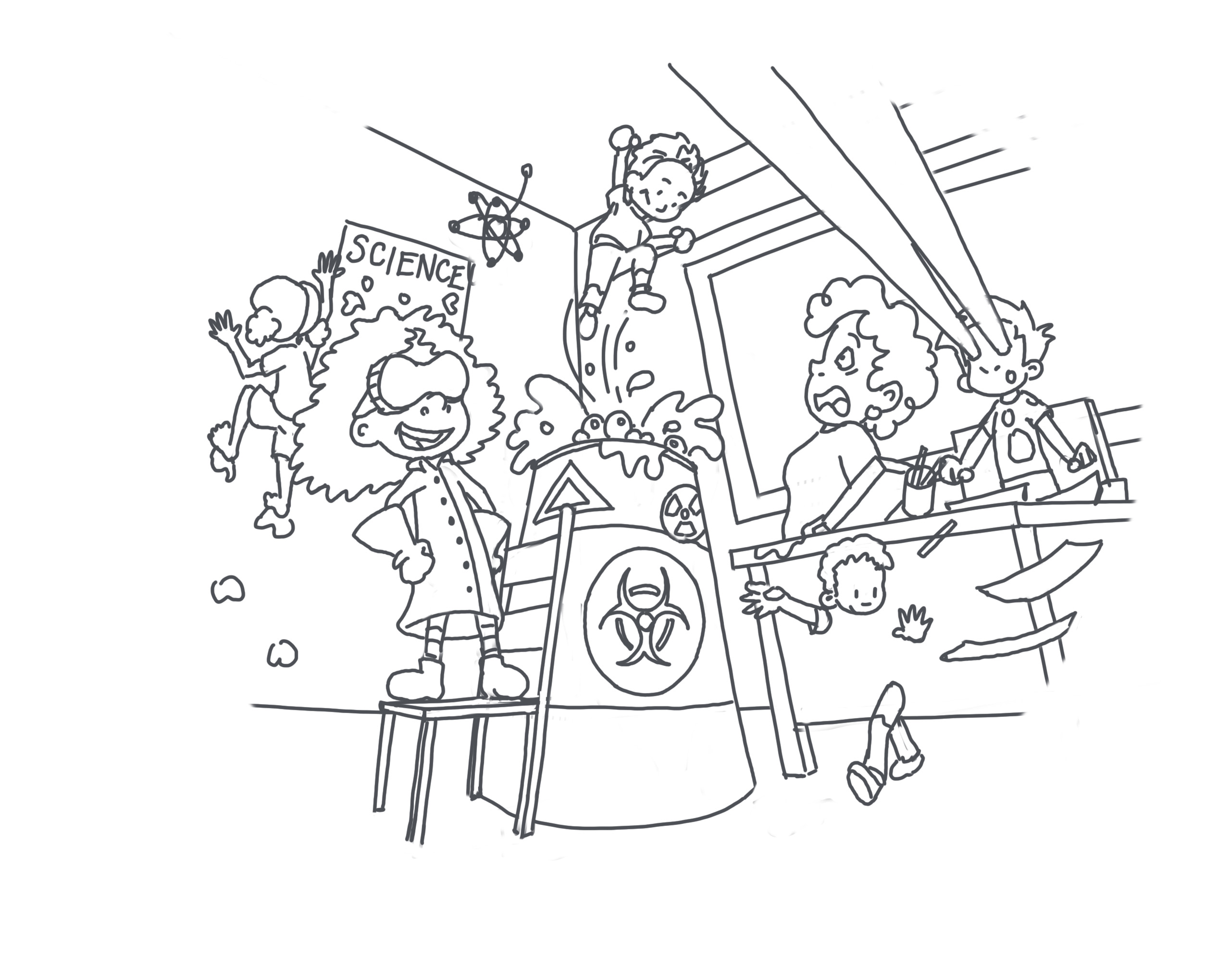
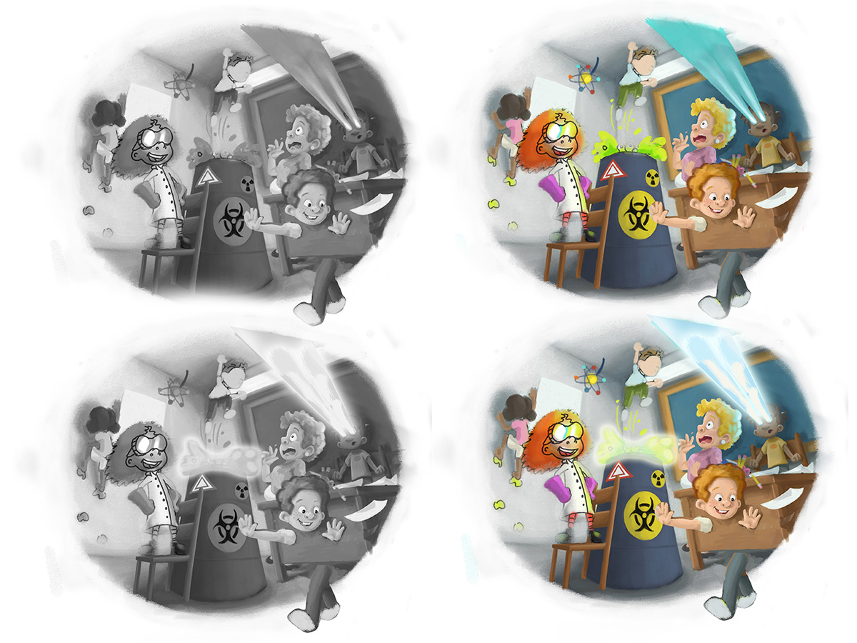
            General idea of where this is going! I'm having so much fun with this one, the lighting will be a little tricky but it's all a learning experience. I'm not happy with the kids' faces yet either, building up will help though.

            march 3rd 2up.jpg

            www.brittanyharrisillustration.com/
            www.instagram.com/britillustration/

            1 Reply Last reply Reply Quote 1
            • Carrie
              Carrie last edited by

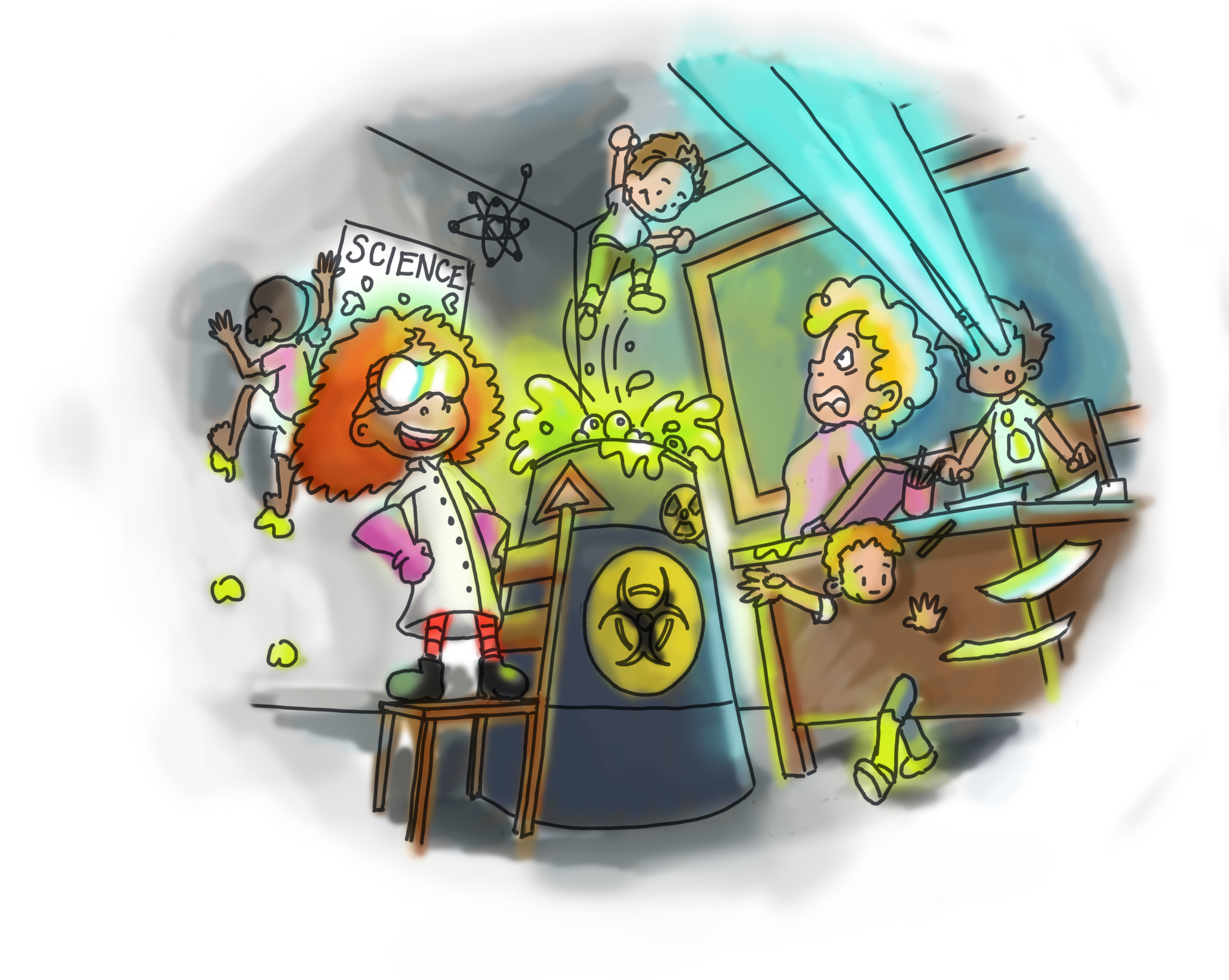
              Your neons really add to it! I love lazer beam eyed boy.

              1 Reply Last reply Reply Quote 1
              • bharris
                bharris last edited by

                @Carrie Thank you, I was worried about vibrating colors, but I guess that's what this picture is. 🙂

                www.brittanyharrisillustration.com/
                www.instagram.com/britillustration/

                1 Reply Last reply Reply Quote 0
                • bharris
                  bharris last edited by

                  march 3rd 2up2.jpg

                  Moving right along! I'm still trying to get better contrast with the back characters, but when I add the lighting I hope it takes care of that a little more. I think I'll darken it again, but I wanted to get the stuff in before I perfected the shadows. I see a few tangents and close to tangents I'll work on too. Anything stick out as really off or thoughts/opinions?

                  Side question does anyone else laugh when they are drawing characters that come out better and more fun than you thought?

                  www.brittanyharrisillustration.com/
                  www.instagram.com/britillustration/

                  Will Terry 1 Reply Last reply Reply Quote 7
                  • bharris
                    bharris last edited by

                    Quick question, the waste and the laser eyes are going to be the main light sources, but they are both on the cool side of colors, should I change the laser to something warmer? My worry is I don't want to take all the attention to that side of the page... and of course the toxic waste has to be neon green! Or does it work as is?

                    www.brittanyharrisillustration.com/
                    www.instagram.com/britillustration/

                    1 Reply Last reply Reply Quote 0
                    • Carrie
                      Carrie last edited by

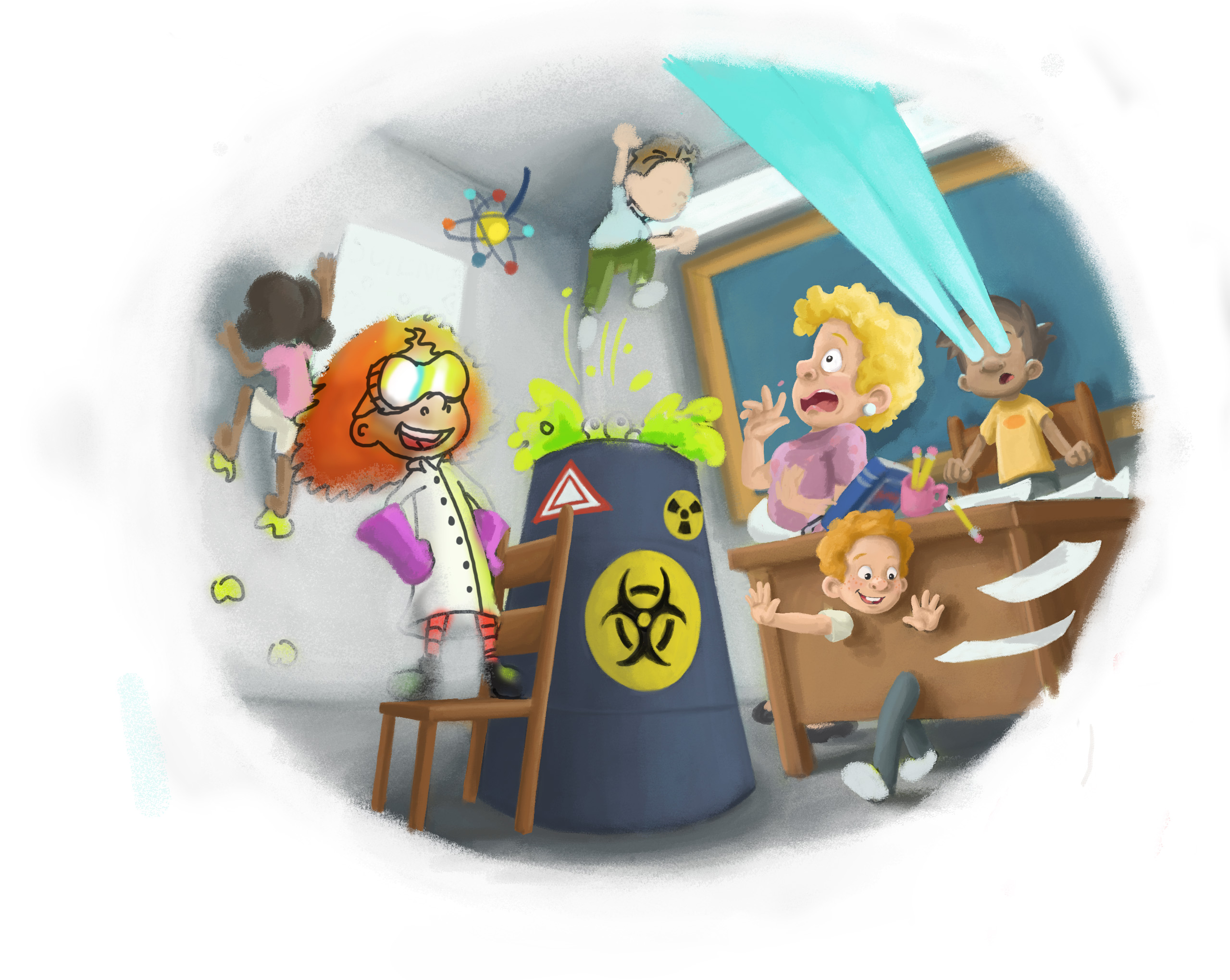
                      I think this looks really great. Your characters' expressions are darling. To address your blue laser eyes question; I'm wondering if you could cut the light off about half way and then it wouldn't lead the viewers eye all the way to the edge. You could fade the light out about half way, maybe? It might not work, but you could try it and see if you liked it better. I just noticed the book and pencils/papers falling off the desk. This is a nice detail and it really shows the movement and chaos of the scene.

                      1 Reply Last reply Reply Quote 1
                      • Rob Smith
                        Rob Smith last edited by

                        @bharris Great start! What if you had the inner parts of the "glowing" eyes a warm color and fading the edges out to a cooler color?

                        1 Reply Last reply Reply Quote 0
                        • Will Terry
                          Will Terry @bharris last edited by

                          @bharris This is such a GREAT idea! ...love it...I just had a few suggestions - nothing major. You might want to break a kid out of the border for emphasis and focal point? ...also the boy with laser eyes will be more believable if the influence of his blue light bounces off other objects as well - like the back of teacher's head. I realize this is WIP and you may have already been going there...nice work!1457216000433-march-3rd-2up2.jpg

                          SVS Instructor
                          http://willterry.com/

                          1 Reply Last reply Reply Quote 2
                          • bharris
                            bharris last edited by

                            @Carrie Thank you, I'll give it a shot, it just seems to me that laser eyes as a super power would go really far.

                            @Rob-Smith I'll check it out, kind of makes me think of fire to do it that way and it might be a nice effect. 🙂

                            @Will-Terry Thank you Will! I was defiantly planning on going there with the light, and I'll try working on the kid too. 😃

                            www.brittanyharrisillustration.com/
                            www.instagram.com/britillustration/

                            1 Reply Last reply Reply Quote 0
                            • Chip Valecek
                              Chip Valecek SVS Team SVS OG last edited by

                              I may be completely off but if you google un-natural light sources there will always be some sort of color blow out that makes the value of the source much brighter then the rest of the values. I always drop a Hue/Saturation layer and turn the saturation all the way down so i can keep checking values. I did this and a quick paint over on the lazer eyes and toxic waste to show what I mean. You can see on the bottom I added bright colors with almost white in the center to really pop those lights in the values. bharris.jpg


                              https://www.instagram.com/chipvalecek/
                              https://www.facebook.com/cvalecek
                              http://www.cshellmedia.com/

                              1 Reply Last reply Reply Quote 1
                              • bharris
                                bharris last edited by

                                @Chip-Valecek You're not off at all! I really love the paint over you did, and I'll give it a try! Thank you Chip!

                                www.brittanyharrisillustration.com/
                                www.instagram.com/britillustration/

                                1 Reply Last reply Reply Quote 1
                                • evilrobot
                                  evilrobot SVS OG last edited by

                                  Just wanted to say this is awesome. Great idea:)

                                  http://www.palacioillustration.com/

                                  https://www.scbwi.org/illustrator-gallery/illustrator-detail/?illustrator_id=84142

                                  https://www.pinterest.com/evilrobot2/pins/

                                  https://twitter.com/MyEvilRobot

                                  1 Reply Last reply Reply Quote 1
                                  • NoWayMe
                                    NoWayMe last edited by

                                    OMG this is genius! I LOVE it! Can't wait to see the final result!!

                                    noemiegionetlandry.squarespace.com
                                    noemie_illustration on Instagram

                                    1 Reply Last reply Reply Quote 1
                                    • Katrina Fowler
                                      Katrina Fowler last edited by

                                      I've been watching this progress to a great piece! Great concept!

                                      "Never give up! Never surrender!" ~Commander Peter Quincy Taggert

                                      http://ziona4000.wixsite.com/katrinafowler

                                      1 Reply Last reply Reply Quote 0
                                      • bharris
                                        bharris last edited by

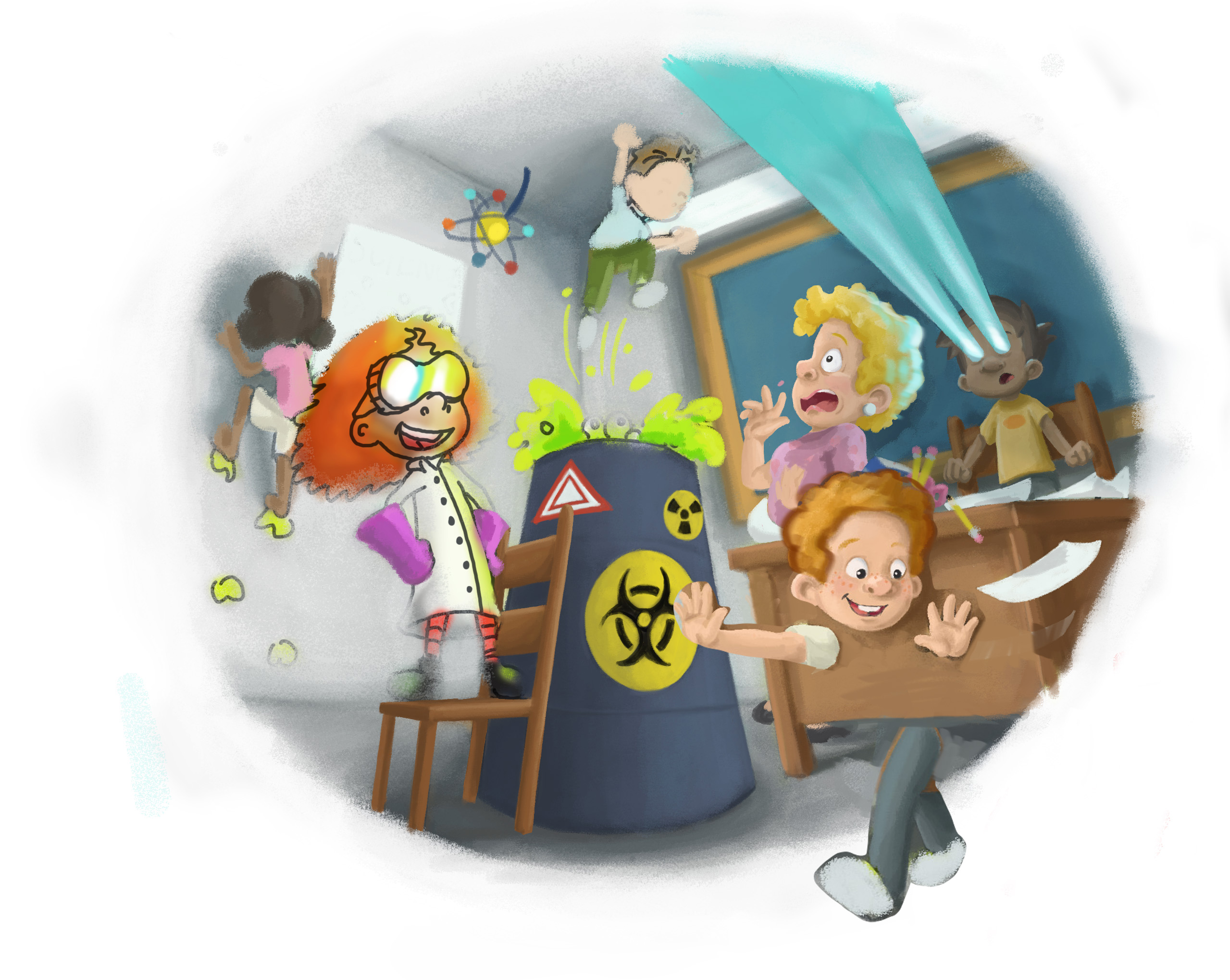
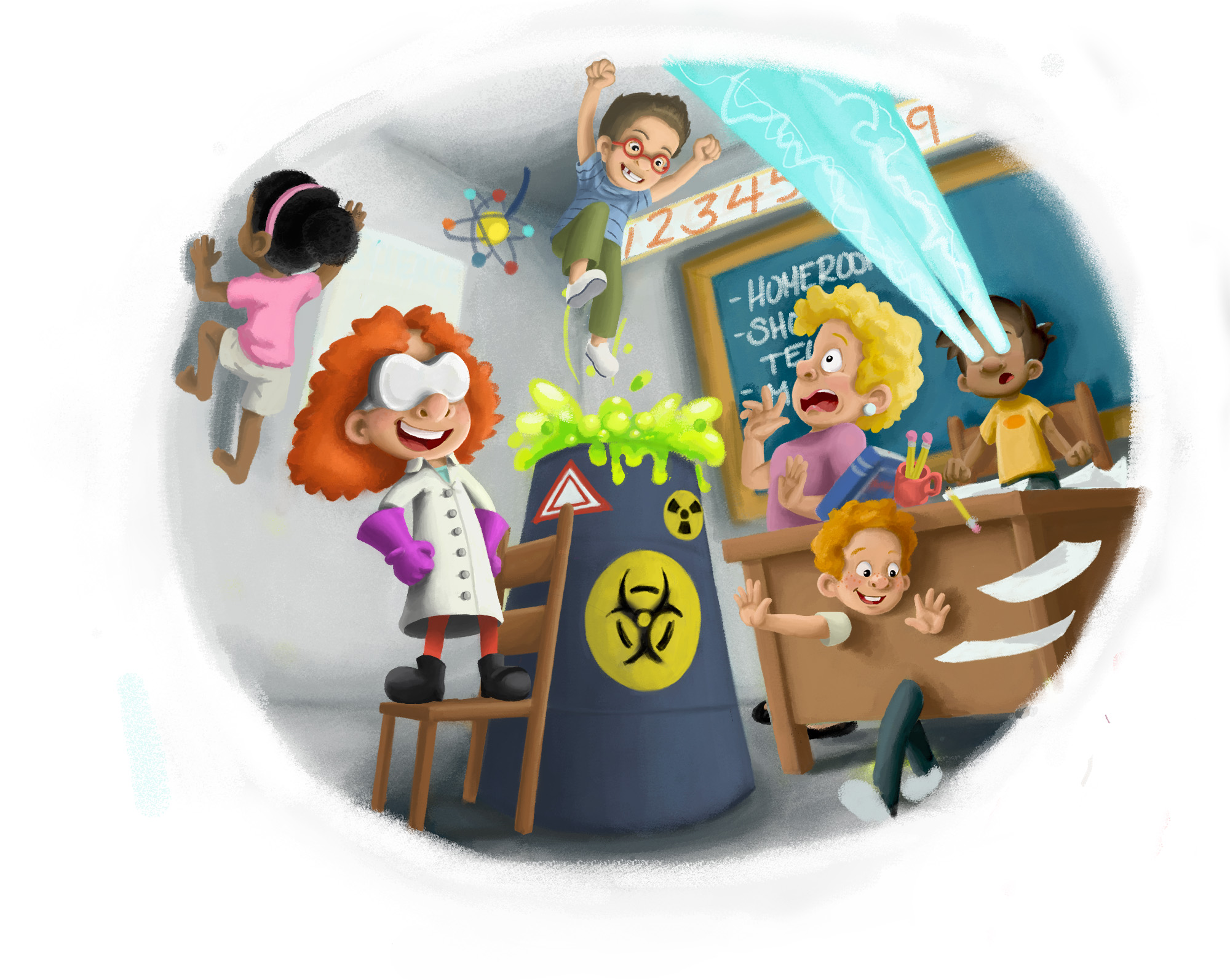
                                        Pretty done with the general painting (still finishing the wall climbing girl), now I'm moving on to light, edges and general perfecting. Pretty happy with the characters and I think the lighting will unify the picture a lot more. Any thoughts?

                                        march 3rd 2 up3.jpg

                                        www.brittanyharrisillustration.com/
                                        www.instagram.com/britillustration/

                                        Kevin Longueil 1 Reply Last reply Reply Quote 5
                                        • Kevin Longueil
                                          Kevin Longueil SVS OG @bharris last edited by

                                          @bharris This looks great! One thing that pops out though is the numbers above the chalk board do not follow the perspective established in the rest of the piece - i think the high contrast of the white background behind the numbers makes it stand out a little more than it would otherwise too - looking forward to seeing the finished piece - great concept!

                                          Portfolio: kevinlongueil.com
                                          https://www.instagram.com/kevinlongueil/

                                          1 Reply Last reply Reply Quote 1
                                          • bharris
                                            bharris last edited by

                                            Thanks Kevin! I'm testing out the posters and the colors. I don't want them to stand out too much of course!

                                            www.brittanyharrisillustration.com/
                                            www.instagram.com/britillustration/

                                            1 Reply Last reply Reply Quote 0
                                            • First post
                                              Last post