Feedback for Portfolio Website
-
@Geoffrey-Mégardon I think the website is great, it's easy to nagivate and well presented! The only thing I would say is that there are two pieces that seem to be in a different style to the rest (fourth row pictures 2,3).
I am not one to say anything about that because I have no consistent style, but the rest of your work is very cohesive in the colors used and especially with the use of lines, and these two have a different color palette and no line work (or less). They are both very good pieces however, so maybe it would show a breadth of your work.
Sorry my post isn't saying anything concrete really!
-
@Asyas_illos thank you for the feedback! I am happy you like it
")
@Mimi-Simon thank you for all the suggestions! I am going to work on it today
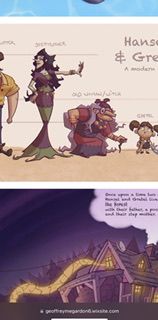
I think I will add a filter at the top so we can see concept art stuffs vs illustration stuff. Also, I will be starting a web comics about John Space (the guy who with the big laser gun and the tentacles) from this month. My goal is to be able to say I am working on this webcomic at the moment.@agathe do you mean these ones?
I purposely try to explore a more painterly style while putting my portfolio together as it is a direction I like and it is more common in children's book. I will probably add more of those in the future and make a category for them.Find me on Instagram: https://www.instagram.com/nodragem/
Portfolio: https://www.nodragemillustration.com -
@Geoffrey-Mégardon Yes! I just noticed that those two were the only ones that didn't have as much line work--however I still think they are really fantastic pieces (like the others on your website!)
-
Hi Geoff,
Im very new to all this so I cant really critique the layout of the website BUT I can tell you that those cut away buildings are GREAT! These are the type of images that mini me back in my youth would have (and still do) LOVE! Looking sharp mate! Well done.
-
@Geoffrey-Mégardon I like the website design--nice and simple! And I agree that the two more painterly illustrations look more like what I would find in children's books.
Proofreading note: on your "about" page, change "developped" to "developed"
-
3 things I like:
- Consistent art style
- Very good anatomy
- Interesting color palettes
3 things to consider:
- Website not formatted for cell phone (see screenshot). I have to click the image to see entire piece.
- Suggest you split your character development and narrative pieces to different tabs.
- The top illustration is not your best. The second one with the T-Rex is much better. Suggest dropping the dragon one.
Few extra things to consider:
- I remember you made sweet 16 on your Hansel and Gretel, but Lee mentioned that your kid designs were not appealing. You might want to take this feedback and make your kids cuter. I’m sure agents and art directors will feel the same.
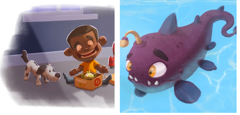
- The kid opening the toy box is a bit scary looking. Is that what you’re going for?
About Page:
You might want to emphasize what you’re going for in illustration. Do you prefer character development or picturebooks?Great work overall!
-
@Jeremy-Ross thank you for your feedback!
-
at the moment, even on desktop the picture are shown on a grid and you need to click to see them full. But I do want to change that and show pictures in full directly. I just need to find a solution so that portrait pictures don't look too big.
-
I also want to do that
and add more design work. -
yes, the T-rex vs RV and the John Space vs Tentacles are my latest pieces and are probably the best one technically. Is there something in particular that you believe could make the Dragon and the Boy a better piece? what is it that makes you want to drop it? I would like to know what to avoid repeating.
-
I am not sure what you mean by "you made sweet 16"? I don't remember Lee giving feedback on my character, was it in a video? there was a discussion on the boy looking too old when presented out of context (alone) on the other thread. The issue is to have to redraw each panel. It might be less mentality demanding to work on new things and drop these pictures as soon as I have better ones. I need to think about it.
-
the kid opening the box was actually made to demonstrate that I can draw a more traditionally cute boy (as opposed to Hansel who was not meant to be cute). So if it looks scary that is an issue
 ! Are you able to point out what make him feel scary?
Thank you again for your feedback!
I hope I will be able to fix some of these issues soon. -
-
@Mimi-Simon @GabeRobinson
I updated my about page: https://geoffreymegardon6.wixsite.com/my-site/about
Thank you for your feedback, I hope it sounds better now! -
@Jeremy-Ross sorry to ping you twice in a day
 I just remember that I did redesign Hansel and Gretel after I’ve got feedback from the other thread and then I forgot to update the lineup of character. As I forgot about it, I did another attempt today too
 So anyway, here are some new designs (Gretel is the same on the two pictures on the right).
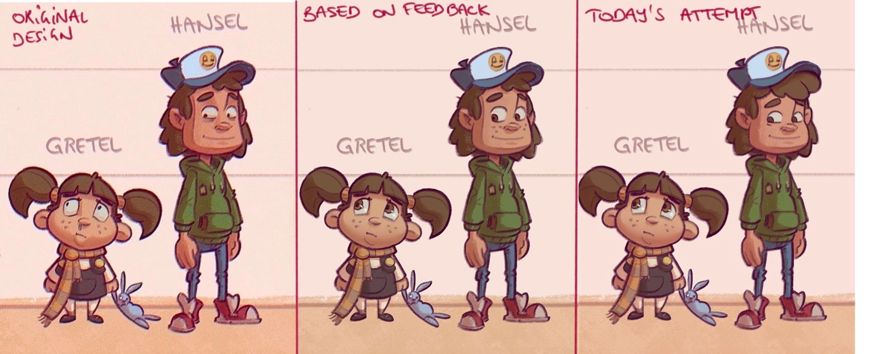
In today’s attempt (3rd column), I really try to push Hansel to a traditional small boy face with round shapes (round cheek, rounder hair, larger irises) while keeping the same silhouette.
Although I think I succeeded to make Hansel a cuter little boy, I think the previous attempt (2nd column) hits the right spot between being cuter, and being part of a grim-ish story.
Concerning Gretel, the cutter version works well for the story I think.
What do you think?
Find me on Instagram: https://www.instagram.com/nodragem/
Portfolio: https://www.nodragemillustration.com -
@Geoffrey-Mégardon oh yes so good I love the third one for them both!
You could also perhaps move his ears a bit forward and down just very slightly and it might help him look even younger. Kids features tend to be more concentrated with more head space in the back. Just a thought, though really they look great to me. -
Hi @Geoffrey-Mégardon, much better!
Regarding your other question about the dragon, there’s nothing wrong with the piece; it just seemed to lack some storytelling. The quality is well done and well rendered.
Regarding the boy looking creepy, perhaps it’s the yellow iris, which gives off “evil villain” vibes. Also, the toy looks pretty terrified….
Here’s what came to mind.
-
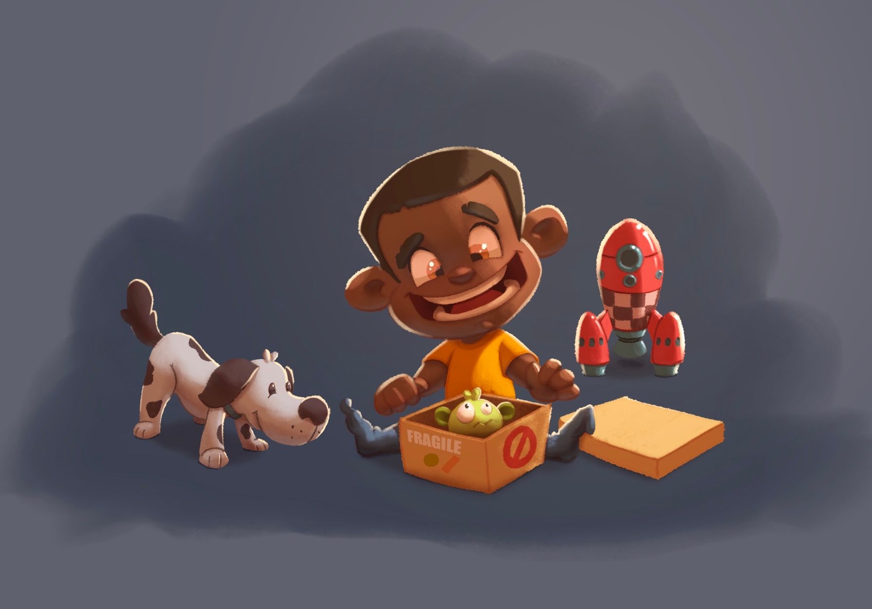
@Jeremy-Ross ha yes indeed, that’s scary!
I tried to improve the picture by decreasing the size of the smile and removing the yellow of his eyes. Does it make it less scary?
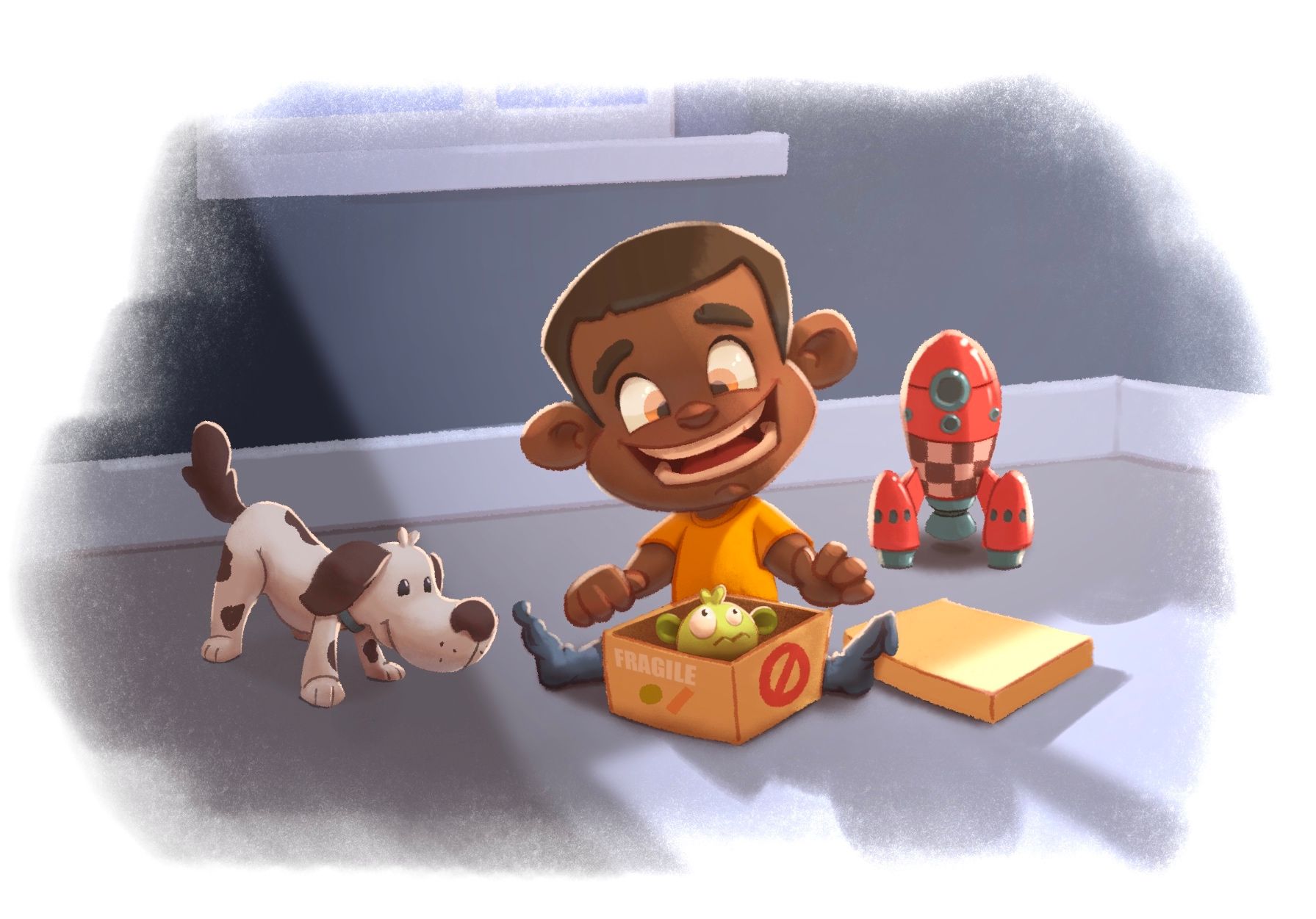
The original kid looks like that for reminder (I could not find it with the same background
sorry):
Find me on Instagram: https://www.instagram.com/nodragem/
Portfolio: https://www.nodragemillustration.com -
@Geoffrey-Mégardon To me that's a HUGE difference!
Doen't look creepy anymore. -
@Geoffrey-Mégardon I really like your website! I viewed it on an iPad and everything was super easy to view and navigate. Well done!