Just venting my horror...
-
@Robyn-Hepburn Ahhh. Such a short notice could also mean that the previous volunteer person bailed for whatever reason, as is often the case when nonprefessional engagements have to be deprioritized when their paid workload, family obligation compete for their time.
I'm sorry you are going through this. I was the go to poster and concert booklet design volunteer for a choir I was part of ages ago, and it was fun for the first few but after that I moved on...
-
@Robyn-Hepburn I don’t know if anyone else has experienced this same phenomenon, but I have had pieces that took me weeks to complete that I was incredibly proud of, but when I showed them off to an audience, they would get a collective shrug. Conversely, there have been times that I’ve put some piece of crap together really fast, and they’ve gotten a lot of “Oohs and Aahs.”
-
@jvartandillustration Haha! Yes, I know that feeling. Thanks for the encouragement - hopefully my cobbled-together attempt will have that effect this time.
@ArtMelC @lpetiti I did wonder about that. It's possible that someone's bailed last minute. It's a very professional team and they're usually on the ball.
I did their poster last year and it took months, but they were easy to work with, however there's always that last bit of back and forth - finishing touches - that takes ages... But I'm hoping Canva can help with that: I can give them the poster on that and they can move the extra elements around, make things bigger or smaller etc - all the practical design stuff.That's a great point about them being artists themselves - especially running a theatre festival, they should definitely have a better understanding of the work that goes into it, so I should be able to be upfront with them.

@Blitz55 The amount of disappointing images and design work all over the place is upsetting. I'm often tempted to offer better logos and illustrations to everyone, or least my well-meaning critique and suggestions for improvement
 but I don't think they see the value of well-made images.
 -
@Robyn-Hepburn Here’s your chance to give generative AI a try.
 Just kidding.
 -
@danielerossi Scary thought.

-
@Coreyartus
 I think they either lost their artist or they're taking me for granted because I did it for them last year. Yes, they are non-profit.
I told them I'll try make them something simple, with the backup plan that they just use a photograph.
I've used today to see if I can do something quick and easy - a shortcut - and it failed. Arg.
I'll show them what I've got and say if they don't like it, they can just go with a photo.
Either way I'm asking for a big advert in their program and lots of chocolate. (I'm in the UK, so I don't have to pay taxes until I actually start earning a proper living, which I'm never going to do if I keep taking these unpaid jobs.) -
@Robyn-Hepburn I gave them 3 very rough sketches to chose from (and have discovered that rough is bad, because it leaves too much open to interpretation). They chose this one:
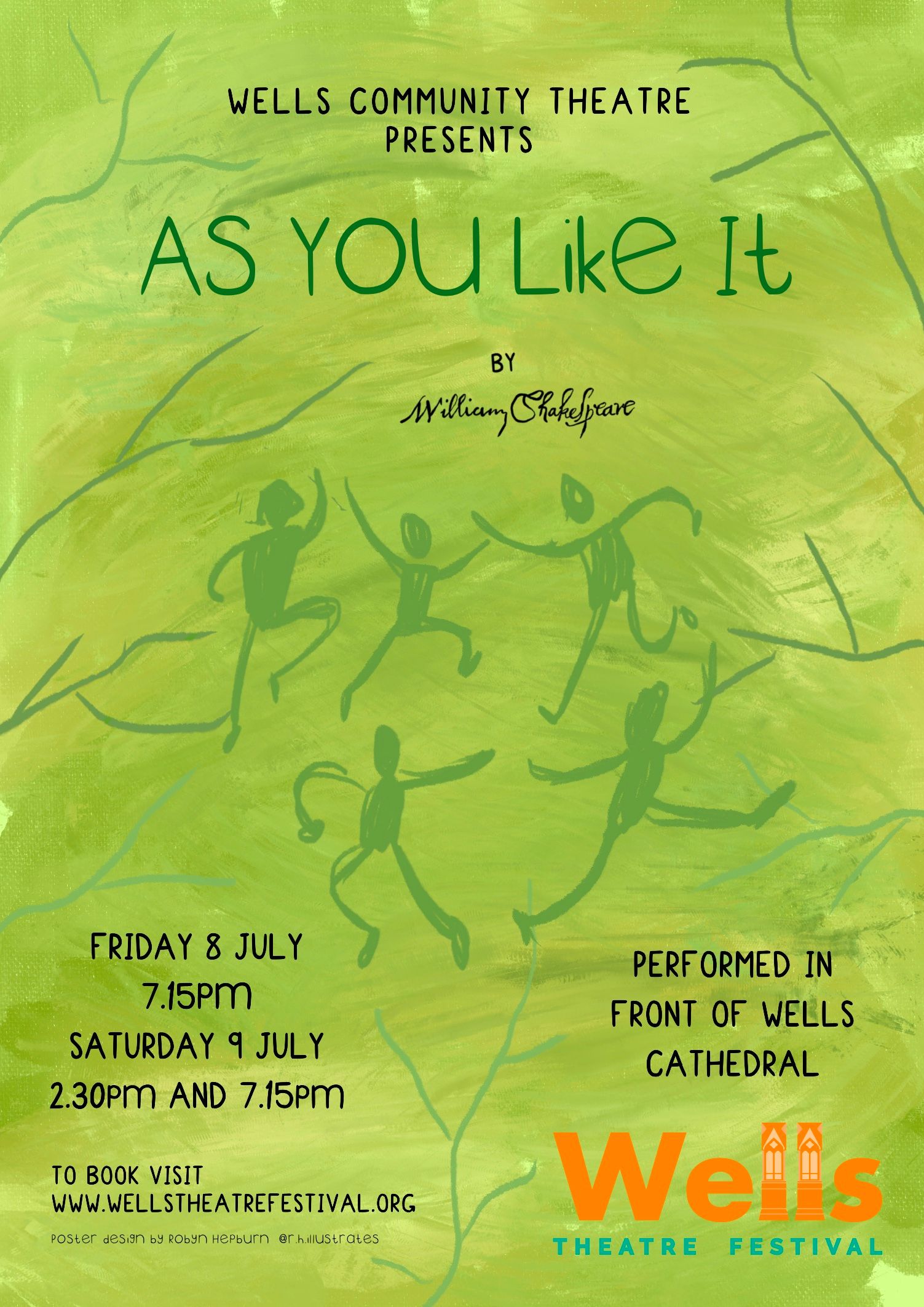
(The info is from last year's poster that I used as a template. Thankfully they've agreed to do all the text parts themselves!)Here's what I worked on today:
Part of me hopes they choose to go with the backup plan: just using a photo, but they better tell me now or never! 🥴
If you have any feedback at this still-pretty-rough stage, I'd love you hear your thoughts! -
@Robyn-Hepburn Wow, nice work for putting something together quickly.
")
A few considerations in case they help!
-
If you squint while looking at the poster it is difficult to read the title because the orange is so similar in value to the green. This will make it hard to read from far away, so consider changing the value of the title so it really pops.
-
I like the red dresses and larger figures personally, but I'd move the foot from behind the text.
-
As a Shakespeare illiterate person, I don't know the theme of the play, so the dancers don't convey much meaning to me. Could you add a brief line of text describing the play?
-
Cool background. I think you've done a great job with the timeline you're working with.
-
-
@KathrynAdebayo Thanks for your feedback! Much appreciated.
I totally agree with your first 2 points, I'm just leaving everything to do with the text until last. If the images end up larger I'll move and charge the text to fit nicely etc.
As for the story, I think I'm going to include some love notes hanging from the trees somehow... Or a guy carving his love's name on a tree.
I was thinking of including the line "all the world's a stage" or "all the men and women merely players," but I'm not great at incorporating text with image, so I'll play to my strengths with this short deadline!
Thanks! I like the background, just worried it will make the overall image too messy or busy... Well, we'll see how things progress today... -
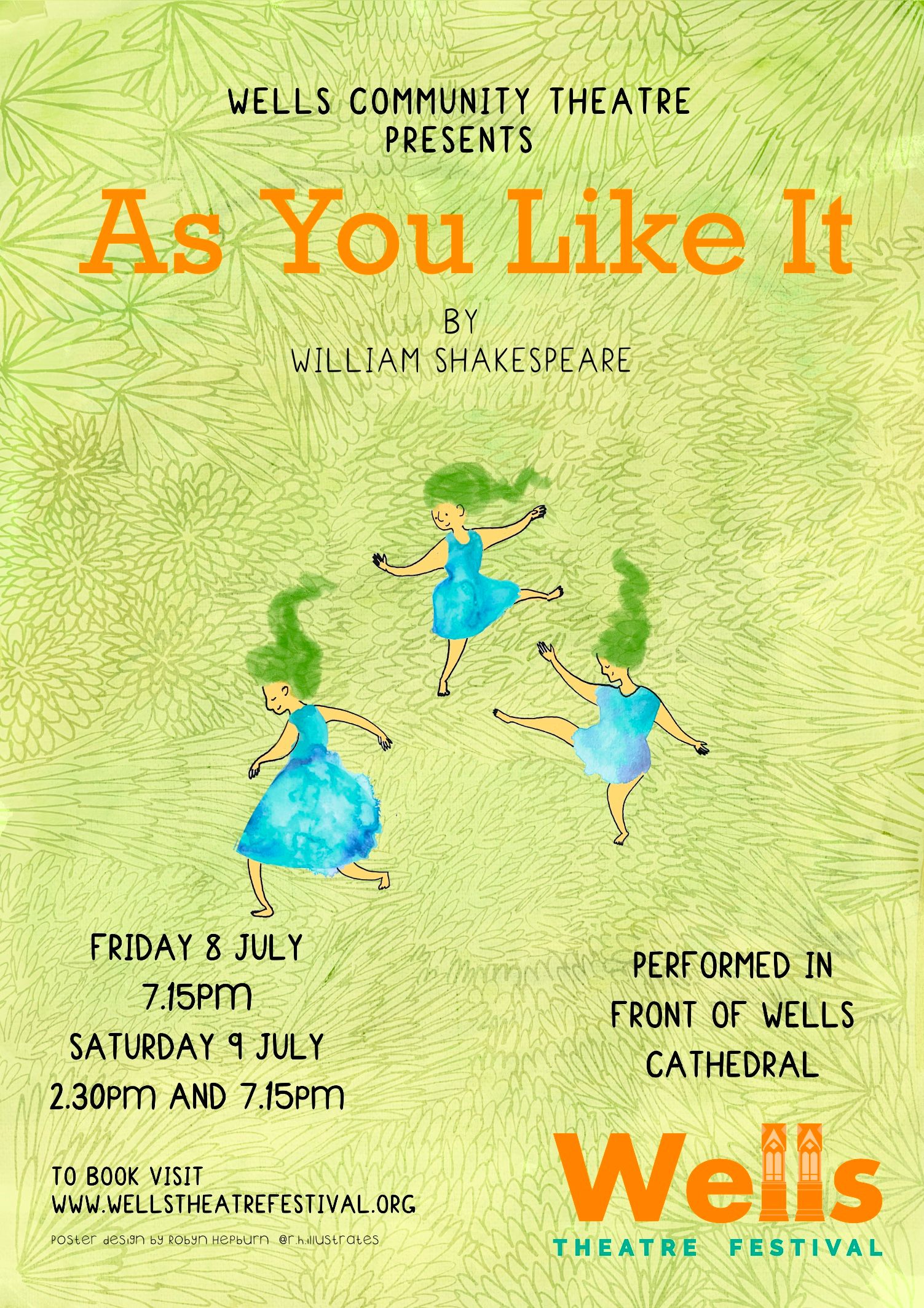
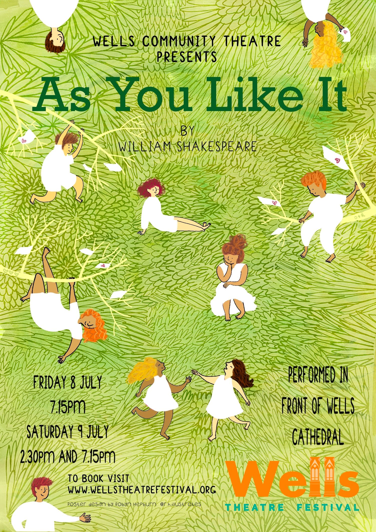
What is looks like thus far... At least an improvement I think.
I thought I'd go for lots of colours against the green background, for the fun of it, but I can always change that later. (I'm not naturally a limited-colour-pallette kind of person.) I'm also planning on giving them various skin tones, so I might make their clothes all the same colour... I'm just thinking out loud now.
It's quite busy and I'm not sure people will know what to look at, so I'm still working on where to place the people.
I'm also going to add some love notes in the branches.
-
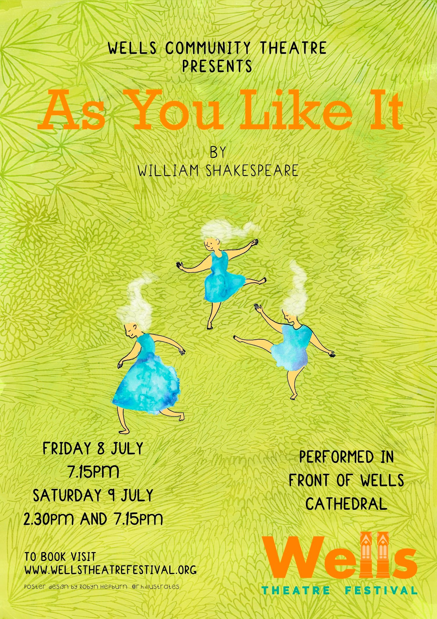
I think... I'm finished...

Just got to do the text-stuff now.
What you think? Is there anything I'm missing? Any mistakes?
-
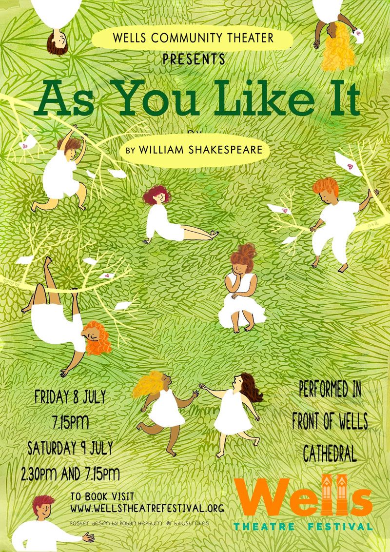
@Robyn-Hepburn This looks really amazing, and I can't believe how quickly you made this!
The only thing is that the text is quite hard to read, especially the Theater line and William Shakespeare. There are multiple ways to fix this. You could make the green lines in the background paler just behind the text to improve readability, or erase the lines behind the text.
You could also add a shape behind some of the text like this:
vanessastoilova.com
instagram.com/vanessa.stoilova/Check out my Youtube channel for tips on how to start your career in illustration! www.youtube.com/c/ArtBusinesswithNess
-
@NessIllustration The credit line is also really hard to read with a triple threat of small size, thin lines and funky font! I can't for the life of me make out your Instagram handle
 This is your time to shine to choose a simpler and thicker font!
 -
Hey,
i did take a closer look and the progress is nice so far.
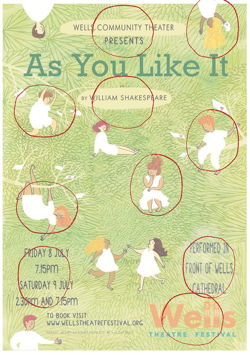
I have some suggestions though. ( i went forward with the suggestions of @NessIllustration )I will show two suggestions.
The one with the circles is showing, that everything is kind of using the same space.
Every part of the poster is as big as the other, the Font, the People.
you can absolutely work with different kind of sizes. maybe the guy on the tree is nearby and bigger then the others or something like that. it could make it more interestingYou also could google sizes for fonts on Posters.
I don't know how big the poster will be printed. but if its around A3 its big enough to make some fonts smaller.
There are suggestions out there you can use for your design.Also the Logo of the Theater is BIG. it dosnt need that much space. Its not the most important object, still you choose to make it bigger than other parts on the Picture
I would recommand to google for posters though, mostly they choose to go big with the font or big with the visual element.
You Choose how much time you will put in for free, but now it's gonna represent you out in the wild, so i would choose to shine like @NessIllustration said.
Website: www.von-Nimmermehr.com
Instagram: https://www.instagram.com/von_nimmermehr_illustration/ -
@von_Nimmermehr @NessIllustration
Thank you both so much for your feedback. I appreciate how much you've put into this (for free too!)
Because I've pretty much left the typeface/text/info choices up to them, I hadn't really thought much about all that, but I'm definitely going to use a few of your suggestions before I hand it over to them:
I'll make their logo smaller and maybe even cheekily add my own!
I'll add a lighter green behind some of the text; it looks really nice how you did it.
I'll also make some of the people larger and smaller to show some depth.
Thank you all again for all your invaluable help with this! I'll be sure to post the finished poster with the autograph.

-
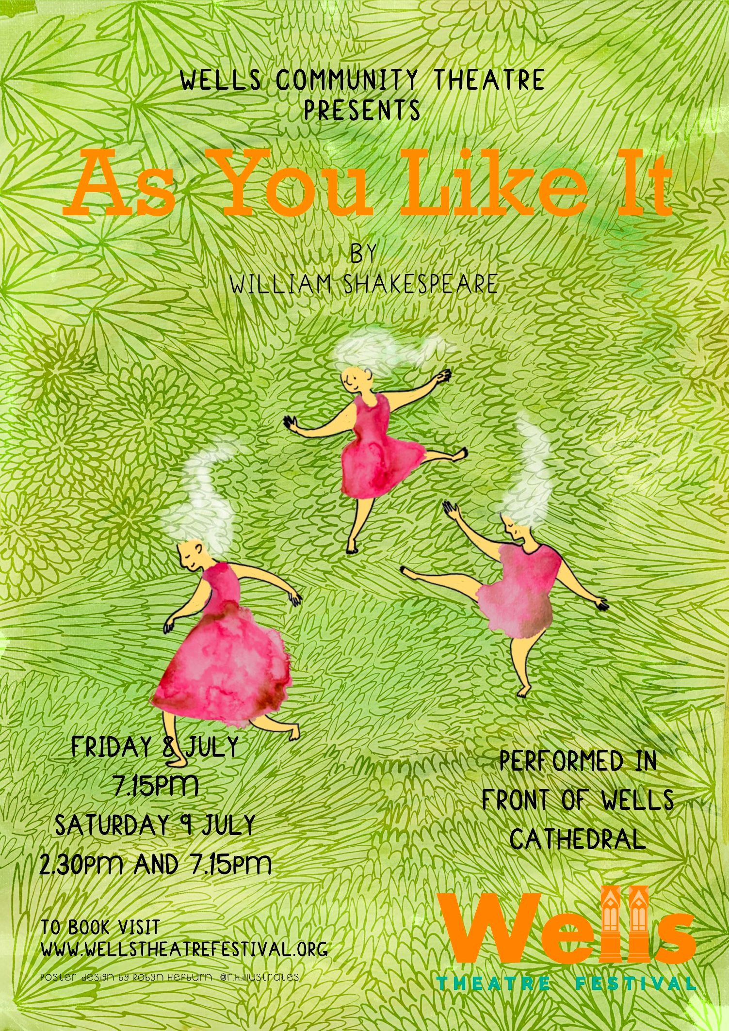
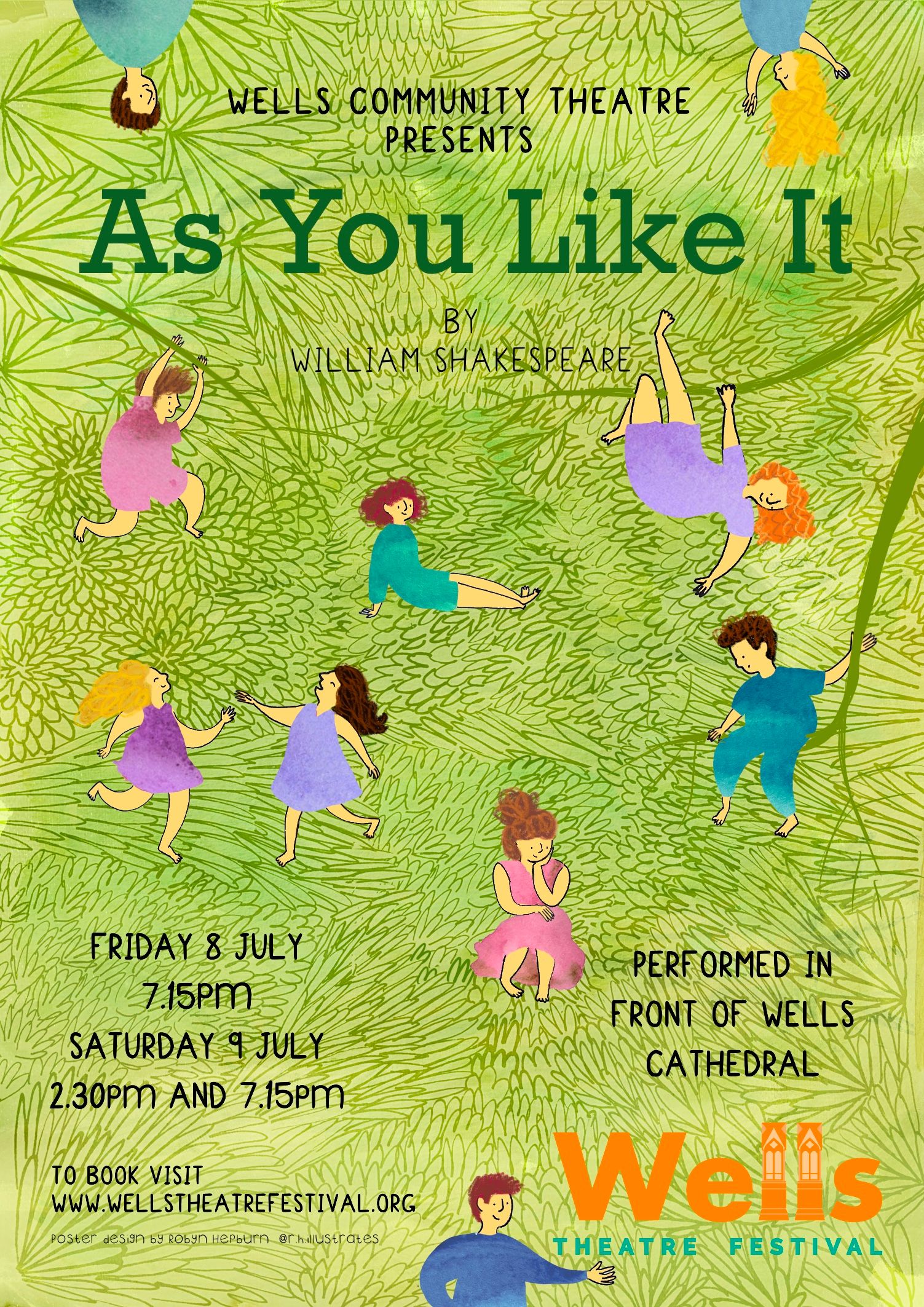
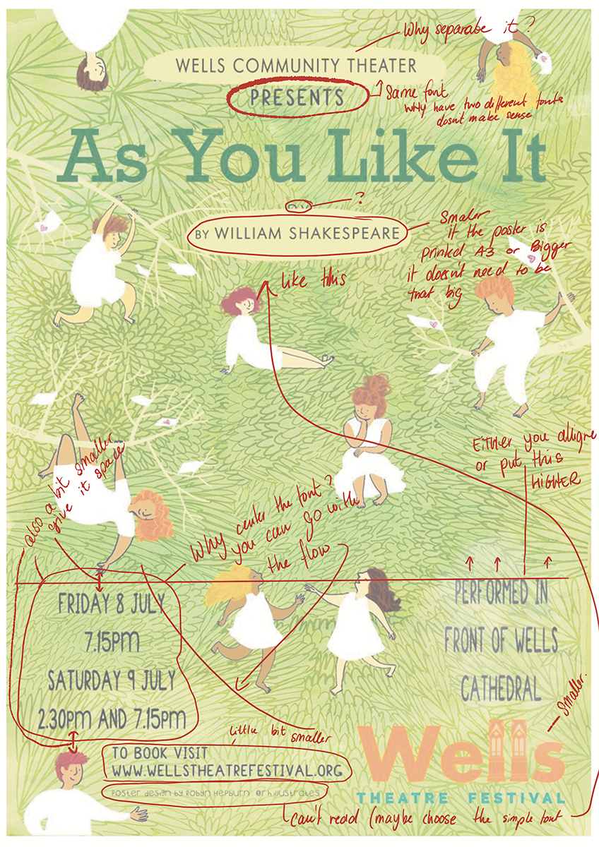
Thanks for all the help all you guys gave me. I managed to get it all done in 5 days! Thankfully they were easy to work with and knew what they wanted without over-directing me.
This is the finished poster (no more criticism please!)