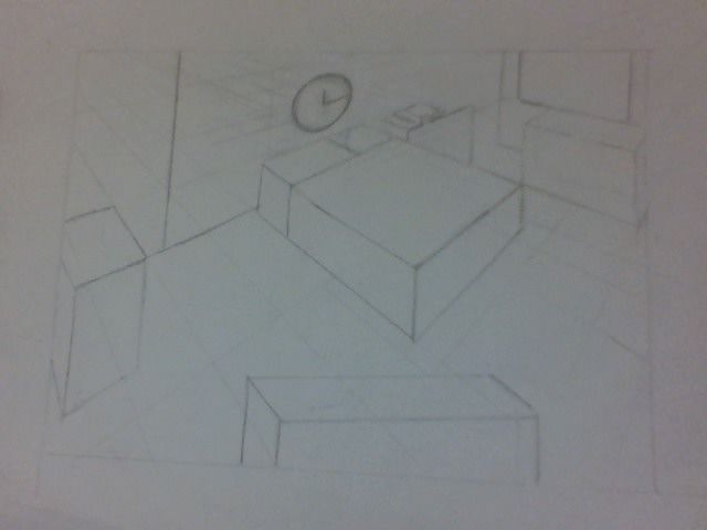
Basic Perspective final
-
@Kevin-Longueil oh wow I went through the class really slow and yet I guess I am on the longer learner's curves!! I should go through it again. Wow ok hard not to get down on myself. But it is what it is. I will keep going and not give up
I will try a small box first on a paper and then try on a big paper thank you for even making me a sketch to illustrate very very giving ( why are you so giving lol )
) -
@Blima-Spetner Yes. It is perfectly normal for this to take hours as you are starting.
Keep in mind you are creating an optical illusion here. The illusion of 3D space on a 2D plane. This is a mind bending task! I remember watching an old PBS documentary about the artists/mathematicians who originally figured all this out and it blew my 9 year old mind!
Be kind to yourself. Recognize your successes and build on them. It gets easier -- but the learning never stops.
-
@davidhohn Thank you for giving me feedback.
This is the retry. Please tell me what I did wrong ( and right LOL)
I can see the circle is off and the dresser/toy chest whatever you want to call it- it is the south of the page) looks off as well
Thank you
-
@Kevin-Longueil wow you are good. way past my skill level but I am learning
-
@Kevin-Longueil is this better?

-
@Blima-Spetner This is the retry. Please tell me what I did wrong ( and right LOL)
I can see the circle is off and the dresser/toy chest whatever you want to call it- it is the south of the page) looks off as well
Thank you
-
@Blima-Spetner looking good! I have a question about the object in the foreground. Is it an addition or is it supposed to be the bookcase on the south wall? If it is an additional piece of furniture that you have added it does look like it has a different horizon line than the rest of the drawing. I had a crack at it and added a picture below. Thanks for the compliment
 I am using procreate though which makes this stuff super easy. I ended up needing to put the vanishing point very far away to get the positioning right. Great job sticking with it. It really does look improved!
-
@Kevin-Longueil thank you for your patience I still can't believe you have stuck with me and are still taking your time to help. YES that "object" does look like it has a different horizon but I keep measuring it goes to the same vp!!
I don't know why it looks like that.
What else needs to be adjusted? Does the clock look right at all? -
@davidhohn thank you for your kind words any other feedback
Do you think I should go through the course again or go on to the Visualizing Drawing in Perspective course that seems to follow? -
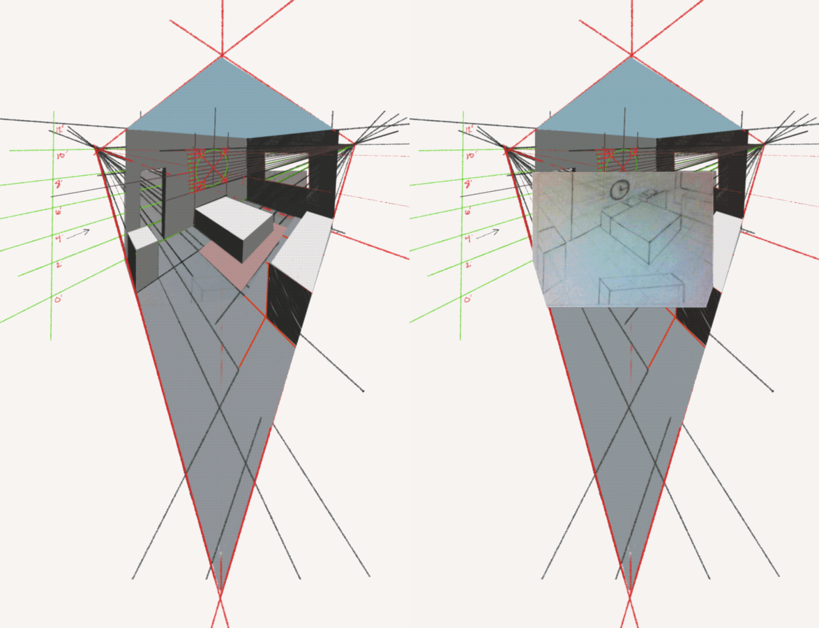
@Blima-Spetner for final adjustments I would say the clock is too low on the wall and the space between the East wall and the bed is compressed a bit too much for there to be room for the side table and toy chest. In the floor plan there is a couple of feet between the side table and wall by my estimation. I completed the room to include the ceiling and floor to show just how distorted a room becomes when the vanishing points are close together. I constructed an oversized ellipse in perspective where the clock would be just to make it a bit more legible. The zero through 12 on the left is just me deciding that the ceiling is 12 feet high and the bed is 24 inches off the ground to help place the height of the oversized clock. I included the bookcase which lines up with the west side of the carpet on one end and the East side of the bed on the other. Having multiple vanishing points by adding a rotated object is doable but is super hard to explain how do do it accurately. There are a lot of YouTube videos on multiple vanishing points though. If it does not have to be perfect but just believable that will make it much easier. You can build a cube in the perspective of the room that your object fits within and rotate it within an ellipse that you draw on the top…easy peasy
 Kidding….hurts my brain a little bit. I think finishing the floor and ceiling really gives an idea of how distorted things will need to look in the foreground though to be accurate.
-
@Blima-Spetner Given the way SVS is set up I would say go ahead and move on the Visualizing Drawing.
Pretty sure that one is taught by Will. He'll cover very much the same info as Basic Perspective but with a slightly different focus. And that's the thing that I've found as I've been learning across the years. A concept that I can't quite get from one class/instructor will suddenly become crystal clear when coming from a different class/instructor.
The benefit really comes from then going back to an earlier class with a new or deeper well of information to draw on. This is one of the things that I like about SVS (as compared to a typical college experience) You can take a class over and over each time gleaning some new insight.
-
@davidhohn thank you again for taking your time to reply
-
@Kevin-Longueil wow you are still with me in this !!!!!!! THANK YOU
Ok can I ask how I can see my image side by side with yours ( the blinking I am older!! makes my head spin) so I can see how you would have done it and how I did it) I will try again from scratch -
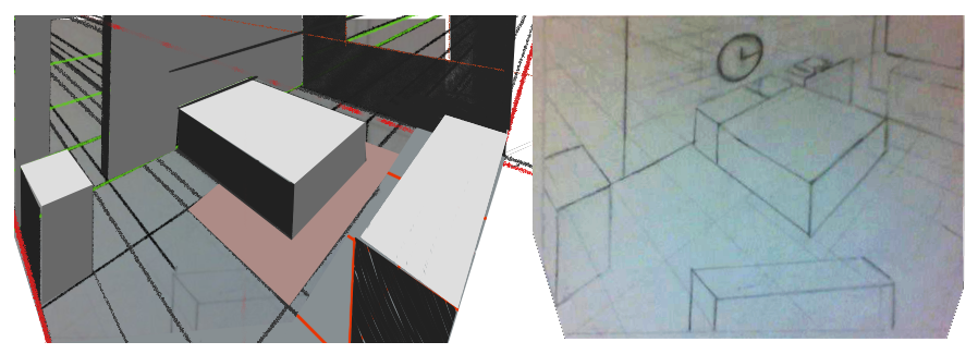
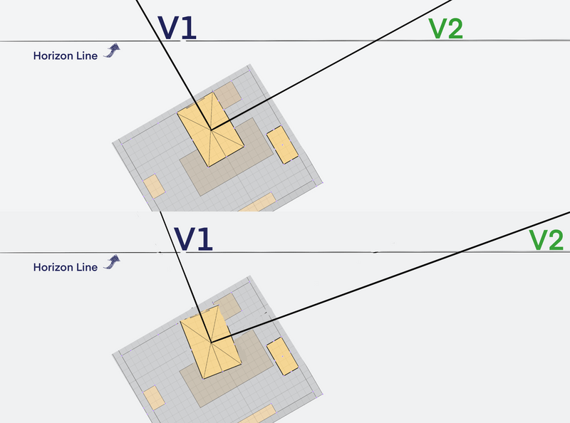
@Blima-Spetner I was worried that the gif would be annoying. Your drawing is good I think. I drew over the top of your drawing just to show the distortion that happens when vanishing points are so close. Only the foreground piece seems off. It looks like it is sharing the same vanishing point on the left as the rest of the room. This makes it feel off. If for instance you were to rotate the bed slightly clockwise the vanishing points for the bed would both move slightly to the right. The farther you rotate the bed clockwise the farther to the right the vanishing points would move along the horizon line…here is another gif. It is an overhead view of the room. V1 and v2 are the vanishing points of the bed as it rotates. This shows that rotating an object changes its vanishing point. Once again, I think you have pretty much got this!

