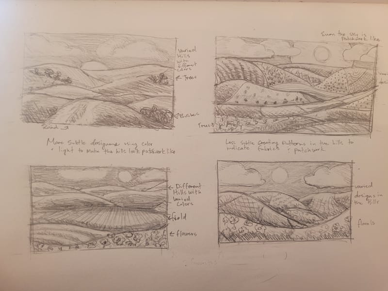
Feedback on thumbnail designs
-
Hey Friends!
I am doing a commission. This is the first time I have done one for someone I don't know.
The lady is starting a business soon-ish and wants to have an image she can put up on her website, in newspapers, and possibly on the back of her business cards.
Her business is quilting, particularly patchwork sewing.
She wants an image with hills, and she has the word "fields" in her business name. she wants a sweet but cute style and she requested watercolor.
I am going to send her some thumbnails to choose from but before doing so I wondered what feedback you all had for me.
Anything I can do to these designs to push them further and/or make them more appealing?
Thanks for any feedback you can give me
")
-
@MerryMary so my eyes love top right in particular because the stylized look of all those patterns in the fields scream patchwork quilt to me! I would personally go for that!
-
Top Right looks best to me, because it guides your eye to bounce left and right, top to bottom, or vice versa. Zigzag pattern similar to making a s curve composition.
-
@MerryMary I think if you move the sun to the right in the top right version then I would go for that. Although the bottom right is appealing, the detail may get lost when printed/seen in a small format such as on a business card
-
@Heather-Foxwood thank you! That is helpful, I haven't really decided which one I like best and it is true this one does seam most patchwork like to me too
-
@kayleenartlover I hadn't noticed but that is true! Now that I look at all of them again, that one does guide the eye through the image the best. Thank you
-
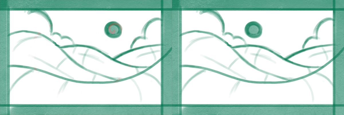
@Gary-Wilkinson move the sun a lot, like all the way to the edge, or just a little smidgen? Also how come? I want to see what you are seeing... is it to balance the lighter tones?
Thank you -
@Gary-Wilkinson also I agree about the detail thing... I'm not sure what do to about it though, since she doesnt want the image to be overly graphic looking and wants a more painterly look, any thoughts?
. -
@MerryMary the image can still remain painterly and less graphic. Although I do think the top right would look great, but I just imagine it wouldn't scale well to a smaller size.
The reason I mentioned to move the sun was just to help the composition more. You have it slightly off center with the flow of the hills moving the the right. When I choose a composition I like my eyes to follow the movement of where other objects are going (which you did well in the top right one). I did a quick sketch to show the difference, but it could just be my personal taste.
-
@Gary-Wilkinson oh yes, I can see that it looks much more balanced with the sun over that way. Thanks very much for the help, friend!