Advice for improvement
-
Hello all!
I'm currently working on some decorative pieces to print and send to a café to sell. They're just drawings that I drew on location in my adventures around England, which I'm editing digitally to keep as much of the loose, messy vibe going as I can.
With this one in particular, I wanted to ask you guys what you think. I'm not sure about the colours, which would be easy to edit without redrawing, but also, if I redrew it, what changes do you think I could make to improve it?
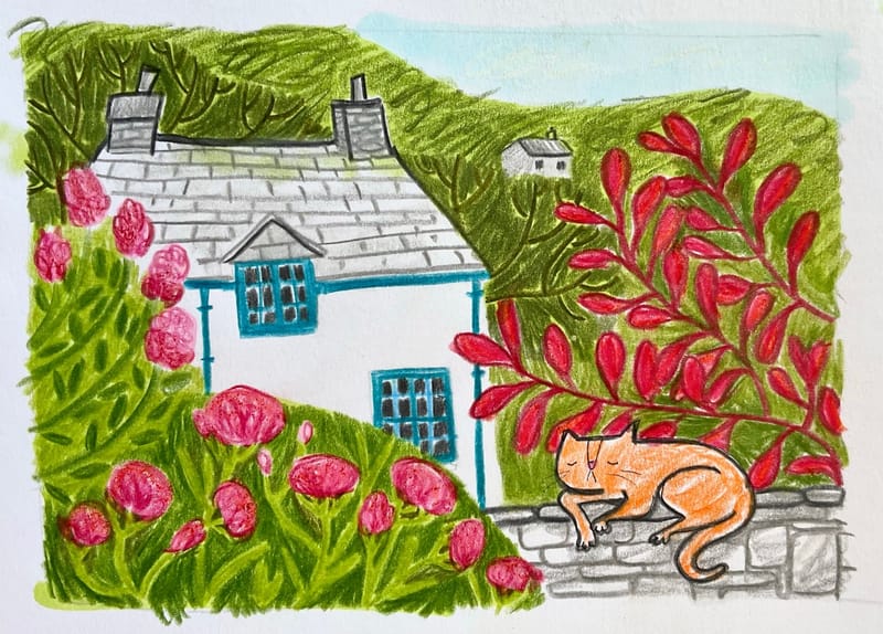
Thank you in advance for any criticism and even encouragement you have for me! -
@Robyn-Hepburn hi! My one advice would be to lighten the background trees a bit to create depth. That's all! All the best.
Portfolio: nyrrylcadiz.com
Instagram: https://www.instagram.com/nyrryl_cadiz/
YouTube: https://www.youtube.com/channel/UCbJCF1Im8ZO7hpGWTKOJMuA -
@Nyrryl-Cadiz Ooh yes, good point! Thank you.

-
I notice 3 things. One, you are using warm colors everywhere except you've used a super cool teal blue color on the window frames and I keep looking at them but I think you want us to focus on the cat. Perhaps use a warmer blue and a cool blue collar on the cat? Also, I think all the little red leaves on the branch behind the cat make it a very busy location. How about arching a branch kind of framing it. The breathing space that will give around the cat will highlight him better. I think you could also leave out the black lines on the tiny white house in the background to set it back. I do like how this makes me feel happy when I look it! keep at it!
-
@Larue
Thank you! That's very helpful. Interesting about the house being the focal point, since that's what it was originally (the cat was added from memory - I'd just met him earlier) and I suppose I wasn't really sure what I wanted the focal point to be. I shall try your suggestions.
Really glad it makes you feel happy! -
@Robyn-Hepburn The thick black outline around the cat throws me a bit! It feels more "cartoony" than the style of the rest of the picture.