Cover help and advice
-
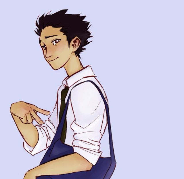
Hi everyone! Im back! Ok I am working on a different cover for a novel im finishing edits on. I set focus and goals using Jake’s Planner so this cover is just a placeholder for me to publish my novel and start gaining feedback. Later during the year I will have more time and work on a different more detailed cover (if needed)
I can always go with just the title and a stencil design, but I really want to show this novel is about these characters. So I have lineart only, silhouettes, or focus on main characters. I would love your help and comments. Thank you
Its a fantasy adventure and I have a draft if anyone would like to be an alpha reader.
Stroogle.xyz (webcomic)
-
@makekong Great start! I would try making the characters just a little bit bigger so you can get some detail into the faces.
As for background ideas, think about the characters and what details would be relevant to your story. Brainstorm a list in words and then do some thumbnails.Or take a look at other covers that have multiple characters and see what kind of backgrounds they have. Examples could be: a big moon, flames/ice/waves/the elements, city, forest, etc. Maybe there could be huge faces of the villains behind the characters.
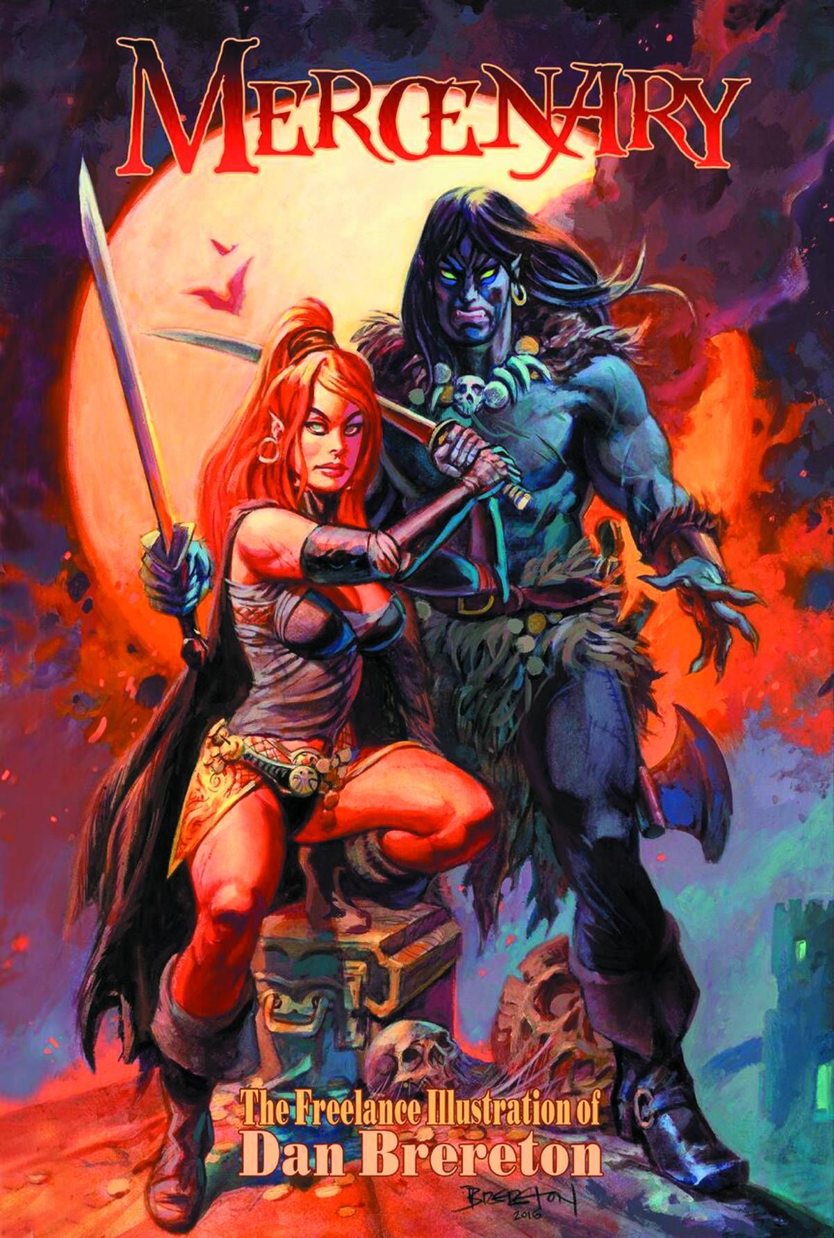
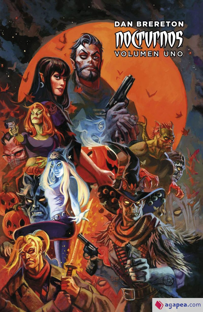
One artist I really like who does these kind of multi-character covers is Dan Brereton.
-
Id love to see your mood board and inspiration / roadmap book covers as well
")
-
@reberlik @R-Fey-Realme thank you!
First - I work a lot in my head so Im starting to get things into boards to help myself.
The plan is to have a high contrast image that works well as a thumbnail and also hints at the theme and story. I mean this because the other cover is a bit more dramatic because the story will be on that tone. This cover is still for a high stakes adventure but I want to add a bit of joy to it
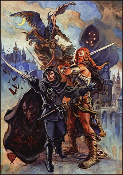
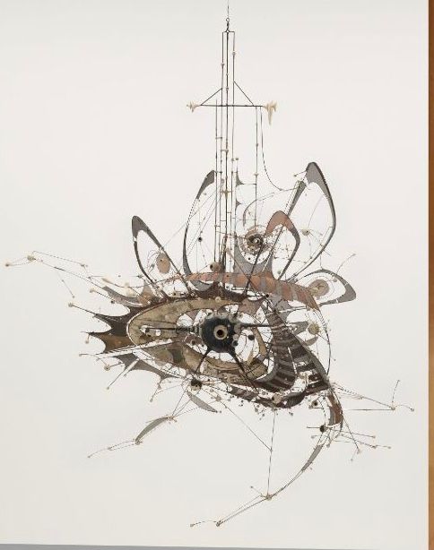
the layout is central like this sculpture (Jake shared in newsletter)
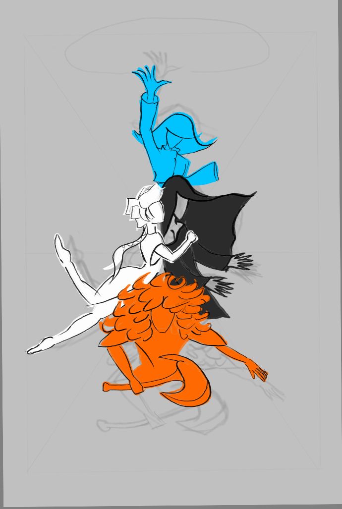
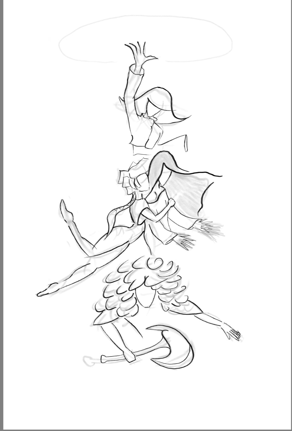
So I arranged the characters in that position because theres a great tip “avoid the lineup” like reberlik shares on the images.
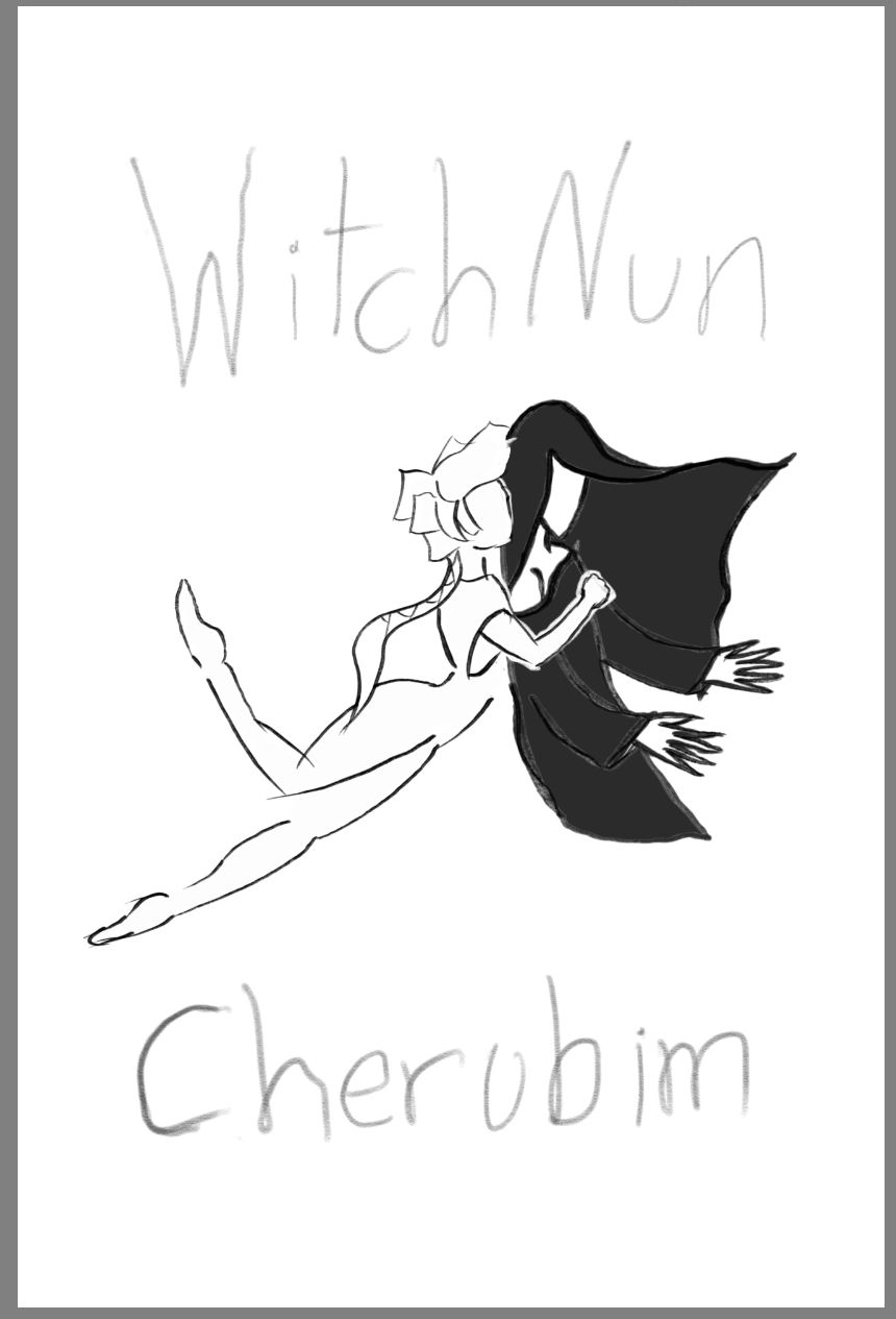
So because of my current skill I wont draw a background so I use it as a high contrast point like manga, But ill focus on the characters. Now I wanted to have this first cover as a placeholder so Iwas thinking on doing silouettes, and then with more time to do a revision -
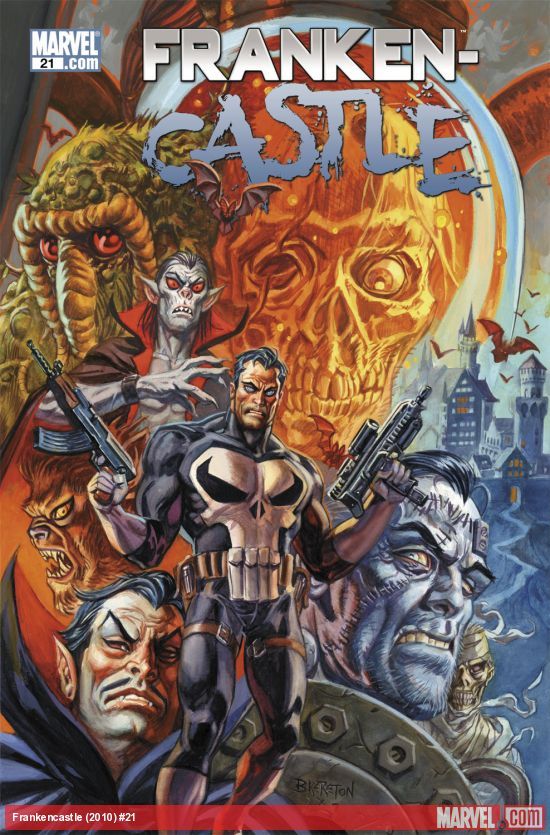
A couple multicharacter covers are these
And for the high contrast, low rendering, and joyful tone I got these ones
-
And I mention thumbnail because the first goal for this is to finish editing my novel and then post it at drivethrufiction. So the cover needs to be a good clickbait at a standard amazon, online webstore browsing size.
When I start editing the second novel, I will start doing Chapter Illustrations for this one and relaunching until I have 3 then Ill kickstart the print editions
Stroogle.xyz (webcomic)
-
@makekong Sounds like you've got a solid plan! Keep up the great work
-
@reberlik thank you and I will still love any comments on the upcoming progress (I will be dealing with faces lol)
Stroogle.xyz (webcomic)
-
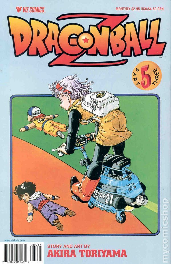
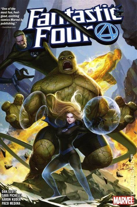
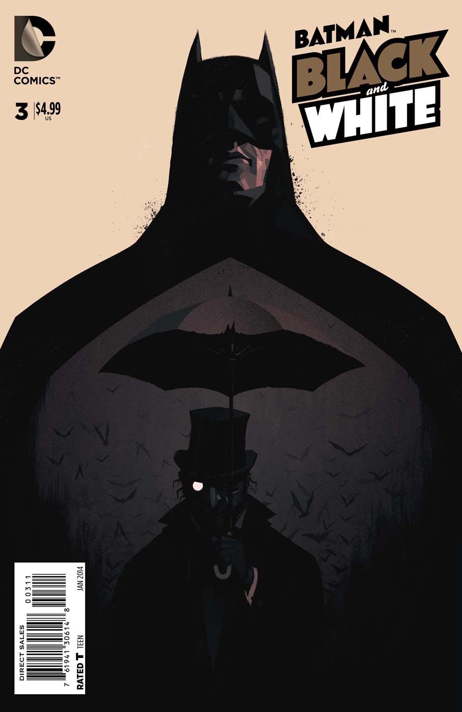
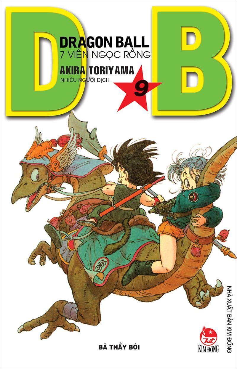
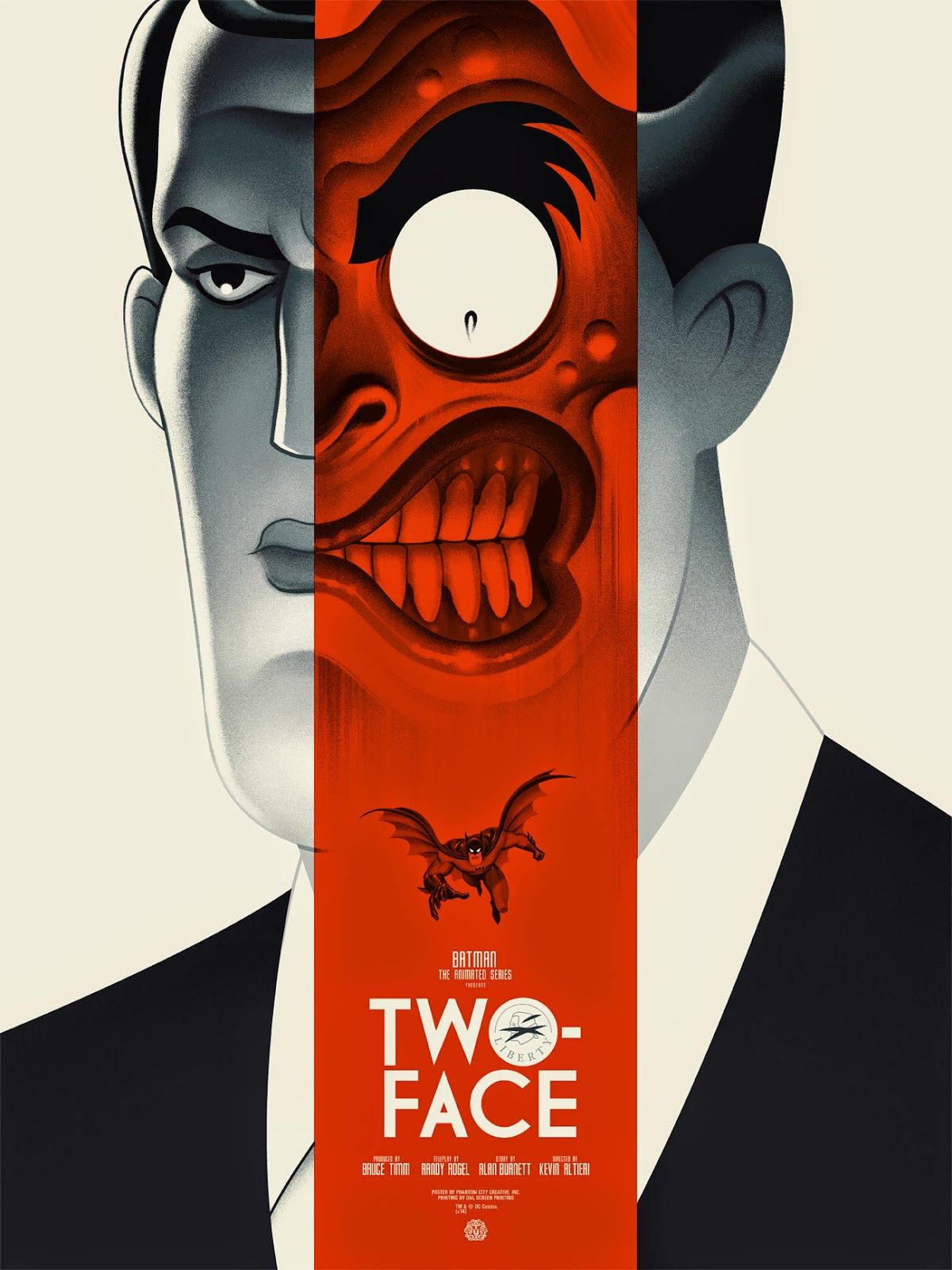
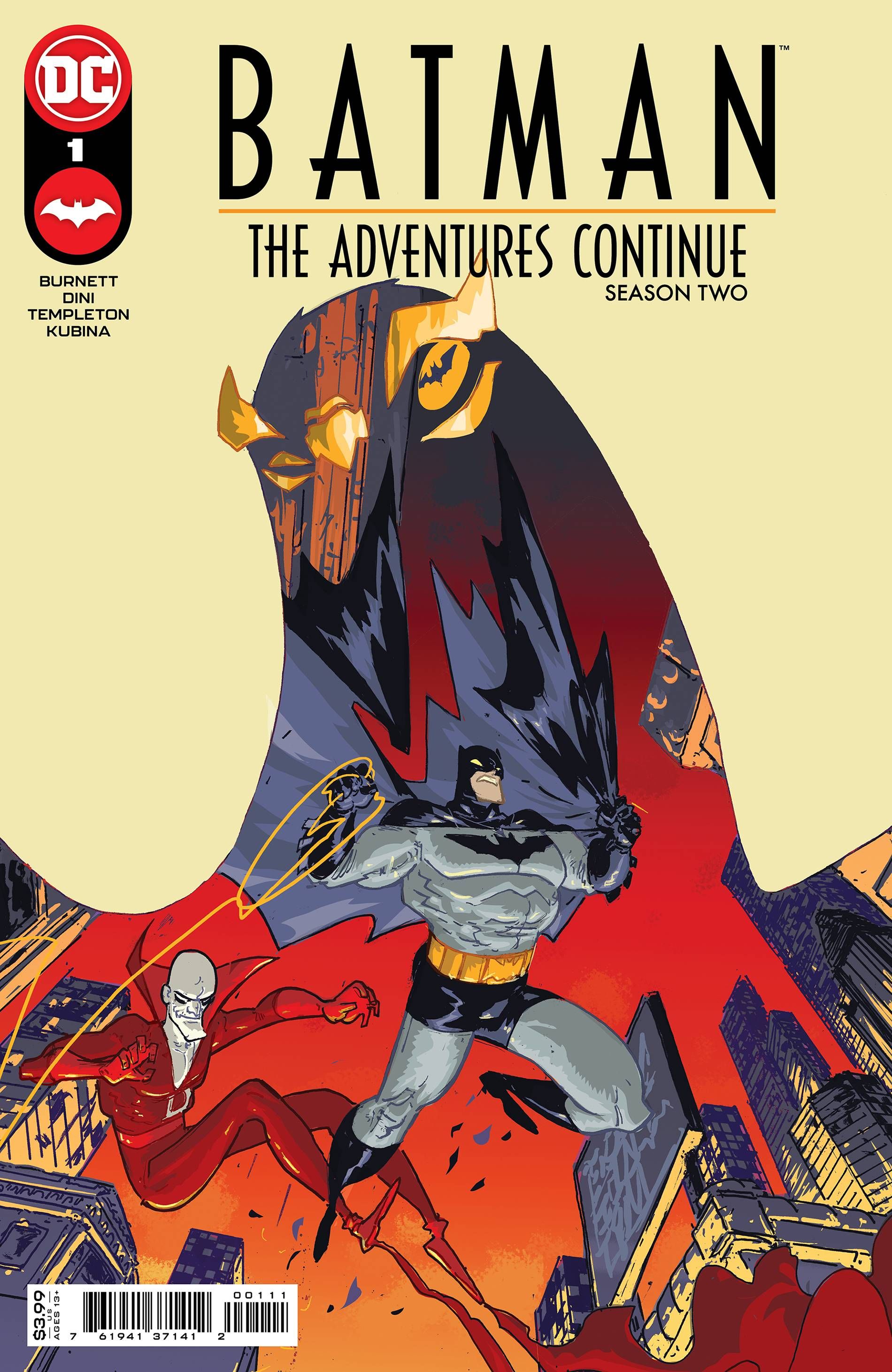
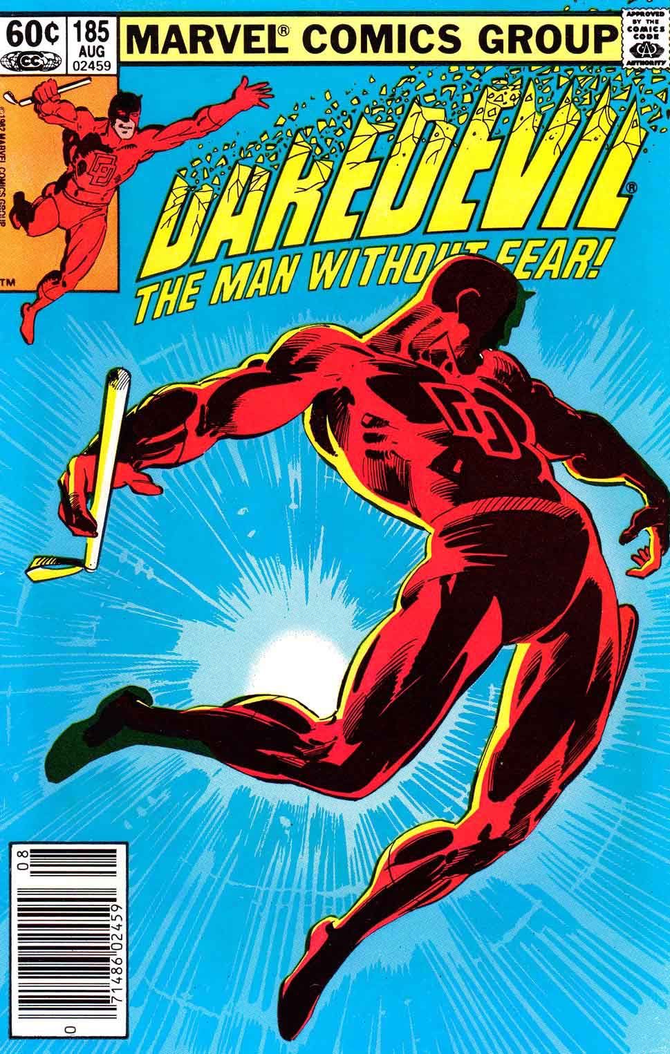
@makekong wow I think you have a good taste in covers, those multicharacter covers you shared are all so fantastic. I must admit that my favorite are the batman black and white and the batman two-face--maybe all the batmans haha. I guess that tells you about my personal taste. The common theme that I am seeing is they all have very clear size variations, conscious silhouettes, and they use the whole space in one way or another. I think this is something you have a lot of room to play with still and it would really strengthen your cover, (all your characters are roughly the same size and tend to be placed in the center of the page). The covers you shared were made with a predominant character and a second-read character(s) that is much smaller. In the case of Dragon Ball Z covers and the Fantastic Four cover they are showing a more dynamic moment--a complete action idea, but they still have a predominant character, and the smaller other characters, all with a very clear silhouette. Another important difference between the ones you shared and the thumbnails you have is how much space the text takes up.
also, be careful not to fall into the contemporary movie poster trap that is just a bunch of people collaged together. They do that to advertise the famous people in the movie (big faces, and lots of small supporting character faces), but the reeally good book covers and comic covers (and movie posters, lets be real) tell you something about the story that grabs you by making an emotional connection with one of the characters.the only manga I have ever read was sold to me in these two images, one by an artist I followed
and the second was the cover of the first volume that I saw online
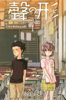
I just had to know who these people were and what their story was!
hope it helps! im excited to see what your next steps are! it is hard getting stuff out of your head, but I know you can do it!Blog: mamatheartist.blogspot.com
Coloring page newsletter: https://bit.ly/Color-in -
@R-Fey-Realme thank you! I have been playing with giving priority to the main characters but I got stuck as I thought it could ruin the perspective. I will chew on it knowing they are not famous faces (thanks for that comment)
-
Wishing everyonr a wonderful weekend. I am Still working on the pitch. But its the story Im working on the cover above. Its a fantasy adventure. Two sisters with no memory of who they are, but with special habilities, search the dangerous dark forest for answers and after a rescue mission they meet two other adventurers who have clues that will help them find what they look for.
-
-
If you are a fantasy adventure reader and took a moment to read it, I am thankful for your help and would love to hear your thoughts.
Stroogle.xyz (webcomic)
-
@makekong back at the cover (this is my “create to promote quarter” so Ill be working on images
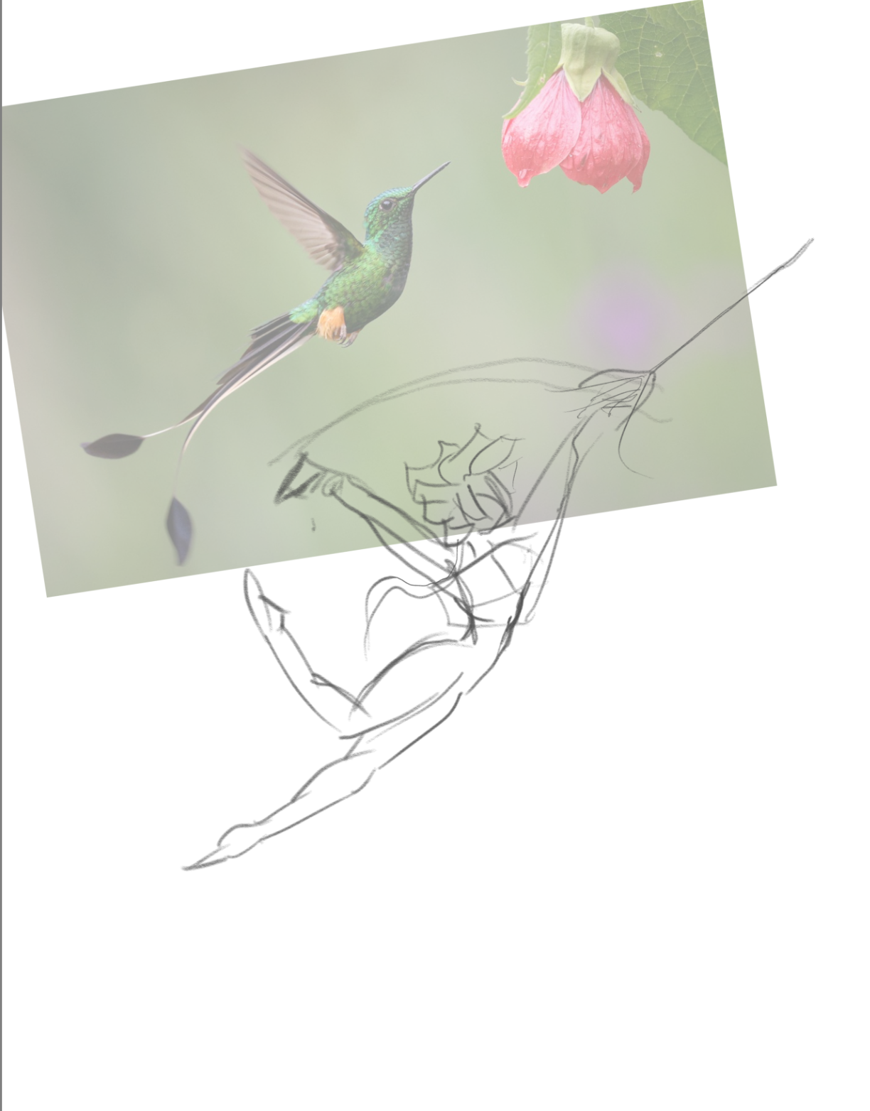
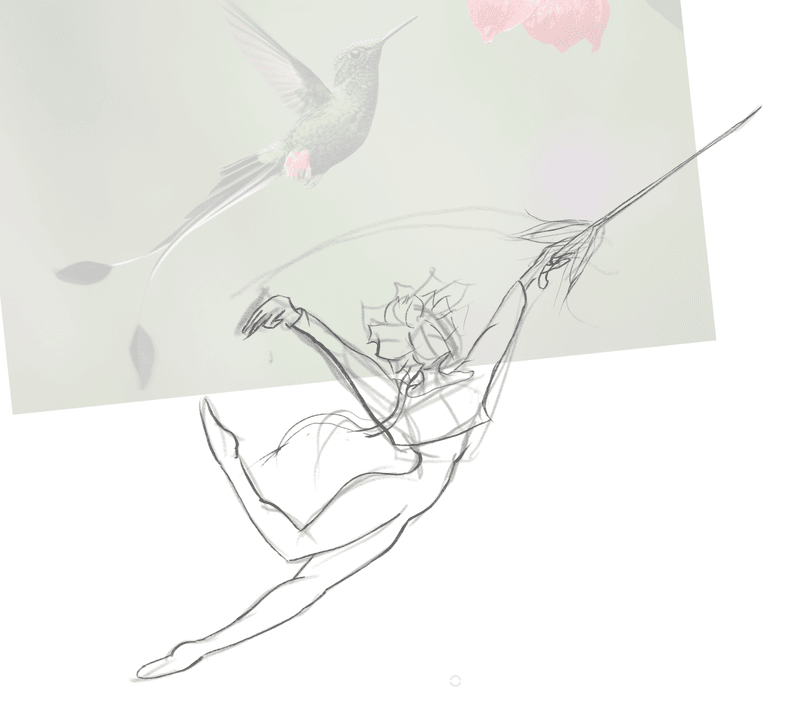
I retraced and would like to start with a single character silhouette. This is The hummingbird< a fencer with short hair and a crop top bolero shirt that looks like wings.
I would like your help with opinion on the pose and proportions thank you!Stroogle.xyz (webcomic)
-