Jack Leapt: Lets share our inspiration and WIPs!!
-
@Larue the kitchen stuff is mentioned in the story above (from the march prompt, the kitchen where he works falls off the cliff, for a middle grade book), i was just trying to keep consistent with that story. As I'm writing this I think I might add some stones falling too...Yea, the clothes, dark brown or black are consistent with the character, maybe i will make the cliff lighter for that... not sure how to get around that and sabotage the character/story.
Thanks for the feedback
-
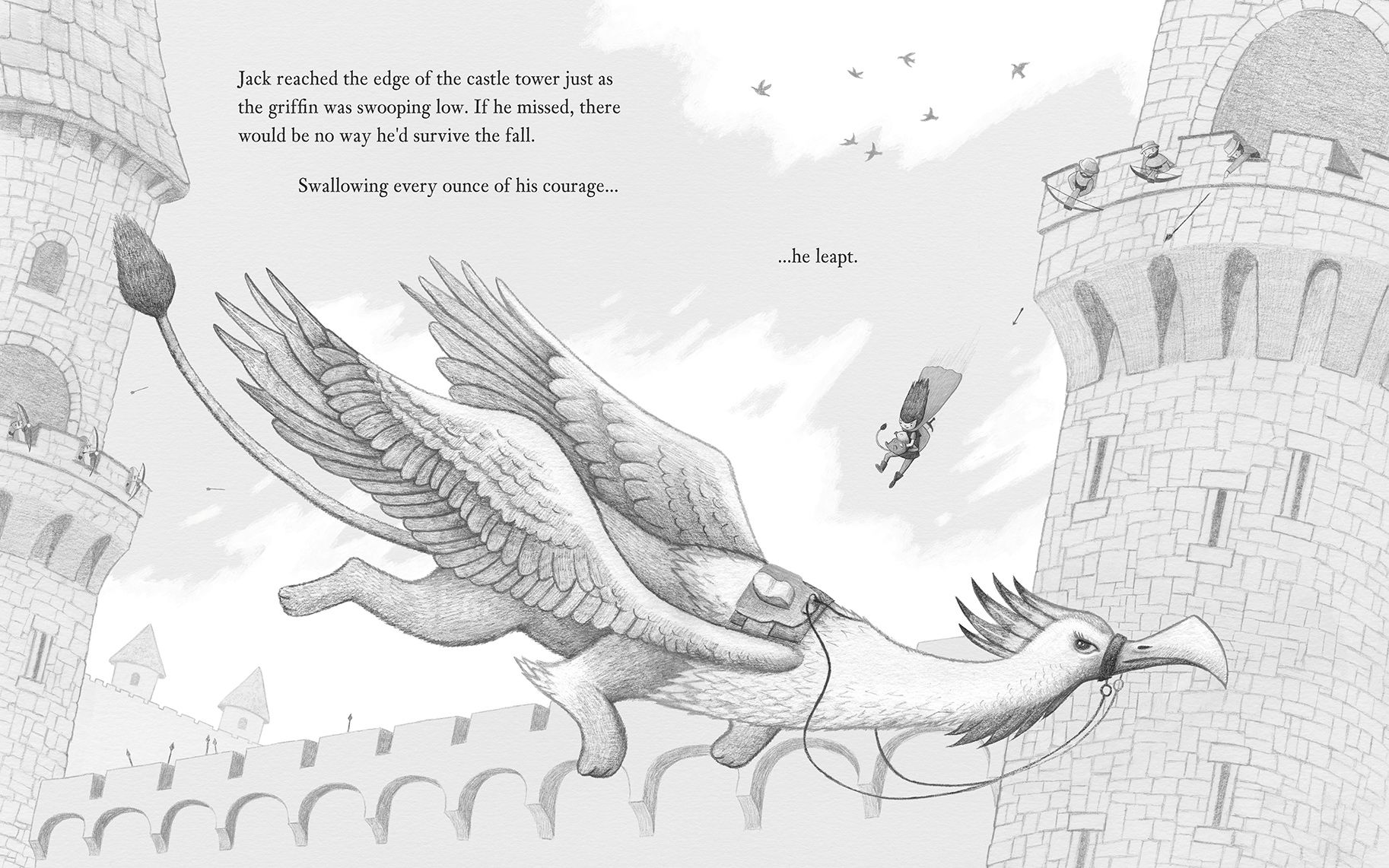
Here's the pencil render before I change it to multiply and paint colour underneath. It's mostly pencil on paper and about 20% digital pencil. I think I'm going to do digital pencil going forward as it's so much faster, my hands are super shaky when working traditionally.
-
@Jason-Crowley
Beautiful work, lovely detail. Looking forward to you’re finished piece. -
-
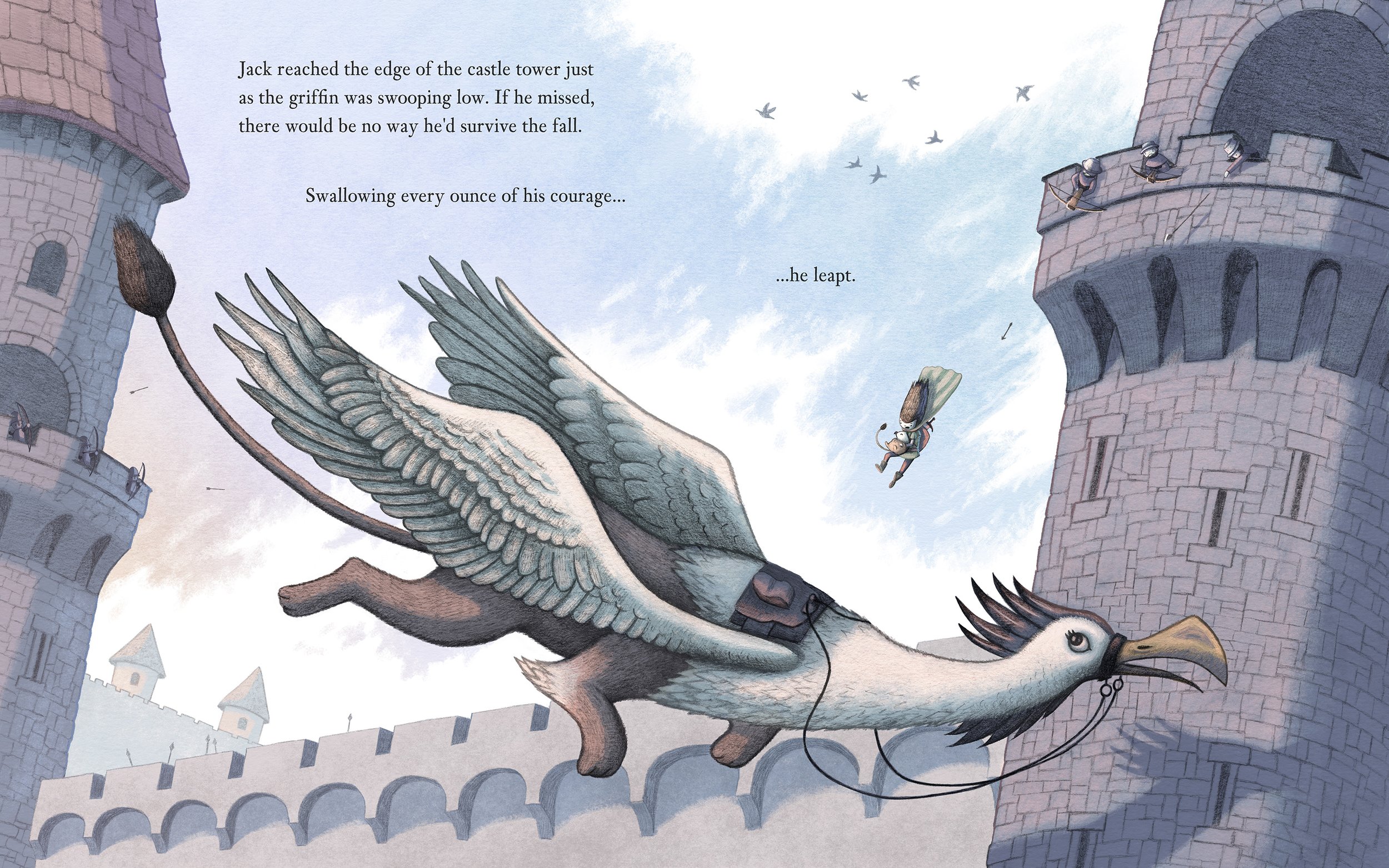
Here's my finished piece. I think the composition works pretty well as a double page spread with a gutter down the middle, reading left to right. Having said that, I wish I spent more time in the thumbnail phase to experiment with lots of different ideas, as I went with this layout too quickly. But, being this close to the deadline I didn't feel I could really experiment with castle or griffin design, as they were all new to me. I almost put this prompt in the too-hard basket but I'm glad I gave it a try.
I do feel a little bit closer to nailing down my process and 'style', which in this case is drawing (digitally and traditionally) and colouring separately. So I plan to keep experimenting there. The next prompt sounds right up my alley, and I won't have text to contend with text on a page

-
PS: If you're concerned about resolution and compression when uploading to this forum I've figured out these two things:
When uploading:
Use a max-width of 1826px (1074 * .85 = 912.9 * 2) and it will render crisp in the forum post. Anything over this size will apply a lot of compression (blurriness and artifacts) to the image in the post itself. Clicking on the image should show the original uncompressed version of the image.When linking an image:
If you want a larger size then use the Image Link option, and host the image on your own website. It doesn't seem to over compress it using this option. -
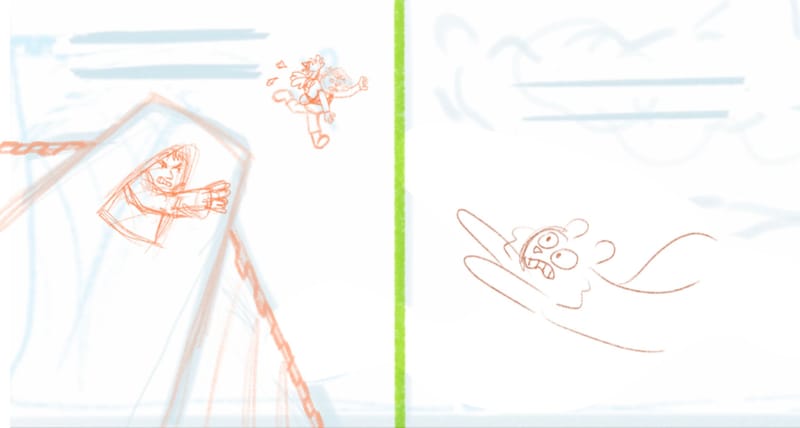
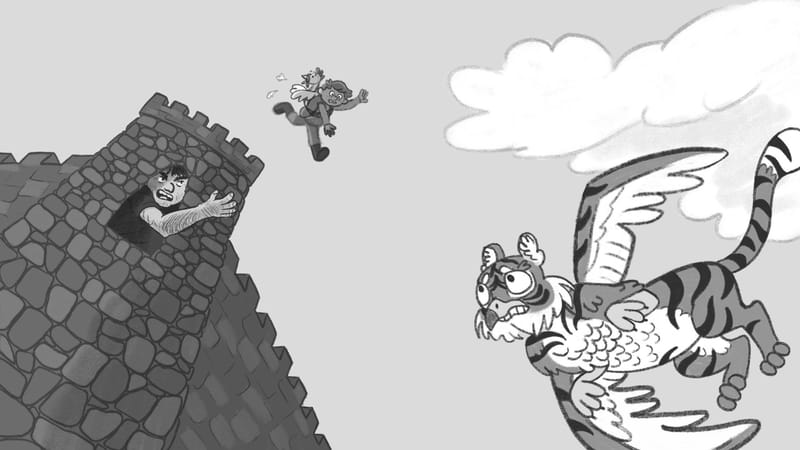
Do any of these poses for the griffin work? Should the body/wings be a different gesture position? It was flying low, then is suddenly changing directions to try to catch Jack above.
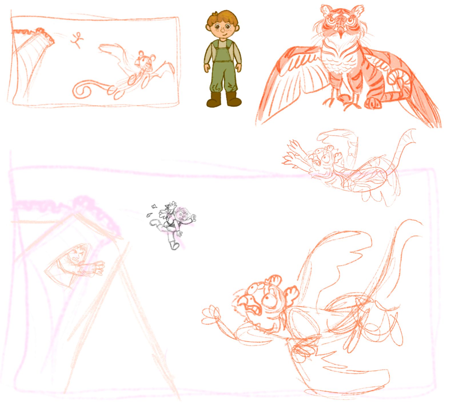
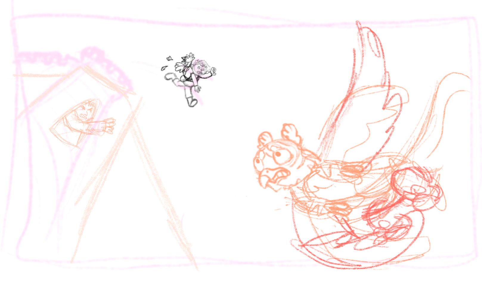
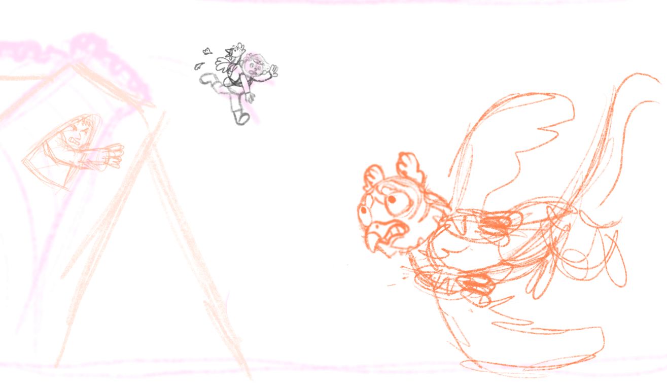
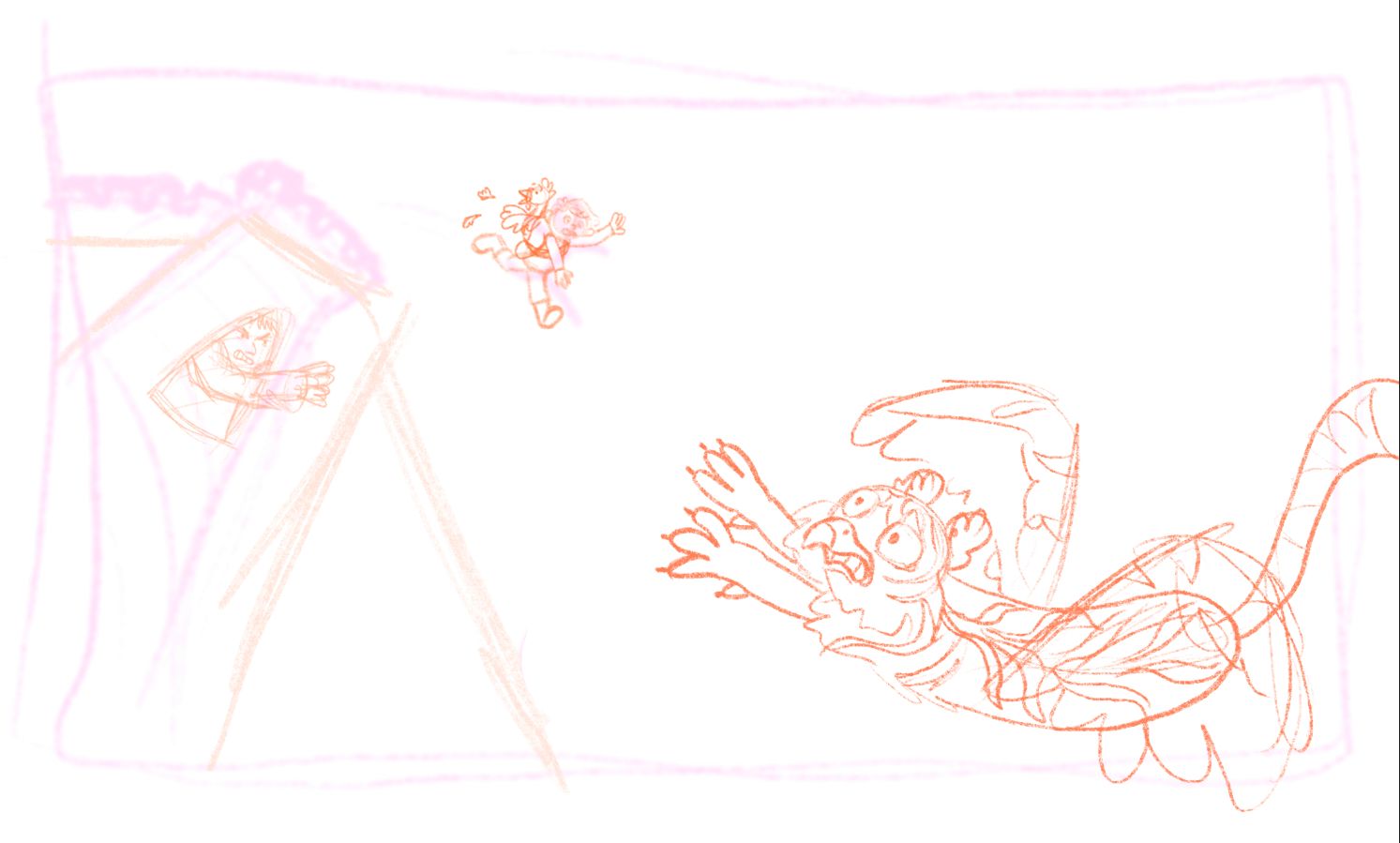
(The sketches ended up out of the order I drew them in)
-
-
I'm trying to get this finished today, even if I don't get to polish it much I had fun with the idea and with getting back to the SVS prompts after a long pause

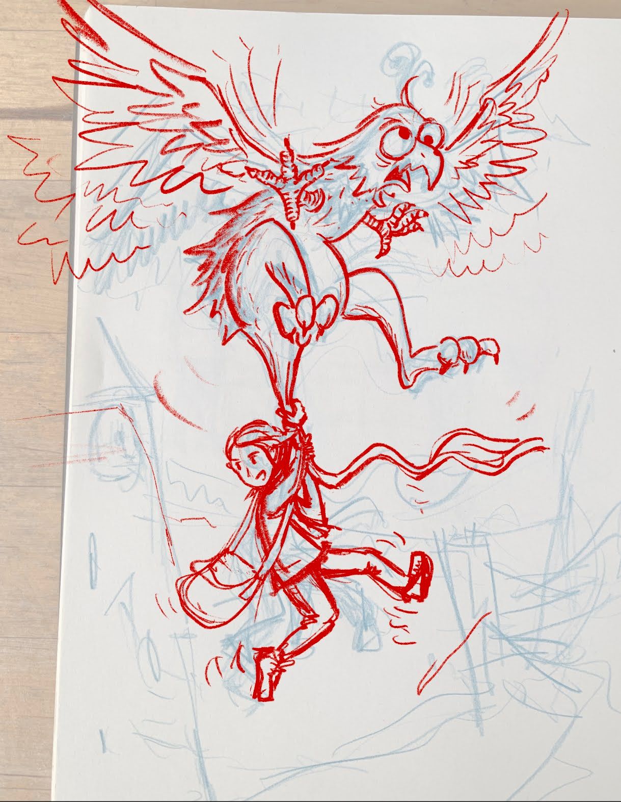 .
.I am not shure what my inspiration is at this point, I have gone back to some old Donald Duck comics I loved in my childhood and I think some of the expressions and gestures from that type of images comes through. For the background I plan to use a bit of local roumanian castle architecture.
-
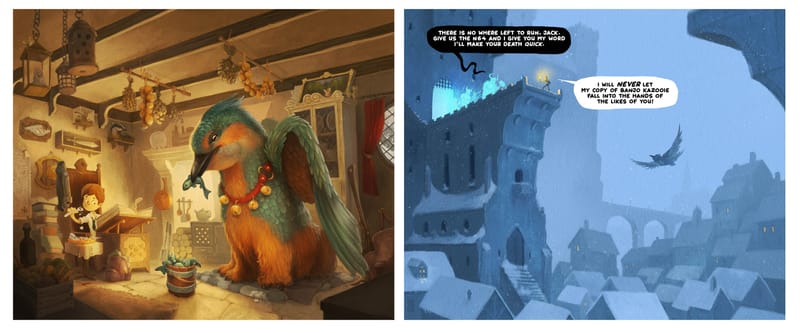
I tried to design this months image to complement the previous one I did. I liked the idea of inverting the colour temperature for the newest illustration by keeping the majority of the image super cold blue.