Experimenting with ink - HELP
-
Hello everybody
I am Gillian and new to SVS learn Forum. I have bin making art for a while and now trying to improve my work. I love working with ink, but realised that I have no actual skill using it :).
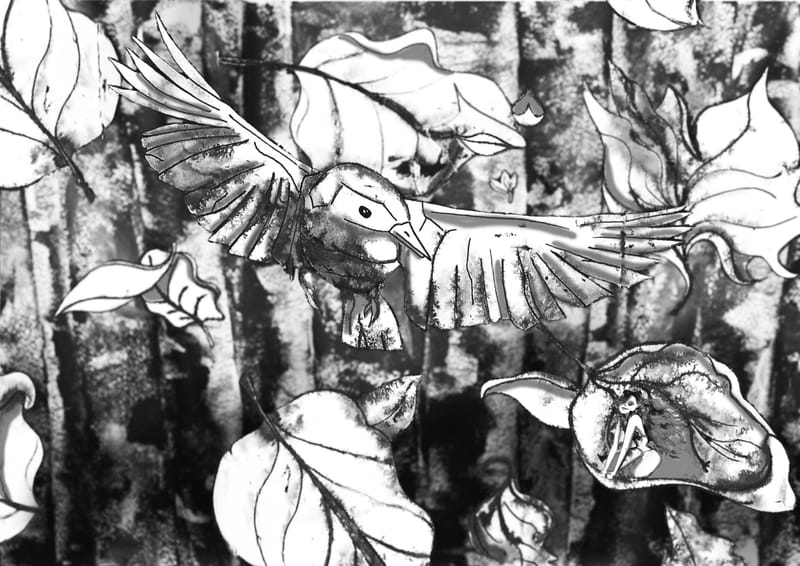
I started doing the course experimenting with ink.I made this Image during this course. And I am not happy, I feel like the values are all the same, but now I'm stuck.
Would you guys help me, see what is not working in this image and what is? So I can improve, and not do the same thing over and over.
-
Welcome to the forum, Gillian. I like how there's energy in the piece. The texture for the forest background is a nice choice.
You're assessment is correct; more values are needed to push forward the elements in need of focus.
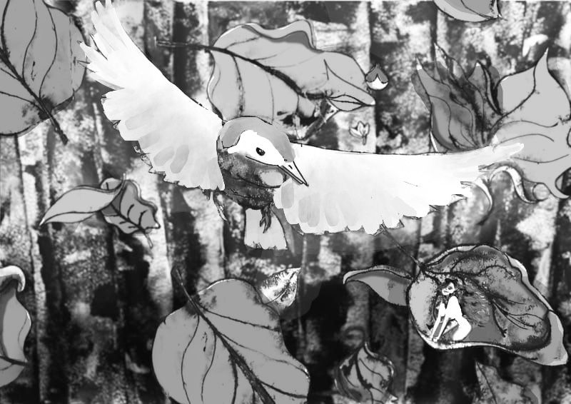
I did an experiment on photoshop. The wings were redone so it can be an area where the audience's eyes can rest. I like to think no line work suggests softness of feathers and quick movement. In your OG piece I agree texture is needed on the bird, but it was too harsh and looked too similar to the background. Maybe use a second texture?
The leaves were given tone to push forward the central character and empathize spatial relationship. Some leaves have a lighter tone to show it is reflecting the sunlight, others are darker to say we're looking at the shadow side. The upper half of the background is made less saturated for the same effect.
With inks less is more and strokes should be economically used. I think you made a good choice of using varied line weight for the stems of the leaves and could have continued that line quality for all objects.
You may already have a list of ink painters you're studying from, but I would like to makes some recommendations. Look up turn of the century artist Charles Dana Gibson and Al Hirschfeld; both are masters of line quality. East Asian art like Japanese sumi-e ink paintings or fine art calligraphy can be inspiring; Google Images doesn't have great examples, so look up an online musuem collection.
-
@willicreate Thanks for the feedback. It seems like I'm on the right path. thanks for the visual aswell, always better to see it
")
Thanks for the names aswell, i love Charles Dana Gibson, and am a big fan Japanese Sumi-e also did a course myself from a colleague her in holland. I didnt kiw Al Hirschfeld, Looked into him, he does make realy nice ink drawings. thanks, always nice to see more great work.