Question on type for book titles
-
There are some great lettering courses on www.skillshare.com especially those by Mary Kate McDevitt.
-
@Russ-Van-Dine Sorry, didn't read close enough, I thought you did these... these are good, I agree.
-
Oh Russ, maybe I should have made it clearer, I didn't do those covers (because if I did, I wouldn't be posting this question here) ..
They were just examples on what I was talking about. I can't make any type different from my own handwriting and it's pretty frustrating

@Nanette thanks, I will check it out!
-
If you happen to be working digitally, I use Adobe Illustrator. Choose a font that is close to what you want then use the create outlines function and alter each letter with the selection tool to give it a custom look. I usually have better luck with bolder type faces.
-
I struggle with this too. I just submitted a book to a publisher and the way I ended up finishing the title (after posting it on here and getting some great advice!) was to pick a font (can't remember if it was a Photoshop standard or if it was from dafont.com) and painting over it to give it a little more life.
-
Hi @Anda-Ansheen,
I agree with @Nanette about skillshare - they had a $0.99 for 3 months trial at one point, maybe they still do. I highly recommend starting there.
Another thing to do is to pick a typeface that inspires you, then practise drawing it over and over and make small adjustments to suit your own personality/liking as you go. Actually type in the title of your book on a font website to see it in action, then take a screenshot of it to go off of. If you're hand lettering it, there's no need to work off of crappy cheap or free fonts, so please stay away from sites like dafont. There's the odd one on there that's okay, but in general they're just bad. I have a trained eye in it (I'm a graphic designer) so I will sift through to find something good, but it's easier to just go straight to a great font website like http://myfonts.com They're all quality, so you can't go wrong. Also, when polishing take note of the space between the letters (kerning) so that they optically look about the same distance apart.
And post progress on here. I'd love to give feedback
") Good luck!
Good luck! -
Just wanted to give you a couple of examples of hand-lettering I've done using the method I mention (above) - I drew/painted the letters myself, but I was inspired by actual typefaces I found on myfonts. They're not exact replicas, there's small changes I made to suit my liking, plus since they're hand-done, so not every instance of the same letter will look exactly the same like using a font would, so it gives it more character IMHO.
-
@DanetteDraws Thanks for the tips!
Actually for some previous books I did that thing, taking a font then painted on top of it to make it different..But for this book I wanted to have that real "hand painted" look, where letters are arranged differently and entangling to make a pretty design...
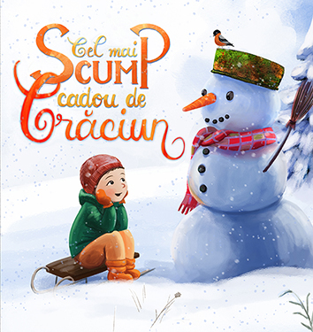
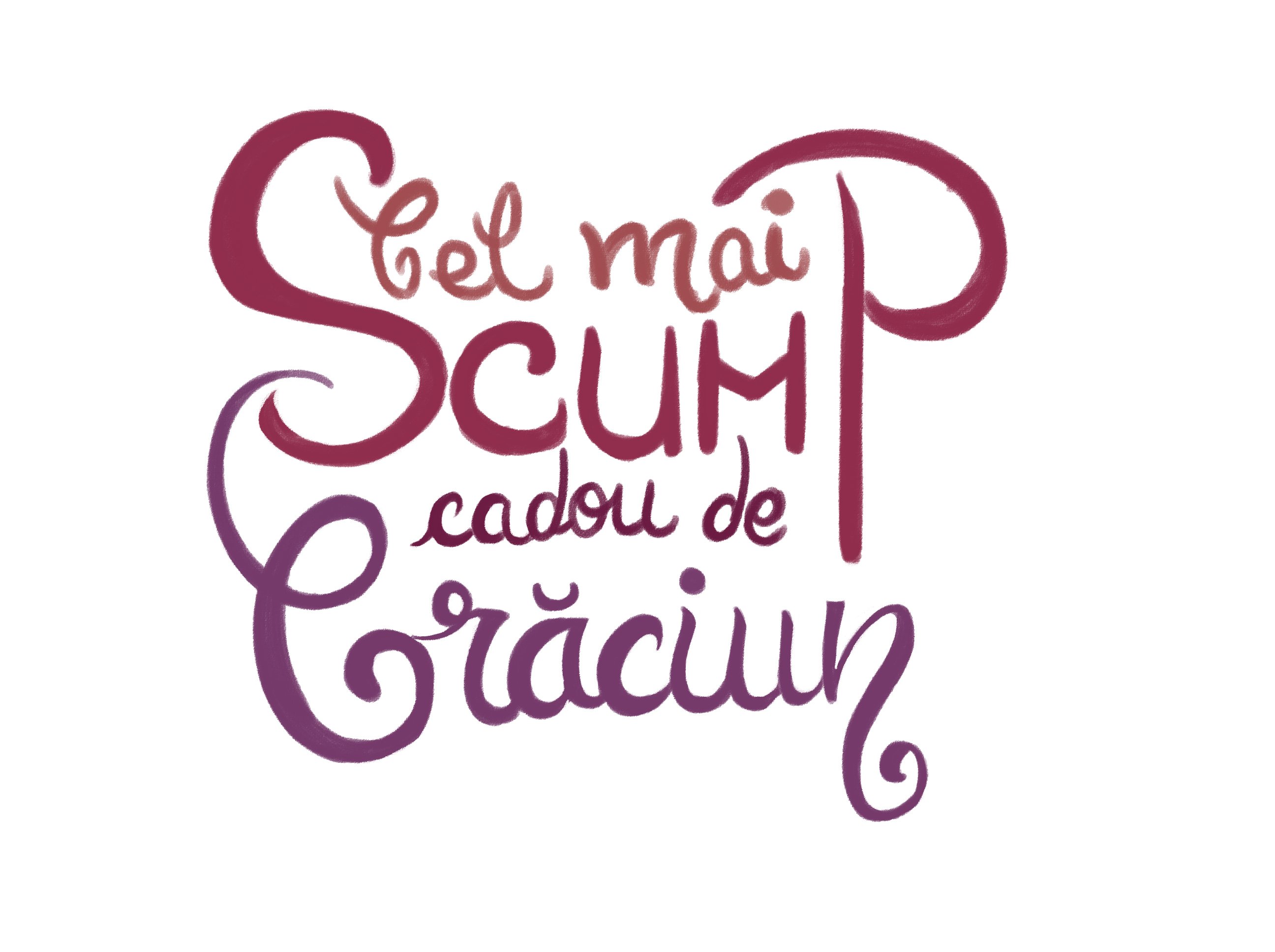
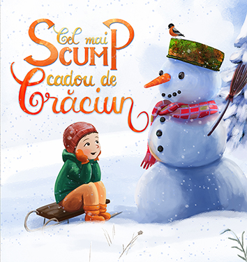
Anyway, I looked on skillshare, they still have that $0.99 trial for 3 months, and I also searched on youtube for waterbrush lettering.. And this is the best design I could come up with so far (I made the drawing with watercolors but this is the photoshopped version):
(it's in Romanian language and it means "The most expensive Christmas gift")
-
Great question, I've been wondering the same thing myself! Interesting info so far.
-
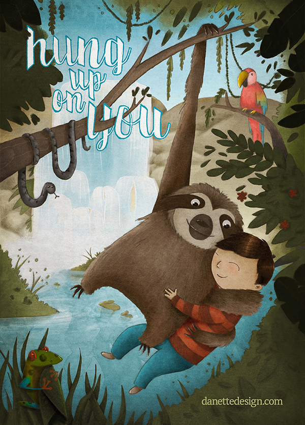
@Anda-Ansheen I love hand-lettered designs..so beautiful and I think what you've done already is a really nice start.. I agree that there are already some beautiful examples in this thread of hand lettering done well.
I was going to say that if I were trying to do the same thing, I'd make a Pinterest folder with my favourite examples to look at, and try and work out what makes them really nice....then I looked on Pinterest myself...searched for 'hand lettering' and found this link, it's got lots of really interesting examples of hand lettering and tips on how to emulate them:
-
Hi @Anda-Ansheen, really great start you have here! I love the way the 'swirls' interact with each other and the ombre effect.
You can still use a similar method I was talking about when doing this, but you just alter the size relationships of the letters and placement of course.
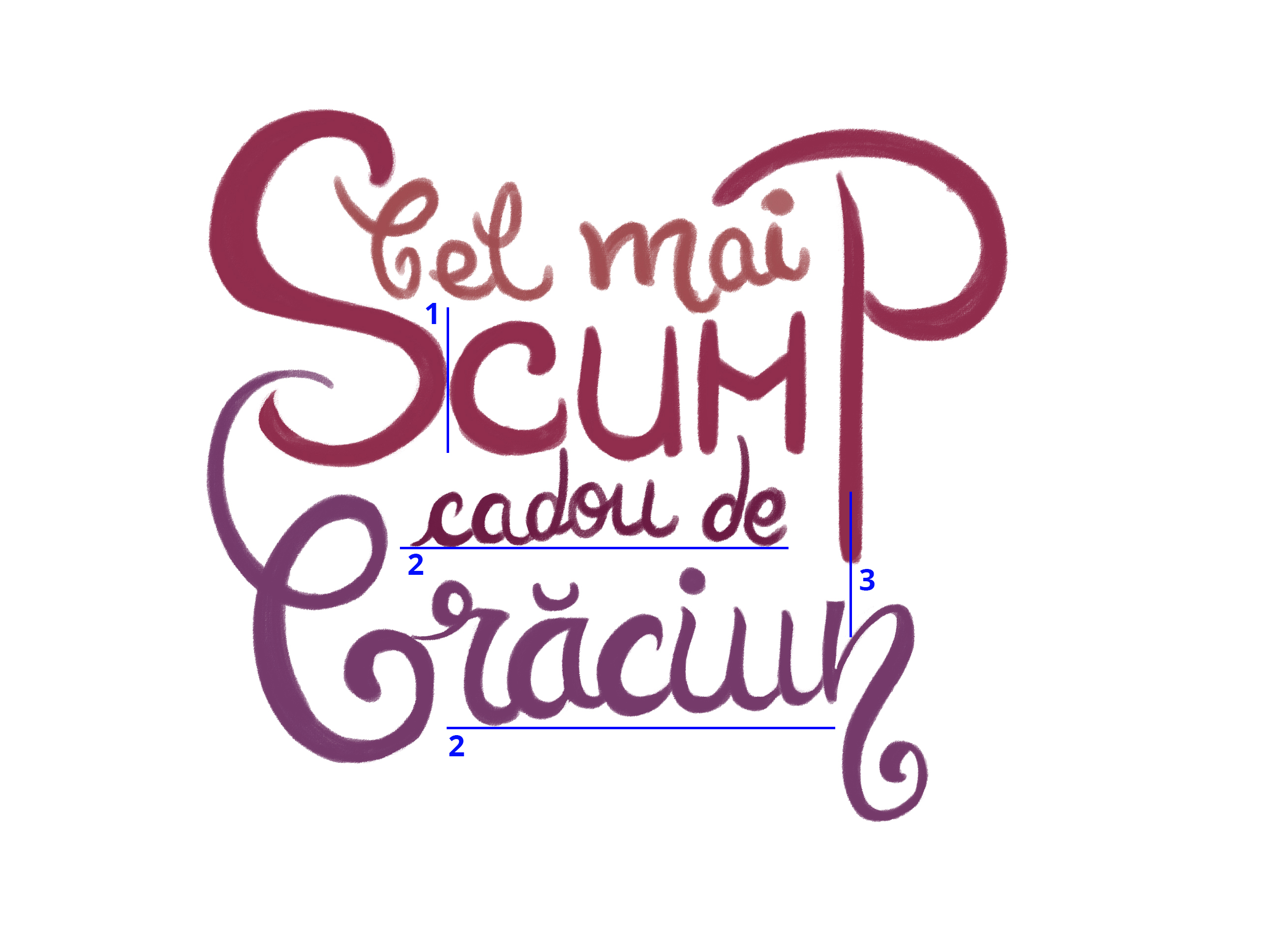
I have a few tips to improve what you've got:
-
Kerning - you need more space between the 'S' and the 'c'. There's a bit too much space between the 'M' and 'P' so you could just move the 3 letters 'cum' to the right a bit. The goal is to have "optically the same" spacing between your letters.
-
Align your baselines. You'll still get a hand-lettered look even with penciling out a straight line to guide you, and it'll make a huge difference in the polish.
-
When there's 'stems' that are almost lined up, go ahead and align them. I mean the straight line of the 'n' and the descender of the 'P' above it.
Also, I'm sure it's because you're still working on it, but the top line of lettering looks unfinished. You said this is a photoshop version, so you're probably not going for a polished look on this one. Your watercolour version will look great! Will you let the watercolours 'run' together to make that ombre look? Will look fantastic with texture too.
-
-
@DanetteDraws Wow thanks a lot for the tips! Will come back with the modified drawing

-
Thanks for asking this question! Just what I needed to read. Now I'm off to play with fonts!
-
Ok so I returned
This is the best I could do, I have put it in context so you can have a better idea on what it's going to be used for
@DanetteDraws what do you think? ^_^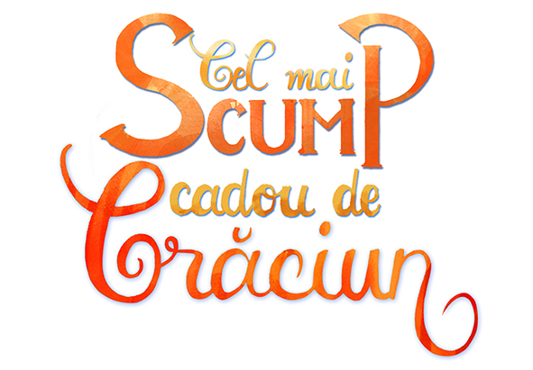
And here it is in context:
-
well done, this seems to really work for me. I like the warm colors next to the snowman and it is the right one to pull out of the scarf...
-
Hi @Anda-Ansheen, wow this is so magical! LOVE the type integration in with your illustration - it's very strong compositionally and the colour is just fantastic!
I want to point out that just as with your illustration, you should watch out for tangents with type as well:
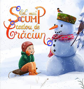
I did a paint-over of your type - I fixed the tangents, and there's at least 10 other extremely subtle things that make a huge difference too. I also thought it would be fun to intertwine the 'S' and the 'C'.
Hope this helps!