Society of Visual Storytelling

    SVSLearn Forums

    • Register
    • Login
    • Search
    • Recent
    • Tags
    • Popular
    • Users
    • Groups
    • Search

    Feedback for potential portfolio piece

    Projects
    4
    13
    688
    Loading More Posts
    • Oldest to Newest
    • Newest to Oldest
    • Most Votes
    Reply
    • Reply as topic
    Log in to reply
    This topic has been deleted. Only users with topic management privileges can see it.
    • ChloeGreenbergArt
      ChloeGreenbergArt last edited by

      Hi! Here is a rough sketch for an idea I had based off of a TikTok where someone held up a small harp, and the wind made the strings sound gorgeous. It's called the Aeolian Harp Effect.
      Here is the link to the TikTok if you're curious: link text

      I just wanted some general feedback to make sure this is the best version it can be. I was going for a picture book cover illustration, although I know it's not ideal for a main character to be so small on a cover. I'm conflicted because the scale of the main character compared to the wind goddess has impact that I find very appealing.
      Thanks!
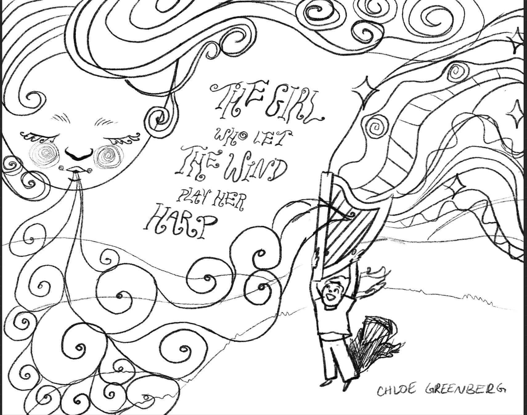
      image_6487327 (3).JPG

      Yogita Chawdhary ChloeGreenbergArt 2 Replies Last reply Reply Quote 2
      • Yogita Chawdhary
        Yogita Chawdhary @ChloeGreenbergArt last edited by

        @ChloeGreenbergArt The cover looks so interesting- I love the overall composition. And I think it is okay for the main character to be smaller here- the cover title makes it clear who the main character is. I don’t have much critique, but maybe the face of the wind goddess could be angled slightly towards the character, guiding the viewer’s eye and hinting at where to look next after noticing the goddess.

        Yogita Chawdhary
        Portfolio: https://www.yogitachawdhary.com/
        Instagram: https://www.instagram.com/yogita_illustrations/

        ChloeGreenbergArt 2 Replies Last reply Reply Quote 1
        • ChloeGreenbergArt
          ChloeGreenbergArt @Yogita Chawdhary last edited by

          @Yogita-Chawdhary Good idea, I'll definitely try that out! thanks ❤

          1 Reply Last reply Reply Quote 1
          • ChloeGreenbergArt
            ChloeGreenbergArt @Yogita Chawdhary last edited by

            @Yogita-Chawdhary

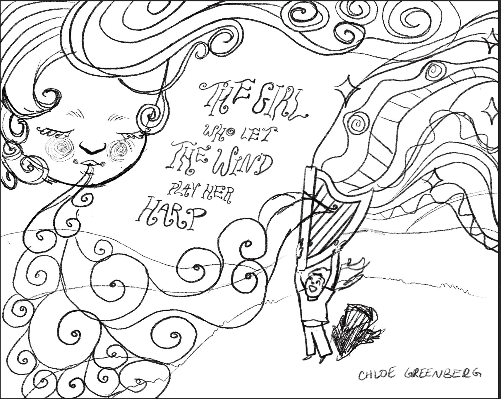
            I tilted her head to the side a little, what do we think?

            B1335522-EEC6-4053-ACD9-3BD629F955FF.jpeg

            StudioHannah Yogita Chawdhary 2 Replies Last reply Reply Quote 0
            • StudioHannah
              StudioHannah @ChloeGreenbergArt last edited by

              @ChloeGreenbergArt I had to go back and forth a few times to see that you'd made a change, so going off og @Yogita-Chawdhary 's feedback I'd say to angle the face just a bit more so it's more directional toward the main character.

              It's looking good so far, and a lot of how this will work I think will depend on your use of tone and color as well, so I'm looking forward to seeing what you end up doing with it!

              www.studiohannah.com
              Social:
              www.instagram.com/studiohannahart
              www.facebook.com/studiohannahart
              www.YouTube.com/studiohannah

              1 Reply Last reply Reply Quote 1
              • Yogita Chawdhary
                Yogita Chawdhary @ChloeGreenbergArt last edited by

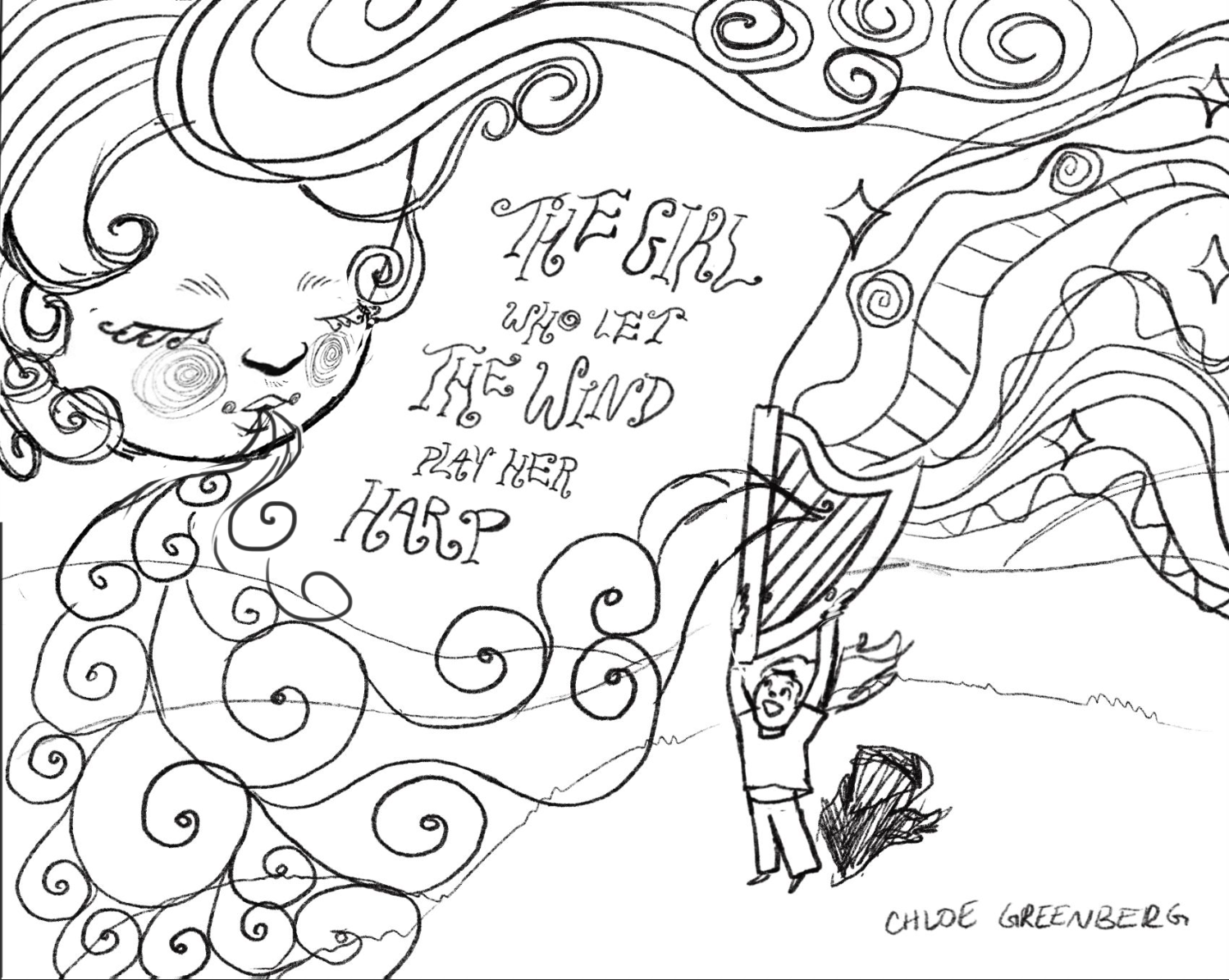
                @ChloeGreenbergArt I agree with @StudioHannah - it'll look even better if the face were tilted a little more toward the character. I’ve roughly adjusted the tilt slightly in a mockup. Hope this helps!
                Feedback for Chloe.PNG

                Yogita Chawdhary
                Portfolio: https://www.yogitachawdhary.com/
                Instagram: https://www.instagram.com/yogita_illustrations/

                ChloeGreenbergArt 1 Reply Last reply Reply Quote 2
                • ChloeGreenbergArt
                  ChloeGreenbergArt @Yogita Chawdhary last edited by

                  @Yogita-Chawdhary thank you so much! This looks great ❤

                  1 Reply Last reply Reply Quote 1
                  • ChloeGreenbergArt
                    ChloeGreenbergArt @ChloeGreenbergArt last edited by

                    @ChloeGreenbergArt

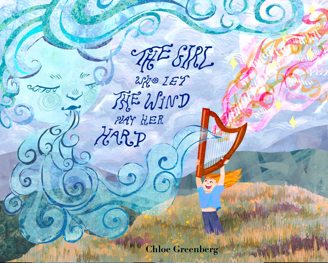
                    Ok so it’s pretty much done now. Anyone have any final tweaks? How do we feel about the swirly rainbows or the hand-lettering?
                    38DB42DC-B078-4CC2-9866-7A41E5AEE0C8.jpeg

                    Yogita Chawdhary StudioHannah 2 Replies Last reply Reply Quote 1
                    • Yogita Chawdhary
                      Yogita Chawdhary @ChloeGreenbergArt last edited by

                      @ChloeGreenbergArt Hi Chloe, I love the colored version! The textures you've used are lovely! Just one last suggestion from me- you could add a bit of motion to the grass to reflect the wind blowing, similar to what you’ve done with the girl's hair and clothing. The hand lettering looks great too! One small thing that’s catching my eye is the letter P in play- it kind of looks like a question mark. You could maybe use P similar to the one used in Harp- that'll work better.

                      Yogita Chawdhary
                      Portfolio: https://www.yogitachawdhary.com/
                      Instagram: https://www.instagram.com/yogita_illustrations/

                      ChloeGreenbergArt 1 Reply Last reply Reply Quote 1
                      • _sadira_
                        _sadira_ last edited by

                        @ChloeGreenbergArt Love this portfolio piece! You have really good movement that keeps the eye moving and the textures you have add to the piece rather than take away from it, overall an outstanding portfolio piece!

                        sadira.artstation.com
                        www.linkedin.com/in/sadira-wofford
                        StickerbySadira.redbubble.com

                        ChloeGreenbergArt 1 Reply Last reply Reply Quote 1
                        • ChloeGreenbergArt
                          ChloeGreenbergArt @Yogita Chawdhary last edited by

                          @Yogita-Chawdhary this is so helpful, hank you so much!

                          1 Reply Last reply Reply Quote 1
                          • ChloeGreenbergArt
                            ChloeGreenbergArt @_sadira_ last edited by

                            @_sadira_ thank you!!!

                            1 Reply Last reply Reply Quote 0
                            • StudioHannah
                              StudioHannah @ChloeGreenbergArt last edited by

                              @ChloeGreenbergArt I like how you used warmer colors for the girl/harp/music to make her stand out fro her cooler surroundings. Great way to bring her to focus with all the textures and movement around her!
                              www.studiohannah.com
                              Social:
                              www.instagram.com/studiohannahart
                              www.facebook.com/studiohannahart
                              www.YouTube.com/studiohannah

                              1 Reply Last reply Reply Quote 1
                              • First post
                                Last post