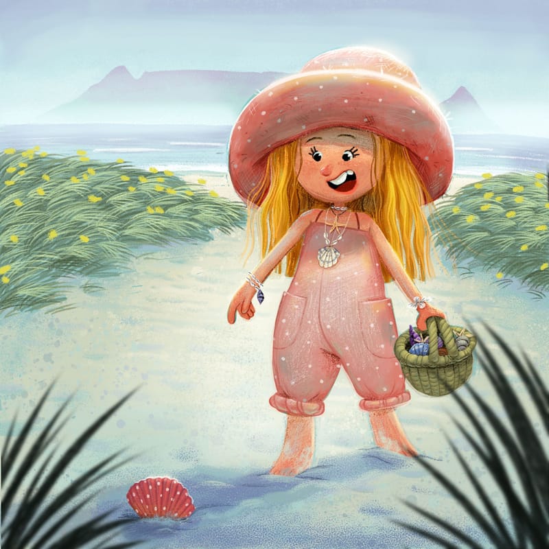
Feedback on new portfolio piece wanted... Don't Hold Back :)
-
@Gabby-Correia Hi Gabby, I love your art style and colours. The pencil texture is really great, and I like how you’ve added depth to the illustration with the blurred grass in the foreground.
The character looks awesome! I know the way you draw feet is a stylistic choice, but I think it could be even better if there was a bit more definition to show the shape- like the heel and the top of the feet. You may or may not include the toes, depending on the style, but improving the overall shape could take it up a notch.
-
@ChloeGreenbergArt thank you so much!
-
Thank you so much for your feedback!
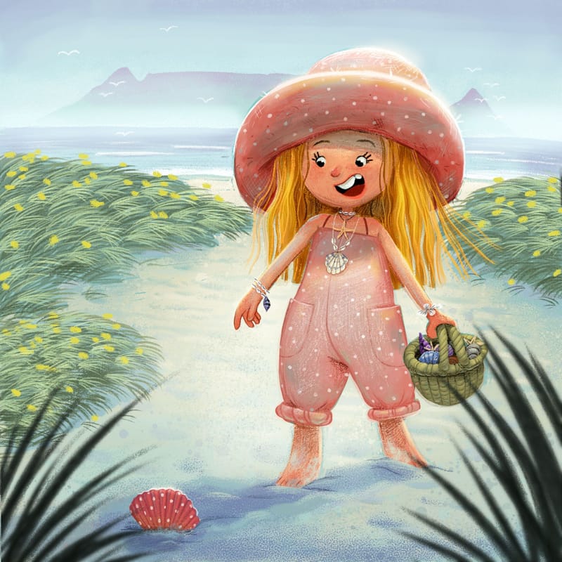
Here is the updated version.Is the concept clear at all?

-
@Gabby-Correia The concept is pretty clear! I’m loving the shell jewelry she’s wearing and the textures throughout.

-
@Gabby-Correia She's lovely!
The only think I had with the 1 pic to add ws the background plants. But you touched that up real nice.I still find it a bit hard to see how old she is. From her face and her jewelry I'd say 10 or so?
But beautiful picture and details. Very pretty textures used
-
@Gabby-Correia I love the way you drew this character! I love your soft pencils and textures... your character is super appealing, color palette, those adorable trinkets and details! She reminds me of my daughter at that age. And, your shadows... chef's kiss!
One thing I noticed was direction of the grasses, how they seem to be opposing each other, like the wind is blowing them in differing directions, and the way you have them looks like that is a very powerful wind. yet the girl's hair is as if the air is quite still. I wonder if you shifted the way the grasses and plants all blowing in the same way that would help us know this, and make her hair follow softly, to match the strength of the air currents.
Also thinking in terms of directional components in composition, since she is the main focus, I think flipping her so she is facing from left to right would help the eye read it that way. Just a few thoughts.

-
The only thing throwing me off about your updated version is the grasses in the front. I see others have already given good suggestions so I mainly wanted to say that I agree, particularly with the comment about the grasses looking fuzzy. The textures say "traditional pencils" but the fuzzing breaks that illusion. You can still have them be out of focus, but you'd have to do it manually like you would if you were using real pencils rather than using a digital blur.
-
I forgot to say in my comment above, also, that this is super cute and I am loving the style and overall look. It would catch my eyes on a book cover for sure!
-

Here is the final piece! Thank you everyone for your comments and suggestions
-
@Gabby-Correia That looks great, wonderful piece!
-
@Gabby-Correia great piece!! love seeing the process of your designs and how it developed
