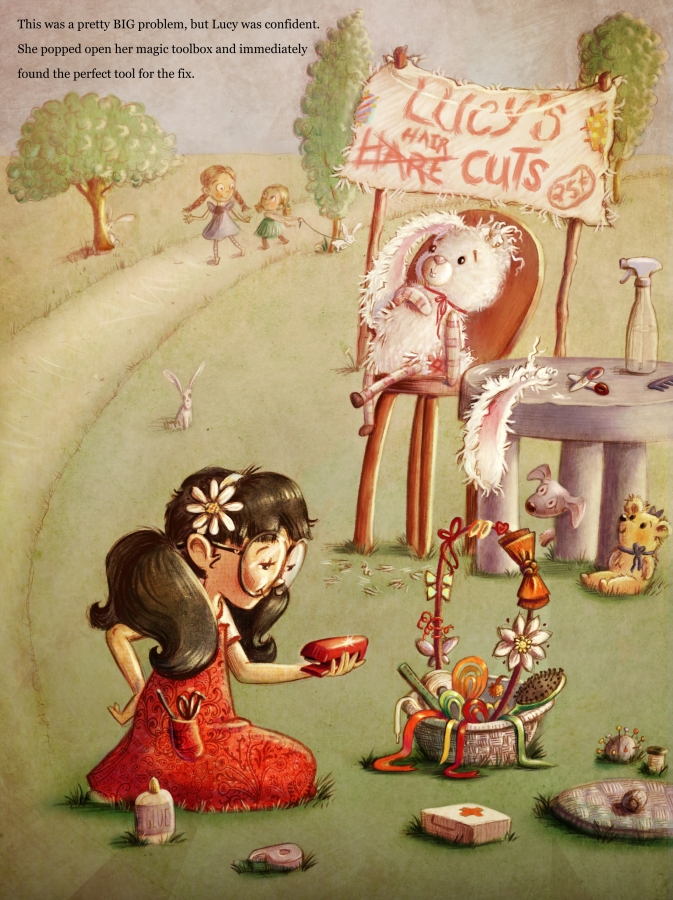
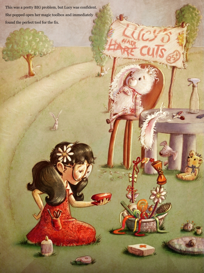
Feedback on my 3rd Thurs concept
-
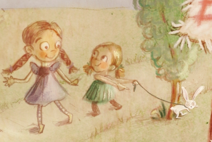
Firstly I love your illustration style, and it is a sweet idea (hair/hare). My only thought was I had to take a double take to decipher what the girl in back was pulling on her string. Otherwise I really like it, especially Lucy
-
I also can't make out what the little girl in the back is pulling on a string. A cat? A bunny? It could read more clearly.
Also at first glance the girl in the red dress...
-
her back ponytail looked like a mustache
-
her arm is at a strange angle behind her hip/rump.
Great style. Love the items in the basket and the white bunny in the chair. Look forward to seeing how you change this.
"Never give up! Never surrender!" ~Commander Peter Quincy Taggert
-
-
Very cool piece! I agree with the comments on the dog on the leash. The tree is cutting the action there, so positioning the kids/dog closer to the front would probably fix that. I love the fearful expression on all of the living animals! Very funny!
-
@lmrush That's really helpful (and kind!), Imrush. Someone else had a similar thought, so it's obviously something to fix!
-
@Katrina-Fowler Thanks, Katrina! Great feedback. I'll see what I can do with her hair and the dog.
-
@Devin-Sailors I'm sensing a theme here and will definitely work with the girl/dog. Thanks for your feedback!
-
I think this is really great work. I remember watching some of the crit videos from the SVS site that were talking about a similar situation that you have going on here. You have those background characters and they may be attracting unwanted attention. They don't seem to be adding to the story you have going on here...and if they are part of the story it's not apparent what part they play when I look at the image. You may just want to cut them out all together. Maybe use that space for your text it looks a little crammed in where it is right now.
-
@evilrobot Thanks, evilrobot! Those are some really good points I'll play around with.
-
Nice painting, what catches my eye and cause confusing is all the different red items. I lose the actual tool with the red dress right there. I think you can push the light/shadow contrast more too. I can see the bright rim lights but I didn't get the same intensity with shadows.
It's already been said about the other girls and story but I do agree with those comments. I really like this piece and love to see how far you push it. -
That's a good point about pushing the shadows, Rich. I'll see what I can do with that, 'cause it's definitely something I've thought about. Can you elaborate on which red items are competing for attention? Is it her dress and stapler, or are other things which are doing this?
I played around to try solving the girls/dog problem: 1) changing the dog to a bunny to add storytelling and putting it in front of the tree (and I'll provide a close-up so you can see the bunny), and 2) taking them out altogether. Any opinions as to which of the two you prefer?
I really appreciate all your help! Thanks so much for the time you're giving me.
-
@Timbdsf There's just so much red in that general area, red dress, red stapler, red ribbons, red cross. Makes my eyes dart around them all. Not sayin to change the actual colors unless you think you need to, just emphasize your focal point. Pushing the shadows may help that too.
-
I like the other children in it personally, they are less distracting now that you solved the problem with everyone wondering "what's on that string." I didn't even catch the hair looking like a mustache until someone said it, then I saw it, great fix--that is what is so wonderful about this forum, we all learn and grow.
-
Thanks for clarifying, Rich. I'll do something about and tinkering with and see what I think about that.
And thanks for your added input, Imrush!
-
I really like your painting style. I also like your texture in your dress and light textures throughout. I am a little lost on the placement of the other objects around Lucy. They are laid out with grass around them... If they are there for a long time, this would happen. I really like the way you have shown the hair and given it texture and form. I agree that the actual form is a little distracting to her face and her body. I think you really don't have to fix anything, these are kinda nit-picky but you asked.
-
Thanks, Russ! I've never considered that it takes some sitting around for grass to come loose around objects - great observation. (It's amazing what you learn when you start drawing something.)
-
I love you style! Just to throw my 2 cents in. I like the two girls in the background. It makes me think that they are going to pick up their rabbit from its hare cut and lends some urgency to Lucy's problem. I don't think she needs the leash though. The angle of her right arm does throw me off a little bit.
-
@stacilyn Thanks so much, Stacilyn! Your feedback is very helpful!
-
I thinks it's charming and beautiful! Totally in love with it! X
-
Its a lovely picture, and I like all the things going on in it and the story you are telling
")