Society of Visual Storytelling

    SVSLearn Forums

    • Register
    • Login
    • Search
    • Recent
    • Tags
    • Popular
    • Users
    • Groups
    • Search

    Album Cover Illustration

    Projects
    11
    31
    12910
    Loading More Posts
    • Oldest to Newest
    • Newest to Oldest
    • Most Votes
    Reply
    • Reply as topic
    Log in to reply
    This topic has been deleted. Only users with topic management privileges can see it.
    • Bob Crum
      Bob Crum last edited by

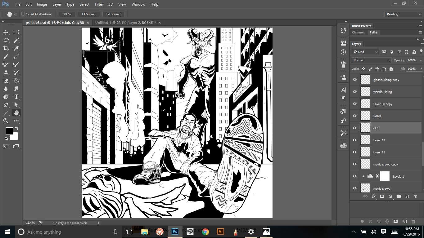
      You have chosen a REALLY tricky perspective and you have pulled it off very nicely. I have no problem with that at all. Consider though, varying your line weight to emphasize the character in the foreground. I did a quick drawover that might help get my point across.
      0_1461097062218_OdomDrawOver.png
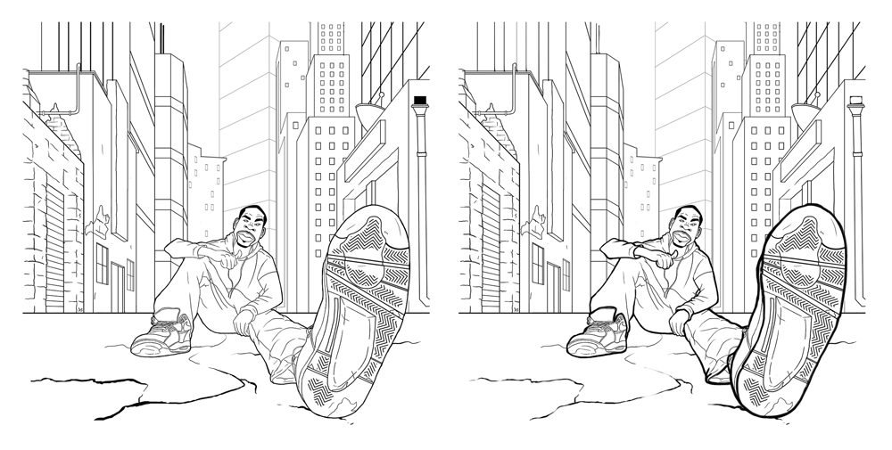
      You can see that if you thicken the lines around your main character, you are really drawn into the piece. It just emphasizes what is truly important looking in the piece. I also decreased some of the lines in the distance as well.
      I think this piece is great!

      Durrell Odom 1 Reply Last reply Reply Quote 3
      • Durrell Odom
        Durrell Odom @Bob Crum last edited by

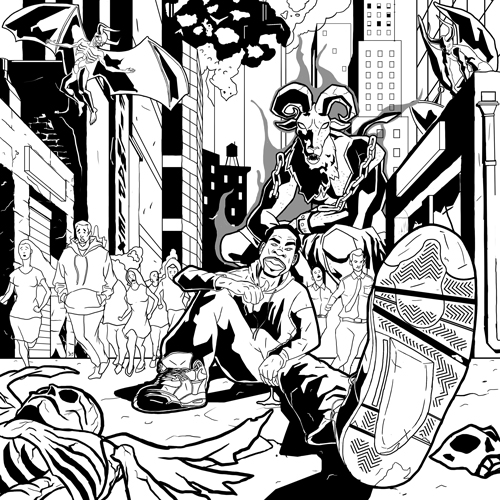
        @Bob-Crum thanks. I actually used one point perspective for this one though some of the buildings are not exactly lined up together so I could give it that abstract downtown look. Still got more ways to go. May add wires and store signs later and reduce the line weight on some of the buildings.

        www.durrellodom.com

        1 Reply Last reply Reply Quote 1
        • Jiří Kůs
          Jiří Kůs last edited by

          I just have to ask... is the album or the band about a foot? Ooor shoe? It seems so important.

          Follow me on
          https://www.instagram.com/yiri_kus/
          http://yirikus.tumblr.com/
          https://www.facebook.com/yirikus/

          Durrell Odom 1 Reply Last reply Reply Quote 0
          • Durrell Odom
            Durrell Odom @Jiří Kůs last edited by

            @Jiří-Kůs lol. Nah, I just did some extreme foreshortening for his left leg and I won't let it he important when I was lay in some values or lighting.

            www.durrellodom.com

            1 Reply Last reply Reply Quote 0
            • Christine Garner
              Christine Garner last edited by

              Great perspective. You could maybe incorporate lettering in the shoe sole as well...that might look cool (if its appropriate to the album of course). It does seem to be the focal point at the moment. Look forward to seeing your colour choices.

              website: https://thimblefolio.com

              Durrell Odom 1 Reply Last reply Reply Quote 0
              • Durrell Odom
                Durrell Odom @Christine Garner last edited by

                @Christine-Garner thanks. Those soles are from the Nike 89 Air Flights. I will add the Nike logo later in the picture.

                www.durrellodom.com

                1 Reply Last reply Reply Quote 0
                • Christine Garner
                  Christine Garner last edited by

                  Just be careful of possible copyright issues if you are doing that. I remember several years ago I had an email from someone who wanted an Illustration of someone holding a Starbucks drink, and the Association of Illustrators advised me not to use their logo because of potential copyright infringement (I didn't do the job anyway...). You might need to get permission from Nike first. Please someone correct me if I'm wrong though- I'm just erring on the side of caution.

                  website: https://thimblefolio.com

                  Durrell Odom 1 Reply Last reply Reply Quote 0
                  • Durrell Odom
                    Durrell Odom @Christine Garner last edited by

                    @Christine-Garner oh yeah I know. I'll prolly just add the type but reduce much of the shape in my linework.

                    www.durrellodom.com

                    1 Reply Last reply Reply Quote 0
                    • MOO
                      MOO SVS OG @Durrell Odom last edited by

                      @Durrell-Odom That is one big foot! :-). Great perspective. I find perspective challenging myself so I am impressed.

                      Marsha Ottum Owen

                      Durrell Odom 1 Reply Last reply Reply Quote 0
                      • elisemc
                        elisemc last edited by

                        I'm definitely no expert, but I just watched the Creative Composition class, and they say in it (Will Terry and Jake Parker) that having lines that correspond to the lines of the sides of the paper aren't as interesting as diagonals. You might want to make that horizon line more diagonally tweaked.

                        Durrell Odom 1 Reply Last reply Reply Quote 0
                        • Durrell Odom
                          Durrell Odom @MOO last edited by

                          @Marsha-Kay-Ottum-Owen this one was a bit challenging for me mainly because I tried doing 1 point perspective in photoshop but you should practice this at least one hour a day from Ernest Norling Perspective Made Easy book.

                          www.durrellodom.com

                          1 Reply Last reply Reply Quote 0
                          • Durrell Odom
                            Durrell Odom @elisemc last edited by

                            @elisemc I will some more figures in this piece so maybe it'll give it a more dynamic look.

                            www.durrellodom.com

                            1 Reply Last reply Reply Quote 0
                            • Durrell Odom
                              Durrell Odom last edited by Durrell Odom

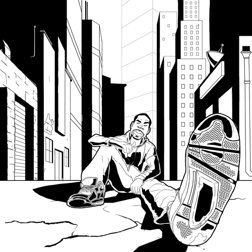
                              Revisiting this illustration. Giving it the Black Dynamite-Sin City appeal to it.

                              0_1465939175765_gshade.jpg

                              www.durrellodom.com

                              1 Reply Last reply Reply Quote 0
                              • Lee White
                                Lee White SVS Team SVS Instructor Pro SVS OG last edited by

                                Hey Durrell, nice looking work there. I like your drawing and the black and white treatment.

                                One thing to consider though in terms of content. It looks like a shoe ad because that foot is SO dominant in the scene. I'm a fan of cool perspectives, but not if the overall intent of the work is lessened because of it.

                                So if you are selling a new tread design, etc. then I would stick with this. Otherwise think about what you want to say about your character and adjust as needed. : )

                                SVS Faculty Instructor
                                www.leewhiteillustration.com

                                Durrell Odom 1 Reply Last reply Reply Quote 0
                                • Durrell Odom
                                  Durrell Odom @Lee White last edited by

                                  @Lee-White Thanks. Once I add color hopefully I could make the less when I add it. I kinda went by the feeling, lol.

                                  My client supposedly want to portray himself like a Constantine type character sitting alone while angels and demons wage war. Which I'll add later.

                                  Also a big fan of your "How to Make Money" courses and your work.

                                  www.durrellodom.com

                                  1 Reply Last reply Reply Quote 1
                                  • Christine Garner
                                    Christine Garner last edited by

                                    I like the strong graphic style of this. I'm looking forward to seeing all the details you describe, it sounds really epic.

                                    website: https://thimblefolio.com

                                    1 Reply Last reply Reply Quote 0
                                    • Durrell Odom
                                      Durrell Odom last edited by

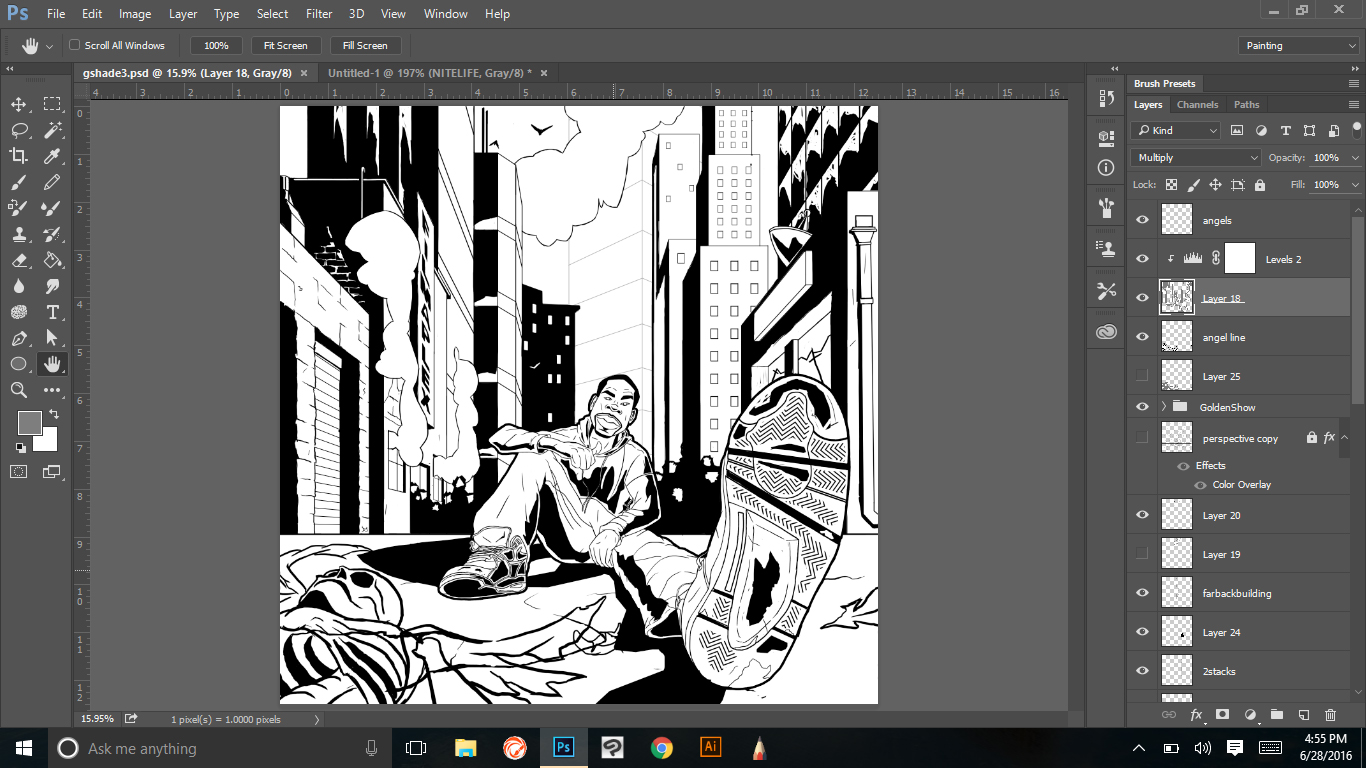
                                      Here's what the point I've gotten to so far not too much to go hopefully.

                                      0_1467177711786_GALMOST.jpg

                                      www.durrellodom.com

                                      1 Reply Last reply Reply Quote 1
                                      • Durrell Odom
                                        Durrell Odom last edited by

                                        0_1467267098348_galmost2.jpg

                                        www.durrellodom.com

                                        1 Reply Last reply Reply Quote 0
                                        • ?
                                          A Former User last edited by

                                          Awesome stuff man, really liking the bold shadows. Stoked to see it in color!

                                          1 Reply Last reply Reply Quote 0
                                          • Durrell Odom
                                            Durrell Odom last edited by Durrell Odom

                                            Last step before going to color

                                            0_1469602257931_gsvs.jpg

                                            www.durrellodom.com

                                            1 Reply Last reply Reply Quote 0
                                            • First post
                                              Last post