3rd Thursday fortune cookie saying...
-
I love this idea! Really fun and I think your initial sketch is excellent too
")
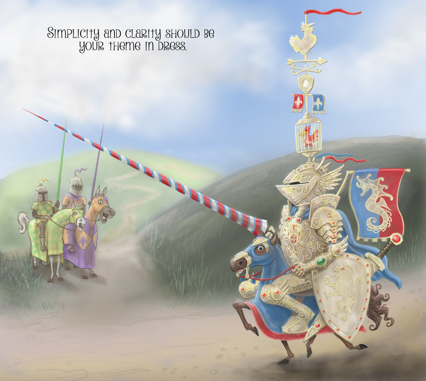
Looking at your thumbnails, I wonder (this is a personal opinion of course) if keeping it really simple would be the best way to go...the story is all about a knight looking silly because he's too fancy...to make that work I think he has to be really big in the picture, so you have space to illustrate all that fancy detail and make it come across as stupidly fancy...if you have him small next to a massive dragon no one will see the fancy stuff because they'll all be looking at the dragon and thinking of a derring-do adventure story and that's not what it's about.
Personally, I would keep it pretty close to your sketch with not too much background to distract - perhaps the knight and pony could be strutting down the street, with some simply-dressed peasants looking a bit unimpressed...that would be nice colour-wise because the peasants could be drab and brown but the knight all colourful. The other thing I think would be really good - is if the Shetland pony is looking unimpressed and grumpy with the knight, having to carry this massive load because the knight is so stupid with his fancy get-up.
AND - once you said Shetland pony I was reminded of the drawings by Thewell...I don't know how globally well known his drawings are, but here he is/was famous for his Shetland pony cartoons (I had his book A Leg At Each Corner as a child when growing up)...found a few to show you:
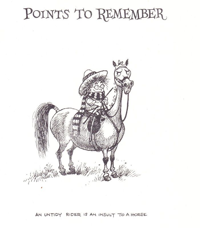
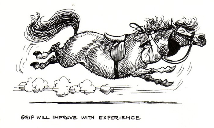
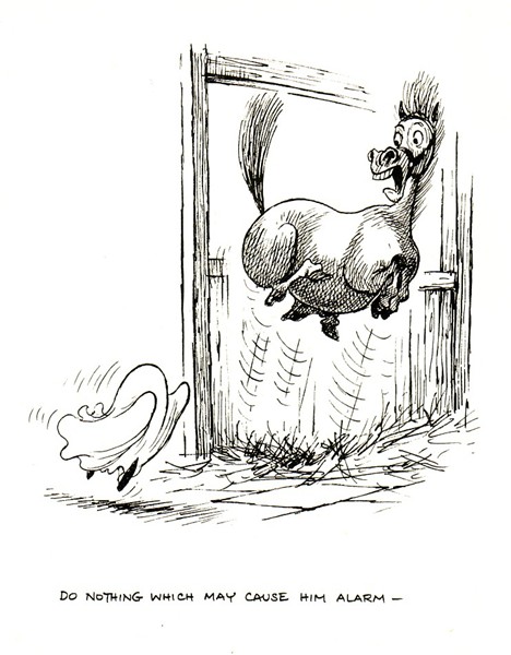
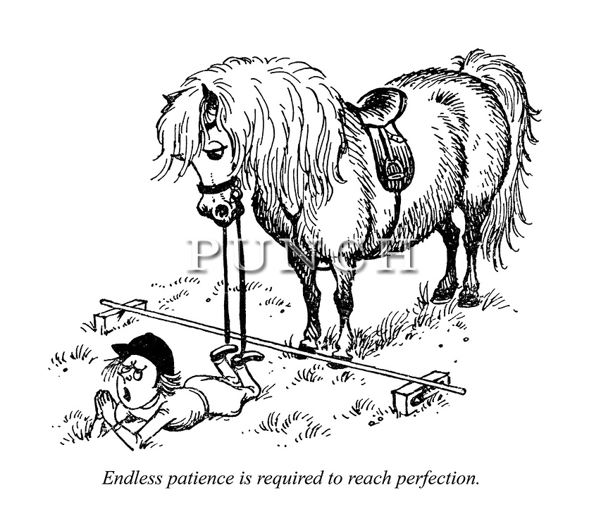
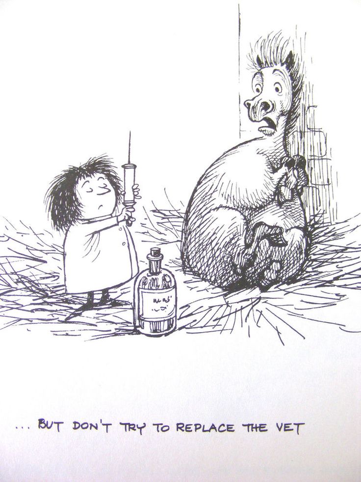
What I think is interesting, is that all of these images have captions too, and if you were to read them on their own and be told 'illustrate that caption' you'd think it would be really boring, but he's made them really fun
Sorry to spam you with horse pictures but hope it's useful in some way. Anyway as I said I think your idea is great and looking forward to where you take this!
-
Great horse pics... I will think again about the thumbnails... I understand that most ponies would be very upset having to carry the massive weight, but this pony is actually very proud of his rider. I know, hard to believe if you have been around horses at all...
The knight is completely covered up, no expression possible, so I actually thought the pony could have all the strut and character... to fulfill the challenge I need to have that "normal" person/knight looking at the ornate knight... a peasant would probably have the same reaction to any knight...
In one of the thumbnails I actually have the horses interacting with a normal horse twisting his head sideways at the ornate knight... who is not on the pony...
thanks for the input, it all helps...
-
I personally like the knight by himself on the little pony, it makes me grin every time i see it!! But i've been missing the mark lately, so don't listen to me lol
-
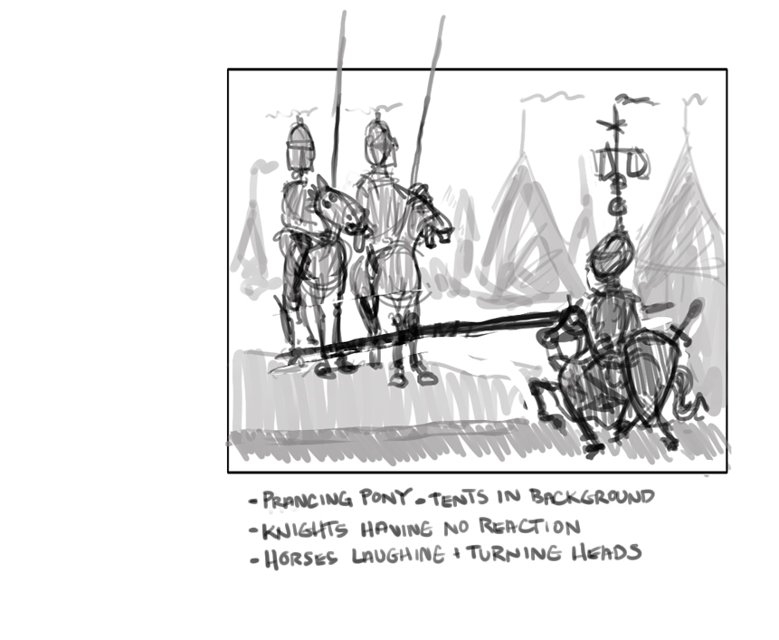
So, maybe the horses are having the action and the knights just sit like statues...
-
I like that idea, and having the knights so overloaded with frivolous things that they really couldn't even move
-
@Russ-Van-Dine I think that's the best thumbnail so far - it's clear and shows the story well. I like the laughing horse
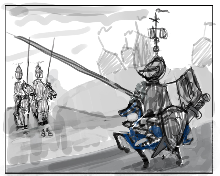
I think when refining the composition further, it might be worth looking at trying to make the fancy knight being the primary focus/the first thing your eye looks at - at the moment the balance is evenly split between him and the normal knights..I know it's a teeny pony but he's also more in the foreground... Perhaps with the saddle and the knight's body and all the fancy pole sticking up, it could all still be taller in total than the other knights...(at the moment it all looks shorter)..and the fancy knight could be bigger as he's closer to us than the other knights. Hope that makes sense. I think it is coming along great though!
-
@Dulcie those are hilarious! Thanks for sharing!!
-
Thank you Dulcie and everyone else, you are right about the knights being smaller. This time I angled the horse and ornate knight so he is more walking towards the viewer. the other knights get smaller and the tents become shades on a hill... I made the pony smaller and colored him blue because I was losing detail and couldn't see the knight or the horse... he isn't blue... I crossed the other knights poles with the ornate knights so even if you look at them this should bring your eye to the ornate knight... I made the stuff on his helmet smaller so he could be larger on the page... still reads as silly and will allow ornate knight to be easier to illustrate...
-
knights on the hill will have cloth coverings with big designs like you might see at a dinner theatre...
-
Unless someone has something else to offer, I am pretty happy with where this one has gotten to... I have time to do this and something else and decide which one to put in for the competition...thanks for the help everyone...
-
@Dulcie
That photoset was a trip down memory lane for me. Wow! These illustrations are great. -
@benben8it I agree, those ponies are really drawn well!
-
@Dulcie
I agree with Dulcie. A few drab looking peasants would complete the idea very well. Keeping the background very simple will only highlight the ridiculous knight all the more. I would hate to lose some of the details of this wonderful knight in order to fit in more background. -
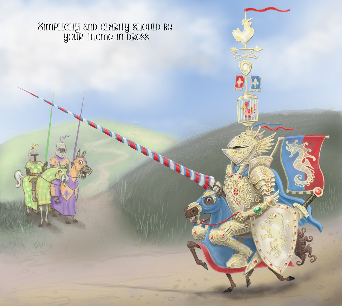
I have been working on the knight and I am close to showing you guys something more... the funny thing is I have been working to make the armor as silly as possible. I have changed the armor three times because it looked cool. I imagine this guy has just come into lots of money and went to the armor shop where they knew exactly how big a fish they had and talked him into a very awesome set of armor...he didn't know what to do...
-
Okay, everything is on a separate layer still so changes can be made easily. Any thoughts?
-
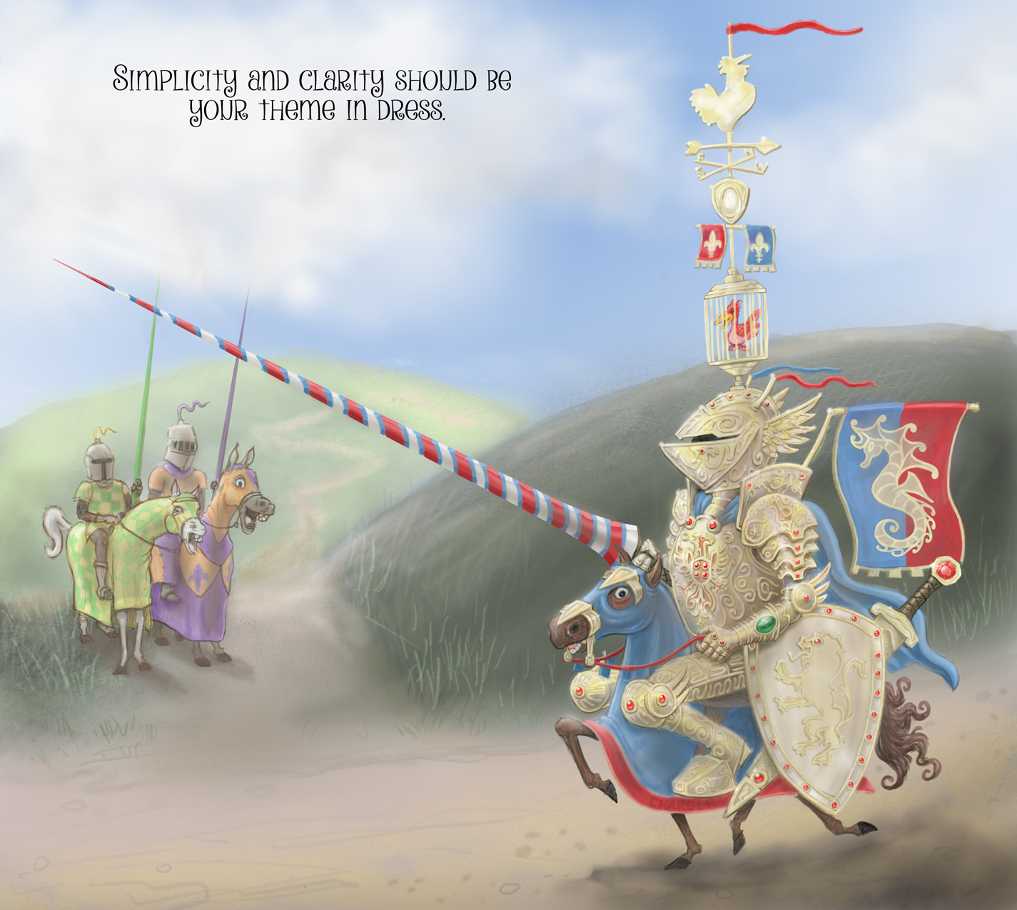
I added some shadows and highlights to try to make it late afternoon... any other ideas? -
Oh, this is wonderful!! I think maybe some really bright highlights and some nice dark occlusion shadows on the armor may help, all of the glorious detail is getting lost. I love the expression on the horse hehe
-
Subtle re-shading, more highlights and darker color values...thanks for the help.
-
This is beyond awesome my friend so great. Love the other horse's faces! I think you are nailing this one going to be a lot of great ones this month they just keep getting better and better.
-
I LOVE the bird in the bird cage...hysterical!