3rd Thursday attempt - critique please!
-
Hi! Thanks for looking! This is my 3rd Thursday attempt. I'm still finding it hard to show thumbnails... They look so rough that I can't see what it's going to be until I really get to work on it. I know that's something I've got to
work on. Anyway, I wanted to incorporate the text into my design as I think lettering makes you more 'desirable'? I took a Skillshare class and enjoyed refining my design. My inspiration came from a picture I have of my
Little girl splashing in a puddle and having the time of her life - I felt like this illustrated the concept well. When we are children we make our fun even on rainy days.....
Anyway, this is quite different from my previous work, but I also think it might be more marketable. I'd really appreciate your thoughts! Thank you. X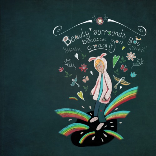
Magical, fairy tale art. Www.jacquelinewild.com
-
It's really nice! I like the folksy whimsical style and the way you've incorporated the lettering into the piece. The concept comes across well too. The main thing I wonder about is whether the puddle could be improved...it's very black, a bit like a deep hole. Perhaps some blue-browns in there plus a hint of reflections?
-
Your left shoulder is missing and your arm is too long. I think if you bump that shoulder out and drop the arm shadow to below where the shoulder starts it will look better. Your picture captures the thought pretty well and I like your birds... great start! don't worry too much about the thumbnails if you can restart your image without being in love with what you started with. Sometimes my images change entirely.
-
@jacs I like the idea and I think it conveys the message of the cookie. Only, I am not sure it´s coming across clearly. I did not recognize the puddle at first sight, nor that the character is jumping in it. It looks like it is standing on a black patch with beauty just streaming out of her. I am not sure I would worry about anatomy, because your style is so nicely stylized, but you may think about making the pose more dynamic (so that it looks like she is jumping) and/or making the puddle more clear (different color? Broken surface? Just some ideas, there are probably different options). I love your lettering and I particularly like the combination of dark background with bright colors!
-
Thanks for all your feedback - that was really useful. I wondered the same about the puddle - I might have a play with that. I'm quite excited to try a few more fortune cookie quotes now and do a bit of series of them!
@Russ-Van-Dine thats reassuring about the thumbnails. I've been watching the lessons and listening to how things shouldn't really move after the initial sketch but it just made me feel boxed in. I know it's something to work towards
but I like a certain amount of adventure while creating! Really appreciate your thoughts and time have a lovely day!
 -
I agree about the puddle and pose, can try a before and after splash image. I think a lighter colored water with a shadow reflections could be interesting.
You could even try a pose with them kicking the water which turns into rainbows and birds flying up.
For thumbnails I think it's just a matter of getting used to posting rough ideas.