Pepper and Carrot
-
Dear all,
within the last weeks I continued working on a fan project which I started to present here in an earlier post.
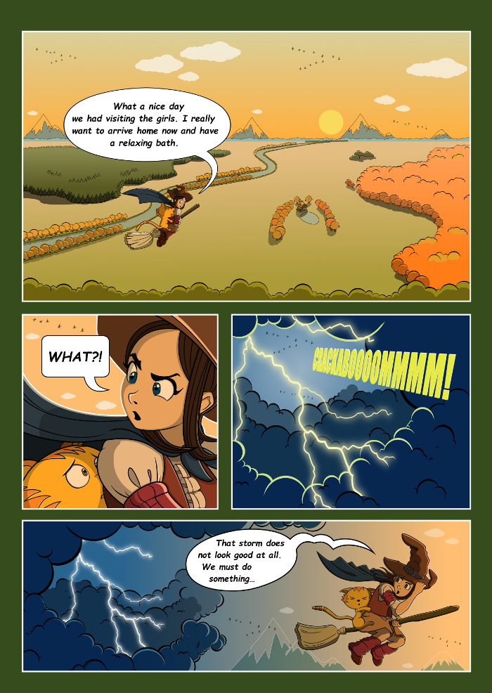
The main characters and the world were designed by David Revoy (http://www.peppercarrot.com/) (License: Creative Commons Attribution 4.0 ). The story was written by Juan Josè Segura (https://segurajj.wordpress.com/2015/10/08/a-pepper-carrot-script-the-storm/). I am lucky to contribute to this awesome project with illustrating Juans story. We would very much appreciate if you would give us some feedback or comments about it") . Here is the first page:
. Here is the first page:
-
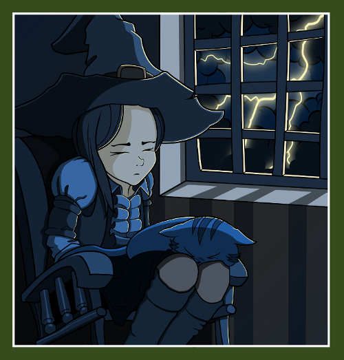
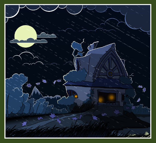
Some more panels for the next pages:
-
Looks like a story I would love to read, I like your use of colours
-
I love your line work and color palette (=
-
Would really love to read this story, the characters look very likeable! Love your composition and use of color. I would suggest spending more time designing the typography - it does not look fitting to the beautiful line drawing. Maybe hand lettering?
-
@smceccarelli I agree the the lettering looks generic compared to the wonderful art. You need a better font or some hand written text.
-
Thanks, @Di07, @dan-tavis, @smceccarelli, @evilrobot for your feedback and comments!
I will definitely work on the typography, I think I will go for handwriting. Thank you so much for that idea. That will be new for me, so if thesomebody can give my any suggestions, they are very welcome. -
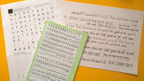
Hi guys! I am just preparing to work on my typography. I found a great source of inspiration, not just for comics. It might also be interesting for you, if you look for picture book lettering or title fonts:
http://www.1001freefonts.com/ -
Oooh, I love your designs. Great work!
-
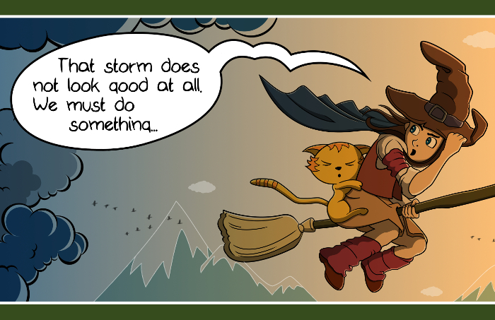
Following @smceccarelli and @evilrobot I started working on the lettering. I started with the text bubbles. What do you like more: the original one, using a GIMP font or the hand written text? I would say that the hand writing fits more to Peppers lively character. But I am not sure and would like to hear other opinions. Thanks in advance!

-
@Jana I definitely like the second one better. But maybe you can try to transform your own handwriting into a font? Jake Parker mentions how to do this at the end of his course on drawing comics.
-
Thanks for the feedback!
 I will definitely try that.
 -
@smceccarelli
I installed my own handwriting font. It was really fun working on that. What do you think? Is that appealing enough?
-
@Jana I think this looks beautiful - and it has the same personality as the drawing!
-
Thank you so much, @smceccarelli! That means really a lot to me.
I will change the other text accordingly, and I will also see if I can improve the soundwords.