Society of Visual Storytelling

    SVSLearn Forums

    • Register
    • Login
    • Search
    • Recent
    • Tags
    • Popular
    • Users
    • Groups
    • Search

    The yukky stage

    General Discussion
    10
    17
    4668
    Loading More Posts
    • Oldest to Newest
    • Newest to Oldest
    • Most Votes
    Reply
    • Reply as topic
    Log in to reply
    This topic has been deleted. Only users with topic management privileges can see it.
    • audrey dowling
      audrey dowling last edited by audrey dowling

      thanks for all your advice, I tried to keep them in mind as I progressed
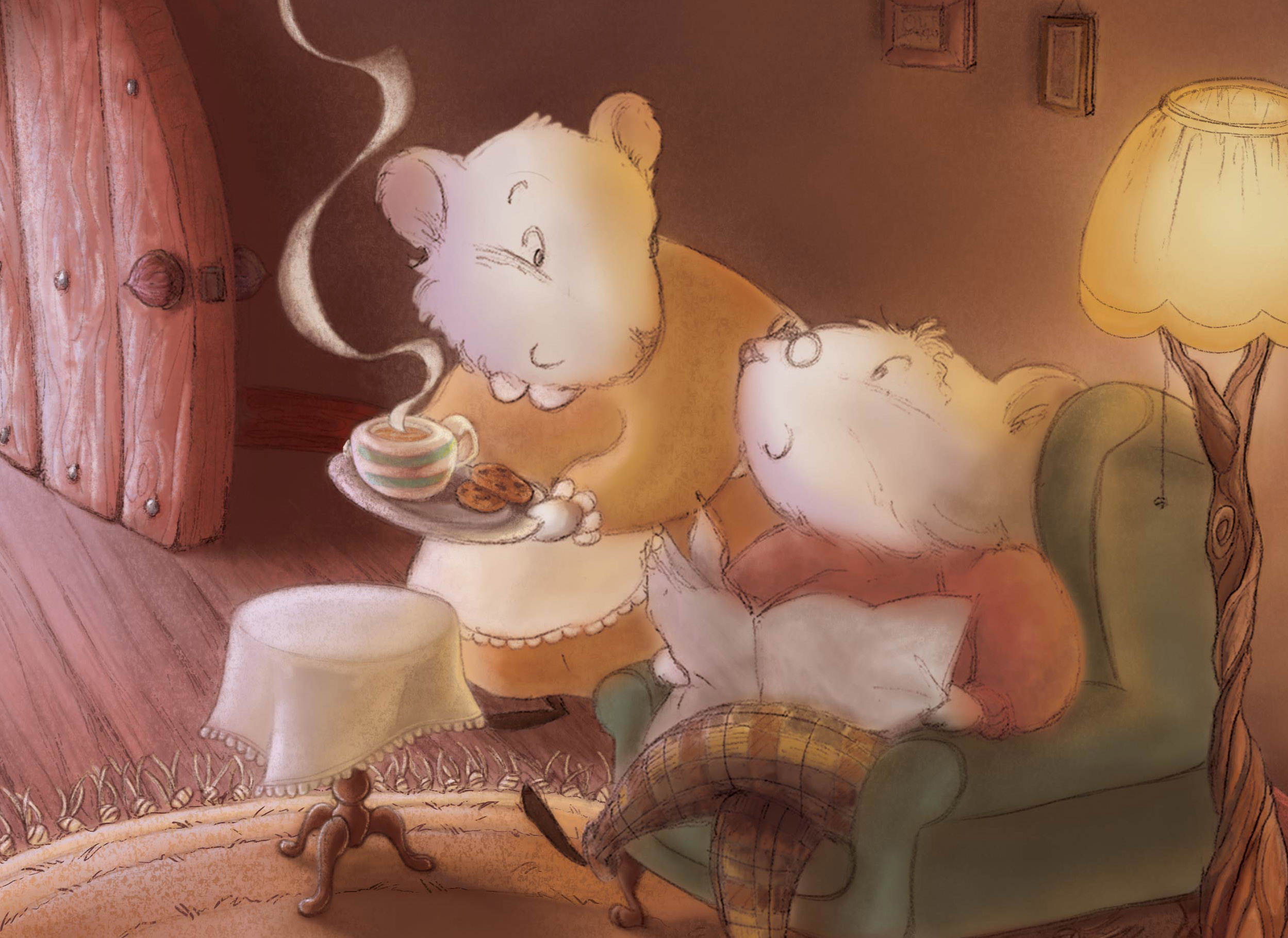
      I've worked mainly on the background and middle ground there. next is the group "mice-armchair-lamp", and refine lighting and soft and hard edges
      as for getting past the yukky stage block, I really forced myself to stop thinking and JUST DO IT, ffs! ^_^ Let's hope it will pay in the end
      0_1463758625725_cup-of-tea.jpg

      website: https://audreydowling.wordpress.com/
      twitter: https://twitter.com/audreydowling
      facebook: https://www.facebook.com/Audrey-Dowling-Artist-Illustrator-498582176906242/timeline/?ref=bookmarks

      1 Reply Last reply Reply Quote 3
      • Lee White
        Lee White SVS Team SVS Instructor Pro SVS OG last edited by

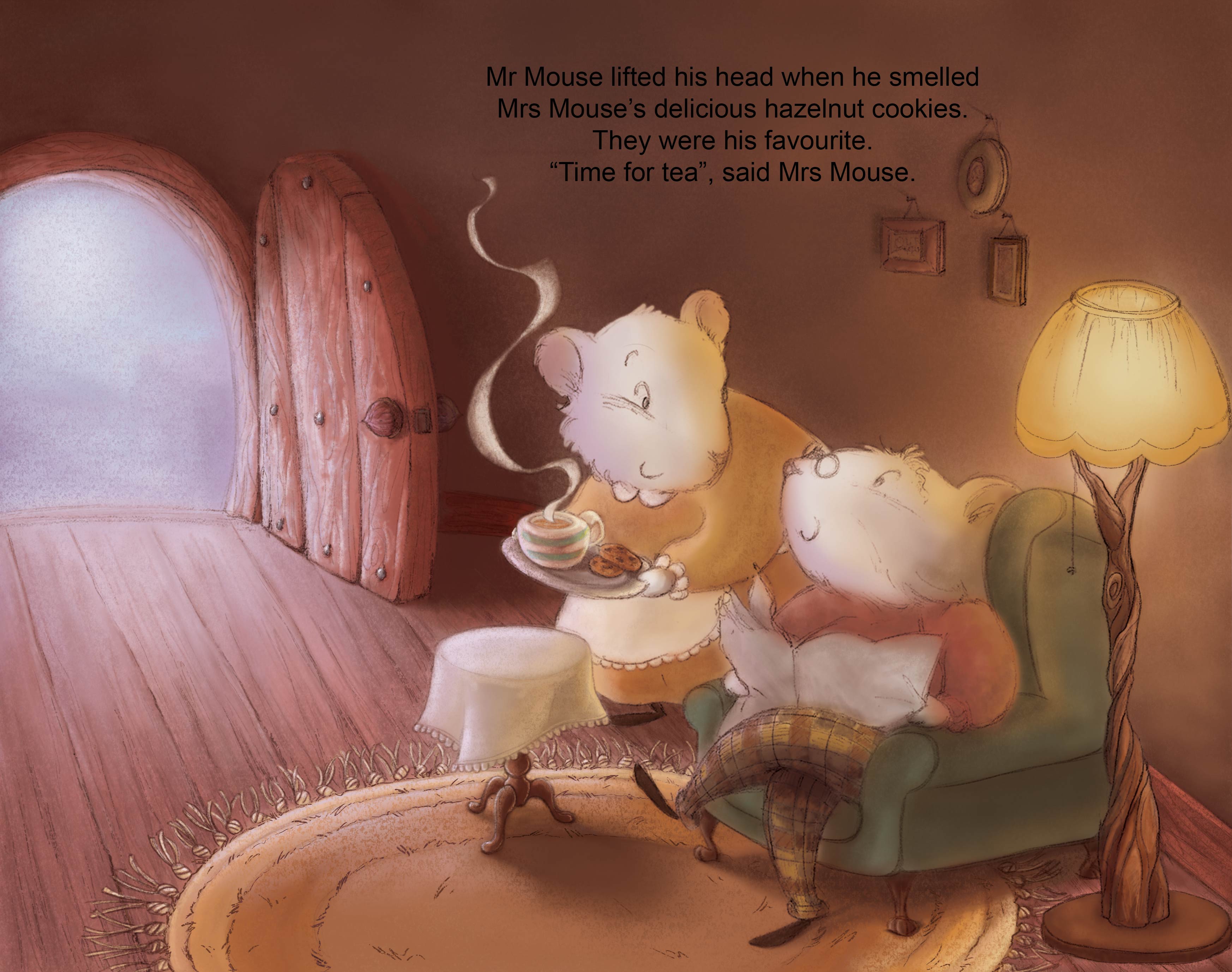
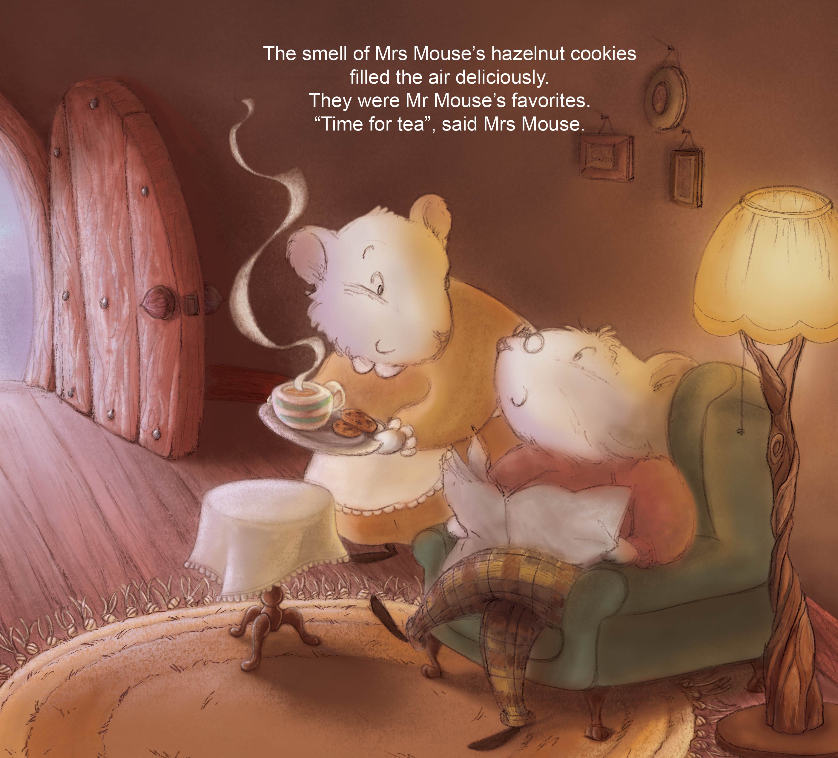
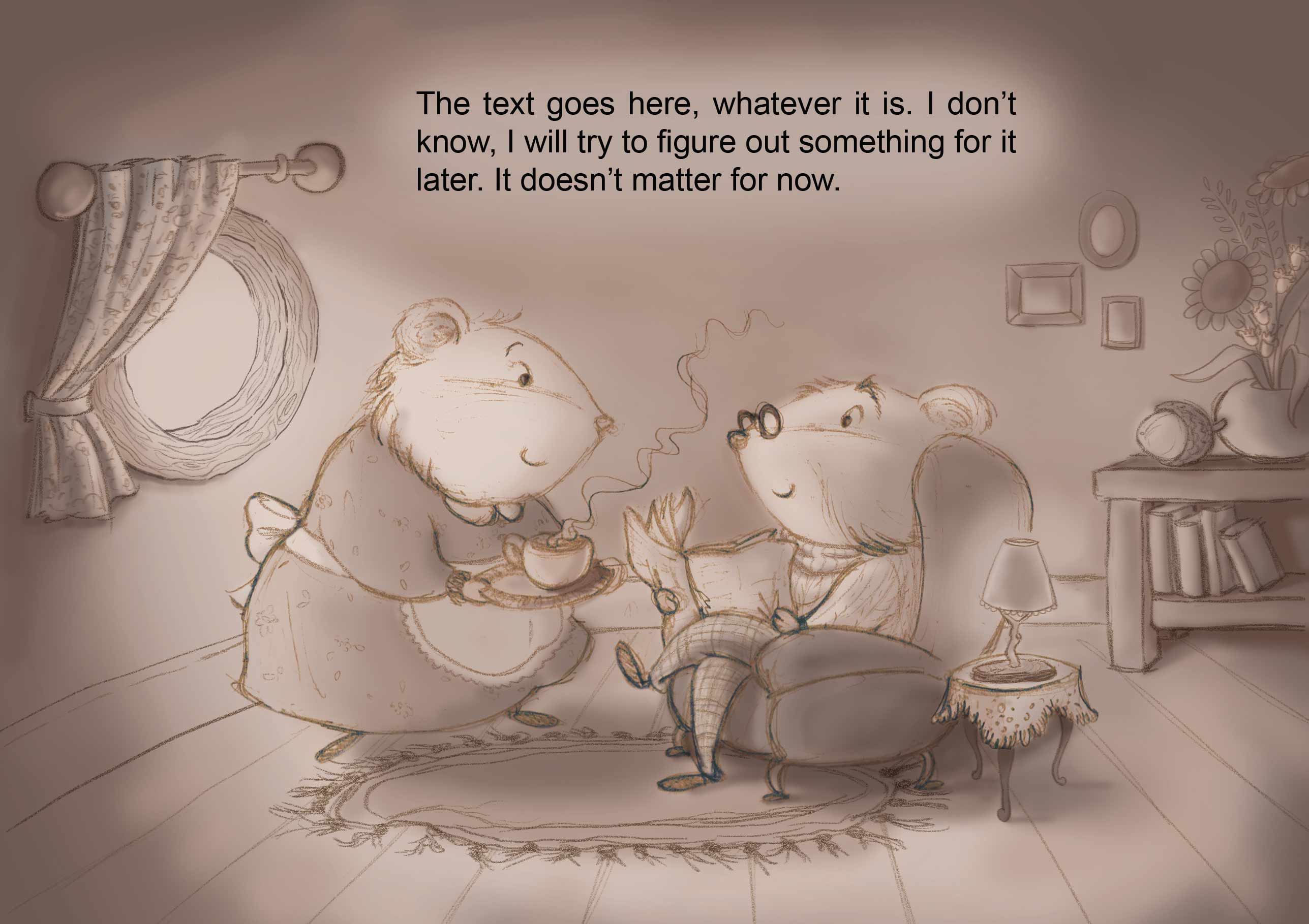
        I think your painting is lovely. I think maybe it's just the composition. That open door is probably a key point in the story, otherwise it wouldn't be open. So maybe it needs to be shown. It is drawing a huge amount of attention in the image. If it's not totally needed in this spread, consider a closer crop. His leg being cut is still problematic, but I think this makes for a much more intimate scene and still leaves room for the type.

        0_1463763419502_1463758660630-cup-of-tea.jpg

        SVS Faculty Instructor
        www.leewhiteillustration.com

        audrey dowling 1 Reply Last reply Reply Quote 3
        • Russ Van Dine
          Russ Van Dine last edited by

          I think your details are coming along great! I like what Lee has to say about the cropping... can't wait to see this one finished!

          1 Reply Last reply Reply Quote 1
          • Christine Garner
            Christine Garner last edited by

            Personally I never feel like I get past the yukky stage until I'm about an hour from completing a picture. I think you just have to stick with it.
            Sometimes I'll look at it later and think- urghh what have I done though. Difficult thing to answer.

            website: https://thimblefolio.com

            1 Reply Last reply Reply Quote 1
            • audrey dowling
              audrey dowling @Lee White last edited by audrey dowling

              @Lee-White, I finally have time to reply
              that door and bright light were bothering me too. I had thought about cropping it, but was afraid the composition might be too centered then... like it was in my initial sketch
              or else, I have thought of toning down the focus on the door by making the light softer and showing what's outside that door
              what would you say works best?
              cropped (but not as much as you did)
              0_1464170365735_cup-of-tea2.jpg
              or showing what's outside the door
              0_1464170470161_cup-of-tea1.jpg

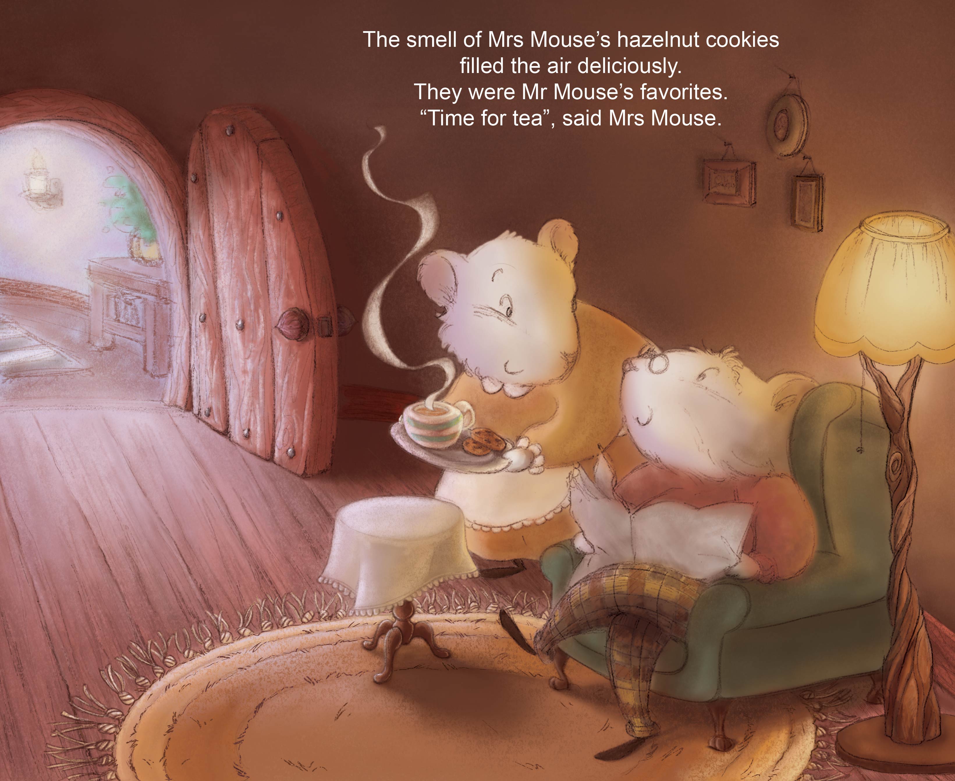
              ps: my initial sketch was like this 0_1464170533032_essai 1 value.jpg

              website: https://audreydowling.wordpress.com/
              twitter: https://twitter.com/audreydowling
              facebook: https://www.facebook.com/Audrey-Dowling-Artist-Illustrator-498582176906242/timeline/?ref=bookmarks

              MOO 1 Reply Last reply Reply Quote 0
              • audrey dowling
                audrey dowling last edited by

                I think I have a preference for the second solution...

                website: https://audreydowling.wordpress.com/
                twitter: https://twitter.com/audreydowling
                facebook: https://www.facebook.com/Audrey-Dowling-Artist-Illustrator-498582176906242/timeline/?ref=bookmarks

                1 Reply Last reply Reply Quote 0
                • Christine Garner
                  Christine Garner last edited by

                  This is looking really nice 🙂 I agree the second solution is good.

                  website: https://thimblefolio.com

                  1 Reply Last reply Reply Quote 1
                  • Lee Holland
                    Lee Holland last edited by

                    I think they are both strong images. i also like the detail you have put in the door way. well done

                    https://www.facebook.com/pages/Lee-Holland-illustration/285517801577676?
                    https://www.instagram.com/lee_holland_illustration/
                    http://lholla56.wix.com/lee-holland

                    1 Reply Last reply Reply Quote 1
                    • Russ Van Dine
                      Russ Van Dine last edited by

                      the detail on the floor and the rug, all awesome... are you going to put any more detail into the mice? I like the one with the door open and the detail outside... maybe you can put an acorn out there on the floor next to the table...

                      1 Reply Last reply Reply Quote 1
                      • audrey dowling
                        audrey dowling last edited by

                        thanks! I'll go with the second one then.
                        I think I might soften and warm up the lighting a bit though
                        yes, Russ, I haven't started the mice yet 😉

                        website: https://audreydowling.wordpress.com/
                        twitter: https://twitter.com/audreydowling
                        facebook: https://www.facebook.com/Audrey-Dowling-Artist-Illustrator-498582176906242/timeline/?ref=bookmarks

                        1 Reply Last reply Reply Quote 0
                        • MOO
                          MOO SVS OG last edited by

                          There is something about the head on the first one that doesn't sit right. It kind of looks like the head i sattached to the neck wrong-if that makes sense but, since you're using the second one, it doesn't really matter. Both of them are really cute but, I do think the second composition looks better. I really like the colors you've used too. Looks so warm and cozy 🙂

                          Marsha Ottum Owen

                          1 Reply Last reply Reply Quote 0
                          • MOO
                            MOO SVS OG @audrey dowling last edited by

                            @audrey-dowling Looks great.

                            Marsha Ottum Owen

                            1 Reply Last reply Reply Quote 0
                            • First post
                              Last post