First digital watercolour piece
-
@Christine-Garner Awesome! No, British English does not sound weird - it's what I was taught in school (I'm Norwegian)
") I'm especially impressed by the running water effects in Rebelle, but the Corel ones looked great as well! Are you planning more videos? Hope so, I just subscribed
I'm especially impressed by the running water effects in Rebelle, but the Corel ones looked great as well! Are you planning more videos? Hope so, I just subscribed -
Cool
Norway is a beautiful place (I haven't been but I've seen pictures).
Yes I plan to make some more videos, I want to do some painting progress videos and get better at talking in them so I break a comfort zone or two. -
@Christine-Garner (English is normal English and not American slang right?) love your demo, I really want to give this a try!
Leontine
"A picture is worth a thousand words."https://leontineillustrator.com
https://www.instagram.com/leontine.illustrator/
http://www.facebook.com/leontineillustration -
-
@Leontine Cool
(I don't understand the slang question though sorry).website: https://thimblefolio.com
-
@Christine-Garner It was just a joke, to make you feel comfortable.
-
@Kevin-Longueil It was just a joke. Please don't feel offended. XD
-
Aaaand the second one

I'm sorry I'm not more active in the community here, I really wish there was a more hours in a day
 But I'm committed to drawing daily, even for just a few minutes, so this takes a chunk out of other activities.
Soooo ... this is my second attempt. I found this image of a stunning goth girl on Pinterest, and tried to capture her awesome expression. Not sure how well I did with that, but I still like how the image turned out
Things I like about this piece:
The aesthetics. Goths are supercool
The cool purple (violet?) shadow colours
Her eye colourThings that could be improved:
Textures - especially the hair, but also the beads in her nose jewellery
The expression, I don't think I nailed it - mine is too prettyI thought of adding some paper textures like @Chip-Valecek suggested, but I'll try printing this on textured paper first. I'm just not sure how my printer handles thicker paper. It would be awesome to have these printed on some sort of canvas. Maybe - if I get a series, perhaps I'll try
My portrait:

Reference photo:

-
@Camomilla This looks good Camomilla - not sure if you are looking for critique on this so i apologize if you are not - i thought i would give feedback on the small differences between the reference and the painting - the reference is very striking - to me it looks as though she is looking directly at the light source - the story it evokes for me is that she has a quarrel with the light source (the Sun) and she intends to win. She has a strong and defiant expression. I think the very dilated pupils are very important to the image and that she is looking up (perhaps at the Sun). In your painting she is looking up a bit and of to the side which seems to take the power away from her. If you raise her irises and move them slightly to our right so they are more hidden by her eyelids and dilate her pupils like in the photo i think it will give her that same character - other two things that are equally as subtle would be to straighten the slight dip in the lower lid on her right (our left) eye - it is a straight line in the photo and this adds to the effect of her looking upwards - and lastly just a bit more shadow under the chin - i see it is there but i think if you darken it it will add to her pose - these are the sublet differences i see that might bring it closer to the attitude you are trying to hit - i could be wrong though of course
- thanks for sharing your paintings - looking forward to you next piece! -
@Kevin-Longueil No, please - critiques are very welcome, especially since I felt I didn't achieve what I wanted with this piece. Yes, the eyes were giving me a huge headache! I did't capture it in my sketches either, often I find the sketches to be more expressive than the finished piece - but this was not the case with this one. Thank you for observing and pinpointing what I could have done differently! Much appreciated
-
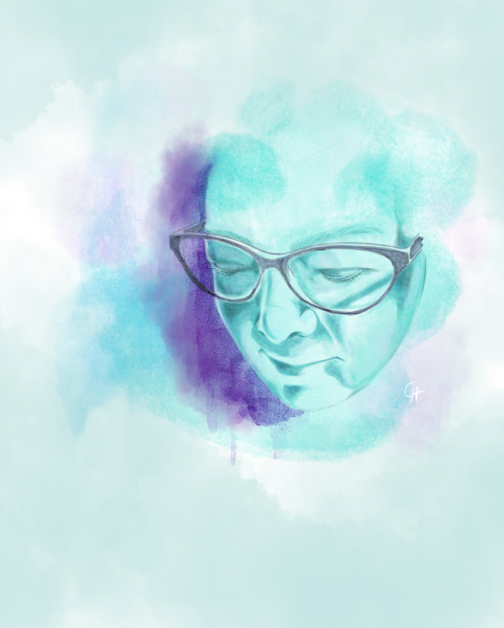
And I've done another. This one is actually a self-portrait, meant to go on my portfolio-site. I work as a graphic designer, and I'm currently re-designing my portfolio. I've included the two other digital watercolour-sketches, to show that I'm able to do simple illustrations as well. I had a kind of generic image next to the "about me"-text, but thought a self portrait would make it more personal. This is the most difficult one I've done to date - I thought I knew what I looked like, but I really didn't lol Still not sure if I pulled off the eyes being shut, I think I need to give more emphasis to the eyelashes to show that the eyes are nearly closed.
Things I struggled with:
- The glasses. I ended up tracing them - they take up a huge amount of space in my kind of tiny face. Besides I could NOT seem to get the angle/perspective right

- The likeness. I'm used to seeing myself in the mirror, but that's not the same as what others see, now is it.
- I wanted a more saturated colour-scheme than my previous two sketches, I sort of got there in the end, but I'm really anxious about using too much colour.
- The background. Allthough I like it, it's not how I imagined it. Don't know how to explain this - I think the image works well, but I still feel that the images I produce should look more like the ones in my mind
Things I like about it:
- The colours and the mood.
- The expression (at least when I fix the lashes, I think)
- The likeness. I got there. In the end.
Please comment - always grateful for feedback on my stuff
- The glasses. I ended up tracing them - they take up a huge amount of space in my kind of tiny face. Besides I could NOT seem to get the angle/perspective right
-
Moar eyelashezzz
I think it reads better now. I've published it on my site. It feels good 
