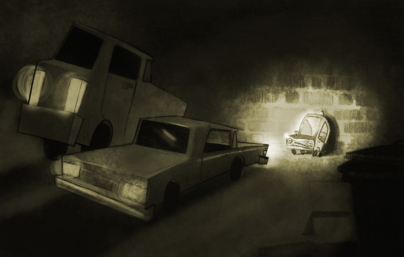
Black & white fail.
-
This post is deleted! -
I actually like that third rendering. The lighting is impressive but I think more contrast can help. Darker darks and brighter lights.
-
@gimmehummus I think the drawing is excellent really - it looks very well done to me - if you duplicate this layer and lay it over the original and set it to multiply it will get nice and dark - you could then go In With a low opacity eraser and define some shadows on the ground by erasing a bit around them - you could make the top planes slightly lighter than the backs too - and possibly erase completely the multiply from on top of the little car to allow him to really pop - last idea would be to allow the van to be darker than the car - just ideas of course - I really do think this is a very nice drawing

-
@gimmehummus Here is the result of the multiply layer with highlights and erasing - i just now had an opportunity to draw it - not sure it helps at all - i did not do much - used the selection tool to mask areas i was erasing the multiply from - but it just feels like going darker overall will really allow you to make it look like a night scene - love the gestures and characters in this

-
That's much stronger, I love it.