Society of Visual Storytelling

    SVSLearn Forums

    • Register
    • Login
    • Search
    • Recent
    • Tags
    • Popular
    • Users
    • Groups
    • Search

    Building volume! Tropical birds

    General Discussion
    11
    19
    5085
    Loading More Posts
    • Oldest to Newest
    • Newest to Oldest
    • Most Votes
    Reply
    • Reply as topic
    Log in to reply
    This topic has been deleted. Only users with topic management privileges can see it.
    • Chris Perry
      Chris Perry @bharris last edited by

      @bharris I love the volume as you put it. Everything looks well drawn and solid. Looks good to me. I like the color scheme too.

      1 Reply Last reply Reply Quote 1
      • bharris
        bharris last edited by

        @Chris-Perry Thanks! I just moved the bear and shrunk it down, and I like it a bit better. 🙂 Seems to get the story across too.

        0_1468696418534_bed teddy 5.jpg

        www.brittanyharrisillustration.com/
        www.instagram.com/britillustration/

        1 Reply Last reply Reply Quote 1
        • smceccarelli
          smceccarelli Pro SVS OG last edited by

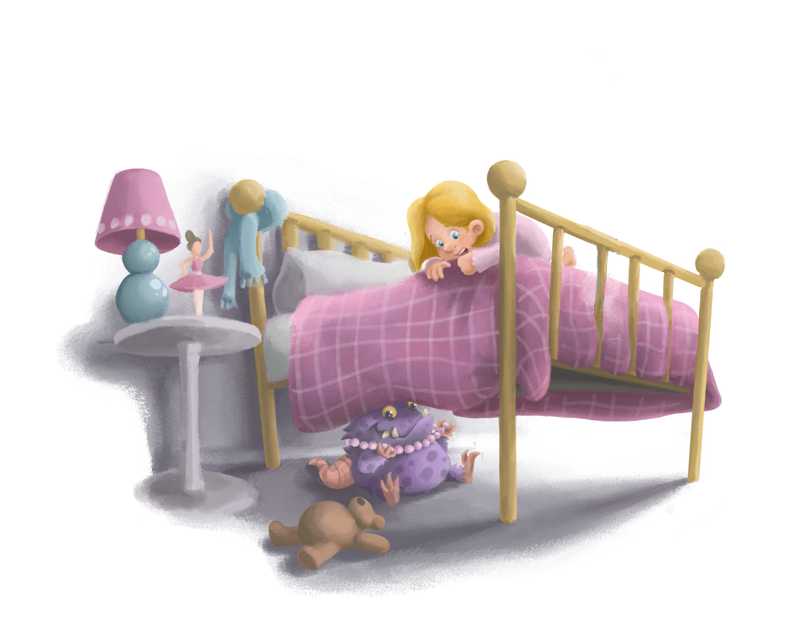
          This a nice piece, with a beautiful choice of colors. The perspective of the table does not match the bed, I think - the top plane is fine but the bottom foot should be much more foreshortened and the pole should have the same tilt as the bed posts.
          Have you considered taking away the teddy bear completely? Is it a needed element of the story?
          Your image makes me think at "I need my monster", a picture book by Amanda Noll and Howard McWilliam that my kids love beyond measure (and I dread, because I have read it at least a hundred times...)

          1 Reply Last reply Reply Quote 1
          • Dulcie
            Dulcie SVS OG last edited by

            @bharris It looks great! I love the monster design, especially that cute face, it's just the right mix of cute and mischievous 🙂

            www.dulciemascord.com
            https://www.instagram.com/dulciemascord
            https://twitter.com/dulciemascord
            https://www.facebook.com/dulciemascord

            1 Reply Last reply Reply Quote 0
            • bharris
              bharris last edited by

              @smceccarelli Thank you! I will change the table, I was just starting to work on it and you're right! For me the story line is that she dropped the bear and there is a monster under the bed she is afraid of. I was hoping to make the monster a collector of her things, but it gets rather cluttered if I add other things under the bed... Not sure if that will come across.
              Too much of a good thing! Beautiful images in that book. 🙂

              @Dulcie Thank you, I was scrolling through Danny Beck's stuff and was inspired to try a monster. I've never done one before.

              www.brittanyharrisillustration.com/
              www.instagram.com/britillustration/

              1 Reply Last reply Reply Quote 0
              • bharris
                bharris last edited by

                Finishing the bear and lighting today, day off and then on to the next project. 🙂

                0_1468766006214_Bed teddy 6.jpg

                www.brittanyharrisillustration.com/
                www.instagram.com/britillustration/

                1 Reply Last reply Reply Quote 0
                • bharris
                  bharris last edited by

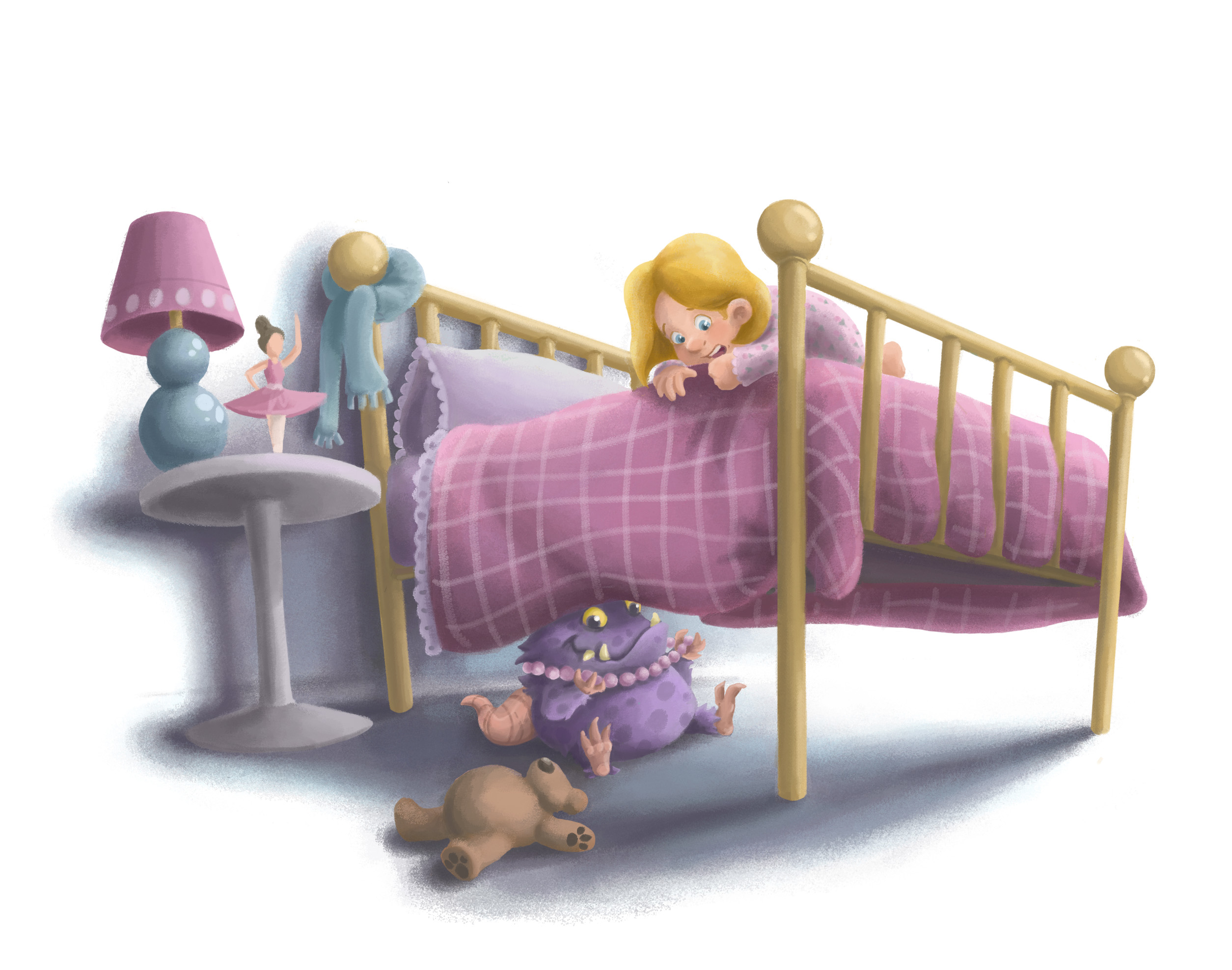
                  Finished! Whew. An image a week may be a lot... lol!

                  0_1468775670167_Bed teddy Final.jpg

                  www.brittanyharrisillustration.com/
                  www.instagram.com/britillustration/

                  Chip Valecek 1 Reply Last reply Reply Quote 4
                  • Chip Valecek
                    Chip Valecek SVS Team SVS OG @bharris last edited by

                    @bharris Looks great! Good luck with an image a week.


                    https://www.instagram.com/chipvalecek/
                    https://www.facebook.com/cvalecek
                    http://www.cshellmedia.com/

                    1 Reply Last reply Reply Quote 1
                    • JajaJulie
                      JajaJulie last edited by

                      Love the monster, so cute. Wonderful work with this @bharris! 🙂

                      http://julienewcombdesign.wix.com/portfolio

                      1 Reply Last reply Reply Quote 0
                      • MOO
                        MOO SVS OG @bharris last edited by MOO

                        @bharris Iagree that the table doesn't match the perspective of the bed and I feel like the monster should be a little deeper under the bed or something..or maybe the shadow go bsck a little farther toward the lighted side. Just a little but, maybe it's supposed to be right on the edge and showing a bit. I also love the colors and it si so cute.

                        Marsha Ottum Owen

                        1 Reply Last reply Reply Quote 0
                        • natiwata
                          natiwata SVS OG last edited by natiwata

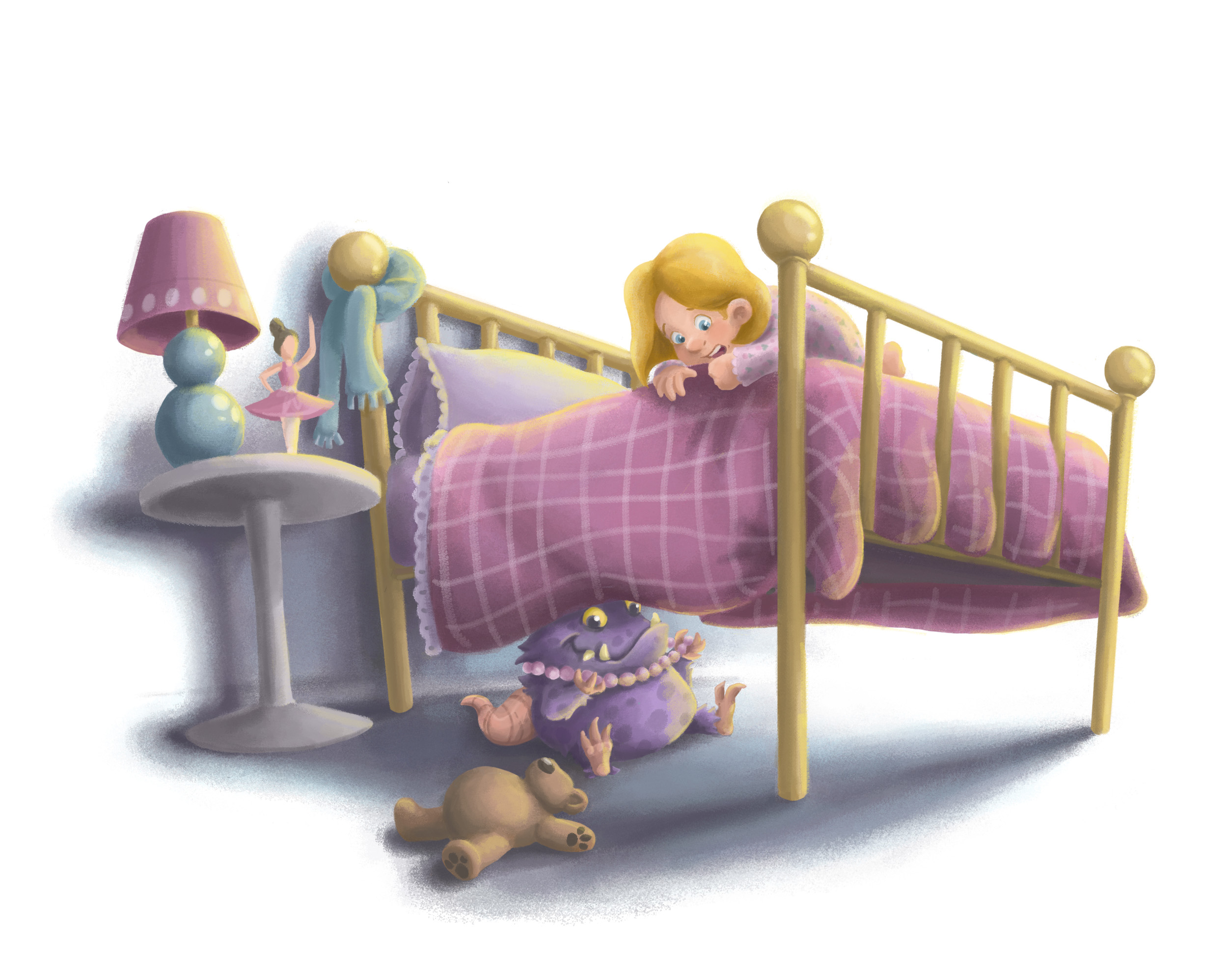
                          This turned out really nice @bharris ! Nice rendering style and texture. Really starting to have your own distinct style that I recognize! Settled into the new location I hope?

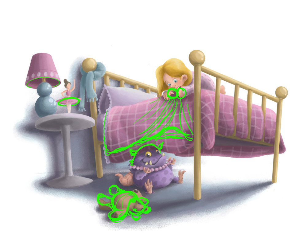
                          I made a couple quick notes as things you might try that I think would make this read a little clearer, but finished not perfect as Jake says right?
                          -Turning the bear would let us see both ears, classic bear shape and make it read at a glance I think.
                          -If she was pulling the covers up a bit, it might add to showing her anxiety (bunching the covers up nervously) and it would give some room for a clear profile of the monster
                          -ballerina should match the angle of the lamp and table being a round shape.
                          --There is a lot of the same color in this image, making the monster a different color might help break things up.

                          My two cents 🙂

                          0_1468975904144_feedback.jpg

                          Nat Iwata
                          www.iwataillustration.com

                          mattramsey 1 Reply Last reply Reply Quote 4
                          • bharris
                            bharris last edited by

                            @natiwata WOW! Thank you for that insight! It looks so great like that and so much more dynamic and a better story! I've moved on to the next project, but I've downloaded this for when I can go back and re-work it. 🙂

                            @Chip-Valecek @JajaJulie Thank you!

                            @Marsha-Kay-Ottum-Owen Thanks for that! I really struggled with the table, but it still is a little off. I'll go back and re-work the image later.

                            www.brittanyharrisillustration.com/
                            www.instagram.com/britillustration/

                            1 Reply Last reply Reply Quote 0
                            • mattramsey
                              mattramsey @natiwata last edited by

                              @natiwata spot on!

                              @bharris awesome work! I especially like the design of the monster.

                              https://www.inprnt.com/gallery/mattramsey/
                              https://mattramsey.artstation.com/
                              https://twitter.com/mramseyART

                              1 Reply Last reply Reply Quote 1
                              • bharris
                                bharris last edited by bharris

                                Did another piece for building volume and trying different things! I already notice that the tone is off, but I'm moving on to the next and learning as I go!

                                0_1469844637999_Tropical birds 3.jpg

                                www.brittanyharrisillustration.com/
                                www.instagram.com/britillustration/

                                1 Reply Last reply Reply Quote 7
                                • R
                                  Rachel last edited by

                                  I love how you can switch styles so easily. This is really nice.

                                  1 Reply Last reply Reply Quote 0
                                  • bharris
                                    bharris last edited by bharris

                                    @Rachel Thanks! I guess I'm still exploring to find what I like working with best. 🙂

                                    www.brittanyharrisillustration.com/
                                    www.instagram.com/britillustration/

                                    1 Reply Last reply Reply Quote 0
                                    • Russ Van Dine
                                      Russ Van Dine last edited by

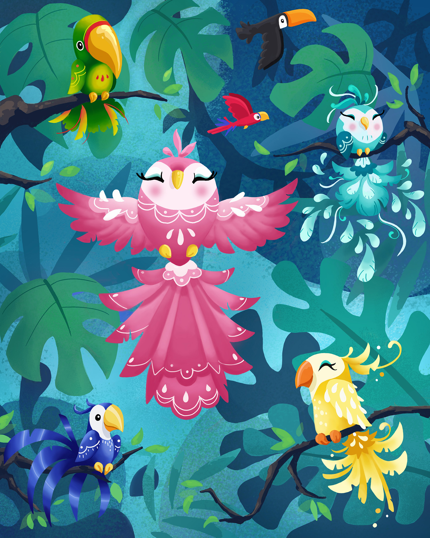
                                      I love this, just a small note, the darkest value next to the lightest value is in the lower right, the two leaves... I would make this lighter area behind the yellow bird, behind the dark leaf darker than the leaf not lighter. That way, your yellow bird would pop out instead of the background behind the dark leaf. this is a great style and I like the birds, I might have to use this as a source in the future! Nice job!

                                      1 Reply Last reply Reply Quote 0
                                      • bharris
                                        bharris last edited by

                                        @Russ-Van-Dine Thank you! I noticed that too after I finished. Also the tone from the background to the pink bird is basically the same. Gray scale is so helpful! I plan on revisiting a lot of the work I'm doing, it really is never finished!

                                        www.brittanyharrisillustration.com/
                                        www.instagram.com/britillustration/

                                        1 Reply Last reply Reply Quote 0
                                        • First post
                                          Last post