Red Riding Hood Feed back
-
I have this in my portfolio but not sure it's working. Please send me your thoughts on how/ if this needs improving.
"Never give up! Never surrender!" ~Commander Peter Quincy Taggert
-
Hi Katrina! Good to see you here! It's been a while since I saw you. How long ago did you take my class? 2007?
I took a look at your portfolio and think this is one of the stronger pieces. It has a solid feel and I love the graphic sensibilities of it. That said, the surfer girl and those other 3 pieces right after feel out of place. Not as strong as the other work for sure.
I really like the work you are doing, although a client may be confused to what your style is with the painting and illustration section being on the same page. Whatever is your MAIN focus is what I'd put at the top. Right now, the painting seems like the main thing and the illustration and graphic design being secondary.
Hope to see a lot more from ya!
Cheers,
Lee -
Hey Lee. You are SO correct. I want it all. I've been showing at a local gallery AND trying to refocus on Illustration It's very frustrating! I have a show coming up in October that I need to finalize some painting, an illustration competion I'm working on AND trying to create pieces for a portfolio. UGH!
Thanks for the feed back! It is very much appreciated! Sounds like I might want to rework my website as well.
thx
Katrina -
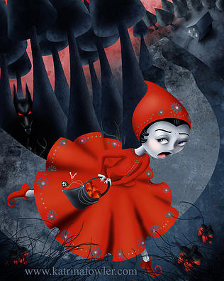
Wow love your peice, thought the image is nicely stylised red looks like she is running off the page.
-
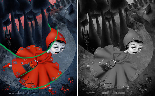
Hi Katrina! I really like this piece, there are a lot of interesting shapes and textures. The mood of dread is really strong, and I'm digging the skewed perspective and crooked road.
There are some tangents in here that are a bit distracting, like where the road meets the bottom of her dress, and it looks like the top of the road is in perfect line with her neck as well. While the red really helps pop the character forward, when you remove the color everything gets harder to read. I did a quick draw-over and devalued the image to show what I'm talking about. I think shifting the figure a little will fix the tangents, and possibly pushing the values more can strengthen the image. I think this is a nice piece.
-
I love the warped perspective on this ... great job Katrina.
-
First off-- the skewed perspective is SO COOL! You've got a lot of things that are working really well for me: The flair of her skirt and the details in her clothing and bag, the texture on the path, the wolf hidden in the woods.
My immediate feeling when I saw the image was disgust rather than fear. I think it has something to do with her mouth/tongue
I also thought she was tripping rather than running at first. It's tricky for me to think how you could change this while keeping the cool perspective, but maybe if the path came off the page and then wrapped back around. This could also address some of the issues with values and tangents that Shannon mentioned.
-
@Katrina-Fowler I love the composition and the rendering. Riding looks really afraid! Like your style!

