Society of Visual Storytelling

    SVSLearn Forums

    • Register
    • Login
    • Search
    • Recent
    • Tags
    • Popular
    • Users
    • Groups
    • Search

    August 3rd Thursday

    General Discussion
    18
    65
    31760
    Loading More Posts
    • Oldest to Newest
    • Newest to Oldest
    • Most Votes
    Reply
    • Reply as topic
    Log in to reply
    This topic has been deleted. Only users with topic management privileges can see it.
    • Jodi Gregg
      Jodi Gregg @smceccarelli last edited by

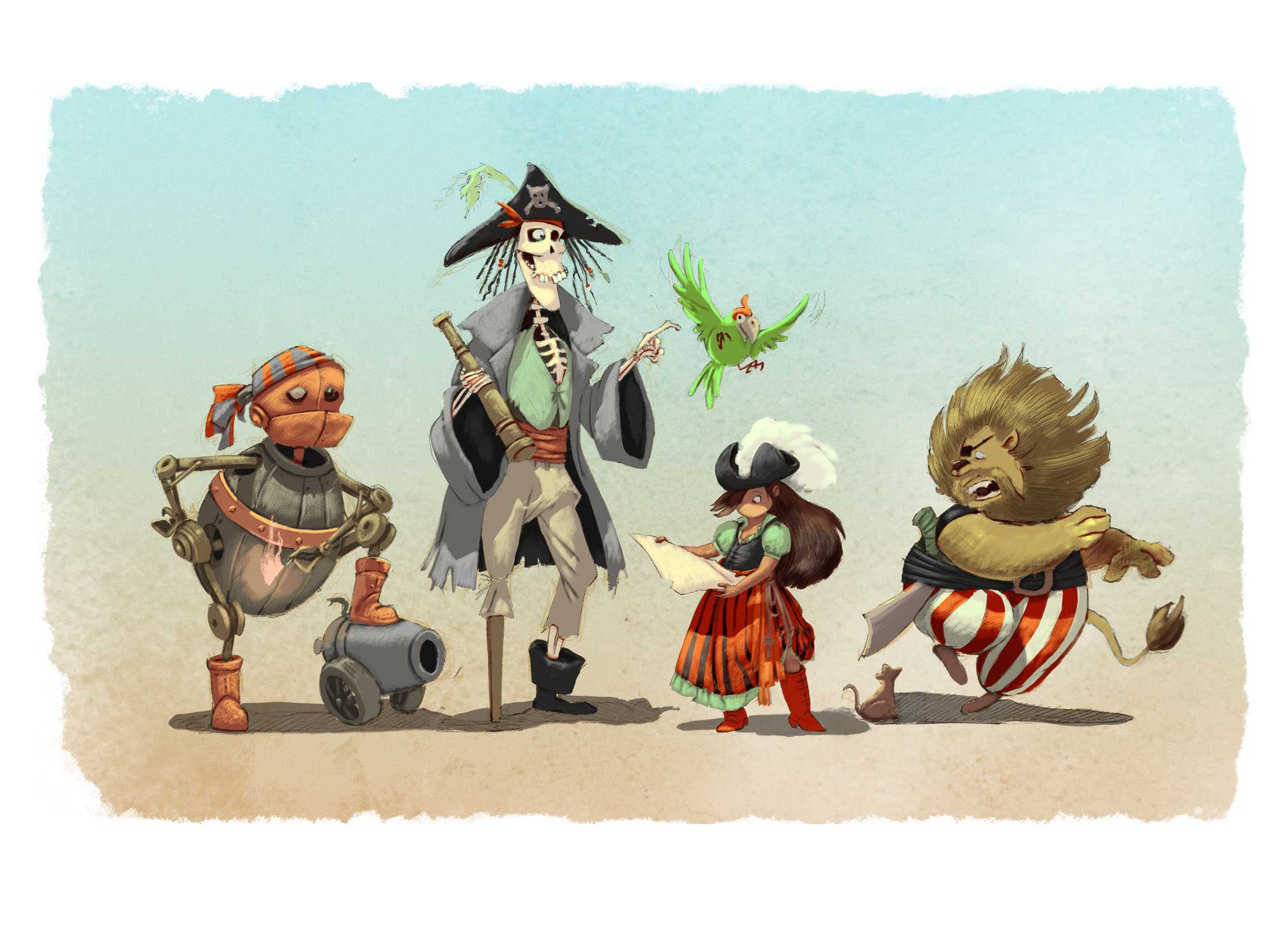
      @smceccarelli This version of Dorothy has so much personality! I love that you are moving away from the traditional color schemes and pushing the nautical/beach colors. The update to the Lion is great too! I understand exactly who they are now!

      I'd suggest updating the scarecrow and tinman too. Maybe make the scarecrow's pose a little looser. He's maybe a more scatterbrained, forgetful kinda guy... maybe make him more frazzled or less put together (maybe literally falling apart?) Also, I'm losing the lit match on the tinman pose. Checking how the silhouette reads can help the pose be clearer. Maybe have the arm in the opposite direction so the tinman is looking directly at it.

      Overall, the pirate designs on these are fantastic and really unique! I really really look forward to seeing these progress!! Keep up the stellar work!

      www.girlgreggarts.com
      http://girlgregg.tumblr.com/

      1 Reply Last reply Reply Quote 1
      • ErikBurlefinger
        ErikBurlefinger last edited by

        Your work is really beautiful, continue please!

        1 Reply Last reply Reply Quote 0
        • smceccarelli
          smceccarelli Pro SVS OG last edited by

          Work in progress...I am experimenting with a new process. Still many many hours to go!

          0_1470597310230_WIP.jpg

          NoWayMe Rebecca Hirsch evilrobot mattramsey 4 Replies Last reply Reply Quote 9
          • Lisa M Griffin
            Lisa M Griffin last edited by

            really fun idea and twist.

            instagram: lisamgriffinart

            1 Reply Last reply Reply Quote 0
            • Dulcie
              Dulcie SVS OG last edited by

              It looks fantastic already 🙂 Nice canvas textures going on in the paintwork, it all looks very natural.

              www.dulciemascord.com
              https://www.instagram.com/dulciemascord
              https://twitter.com/dulciemascord
              https://www.facebook.com/dulciemascord

              1 Reply Last reply Reply Quote 0
              • NoWayMe
                NoWayMe @smceccarelli last edited by

                @smceccarelli Love these characters!!! Great work!

                noemiegionetlandry.squarespace.com
                noemie_illustration on Instagram

                1 Reply Last reply Reply Quote 0
                • bharris
                  bharris last edited by

                  I love this so much!! Great action, dynamic, design, color and their interaction with the props and each other is so good!

                  www.brittanyharrisillustration.com/
                  www.instagram.com/britillustration/

                  1 Reply Last reply Reply Quote 0
                  • Rebecca Hirsch
                    Rebecca Hirsch @smceccarelli last edited by

                    @smceccarelli I love your painting style, and the silhouettes of your characters. My only concern is that, with the exception of the Cowardly Lion, I don't know that I would get that the other characters are from the Wizard of Oz if you hadn't told me. Just a thought, for what it's worth. But I think your illustration style is outstanding.

                    1 Reply Last reply Reply Quote 0
                    • evilrobot
                      evilrobot SVS OG @smceccarelli last edited by

                      @smceccarelli amazing work so far. I love what you did with Dorothy her color scheme is perfect.

                      http://www.palacioillustration.com/

                      https://www.scbwi.org/illustrator-gallery/illustrator-detail/?illustrator_id=84142

                      https://www.pinterest.com/evilrobot2/pins/

                      https://twitter.com/MyEvilRobot

                      1 Reply Last reply Reply Quote 0
                      • mattramsey
                        mattramsey @smceccarelli last edited by mattramsey

                        @smceccarelli pro level work! this is really really great. Can't wait to see where you take this, you've got a very solid design and color foundation here.

                        One thing, it might be interesting to see the traditional Dorthy colors (blue/white) incorporated into your new design. The reason I say this is because I think it would make the boots really pop (the red footwear is iconic and it's getting a bit lost in the color scheme) as well as helping with the overall recognition of the character.

                        Along those lines: maybe sparkles on the boots? That might have been the next step and you're just not at that level of rendering on the piece yet but just thought I'd mention it.

                        https://www.inprnt.com/gallery/mattramsey/
                        https://mattramsey.artstation.com/
                        https://twitter.com/mramseyART

                        Rebecca Hirsch 1 Reply Last reply Reply Quote 0
                        • Rebecca Hirsch
                          Rebecca Hirsch @mattramsey last edited by

                          @mattramsey I was thinking that too. Maybe give her braids as well - those are iconic Dorothy as well.

                          mattramsey 1 Reply Last reply Reply Quote 1
                          • Russ Van Dine
                            Russ Van Dine last edited by

                            This is really great work, lots of character and personality!

                            1 Reply Last reply Reply Quote 0
                            • mattramsey
                              mattramsey @Rebecca Hirsch last edited by

                              @Rebecca-Hirsch forgot about the braids. Yes you are absolutely right.

                              Looks like one of the earlier sketches did have the braids.

                              https://www.inprnt.com/gallery/mattramsey/
                              https://mattramsey.artstation.com/
                              https://twitter.com/mramseyART

                              1 Reply Last reply Reply Quote 0
                              • smceccarelli
                                smceccarelli Pro SVS OG last edited by

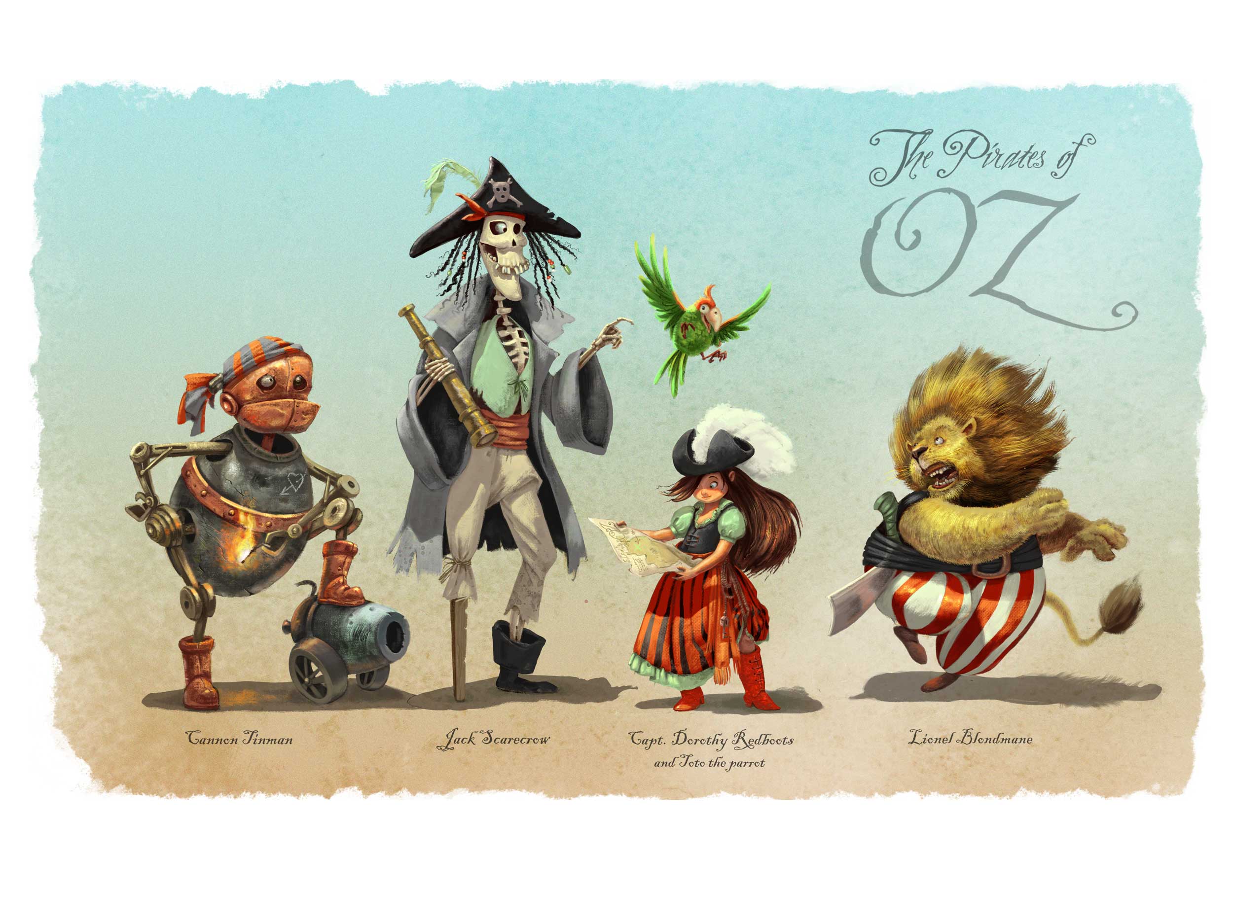
                                And here is where I am - finished? Not sure about whether to include the typography or not. Thank you every body for so many positive comments and feedback! I really set off to do a portfolio piece this time, and I think I am happy enough with the outcome to include it.
                                @mattramsey you have a very good point with the boots and the color scheme - but I decided to stick with the red/green as an experiment in limited palette: it is training I really need. I did add sparkles to the boots though. I do not thing there is an "iconic Dorothy design". There have been so many different version of the WOZ characters along the decades, everything and anything has been done. I love Greg Manchess' version, in which Dorothy is a black-haired punk-gothic teenager and Toto is a bulldog (and which, by the way, was featured on the cover of Spectrum 17).
                                I am not totally happy with the Lion - and anything else you can spot that needs tweaking would be welcome!!
                                0_1470944565457_POZ_FINAL_SMALL.jpg

                                mattramsey evilrobot 2 Replies Last reply Reply Quote 9
                                • Dulcie
                                  Dulcie SVS OG last edited by

                                  Wow - amazing!! It's so beautifully painted, I love seeing it up close and just absorbing all the detail you put in there. Really well done! I love the textures, the way you've got that metallic texture on Tin Man and the lion's mane and cheeks also lovely brushstrokes. I could go on! ...but as you've asked for suggestions I'll make one - if I were to change anything, I'd make the Lion's cheek just cover his upper gums a bit more. There's something about his jawline and teeth that bothers me...but honestly it's a minor thing amongst so much awesome painting.

                                  I like the typography, I'd keep it in there personally. Great piece all round!

                                  www.dulciemascord.com
                                  https://www.instagram.com/dulciemascord
                                  https://twitter.com/dulciemascord
                                  https://www.facebook.com/dulciemascord

                                  smceccarelli 1 Reply Last reply Reply Quote 0
                                  • smceccarelli
                                    smceccarelli Pro SVS OG @Dulcie last edited by

                                    @Dulcie Thank you so much! I see what you mean with the Lion's cheek. I am also seeing a few other things to correct here and there, so not finished yet!
                                    Pausing for a couple of days - it's the best way to spot mistakes for me.
                                    Does anybody else also need "simmering time" on pieces, before deciding whether they are finished or not?

                                    1 Reply Last reply Reply Quote 1
                                    • Dulcie
                                      Dulcie SVS OG last edited by

                                      Oh yes I need simmering time - during final pieces, though actually I need it most when doing character sketches..often I do a new one, and immediately think YES this is the one...then when I look at it the next morning think 'Oh no way the first one was better', or 'I need to sketch some more', etc.

                                      www.dulciemascord.com
                                      https://www.instagram.com/dulciemascord
                                      https://twitter.com/dulciemascord
                                      https://www.facebook.com/dulciemascord

                                      1 Reply Last reply Reply Quote 1
                                      • mattramsey
                                        mattramsey @smceccarelli last edited by mattramsey

                                        @smceccarelli I guess I would say that there is an iconic Dorthy. Imagine Manchess didn't have the red footwear. The only way we'd know it was Dorthy was the other characters around her--and really, we do need those because without them it could just be any punk girl. As soon as you see a monkey with wings (or the robot guy) it suddenly makes sense. If he would have only included her (and maybe her dog) I'm very confident he would have needed to add in other iconic elements such as a wicker basket, braids, a blue & white dress, etc or no one would have gotten the connection. He wouldn't need ALL of those items but there has to be some other elements there.

                                        Another (not that anyone needs/wants one) example: Imagine an artist were to re-imagine Dorthy as a fat, balding, middle aged man sitting on a couch eating junk food. No one would have a clue that THAT'S supposed to be Dorthy. However, if the artist started adding in iconic Dorthy stuff, now the viewer gets it.

                                        So really, the iconic Dorthy is the one first imagined by the movie (not the book which, relative to the movie, few people have been exposed).

                                        All that doesn't really have to do with your (awesome!) piece but I'm just putting my 2 cents in.

                                        https://www.inprnt.com/gallery/mattramsey/
                                        https://mattramsey.artstation.com/
                                        https://twitter.com/mramseyART

                                        smceccarelli 1 Reply Last reply Reply Quote 0
                                        • evilrobot
                                          evilrobot SVS OG @smceccarelli last edited by

                                          @smceccarelli Really great work. I love it. There are probably a few little tweaks here and there like maybe a bit more rending on the tin man's hand holding the match to help it pop out from his body a bit more. But overall it's really beautiful I love the cast shadows on Dorothy's dress. And the rendering on the scarecrow's pants is done really nicely.

                                          http://www.palacioillustration.com/

                                          https://www.scbwi.org/illustrator-gallery/illustrator-detail/?illustrator_id=84142

                                          https://www.pinterest.com/evilrobot2/pins/

                                          https://twitter.com/MyEvilRobot

                                          1 Reply Last reply Reply Quote 0
                                          • Rebecca Hirsch
                                            Rebecca Hirsch last edited by

                                            I think you've come really close to nailing this one. Would not be surprised to hear your name mentioned during the critique. Best of luck and great job!

                                            1 Reply Last reply Reply Quote 0
                                            • First post
                                              Last post