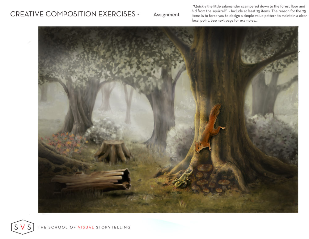
Work Book Exersise
-
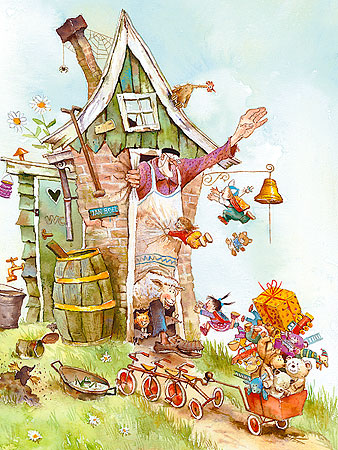
Check this dutch artist: Marius van Dokkum . He makes paintings for grown ups, but also does children's books. This one is called Grandfather Jan, its so nice because of the chaos.
-
Thanks much appreciated! Ill check him out!
-
I tweaked the imaged a little, putting more focus on the squirrel and salamander, also fading the dear behind them. I think to works better.
-
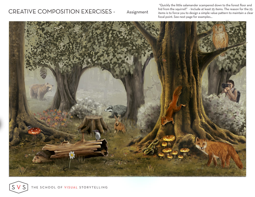
Hey Steve, Great work. I'm so thrilled to see you guys doing the work from the videos! This is a tough assignment!
I'm not sure of the particulars of the assignment, but you definitely got your 25 items in! I think it went a bit too far though. When you are adding complexity, you need to strive for simplicity (how's that for some yoda teaching!). In other words, the more stuff you add, the more you have to control the basics so the scene doesn't get away from you.
By adding so much wildlife, you have taken away our focal point. Anytime there is wildlife in a scene, it's human nature to pay attention to it. We need to find out quickly if we are in danger, so we are programmed for it. If a person is in there that response is even more extreme.
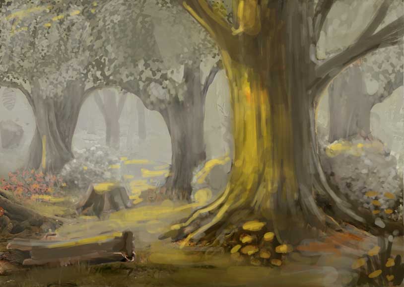
In this paintover, I have hopefully set up the stage for you to add your main characters. I took out all your living creatures and started there (BTW: that's exactly how I'd start this assignmnet). Figure out your scene and how you are going to control the value and lighting and hold a focal point, then add the details making sure they don't overwhelm the focal point and main characters.
set up a lighting scene that makes putting them on the tree a bit easier. If they are scurrying down the tree on the lit side, they will cast shadows and that will definitely call attention to them. I'm not sure I would add any other wildlife besides our main characters. Fill it with flowers and stuff (which have already done nicely).
You don't have to use my painting, per se, but you can use it as a starting point on holding your values and setting up a favorable lighting situation for your characters.
I hope that helps some. Keep up the good work! : )
 I
ISVS Faculty Instructor
www.leewhiteillustration.com -
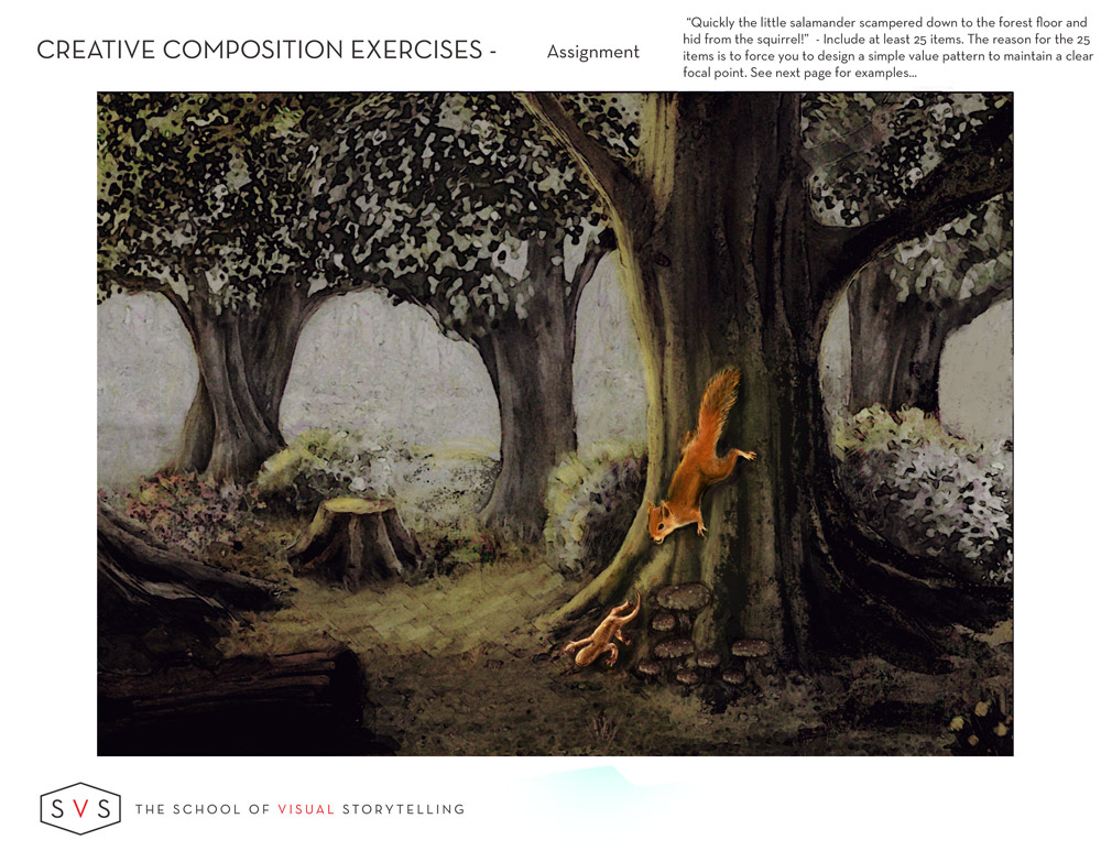
@Lee-White I Your right of course I had a good idea that I was breaking the simplicity rules : Your paint over really helps. Thanks Ill take it into consideration.
-
Accidental Success, whist working on the images based on @lee-white feedback. I was doing a layer adjustment and hit on this crude color scheme and it felt like a watercolor / oil painting. I liked it a lot. So I played with it. Dont worry I will still work on the original version. Just curious what you peeps think.
Never give up, always push yourself two steps further than you believe you can go.
-
Here is the original image adjusted using a light beam to highlight the main characters and blurring the object around the characters making more of a focus.
-
RE: Accidental Success
@Steve-Young I like it a lot actually. Feels more finished, clean, focused. I also like that it brings out so much texture. I'm a sucker for texture.")
-
Beautiful painting! I love the light coming through the trees! It really looks like a traditional painting. Great job!
-
This is much better @Steve-Young
My eye seems to know exactly where to look! -
This absolutely has better focus and feels more organized, great job!
-
Thank you, your word of appreciation is err appreciated.
-
Very nice! I like the soft brushwork. I wonder about maybe adding a pale color, to the background? (unless the assignment said not to--I see it says value pattern, but can't see the whole thing--which class is it from?) Maybe the leaves in the middle trees could be a bit more faded and generalized? The squirrel is lovely and the front tree is great. I think the light beam would have a color and hit the mushrooms too (though light sources are not my strong point). I'm not sure about it shining directly on the squirrel--usually light beams cover more area. But just for the exercise it works well to make the focal point (and so does the near black and white part).
I think you have 25 items even without the other animals!
-
@Vicky-Vicky thanks about mentioning about the issues your raised, I am away of some of them. Thought to complete the image I had to make some sacrifices. The assignment is from the creative composition. Thanks for the feedback much appreciated.
-
I think you did a great job. The assignment was to make a clear tonal structure and focal point, which you did. If you later want to add color or whatever it's up to you, but you started with a really complicated image with many animals and simplified it. I really liked the way you do animals (I'm partial to animals) and look forward to seeing more of your work.
-
Thanks! Regarding the animals, they were fun to do, I captured thee silhouettes then forms and finally added there detail.