Society of Visual Storytelling

    SVSLearn Forums

    • Register
    • Login
    • Search
    • Recent
    • Tags
    • Popular
    • Users
    • Groups
    • Search

    August 3rd Thursday-Reworking

    General Discussion
    13
    49
    16916
    Loading More Posts
    • Oldest to Newest
    • Newest to Oldest
    • Most Votes
    Reply
    • Reply as topic
    Log in to reply
    This topic has been deleted. Only users with topic management privileges can see it.
    • Kevin Longueil
      Kevin Longueil SVS OG @bharris last edited by

      @bharris Hey this is looking great! I think you might just need some lighter highlights following the forms to give the witch's clothing a sort of sheen - i think silk has wide defuse highlights with hot spots here and there .... not sure -..thats what i picture though - i like the green version too but possibly you could try the highlights on the green too to see if it works πŸ™‚

      Portfolio: kevinlongueil.com
      https://www.instagram.com/kevinlongueil/

      1 Reply Last reply Reply Quote 1
      • Rich Green
        Rich Green SVS OG @bharris last edited by Rich Green

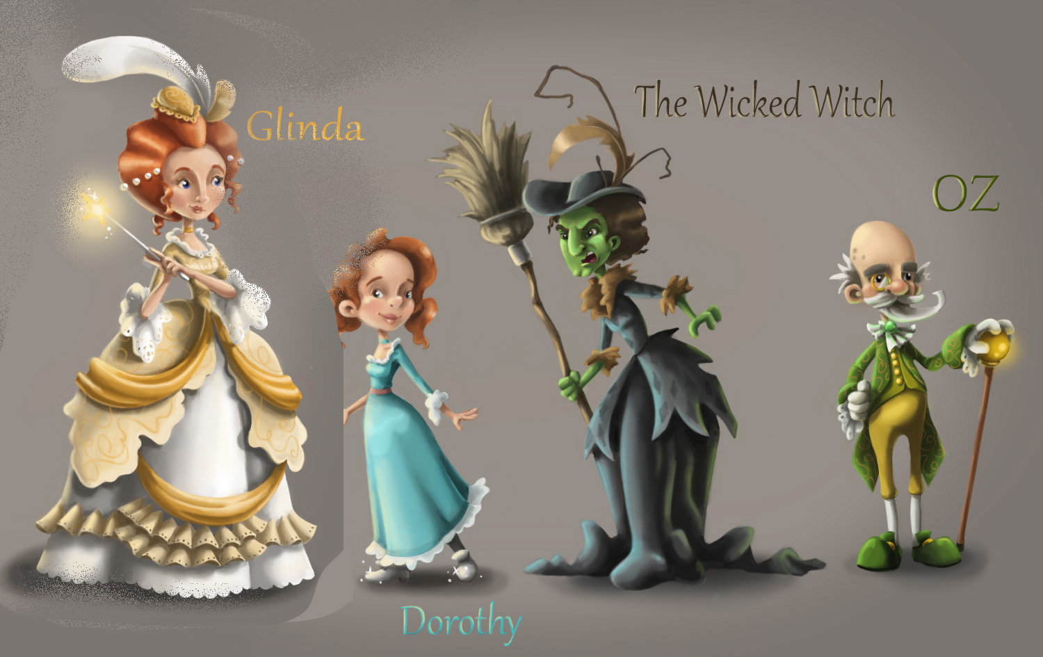
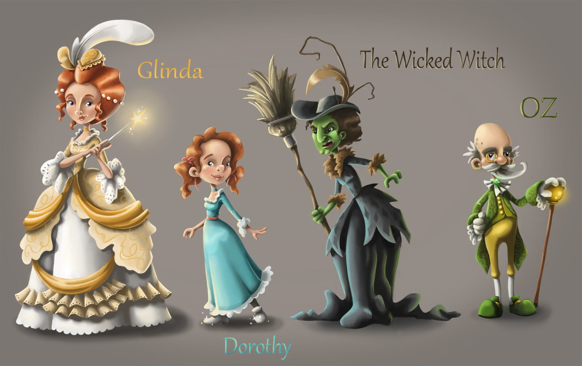
        @bharris - To me what the problem may be is that you have a nice harmonious color palette going on with the good witch, Dorothy and the wizard.

        When you add in the less saturated gray/green to the dress of the witch it does not fit into the overall scheme (to me) and actually clashes with the very yellow green of her own skin and the wizard next to her.

        I did a google image search for Victorian Dresses and one of the first ones that showed up was this:

        0_1471367929541_Black-Gothic-Victorian-Dress-TQL120427056.jpg

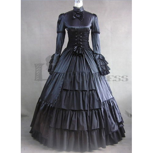
        I realize it has as sheen to it but what I liked was that it pulls in reflections from the main light source as well as a fill light. See those hints of blue/teal that show upon the left side.

        So that made me think - what could work to give the witch a bit of color, without actually changing the color of her dress, would be to use those vivid colors from Dorothy's dress and the wizards coat to bounce off the highlights and low lights in the witch.

        All I did was applied those colors on an overlay layer to quickly get you this concept:

        0_1471368062762_1471366923034-wizard-of-oz-character-design-1.jpg

        It provides some color and interest to her while still keeping the overall tone of the dress black. Anyway just an option to consider or play around with.

        www.richgreenart.com instagram.com/richgreenart/

        1 Reply Last reply Reply Quote 2
        • bharris
          bharris last edited by

          Thanks @Rich-Green! That makes it work, finally! I'm cooling off the skin tone a bit too and it's looking much better!

          www.brittanyharrisillustration.com/
          www.instagram.com/britillustration/

          1 Reply Last reply Reply Quote 1
          • bharris
            bharris last edited by

            @Kevin-Longueil Thanks! I think with more highlights and @Rich-Green's suggestion it will look a lot better. I'm trying to get rid of those hot spots as well.

            www.brittanyharrisillustration.com/
            www.instagram.com/britillustration/

            1 Reply Last reply Reply Quote 1
            • Dulcie
              Dulcie SVS OG last edited by

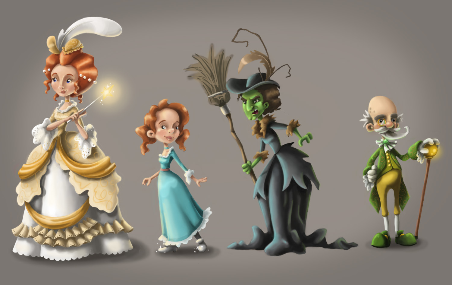
              Looking very good @bharris! I also prefer the original black version of the witch's dress. I wonder if one reason for the black not 'popping' as much as you'd like, is because the grey values in it are very close to the colour of the background. You could try changing the background to a neutral brown-ish colour instead - that would still contrast with the green, yellow and aqua in the other characters. You might have to highlight the broom and witch tufty dress bits some more, but that shouldn't be too tricky. Just a thought! It's looking great anyway πŸ™‚

              www.dulciemascord.com
              https://www.instagram.com/dulciemascord
              https://twitter.com/dulciemascord
              https://www.facebook.com/dulciemascord

              1 Reply Last reply Reply Quote 1
              • bharris
                bharris last edited by

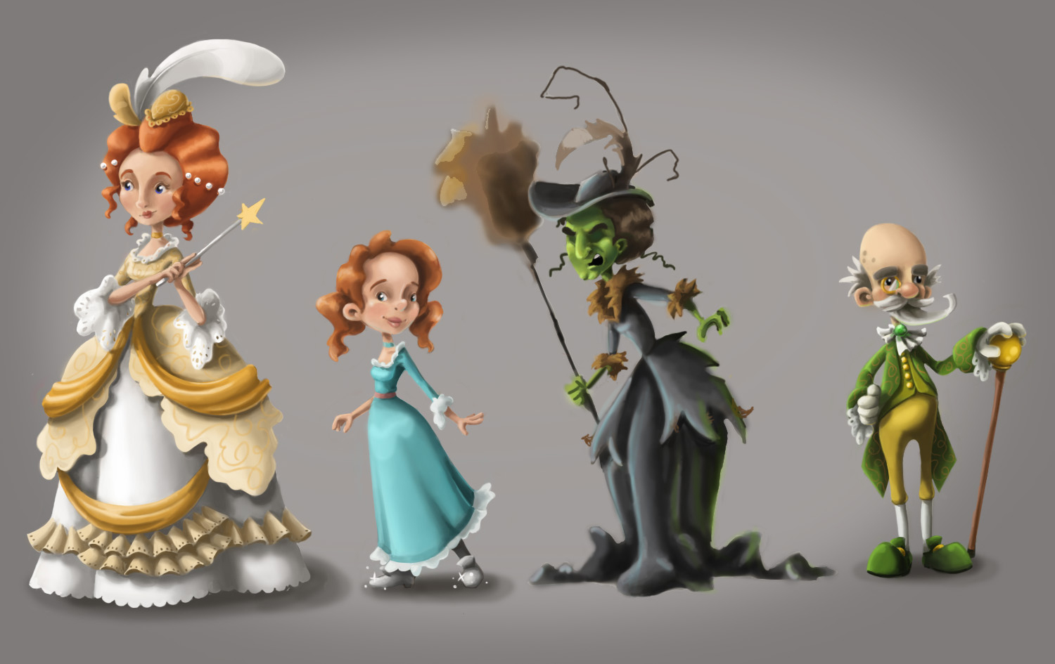
                Something is feeling super off to me around the witches face. The broom isn't done yet. Perhaps it's the play between the warm brown and black, or between the green and the hair any ideas for fixing it?

                0_1471394996292_Wizard of OZ Character design 9.jpg

                www.brittanyharrisillustration.com/
                www.instagram.com/britillustration/

                1 Reply Last reply Reply Quote 0
                • Lydia M
                  Lydia M last edited by

                  Hmm... could be her eyebrows? They are pretty thick like caterpillars. You could narrow them down and give them more of a pointy arch.

                  www.lydiamueller.com
                  Twitter @lydesigns

                  1 Reply Last reply Reply Quote 0
                  • Lydia M
                    Lydia M last edited by

                    Forgot to add - nothing jumps out as super off color-wise, but if the brown/black combo is bugging you why not change the brown to grey?

                    www.lydiamueller.com
                    Twitter @lydesigns

                    1 Reply Last reply Reply Quote 0
                    • bharris
                      bharris last edited by

                      @Dulcie and @Lydia-M Thanks! I tried to incorporate your suggestions. Any better? This is where I'm at tonight, gonna sleep on it tonight and do some touch ups tomorrow.

                      0_1471404260001_Wizard of OZ Character design.jpg

                      www.brittanyharrisillustration.com/
                      www.instagram.com/britillustration/

                      Rich Green 1 Reply Last reply Reply Quote 3
                      • Rich Green
                        Rich Green SVS OG @bharris last edited by

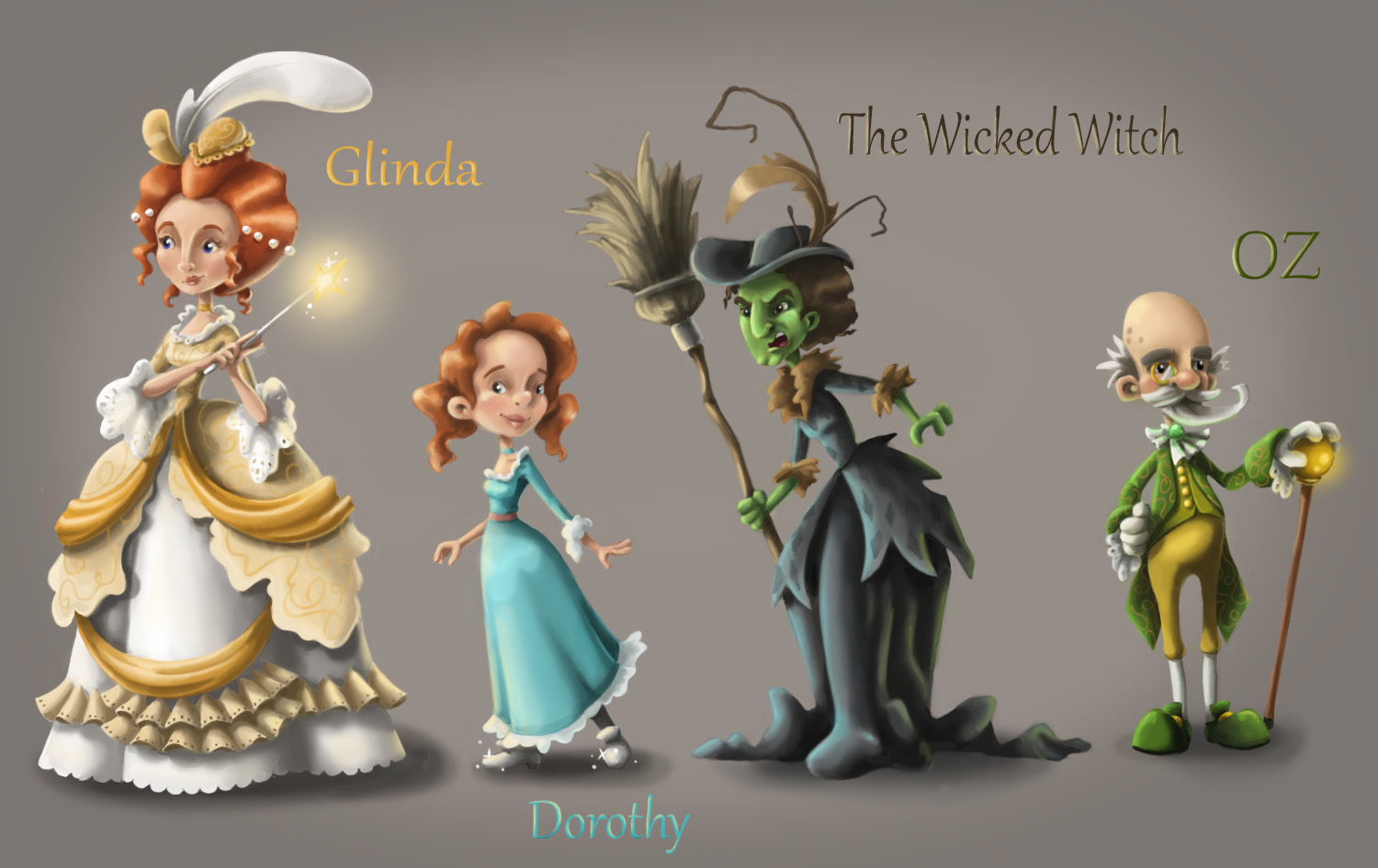
                        @bharris I really like the hints of the diamond pattern you added onto the coat portion of the witches dress, its a small detail but it really adds a nice visual.

                        And while I am partial to the use of the blue and green lighting to enhance her dress anyway, I just want to say I think it really worked out nicely here. It almost helps give her that hint of magic that we see other characters might have like Glinda with her wand and the Wizard with his glowing staff.

                        Speaking of the reflected light - I love that you also added some yellow fill onto Dorothy. Again small detail but it really elevates her and pulls here into the space more as well now too.

                        Really nice designs and style you came up with for this one! I am envious!!!

                        www.richgreenart.com instagram.com/richgreenart/

                        1 Reply Last reply Reply Quote 0
                        • bharris
                          bharris last edited by

                          @Rich-Green Thank you so much Rich! It makes me happy that you noticed all those details, non- artists (hubby) tend to say "good arting." lol!

                          www.brittanyharrisillustration.com/
                          www.instagram.com/britillustration/

                          1 Reply Last reply Reply Quote 1
                          • bharris
                            bharris last edited by

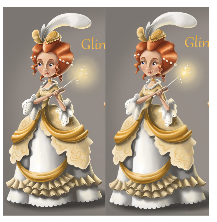
                            Hey, did a little re-working on Glinda after last night's critique! She is looking better and I'm planning to continue working on all of them.

                            0_1471628739702_glinda compare.jpg

                            www.brittanyharrisillustration.com/
                            www.instagram.com/britillustration/

                            Rich Green 1 Reply Last reply Reply Quote 1
                            • Rich Green
                              Rich Green SVS OG @bharris last edited by

                              @bharris Hi Brittany! Was so nice to hear the great feedback you got on this piece during the live event last night. Congrats again on such great design. One thing I noticed during the event and now that you have Glinda zoomed in here. Is that she is looking out of the side of the image at nothing really. I wonder if moving her eyes to be looking towards her wand or Dorothy might work better.

                              Plus she has a fondness for Dorothy and wants to look out for her so I think she would be looking her way even if just a casual side glance. Thoughts?

                              www.richgreenart.com instagram.com/richgreenart/

                              1 Reply Last reply Reply Quote 1
                              • bharris
                                bharris last edited by

                                @Rich-Green I like that idea I'll give it a shot!

                                www.brittanyharrisillustration.com/
                                www.instagram.com/britillustration/

                                1 Reply Last reply Reply Quote 0
                                • Lee White
                                  Lee White SVS Team SVS Instructor Pro SVS OG last edited by

                                  easier solutionβ€” just flip her horizontally...

                                  0_1471636738255_1471404257987-wizard-of-oz-character-design.jpg

                                  SVS Faculty Instructor
                                  www.leewhiteillustration.com

                                  bharris 1 Reply Last reply Reply Quote 0
                                  • bharris
                                    bharris @Lee White last edited by

                                    @Lee-White But then I have to repaint the shadow on her from where the main light source is coming from...?

                                    www.brittanyharrisillustration.com/
                                    www.instagram.com/britillustration/

                                    Rich Green 1 Reply Last reply Reply Quote 0
                                    • Rich Green
                                      Rich Green SVS OG @bharris last edited by

                                      @bharris and @Lee-White - there is almost something more inferred about Glinda's protector role, if you keep the original position and just have the eyes glancing over at Dorothy.

                                      It's almost as if she is casually protecting her or casting some magic on Dorothy in that pose. Makes her like a fairy god mother if you will.

                                      If she is flipped around to actually face into the scene - it then looks more like a battle between Glinda and the Wicked Witch and changes that dynamic. Which could also work but speaks differently to me.

                                      Not sure in a portfolio someone would think that deep into this. But since I have seen this image several times now that is how I like to interpret what Glinda is doing here

                                      www.richgreenart.com instagram.com/richgreenart/

                                      1 Reply Last reply Reply Quote 1
                                      • bharris
                                        bharris last edited by

                                        @Rich-Green I agree. I did the eyes and like the extra dynamic. Will share soon!

                                        www.brittanyharrisillustration.com/
                                        www.instagram.com/britillustration/

                                        1 Reply Last reply Reply Quote 0
                                        • bharris
                                          bharris last edited by

                                          K so here is my re-worked image. I think it looks much better and I'm glad I spent the extra time that Will, Lee and Jake suggested. I don't plan to do much more on it at this time, but if you have comments or thoughts I'd love to hear them! Thanks!

                                          0_1471651299332_Wizard of OZ Final.jpg

                                          www.brittanyharrisillustration.com/
                                          www.instagram.com/britillustration/

                                          1 Reply Last reply Reply Quote 3
                                          • natiwata
                                            natiwata SVS OG last edited by

                                            Looking good! Those details really made things pop!

                                            Nat Iwata
                                            www.iwataillustration.com

                                            1 Reply Last reply Reply Quote 0
                                            • First post
                                              Last post