Society of Visual Storytelling

    SVSLearn Forums

    • Register
    • Login
    • Search
    • Recent
    • Tags
    • Popular
    • Users
    • Groups
    • Search

    Finished-Quick Painting Feedback

    General Discussion
    10
    16
    3695
    Loading More Posts
    • Oldest to Newest
    • Newest to Oldest
    • Most Votes
    Reply
    • Reply as topic
    Log in to reply
    This topic has been deleted. Only users with topic management privileges can see it.
    • bharris
      bharris last edited by bharris

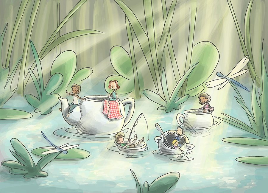
      Hey all, just playing around with this Barrowers inspired illustration. Wondering if I should leave lines or take further without? Thanks!

      0_1472163935989_river teaparty 2.jpg

      0_1472163942918_river teaparty 3.jpg

      www.brittanyharrisillustration.com/
      www.instagram.com/britillustration/

      natiwata Kevin Longueil 2 Replies Last reply Reply Quote 4
      • Eric Castleman
        Eric Castleman last edited by Eric Castleman

        I like the lines. The first image looks really great!

        EricCastleman.com

        SCBWI profile
        https://www.scbwi.org/members-public/eric-castleman

        1 Reply Last reply Reply Quote 0
        • natiwata
          natiwata SVS OG @bharris last edited by

          @bharris BEAUTIFUL work! I think the lines look really nice and you should consider leaving them.

          Nat Iwata
          www.iwataillustration.com

          1 Reply Last reply Reply Quote 0
          • evilrobot
            evilrobot SVS OG last edited by

            I think it looks really nice as is. I'd leave those lines in. Great work.

            http://www.palacioillustration.com/

            https://www.scbwi.org/illustrator-gallery/illustrator-detail/?illustrator_id=84142

            https://www.pinterest.com/evilrobot2/pins/

            https://twitter.com/MyEvilRobot

            1 Reply Last reply Reply Quote 0
            • bharris
              bharris last edited by

              @Eric-Castleman, @natiwata and @evilrobot Thanks! Lines it is!

              www.brittanyharrisillustration.com/
              www.instagram.com/britillustration/

              1 Reply Last reply Reply Quote 1
              • mikesikes
                mikesikes last edited by

                I love the lines! Great work

                1 Reply Last reply Reply Quote 0
                • Kevin Longueil
                  Kevin Longueil SVS OG @bharris last edited by

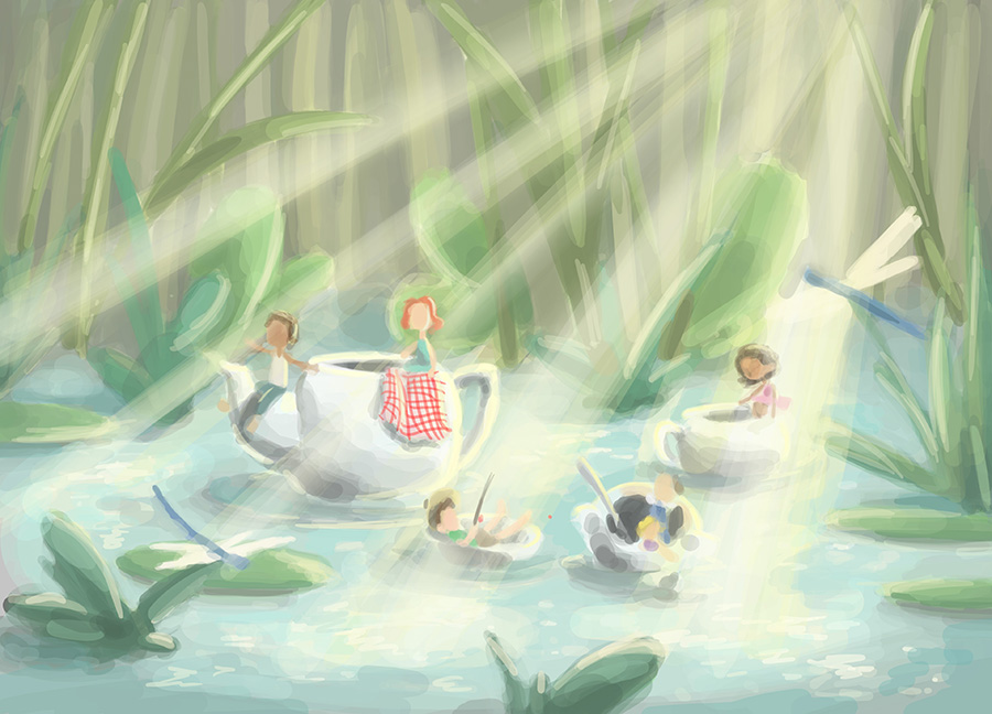
                  @bharris This looks great - "Take it further without" the line would be my feedback - to me the second image really has a lot more depth and life to it and it feels like the beginning of a really great painting - i think the line weight being uniform in the first image is having a flattening effect on the composition for me - i think if you decide to paint further you could just go a tiny bit further with detail everywhere, deepen and warm up the shadows and then add crisper detail to the places you would like our eyes to go ......easily said right - anyways - i love your work and feel free to ignore 🙂

                  Portfolio: kevinlongueil.com
                  https://www.instagram.com/kevinlongueil/

                  1 Reply Last reply Reply Quote 1
                  • smceccarelli
                    smceccarelli Pro SVS OG last edited by

                    It is a beautiful composition, and great sense of light! I agree with @Kevin-Longueil that the second version has more potential. The line version also looks very nice, but it seems a bit harsh for the subject matter. You would want a feeling of lightness and whimsy with this scene, and I think no line or subdued line (in a color matching the painting instead of black) may work better.

                    1 Reply Last reply Reply Quote 0
                    • Dulcie
                      Dulcie SVS OG last edited by

                      I think both versions are lovely, and the line version is really charming, but I agree that it does look a little flatter because the lines are the same weight, even though there is a lot of depth in the picture.

                      Overall I’d choose to work on the second version without line (or with coloured lines) - the lighting really shines and it has a beautiful delicacy about it. I could see it as a beautiful portfolio piece. I guess it depends on how much time you have spare to invest in it…

                      www.dulciemascord.com
                      https://www.instagram.com/dulciemascord
                      https://twitter.com/dulciemascord
                      https://www.facebook.com/dulciemascord

                      1 Reply Last reply Reply Quote 0
                      • bharris
                        bharris last edited by

                        @Kevin-Longueil I couldn't put my finger on it, but yes it does look more flat. Thanks for your feedback, I'll try it out!

                        @smceccarelli Thank you! I agree, it felt off to me. I was painting a bit more loosely and I ended up liking the painting style more than the line work.

                        @Dulcie I really like the term delicacy for this, really what I was going for! I think I will spend more time on it. Thanks for your feedback!

                        www.brittanyharrisillustration.com/
                        www.instagram.com/britillustration/

                        1 Reply Last reply Reply Quote 0
                        • graphitedad
                          graphitedad last edited by

                          I think the color without the lines is the stronger piece. The lines tighten the image and detract from all the wonderful technique happening with the painting.

                          If it were me, I would try developing and refining the color even more. Work on creating a distinct foreground, middle ground, and background. Obviously, add more detail to the characters. From there, if you still want line, then only add it as an accent in order to clarify the imagery, not to outline. If using line make sure that there is a variety of line weight.

                          1 Reply Last reply Reply Quote 0
                          • Russ Van Dine
                            Russ Van Dine last edited by

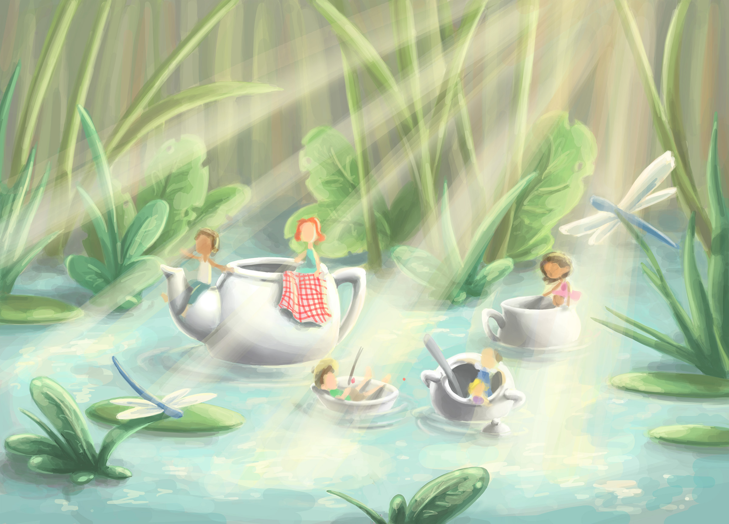
                            I am just learning with everyone else here... I would take the illustration without the linework up to 600dpi and begin to put in detail. I would work harder for the detail on the people than the background. If you use linework, you might think about varying the line thickness...

                            1 Reply Last reply Reply Quote 0
                            • bharris
                              bharris last edited by bharris

                              @graphitedad Great idea! Thank you!

                              @Russ-Van-Dine Thanks!

                              After taking some advice, and I've been working on some of the details. I tried warming up the color a little. Still have the characters to go. I'd like to not have things be too soft, but I think the characters will tighten it up a bit more. I may loosen up the tall grasses painting a little more... Any thoughts?

                              0_1472503973893_river teaparty 6.jpg

                              www.brittanyharrisillustration.com/
                              www.instagram.com/britillustration/

                              1 Reply Last reply Reply Quote 1
                              • bharris
                                bharris last edited by

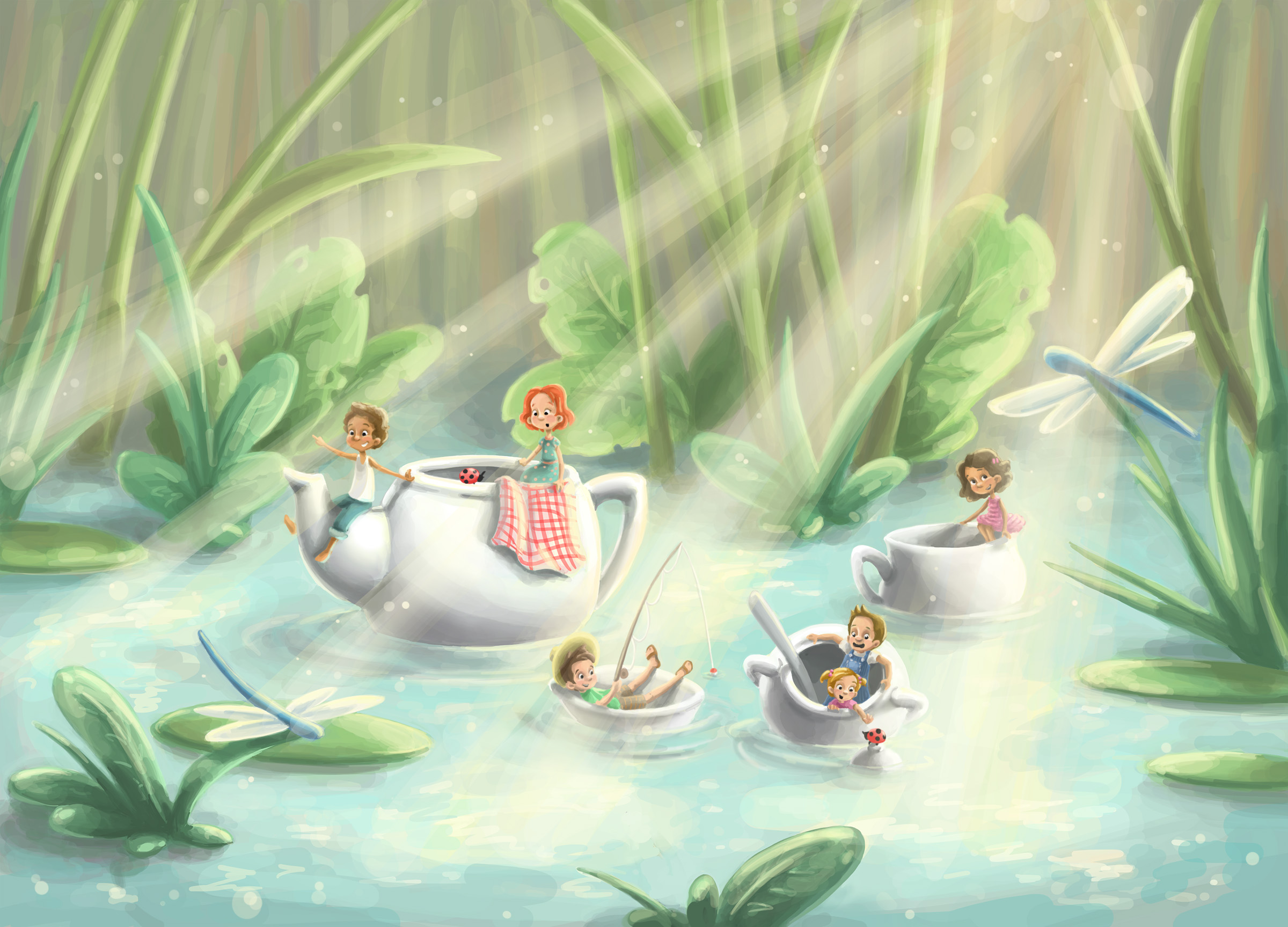
                                Done! Thanks all for the advice, I really like how this turned out!

                                0_1473005115332_river teaparty final.jpg

                                www.brittanyharrisillustration.com/
                                www.instagram.com/britillustration/

                                1 Reply Last reply Reply Quote 6
                                • evilrobot
                                  evilrobot SVS OG last edited by

                                  This is a nice. It's a really cool Idea. You might try to darken the foreground up a bit It might make that light pop a bit better.

                                  http://www.palacioillustration.com/

                                  https://www.scbwi.org/illustrator-gallery/illustrator-detail/?illustrator_id=84142

                                  https://www.pinterest.com/evilrobot2/pins/

                                  https://twitter.com/MyEvilRobot

                                  1 Reply Last reply Reply Quote 0
                                  • Russ Van Dine
                                    Russ Van Dine last edited by

                                    This really went somewhere! Great job! My only little thought would be to desaturate the background a little more, the darker would push the lighter even further forward and make your painting that much more readable and clear... I like this and would love to read a story about these kids in their teapot and cups. I also agree that the bottom corners could receive some deeper colors to chase your eye back to the bright center... Personally, I would make the dragon flies friendly and happy...if you leave them like this I would rather you just take them off and make the subject more about the kids...

                                    1 Reply Last reply Reply Quote 0
                                    • First post
                                      Last post