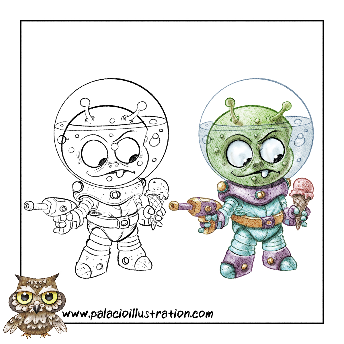
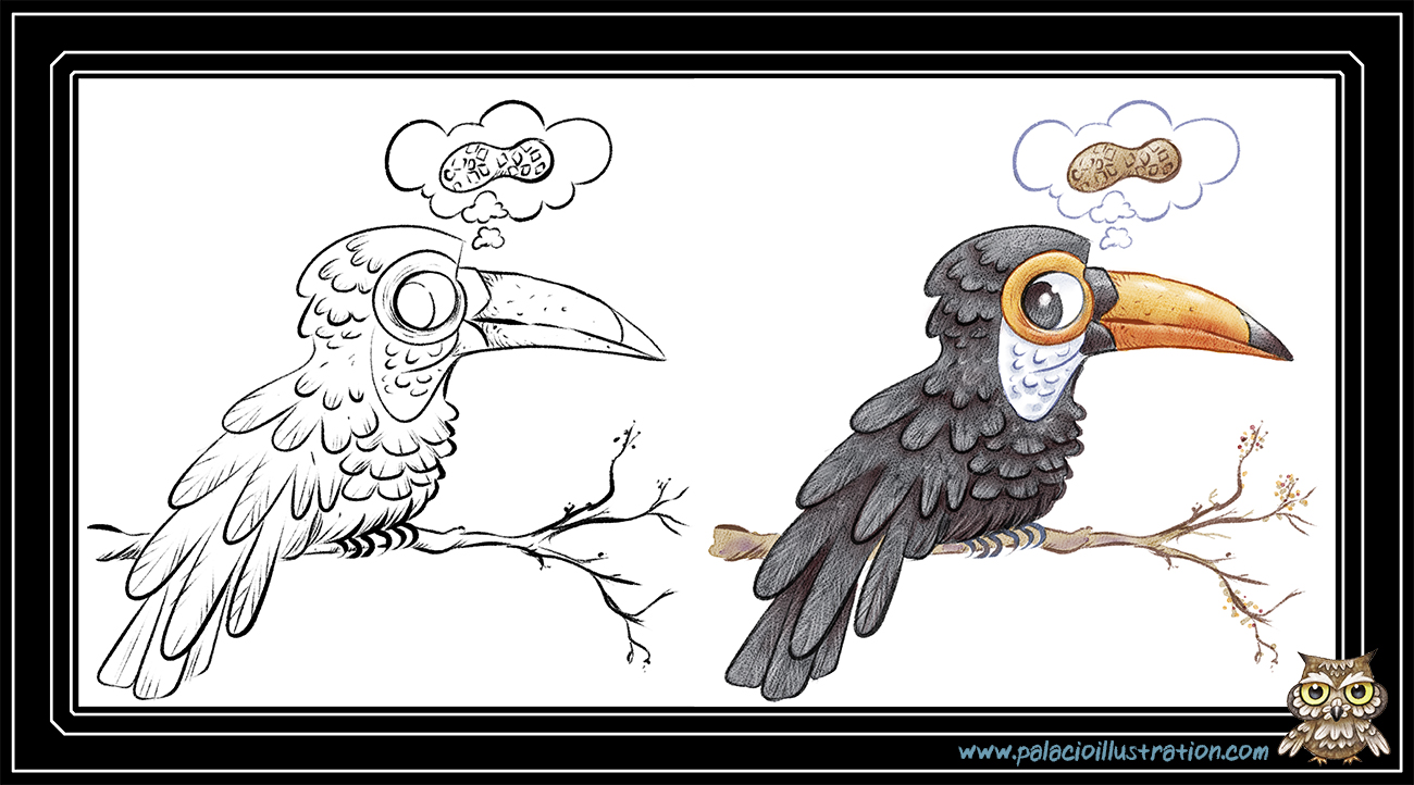
Society of Visual Storytelling

    SVSLearn Forums

    • Register
    • Login
    • Search
    • Recent
    • Tags
    • Popular
    • Users
    • Groups
    • Search

    Process test

    Illustration
    7
    8
    1916
    Loading More Posts
    • Oldest to Newest
    • Newest to Oldest
    • Most Votes
    Reply
    • Reply as topic
    Log in to reply
    This topic has been deleted. Only users with topic management privileges can see it.
    • evilrobot
      evilrobot SVS OG last edited by

      Trying to see if my rendering style will work with this type of line work. It doesn't seem to blend in well enough. 0_1472934219170_Alien-style-test.jpg

      http://www.palacioillustration.com/

      https://www.scbwi.org/illustrator-gallery/illustrator-detail/?illustrator_id=84142

      https://www.pinterest.com/evilrobot2/pins/

      https://twitter.com/MyEvilRobot

      Kevin Longueil 1 Reply Last reply Reply Quote 4
      • Dulcie
        Dulcie SVS OG last edited by

        I'm not sure what you are dissatisfied with but I think it looks great! The linework adds definition but you still have the texture...to me it's a great look overall 🙂

        www.dulciemascord.com
        https://www.instagram.com/dulciemascord
        https://twitter.com/dulciemascord
        https://www.facebook.com/dulciemascord

        1 Reply Last reply Reply Quote 2
        • Kevin Longueil
          Kevin Longueil SVS OG @evilrobot last edited by

          @evilrobot i think it looks really good!

          Portfolio: kevinlongueil.com
          https://www.instagram.com/kevinlongueil/

          1 Reply Last reply Reply Quote 1
          • Rebecca Hirsch
            Rebecca Hirsch last edited by

            I have to agree - I really like the color and texture in the line work. Experimenting with that myself.

            1 Reply Last reply Reply Quote 0
            • Katie W
              Katie W last edited by

              I think it looks great as well! So much of that beautiful texture but the definition from the line work keeps it from looking fuzzy or unfinished. Nicely done!

              1 Reply Last reply Reply Quote 0
              • bharris
                bharris last edited by

                I really like this too!. Perhaps the black around the face is making it feel off. Have you tried using the green from around the head for the eyes or brows?

                www.brittanyharrisillustration.com/
                www.instagram.com/britillustration/

                1 Reply Last reply Reply Quote 0
                • evilrobot
                  evilrobot SVS OG last edited by

                  Wow, thank you all very much. I think the line was just a bit too opaque for me. I do like the line work though. So, on this test I subtracted the paper texture from the line work and I think I like the outcome better. Should I go this route or should I stick to the way I rendered the first test? I'm doing these because I'm trying to figure out how to render my third Thursday piece since the line work on that it so much different than what I usually do. 0_1473018063192_Toucan-for-web.jpg

                  http://www.palacioillustration.com/

                  https://www.scbwi.org/illustrator-gallery/illustrator-detail/?illustrator_id=84142

                  https://www.pinterest.com/evilrobot2/pins/

                  https://twitter.com/MyEvilRobot

                  1 Reply Last reply Reply Quote 0
                  • Russ Van Dine
                    Russ Van Dine last edited by

                    both are very nice!

                    1 Reply Last reply Reply Quote 0
                    • First post
                      Last post