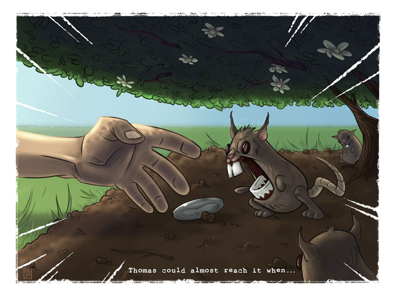
Thomas' reach - Sept 3rd Thursday
-
I like them all, but if I had to choose I would pick the second one with the eagle (3rd of the bottom line). The last one is super-funny, but then Thomas should stretch his hands towards the turtle (or if the turtle is Thomas, she should be trying to bite the man´s nose or something), to indicate the "trying to reach" part. Actually that one is the most original idea, especially if there is a way to stage it so that we see the setup from where the man jumped from, so that the narrative is even clearer. Maybe from the bottom looking up?
Actually, I think that is the one which has the most potential to elicit an immediate laughter, so may be worth developing that.
Great ideas overall! -
I like the first one, second one, and last one (with the turtle) the most.
-
I like the last one as it's different. And the turtle looks cool.
-
Love the last one very unique and fun.
-
@BradAYoo They are all nice compositions - I think the best for me is the first one on the second row
-
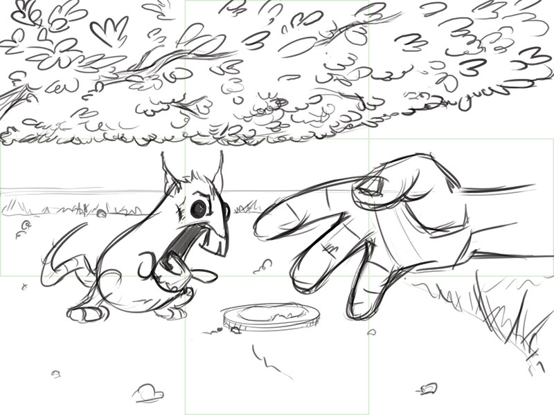
Wow, we have quite a variety of preferences, that's so great. I am still on the fence a little but for now I decided to develop rock wall Thomas some more. As you can see changed the angle because didn't like the lack of depth. TBH I like the new direction and the flow but feel like it may be too busy. That may be just me though.
What say you?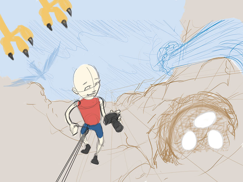
-
Update, I have reworked the logistics of the rat story and am really digging where this is going.
-
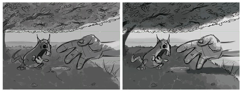
Some lighting tests for Thomas.
-
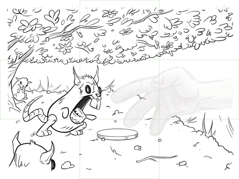
@BradAYoo I liked the rat in the house idea. Is he under a tree now? Should the hand have four fingers?
-
@Chip-Valecek Yeah, I removed the house for a few reasons but mainly I was having a hard time with the size relationship of the hole vs the hand&rat. The hole just looked too big when making it large enough to stick a hand through the wall. Plus I don't know anyone that would reach around to retrieve a dropped piece of chocolate.
 So that's what led to a coin under a shrub. As for the four fingers I was going for more of an animated look. If it looks too odd to you all I'll add another.
What do you think? -
@BradAYoo I guess thats personal choice on the fingers. I would think if the hand is going to be colored as human skin then four fingers would be the way to go. I'm not sure what the rules are on that though.
-
Thanks @Chip-Valecek, that sounds like good advice. While sketching I was thinking "Bob's Burger and Simpson's do it" but my hand probably isn't cartoony enough to pull that off. I would rather put personal preference aside if it means a clear idea to the viewer.
Hand aside, inks are just about done ( 0 _ 0 )
-
Looking good!
-
Thanks @drawingmelee. I just started following you on Twitter. You have some fun work.
")
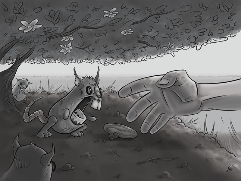
A bit of an update. I've had some sick kiddos so working has slowed but I got in a few hours late last night. Greyscale is all finished and now I'm ready for some colors. I'm still not entirely sure what I'm doing here, comments and critiques are always welcome.
-
@BradAYoo The hand looks better with the four fingers but the pinky has a curve that is throwing it off. If you google reaching hand there are a lot of great reference. I really like the rat design. That guy looks really fun.
-
@BradAYoo : Thanks for following me on twitter! I started following you too, really digging your artwork!
Greyscale is looking fantastic! The rat design you created is very cool.
-
First off, thank you all for the help and critiques. Your input was invaluable.
There are a few things I want to touch up but I have officially run out of time. I had a 3D project unexpectedly land on my plate today so I wanted to finish the night off with completing what I have. Let me know what you think.