Logo design help
-
@sarahelliott489 What is the logo being used for? If it is going to be printed on paper materials, you´d want to go with one or two spot colors, so that costs are contained and consistency is guaranteed. Good logos are printable in one color (for example to brand a pen other merchandising where you have very limited options) and still look good. The main characteristic of a logo, however, is that it has to look good and be recognizable at any size: from half a inch or less on a webpage or advertisement leaflet, to 5 ft printed on a van. Try to reduce the size of this to how it would look on a web banner on a phone. My bet is that it would not be recognizable what it is and you would not be able to read the typography. Just my two cents from doing graphic design for corporate stuff
")
The idea, however, is really nice. Maybe working with the two silhouettes in two colors would be an idea? -
@sarahelliott489 Ditto on all @smceccarelli said. I think that a Michael Schwab approach would look great for this brand! (Michael is a pretty successful and award winning illustrator/designer. I have loved his stuff for like for 20 years)
Also do a Google-Images search on his name and you should see tons more work that he doesn't show on his site. Make sure to take a closer look at his posters, wine labels, etc. too.
EDIT:
BTW, One small point of difference with Simona: I do intensely agree that logos should work in one color form and with as few spot colors as possible (2 or maybe 3 being optimum). This is important for silk screening, embroidery, laser etching, etc. However, if the brand is only presented digitally, or will only ever be printed by digital printing, then there is flexibility since digital printing has become so pervasive and cost effective, particularly for small print runs. With that said, I still think that it is best to create a logo that looks best in 1 color first (for black and white printing) and then can work as 2 spot colors, but you can have the 4-color and even rendered version for all your digital printing & such (One major corporation that does this is UPS)
EDIT 2:
Michael Schwab uses photography reference that he "traces". Granted, he takes liberties with the photographed subject to make refined and well crafted final black and white graphical version, but he uses the photo nevertheless (at least in all the process photos I've seen of his work).
Also, per what Simona said, make sure to watch your line weight. They seem a bit thin right now and probably won't hold up well at small sizes. Print out a page or 2 with your logo at different sizes from 1" up to full page (or even much larger if you want) in 0.5" increments (or the metric equivalent). This will help you see if the logo holds up at small, medium, and large.
-
Thank you so much for the feedback.
I am taking another look at it. I don't have any graphic design training or really any idea how to do logo's.
I probably should have persuaded my friend to pay someone who actually knew what they where doing! But she has just started and really does not have much of an idea where the logo will be used. I am guessing facebook and maybe stickers on the cartons until she gets big enough then she would have to get the logo redone to look more professional anyway.I am seeing her this week so will have a chat with her about it. I wonder if it might be better to get someone who really knows about branding to help her get everything set up.
Anyone know how much it would be to get a logo professionally designed?
-
Anyone know how much it would be to get a logo professionally designed?
Anything from 17 USD (that is what the Nike logo cost) to over 1 Million USD (for UPS)....;-)
Really, there is no limit either way. If it is for a small business and you do not anticipate a lot of different uses, maybe you could consider buying or modifying a stock logo - a quick search on Shutterstock for "cow logo" yields 6000 results. Some of them are really neat - that would cost about 50 USD for the image only (no design of layouts or marketing materials, of course).
Or just google "cow logo" and let yourself be inspired to create an original one based on what you see there...I always start logo design that way, and if is funny how fast you come to a fully original solution when you ground yourself in what you like or dislike from existing ones.Here a couple of my favorites

-
That's a really good idea @smceccarelli however she defiantly wants something showing a calf having the milk as her unique selling point is that the cows are milked when in calf unlike the larger milk farms that use hormones to keep the cows milking permanently.
If she can get it done fairly cheaply it might better to get someone who knows what they are doing to get it right.
Website: http://www.seelliottcreations.com/
Facebook: https://www.facebook.com/SEElliottCreations/ -
@sarahelliott489 You can do it - you can do it - you can do it!
Go Go Go!
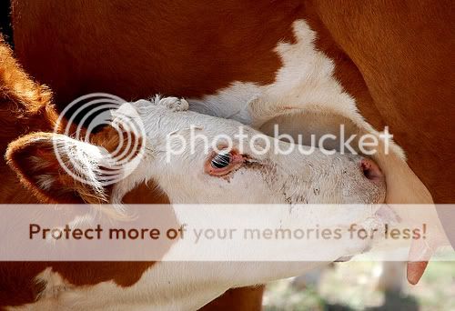
( ^ - ^ )The full mother cow & calf certainly has merit and can be done. Another approach could be to crop in onto the nursing calf (head & udder) and place it within a container (like a circle/oval or square/rectangle). A photograph reference of this is below. (And, of course, I'm sure there are other highly stylized/abstract ways of presenting this concept too)
You can see a couple stylized logos of mine on page 5, where the graphical images I created are placed within a container with text (These clients required the elements as such, rather than highly simplified graphics. You can see other highly stylized/abstract logos in there too):
http://www.quietyell.com/quietyell_portfolio_branding.pdf
(You can see them on my site too at: http://quietyell.com/portfolio/branding/ )
I think like @smceccarelli said, do a Google search on logos and even other similar graphical images to create a “style/mood/reference board”. They don’t have to be about cows either. I don’t know this client’s brand style/personality, but I’d assume that it is jovial, light-hearted, whimsical, dainty, refreshing, etc. and logos from brands covering cheeses, breads, spa products, certain fashion products, etc. will help in providing graphical direction based upon how others achieved portraying the style/personality and pulling forth the "soul of the company" to present to the world.
If it helps, I have TONS of branding/packaging/design references organized on Pinterest: https://www.pinterest.com/ScottMonaco/ (Scroll down past all the illustration related boards to the “Design” & “Branding” boards)
You should be able to aggregate several logos & other graphical treatments that reflect your client’s brand and provide you direction on how you might want to handle the logo, font, etc.
Here's the image I mentioned (I just picked one out of all the Google Images). While I think a photo like this will need to be stylized & made cuter, I think it is still clear that a calf is nursing without having to show the full mother cow; thus emphasizing the calf milking focus of the company and even probably simplifying your logo:
-
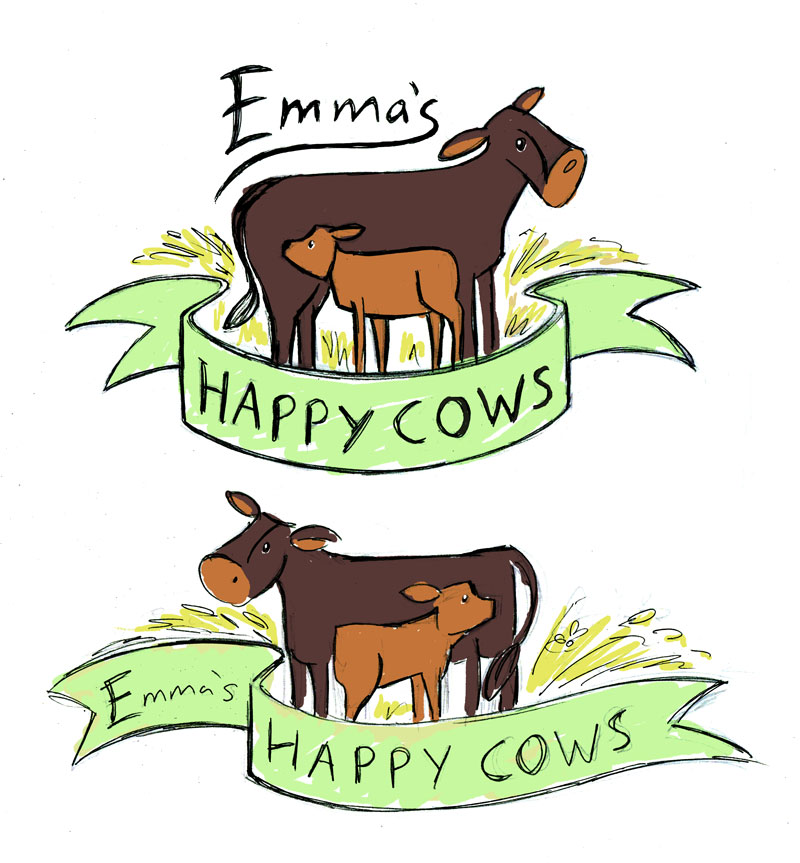
Some great tips and pointers already….I also have some thoughts about your logo. Your original concept is really strong, in my opinion - I like the two cows facing opposite ways, in contrasting colours, with the banner below…with a few tweaks it could work really well.
The things I would look at are:
-
Think about your silhouette. The logo has to be clearly readable at a small size, so you want it to look like a cow even if it’s tiny. On your logo the ear and tail overlap the cow’s body and are the same colour - if they stick out from the body the shape will be clearer. Also, worth looking really closely at some cow reference to get the head shape right - ear and nose shape so important.
-
Text size. The text is too small at the moment, to be clearly readable as others have said, so yeah for sure make that bigger in comparison to the cow. The most difficult thing, I think, with tweaking this, is working out how to place the text, as it doesn’t all fit on the banner when you make it bigger. I’ve come up with a couple of options to show you what I’d try out, if it were my brief. You could possibly think about having some text as script, and some in a different style, e.g. capitals.
-
Shape of the logo/area that it takes up. If your client is just starting out a business, she may not have thought of all the little details like what shape labels she’s going to use on her milk bottles. But, it’s worth finding out as much as you can…e.g. if you make a wonderful oblong-shaped logo, but her labels are square, then your logo might not be able to be printed as big and bold as she might like. So if she can give you any idea of what contexts it will be used, it will help you design more effectively.
-
Simplification. Look at the shapes you’ve created with the cow and calf and banner, and see how you can simplify them, to make them flow and possibly more stylised. Try and reduce your concept down to the simplest essence possible in terms of shape and detail, then if you need to add more detail in again, work up from there.
I’ve done a couple of rough sketches to show what I mean…just in case it inspires you a bit, as to where you take the logo next. The top sketch of mine the Emma lettering isn't ideal yet, I’d work on it more if it were my project, but it's just an idea to show how the text could be made bigger within your original concept.
Hope you don’t mind all of this critique - as I said I think the essential concept of your logo is really good. Good luck with it!
-
-
I agree with everything that's been said so far and I LOVE @Dulcie 's additions. My one suggestion is that instead of making the cows brown, you make them black & white - that will make them more instantly recognizable as cows, from any distance. When people think of cows, they typically think of them as being black & white (even though of course they come in many variations of color). With them brown, the eye doesn't immediately register them as being cows - you have to look for a few seconds, which isn't the best for marketing. I personally love brown cows and like the way they look, but from a logo design perspective, you want it to immediately register with the viewer.
-
I don't have much to add to that. lol But I want to say don't give up! You still have time, so spend a couple days just sketching cows. Don't worry about color until you feel like your cow sketches have improved. Approach it one step at a time.

-
Hi Thanks so much for all the great messages and help.
I am going to have another go this weekend and draw lots of cows. I will post the results.
Just so you know my friend did have some criteria for the logo:
- must show a calf with the mum (preferably feeding)
- would be nice if it was her first cow which is a dark brown colour
- she wants it to look kind of vintage and rustic